

Introduction
Designing a website layout can seem pretty overwhelming, especially if you don’t have a design background. But you are not alone, we’ve all found ourselves staring at a blank screen, completely lost on how to begin. And most of us definitely didn’t nail it from the start.
But you know what’s great? You don’t have to be a design pro to create something amazing. In this guide, we’ll walk you through the process of how to design a website layout, share inspiring website layout examples, and give you practical website layout ideas to try.
Why website layout designs matter
Your website layout designs are like a foundation, they keep everything in place and ensure everything runs smoothly. But it’s not only about having a nice appearance (though that matters too). It’s really about helping your visitors easily locate what they need and enjoy their time on your website.
Think about the last time you visited a website. What was the first thing that grabbed your attention? Was it a nice, welcoming design, or did you find yourself getting annoyed trying to navigate it? That’s the magic of a well-designed layout, it can either keep people engaged or send them right away because of small web design mistakes they don’t even consciously notice at first.
A solid layout achieves a few important things:
- Makes visitors curious: When your website is simple to navigate, people are naturally more inclined to stick around and see what you have to offer.
- Gets results: A well-organized layout design subtly encourages visitors to take action.
- Builds trust: A well-designed layout shows that you pay attention to the details, and people definitely pick up on that.
On the other hand, a messy layout can really throw visitors off and might even drive them away from your website. But here’s the bright side: with a couple of tips we’ll share, you can create a website layout that looks great and uses super user-friendly designs.
How to design a website layout: 7 major steps
Let’s walk through how to design a website layout, honestly, it’s way easier than it looks if you take it step by step. Just make sure to follow these 7 steps:
1. Set goals for your website
You need to figure out what your website is all about before starting your website layout designs. What’s its main goal? Getting a clear idea of its purpose will help you create a design that aligns with your objectives.
One of the website layout examples is when you’re setting up an online store. Make sure your layout highlights your products and makes shopping super easy. If you’re a photographer, your main goal should be showcasing your images. The same idea applies to a blog layout, where clarity helps readers navigate long-form content effortlessly. Having a clear idea of what you want to accomplish will help steer all your design choices.
2. Research and gather inspiration
First, take a moment to explore some websites that really inspire you. Think about your favorite brands, competitors, or any sites with designs you love. What stands out to you? How do they arrange their content? What types of layouts grab your attention?
And no, you shouldn’t be copying what others do, it’s more about recognizing what makes a design effective. Places like design blogs and other creative websites are great for collecting inspiration. Note the things that catch your eye and consider how you can add your unique touch to them.
3. Pick your layout style
Now moving on to the exciting part, choosing a layout style. This is where website layout ideas come into play. You want your layout to align with your website’s objectives and what resonates with your audience. If you want to display a ton of images, a portfolio layout could be just the one for you. On the other hand, if you’re in the business of selling products, a grid layout can really help showcase everything in an appealing way.
There are tons of layout styles out there, and picking the right one really depends on your goals. We’ll explore various layouts later, but just keep in mind that the style you select will shape how visitors engage with your site.
4. Draft your layout
It’s a good idea to wireframe your layout before jumping into the design process. You don’t have to be an amazing artist for this, just noting where you want everything to be on your page will do the trick.
You don’t actually have to go into detail right now. Just think about where the navigation will be, where your content will be placed, and where your main call-to-action buttons (like “Shop Now” or “Contact”) should go. This stage is really about planning and making sure you are covering all the important bits.
5. Choose your tools
So, once you have your plan sorted out, the next step is to pick the right tools to make it happen. Using a theme builder can really change the game for everyone. It gives you complete flexibility to design stunning websites without needing to code, while semantic and utility classes make it easy to keep styling consistent across pages.
Some of them even come with ready-made page kits alongside templates for just about every layout you can imagine. So, surely there’ll be a template that fits your idea perfectly. Additionally, looking at proven website layout examples will help clarify your own structure.
6. Design and customize your layout
Begin by adding your content and choosing your fonts and colors that fit your idea. Just make sure everything works well together. When picking your palette, it helps to know the basics of color theory in web design, it’s a huge factor in how visitors respond.
A quick tip: don’t underestimate the power of whitespace. It might seem odd, but having some empty areas around your content really helps everything feel more open and makes your website layout designs way easier to use. Try not to overload your page with tons of text or images. Keeping it simple and organized is usually the best approach.
7. Test, test, test
Before you go ahead and click “Publish”, take a moment to test everything out. It’s a good idea to check how your website appears on different screen sizes so you can make sure it works smoothly.
Ask someone you trust and see if they can check out your website and share their thoughts. Getting a fresh pair of eyes on things can really help in how to design a website layout. You might be surprised at how even little adjustments can significantly improve the user experience.
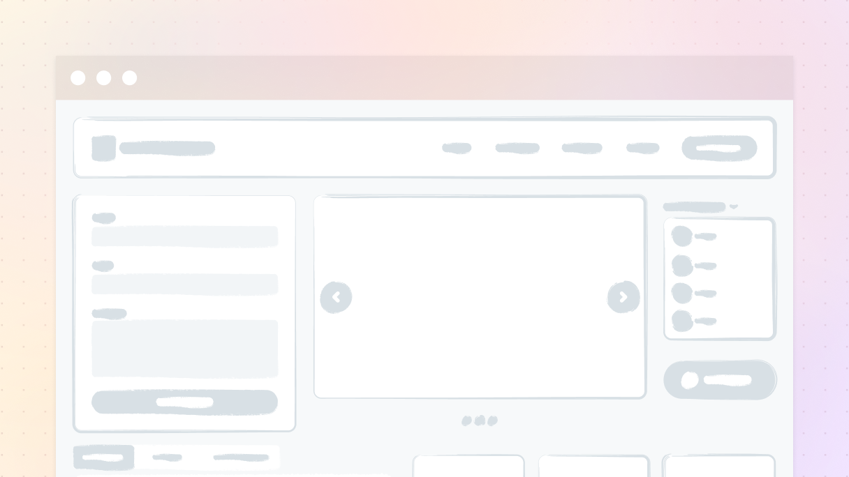
The main parts of a website layout
Every website is like a puzzle, and there are some important pieces that keep it all connected. These key elements are what make your website user-friendly and functional. Every design should include these key parts:
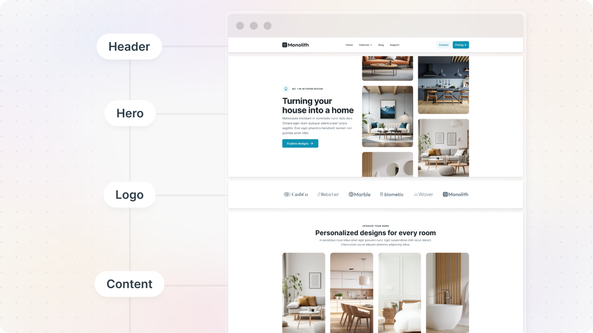
Header and navigation bar
It’s the first thing that catches people’s attention when they visit your page. It typically features your logo and a navigation bar that takes them to pages like “Home”, “About”, and “Contact”.
Your navigation bar needs to be straightforward. Nobody enjoys a game of hide-and-seek when they’re looking for your store or blog. Stick to 4–7 main links and make sure they are easy to click on.
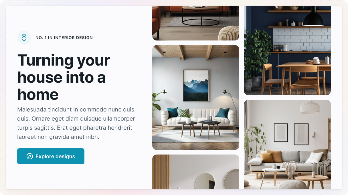
Hero section
Just beneath the header, you’ve got your hero section, and it’s the perfect place to catch people’s attention. Imagine this as your opportunity to create an unforgettable first impression. Use images and words that communicate that they’ve found the right spot, and why they’ll want to stick around.
Content sections
This is the core of your website, the area where all your main content is. Depending on what your website is all about, your content sections could feature:
- Blog entries or articles
- Products or services
- A showcase of your work
- Details about you or your business
To make your content really user-friendly, it’s important to structure it in a way that flows nicely. Use clear headings and subheadings so that people can quickly glance at and find what they need.
Sidebar (optional)
Not every website requires a sidebar, but they can be really useful for blogs or sites packed with content. You could use it to display things like:
- A search bar
- Latest articles
- Categories or tags
- Your social media accounts
Make sure the sidebar doesn’t get too stuffed. It’s meant to improve the experience, not pull attention away from the main content.
Footer
The footer might not get all the attention, but it’s actually a go-to spot for people looking for additional info. You can use this area for things like:
- Contact information
- Copyright information
- Links to your social media profiles
- Links to your policies (terms of service or privacy policy)
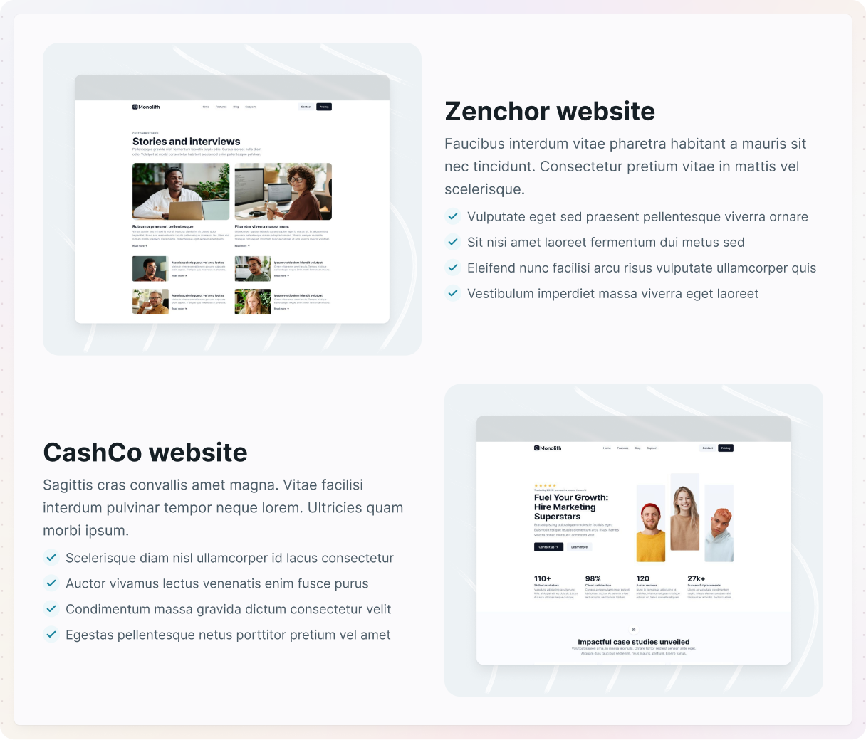
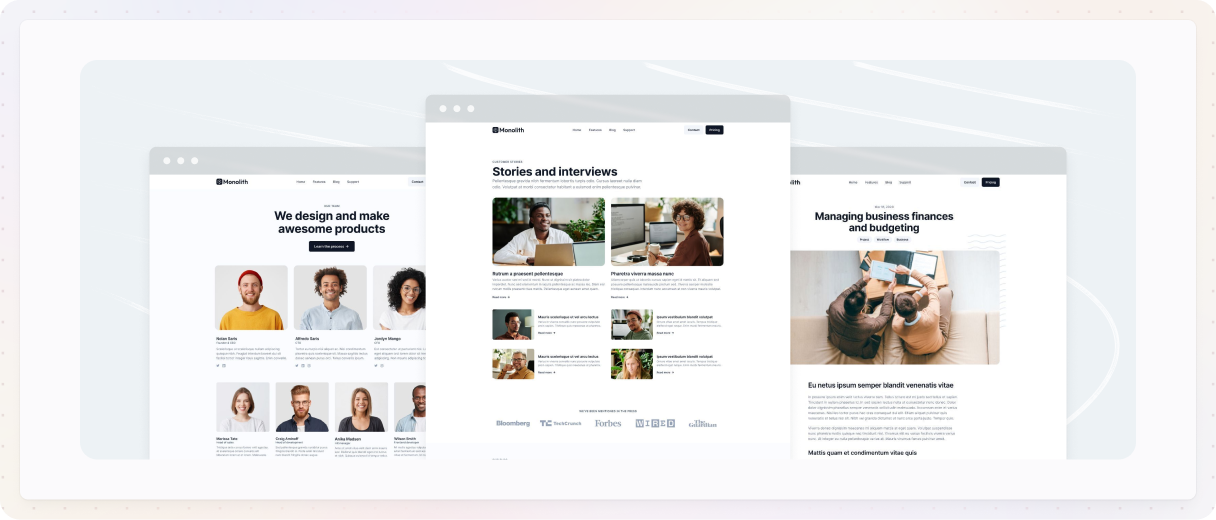
Popular website layout examples
When you’re designing a website, there’s really no strict guideline that says you have to follow a specific layout. To help you discover fresh website layout ideas, we’ve gathered some of the most popular website layout examples on WordPress used by modern designers today. These layouts balance creativity, structure, and user experience.
Zig-zag layout
This is one of the most dynamic website layout examples, ideal for content that needs rhythm and flow. The zig-zag layout of your content leads readers’ eyes smoothly from one side of the page to the other. It’s great for organizing information into sections so they are easier to understand.
Why it works: It grabs attention and makes the design feel lively, almost like you’re guiding them through it.
When to use it:
- You’re breaking down a process.
- You want to show a blend of text and images without overwhelming anyone.
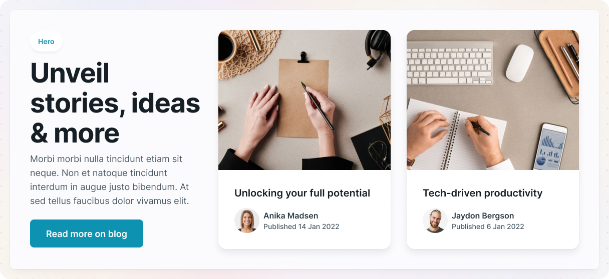
How it’s built
In this layout, we are using the Content 16 block in Monolith. It consists of three containers, and each one is arranged using a grid layout. The grid features two equal columns, which means both sides get to share the available space equally.
Just a quick note: in this theme, all containers stick to the same 12-column grid layout. It’s powered by a specific variable in their max-width settings, which helps keep everything looking nice and consistent throughout.
In the first container, there’s an image on one side and some text on the other. The text is set up inside a row, which makes it stack smoothly. Plus, to give it a nice look, the row is centered.
The next container is mixed up a bit to achieve that classic zig-zag look. Just duplicate the first container and switch the positions of the image’s and text’s rows. You can easily drag and drop the content directly on the canvas or use the navigator. The column gaps are also consistent across all the containers, so everything stays organized.
Card-based layout
Looking for clean and organized website layout ideas? Card-based layouts are always a solid choice. This layout has been around for a while. It arranges everything into clickable boxes, or “cards”. It’s a great way to present a large amount of information without messing up the page.
Why it works: It’s super easy to browse through, so your visitors can quickly spot anything that catches their interest.
When to use it:
- You have a large number of products, posts, or categories that you want to highlight.
- You want your website to have a clean and structured look.
How it’s built
This example uses the Hero 20 block in Monolith, which is all about having a nice and structured look. The container is set up in a grid format with three equal columns, each sharing the available space equally. Plus, to ensure everything feels balanced, there’s a consistent gap between the columns.
Each column has its content organized in divs. These divs create a clear structure and keep the cards distinct from the other elements around them. To ensure the cards stand out, every div has a white background along with a subtle box shadow.
The cards have an image at the top, with the textual content below it. We’ve made sure the text has a consistent padding of 32px, so everything stays well-organized on all the cards.
Asymmetrical layout
This layout style is perfect for creative brands seeking unconventional website layout designs. Asymmetry breaks away from rigid grids and consistent spacing. It introduces a vibrant energy by playing with different shapes, sizes, and arrangements. It’s bold, unique, and exactly what you need if you want your website to grab attention.
Why it works: It’s usually surprising and creative, but it can also be practical if done right.
When to use it:
- You are putting together a portfolio or building a unique brand identity.
- You’re going for an edgy vibe.
How it’s built
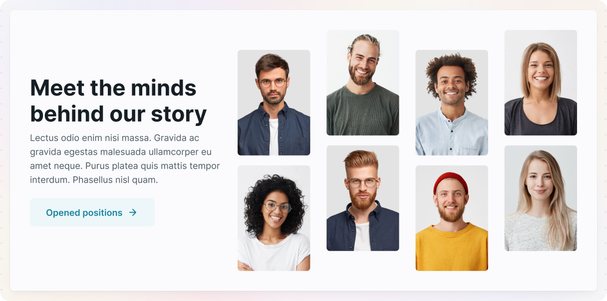
In this example, we used the Team 16 block in Monolith, which uses a grid design along with varying column widths to create the asymmetrical layout. As you may have noticed, all containers in this theme use the same 12-column max-width layout, which in this case is separated into a slimmer 4-column row and a wider 8-column grid, using the ‘4+8’ subclass, which has their max sizes defined.
On the left, you’ve got the text laid out in rows. Over on the right, it gets a little more interesting with a grid made up of four equal columns that split the space evenly. The images are arranged in rows within this grid, so they line up nicely one under the other.
The cool thing about this layout is the way the images are arranged. Some are a bit higher, and others are lower, which adds a fun vibe to it. This effect comes from giving a little extra margin at the top or bottom of the rows with the images. Plus, the images have their sizing set just right to fit into the layout. And the even spacing between the rows and columns really brings everything together.
Full-screen layout
Among the bolder website layout examples, this one captures focus instantly. Full-screen layouts focus on showing off one piece of content at a time, taking up the whole screen. It creates a captivating feeling, almost like it’s drawing you into the narrative.
Why it works: It cuts out all the distractions and directs their attention right where you need it.
When to use it:
- You’re highlighting some high-quality visuals or a product.
- You’re guiding people through a specific flow, similar to how a landing page works.
How it’s built
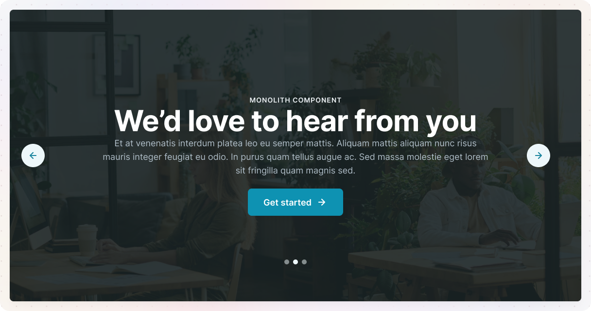
This example uses the Slider 02 block in Monolith, and we’ll explain how to create this full-screen layout from it. Normally, the container has a maximum width, just like all the other containers in this theme. However, if you want the layout to extend all the way across the browser window, you need to get rid of that max width and change it to 100%. This way, it will always fill the entire width of the screen.
We’ve included a slider in the container with some nice background images for each slide. To help the text stand out, there’s a fine dark overlay on the images. You can easily adjust this in the slide’s background settings.
Magazine layout
Great for blogs and media, this layout reflects structured website layout ideas in action.
This design really is like print magazines. Picture bold headlines and organized grids that arrange tons of information so it’s both captivating and easy to understand.
Why it works: Perfect for presenting a ton of information without overwhelming the viewer.
When to use it:
- You’ve got a blog or website filled with content.
- You want to have a clean, professional look, almost like a magazine.
How it’s built
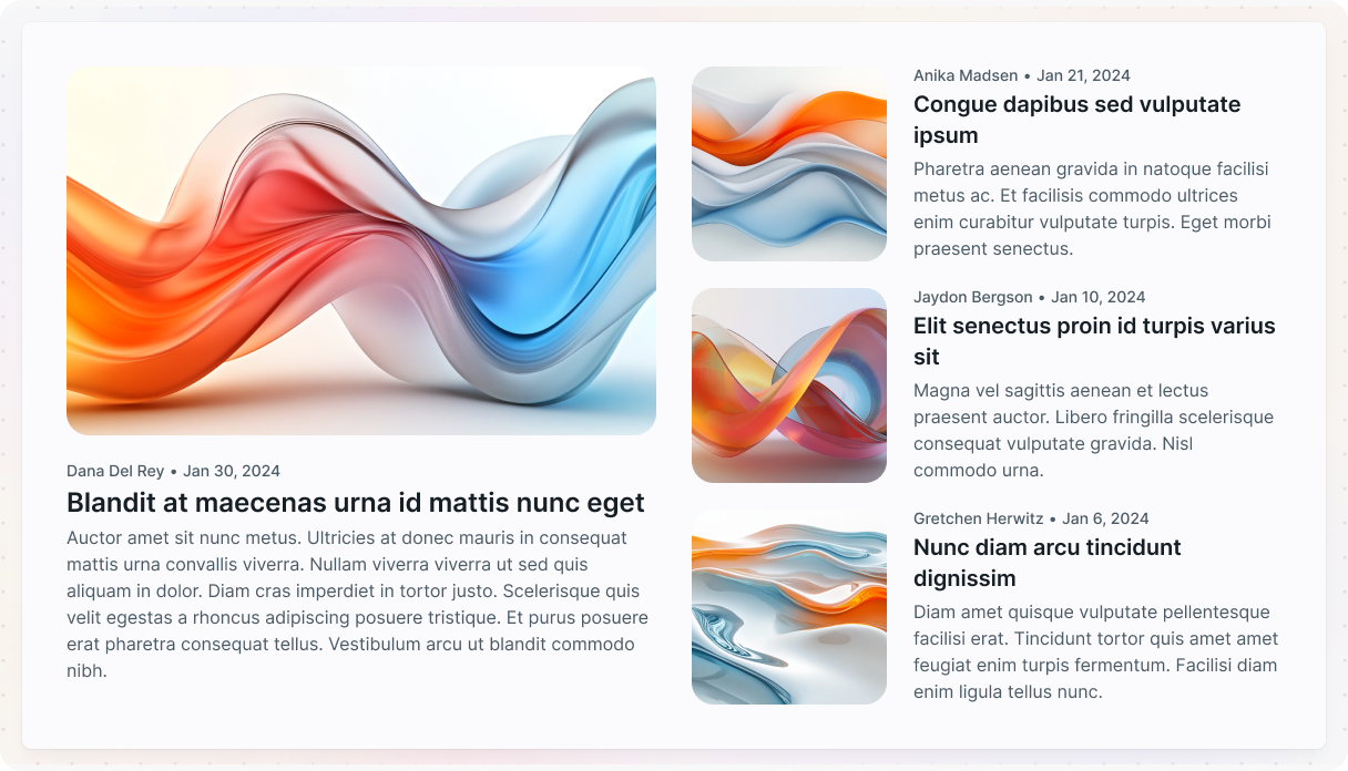
In this example, we used the Blog archive 09 page in Monolith. The grid system works really well for this layout, as it arranges text and images in a way that directs the viewer’s attention and makes it simpler for them to find what they are looking for.
The layout has both loop elements set up in a grid, where each item shares the available space equally. In the first loop, we’ve customized the advanced settings to show 4 records on each page. This loop contains two item elements, and the one on the left is designed to span three rows. Plus, we’ve included conditional visibility, so only the first record in the loop will display this specific layout.
The second loop is designed to show two records on each page, arranging the items into two equal columns for a balanced look.
Grid breaking
For more artistic or unconventional website layout ideas, grid-breaking styles challenge traditional structure. If you’re looking to ditch the usual grid style, this layout is perfect for you. It purposefully overlaps and misaligns different elements, giving it a bold and unique vibe.
Why it works: It stands out by going against traditional design rules. Plus, it has a fresh vibe, which makes it perfect for brands that are creative or experimental.
When to use it:
- Great for new businesses or cool brands.
- You’re a designer or an artist with a creative portfolio.
- Any website aiming for a unique look.
How it’s built
In this example, we used the Hero 25 block in Monolith. The container is designed to display as a grid, but there’s a little twist: it’s divided into two columns that aren’t the same size. We’re using this theme’s 12-column width on the container and breaking it down into a 5-column row on the left and a larger 7-column grid on the right, all made possible by a unique sub-class for this layout.
On the left, the text content is sitting in the slimmer column of the grid. It’s center-aligned, giving it an aesthetic look.
The right side is the exciting part. It has a grid layout with two equal columns, and each column has rows of images lined up perfectly one on top of the other. Everything is centered, and to make it even nicer, the overflow of the images is hidden, creating a nice cut-off look. We’ve set the maximum height of the grid to keep it from changing its height based on the images’ sizes.
Single-column layout
If you’re looking for focused and mobile-friendly website layout examples, the single-column layout stands out for its simplicity. Everything is lined up in a vertical flow. This way, you can tell a story or lead your visitors through your content one step at a time.
Why it works: It’s simple and free of distractions, which helps people concentrate on the message.
When to use it:
- You’re putting together a blog post or creating some in-depth content.
- You’re looking for a simple and clean design.
How it’s built
This example was created from the Filtered post 22 block in Monolith. Normally, when you add elements, they just stack on top of each other without any extra layout adjustments. But if you want to have more control over how the child elements are organized, it’s really simple to change it if you have a flex or single-column grid layout.
To maintain an organized look, it’s important to set the same space between each row. In this design, the original layout had two columns for posts beneath a single column, so the items are designed to stretch across two columns in width.
To get the item to show up in a single column, just adjust its position settings to span two columns. You can easily add your content, like images or text, inside rows, which makes it super easy to keep everything organized.
Masonry
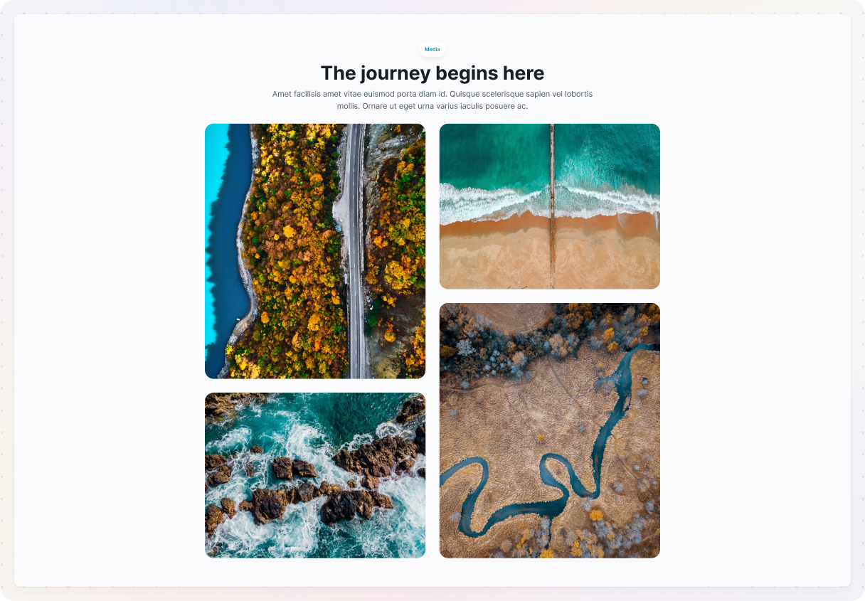
If you’re after visual-heavy website layout examples, masonry grids deliver a strong impact. This layout is like a puzzle, where various elements of your design come together in a way that looks great and flows nicely. It has a creative vibe and really allows your visuals to stand out without being confined to a rigid grid.
Why it works: It’s great for displaying a bunch of images without making the page seem too cramped. Plus, it really helps keep your design lively and interesting.
When to use it:
- For visual-heavy blogs.
- If you have a photography collection.
- Websites that show off arts and crafts.
How it’s built
In this example, we are using the Media 07 block in Mosaic. This section has two containers: one for the text and another for the image layout. The images are arranged inside a Container that’s split into two columns. Each column holds a row, and the images are simply stacked one below the other. Because the images come in different sizes, the stacking automatically creates that staggered, masonry-style look, no complex setup needed.
The gaps between the rows and columns are the same, which makes the design feel structured.
Split screen
An excellent website layout idea when you want to highlight two key elements equally, as this design splits your page into two equal parts, each displaying different but complementary content. It has a clean look and conveys a strong sense of balance.
Why it works: It really catches the eye by presenting two focal points simultaneously, making it a clever way to highlight two types of content.
When to use it:
- You’re highlighting two offerings.
- Great for comparing two products.
- You want to add a creative look to your layout.
How it’s built
In this example, we’re working with the Hero 11 block in Monolith. The design includes a grid setup that has two columns. Just like in some earlier website layout examples, the left column is a bit slimmer compared to the right one, which is achieved by using the ‘5+7’ subclass.
To achieve that split-screen effect where the image fills the entire height of the section, you need to eliminate any padding at the top and bottom of the section. This way, the image can extend without any interruptions.
The text on the left is organized in rows and centered, giving it a nice, balanced look. If we didn’t center it, the text would just cling to the top of the container, which we definitely wanted to steer clear of. Over on the right, the image is set to always be 100% wide, so it fills the space just right.
Overlapping elements
As one of the more artistic website layout designs, overlaying elements brings depth and layering to your site. This layout stacks text, images, and different elements to create an artistic feel. It’s perfect for adding a playful touch to your website.
Why it works: It’s striking, one-of-a-kind, and really catches the eye. The layers bring character and depth to your design.
When to use it:
- Great for unique portfolios.
- If you are looking for an artistic vibe.
- You have a website that targets the younger audience.
How it’s built
In this example, we’re working with the Content 11 block in Monolith, which is divided into three sections. The best part is definitely the middle section, where the overlapping elements give it a really unique vibe.
To create this design, we began by adding a div that contains all the content. This div features padding on the sides and the top, so we can position the overlapping elements just right. It also has a light background color to make the overlapping elements stand out. To keep everything functioning properly, we set the div’s position to relative and adjust its z-index. This step is pretty important since there’s an icon inside the div that’s positioned absolutely for design reasons.
Now we’re actually getting to the overlapping elements. They’re arranged in a 3-column grid, with the middle column being a bit slimmer than the ones on the sides. Each card-like piece has a light shadow, making it stand out just a little more from the background.
The secret to getting that overlapping look is in the middle card. It has some negative margin on either side, which lets it overlap with the cards next to it. Plus, its z-index is set so it sits above the other cards, really highlighting it.
Why a theme builder is your best friend
Creating a website layout can seem pretty daunting, especially if you’re not a pro at web design. However, there’s good news: a theme builder can make the process much easier. Let us explain why a theme builder can really transform your design experience.
- No coding needed: Coding can definitely feel overwhelming, right? But the cool thing is, with a theme builder, you can skip that stress.
- Pre-made layouts to kick things off: They offer a ton of pre-built layouts that really help the process of getting started with the builder. You’ll probably find a style that fits your vision perfectly.
- Flexible customization: Pre-built layouts are a solid starting point, but the real excitement lies in making it your own. You can customize it in any way to truly reflect your brand and vibe.
- Save time and keep stress to a minimum: Creating a website from the ground up can feel like it takes ages, but a theme builder can really speed things up while still giving you a nice finish. They take care of all the technical stuff, letting you concentrate on what’s really important.
- Opportunity to explore new things: The best part? You can play around with all sorts of layouts until you discover what works for you.
Conclusion
Creating a website layout might seem like a huge job before, but as you can see, it doesn’t have to stress you out. With the right tools, like a theme builder on WordPress, you can learn how to design a website layout that’s both stunning and practical, without needing coding or design skills.
Mosaic is just what you need to bring your dream website to life. It’s perfect for trying out different website layout ideas and styles and testing out real website layout examples to see what works best.
Whether you prefer clean grids or more creative website layout designs, Mosaic helps you build with confidence. Just take your time, explore various options, and remember to enjoy the process.


