


Tired of design limits in WordPress? Meet Mosaic.
Mosaic goes beyond page building. It’s a complete theme builder and design system that helps your next website stand out in style, speed, and functionality.
It's a toolkit to shape the web like never before, piece by piece
Your brand isn’t generic, why should your website be? Fully customizable themes and templates give you the power to create something unforgettable.
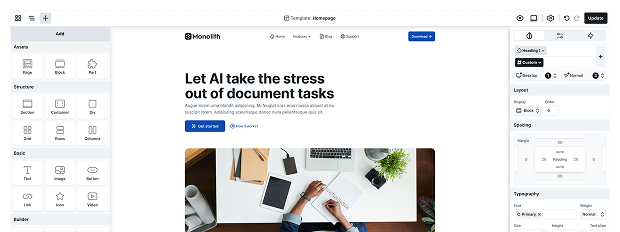
Create entire WordPress themes beginning with ready-made designs, including headers, footers, templates, and everything in between.
Design your site visually, arranging layouts and styles instantly with drag-and-drop, and enhance it with components and advanced elements.
Manage your entire design system, from colors, typography, spacing, and borders to even Gutenberg’s styling options.
Building a website can be complex, but Mosaic simplifies every step
Creating a website can come with unexpected challenges, from design challenges to development issues. Identifying these roadblocks is the first step to success.


Explore features that make website building efficient, flexible, and fun
From innovative design tools to advanced development features and reliable services, discover how our solutions tackle challenges and empower your website-building journey.

01. Design
Explore design tools that bring your vision to life. From full CSS control to style guides and reusable components, everything you need for consistent websites is here.
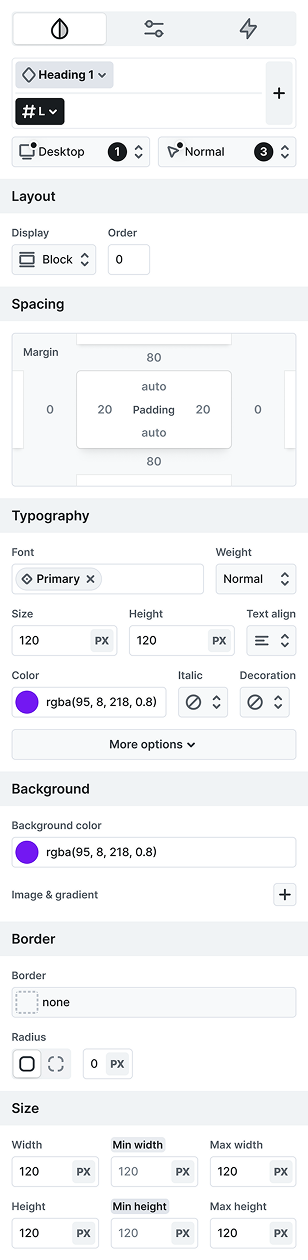
Full CSS control
Mosaic lets you customize every element of your site’s design, offering precise styling options and complete creative freedom for a unique look.
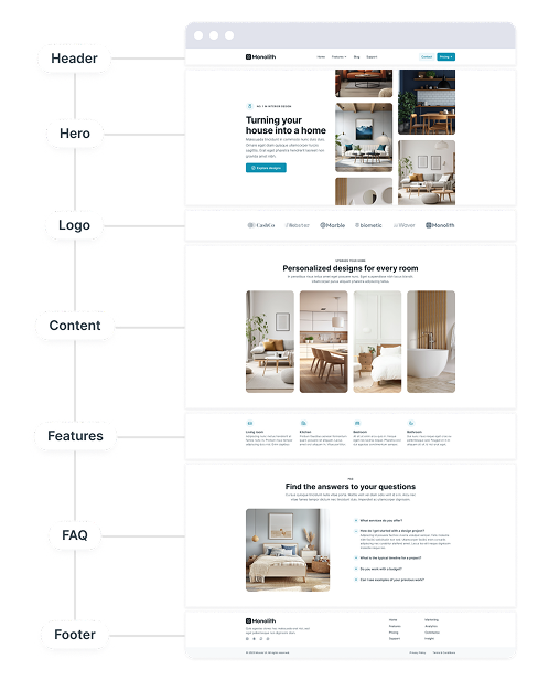
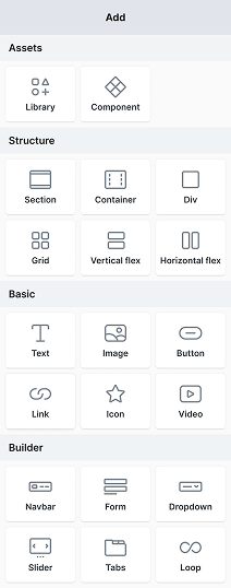
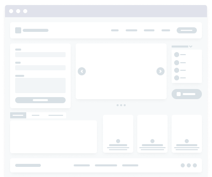
Design library
A huge collection of pre-designed pages, blocks, and elements to help you build stunning websites.

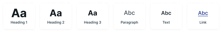
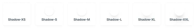
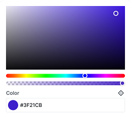
Style guide
Keep your site professional and consistent with a style guide that controls colors and typography.

Interactions
Add life to your website with stunning animations and smooth interactions that boost user engagement and create memorable experiences.

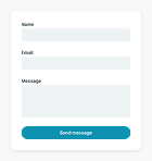


Advanced elements
Build with Mosaic’s advanced elements, including responsive navbars, dynamic loops, interactive sliders and tabs, diverse forms, and beyond.
Components
Customizable, reusable elements ensure consistency and save time while allowing partial overwrites.

02. Development
Empower your development with advanced tools. From class builder to loops and dynamic data, everything needed for scalable, high-performing websites.
Class system
The class creator simplifies styling with reusable element and utility classes, helping you maintain a clean, structured, and efficient design.

Dynamic data
Connect dynamic data from posts, pages, and custom sources to keep your site fresh with real-time content.

Conditional logic
Control visibility with custom conditions, showing content based on user actions, status, or rules.
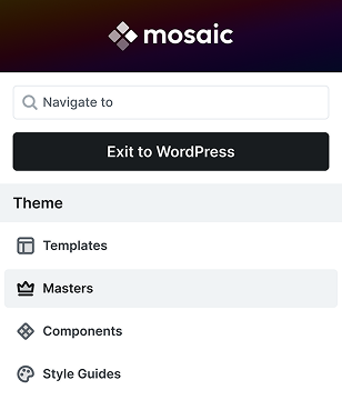
Theme builder
Create unique themes effortlessly using Mosaic’s master and template system, ensuring design consistency and easy content management across your site.
Loop
Automate content creation with loops, dynamically pulling data like posts or items driven by custom conditions and user behavior.
Style variable
Style variables ensure design consistency, allowing quick updates to colors, typography, and spacing.

03. Service
Your success with Mosaic doesn’t stop at great features. Stay ahead with updates, documentation, support, and a community that helps you every step of the way.


Community driven
We believe in the power of community. Suggest new features, request tutorials, and connect with others to help shape Mosaic’s growth and support each other.
Video courses
We create fresh videos regularly, helping users of all levels master Mosaic from different perspectives.
Reliable help
Our dedicated support team is always here to provide quick, helpful responses to your questions.
Continuous updates
Benefit from a consistent update cycle with new features, regular theme updates, fresh library content, and quick bug fixes to keep your site up-to-date.

Fast, beautiful, and scalable themes, ready for your next project
Our framework themes go beyond ordinary themes, offering expansive, feature-rich ecosystems packed with hundreds of blocks and pages for ultimate flexibility.
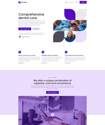
A bold, modern theme with striking layouts and sleek design - perfect for making a statement and showcasing your content with style.
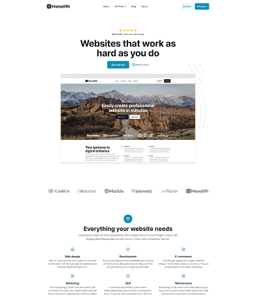
A clean theme with minimalist layouts and timeless design – perfect for highlighting your content and creating a professional, elegant online presence.
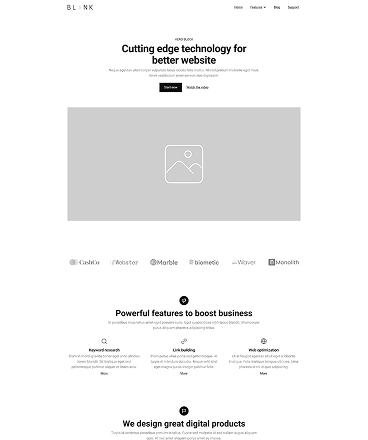
A simple, clean theme with easy layouts and basic designs - just what you need to start building your own unique website from scratch.