

Introduction
Let’s be honest, a great blog layout can make all the difference. And the good news is, you don’t have to be the best web designer to create a WordPress blog that’s not only stunning but also user-friendly. With the right resources, anyone can create a blog that looks great and is easy for readers to explore. And in this post, we’ll guide you through how to do just that. We’ll also share real blog layout examples to help you find inspiration and choose a style that fits your content.
Why blog layouts matter
At this point, you might be wondering, “Why does my blog layout even matter?” Well, if your blog looks messy or is tough to get around, people might bounce away in no time. On the other hand, if your layout is structured and user-friendly, visitors are more likely to hang out and check out your content. So your blog layout really does play a crucial role.
UX and readability
When you go to a blog, you really just want to find what you need quickly, right? A good layout is key to making that happen. If you land on a site where everything’s jumbled and there’s no clear way to navigate or any headings to guide you, you’ll probably get super annoyed, which is often the result of small web design mistakes that make the whole experience harder to use.
Looking at different blog layout examples can help you see how structure impacts readability and engagement. Keeping things structured like this becomes much simpler when your overall design decisions stay consistent, something we explore more deeply in our guide on design systems.
First impressions
The way your blog looks can really set the tone before anyone even starts reading. If you have a smooth design, it shows you mean business with your blog. A cluttered layout can make your visitors wonder if your content is actually worth their time. As color and contrast also play a big role in those first impressions, choosing colors that support your content becomes just as important.
SEO
Did you know that the way your blog is laid out can really make a difference in how Google sees it? Search engines prefer sites that are simple to navigate and have well-organized content. If your blog is designed for easy reading and has clear categories, there’s a better chance that Google will boost your posts in the rankings.
Mobile optimization
You know how it is these days, pretty much everyone is scrolling through the internet on their phones. If your blog isn’t mobile-friendly, you could be losing a ton of potential readers. The good news? With Mosaic, you can easily make sure your site looks great on any device.
How to structure your WordPress blog layout
Before you build, it helps to explore a few blog layout examples to see how these sections are typically used. Many of these ideas come from broader layout principles, which helps everything feel more connected. Now, let’s take a look at the main parts of a blog and see how they fit together.
Main parts of a blog layout
- Header: Your blog’s header is the first thing that catches your readers’ attention. It’s typically where you’ll find your logo and the navigation menu. A clean header not only makes a great first impression but also helps your readers smoothly navigate through your site.
- Main content area: This space should always aim to put your blog posts in the spotlight. They can be arranged in many different ways, like a single-column setup or a grid layout.
- Sidebar (optional): Sidebars can be super useful for highlighting things like trending posts, categories, or even a spot for people to sign up for your newsletter. But if you prefer a minimalist vibe, you can definitely do without it.
- Footer: The footer of your blog is the finishing touch on your content. It’s a great spot for quick links to key pages or social media icons.
Popular blog layout examples and styles
- Single-column layout: This layout places your blog posts under each other, keeping the focus on one blog post at a time without any distractions.
- Grid layout: This layout is great for blogs that have a ton of posts. It uses a grid to visually arrange everything, which helps your readers easily navigate through your content.
- Magazine-style look: If you have a blog that focuses a lot on news or covers various topics, this layout is perfect for you. It organizes everything into sections, so you can showcase different kinds of content all on one page.
- Minimalist layout: This design is elegant and straightforward, making it ideal for personal blogs or portfolios. The focus is on maintaining an elegant look that’s super easy to read.
How to make a blog layout in WordPress
Let’s walk through how you can actually build one in WordPress step-by-step.
1. Set up your WordPress website
Before you start creating your blog, just double-check that your WordPress website is all set up. Once that’s taken care of, you can get started on building it.
2. Install Mosaic
Mosaic is designed to make setting up and customizing your blog page super easy. After you’ve got it installed, here’s what you need to do:
- Pick a theme you love: When you pick a theme, a setup wizard will help you out every step of the way. You can choose from different templates and even make your blog the homepage if that’s what you’re into.
- Choose a blog template: Choose a template that fits your vibe and figure out how many posts you want to show on each page. No worries if you change your mind later, it’s totally adjustable. These templates are great for giving you a head start, so you won’t be left staring at a blank page, unsure of what to do next.
3. Personalize your blog page
- Edit an existing template: If one of the templates matches your style, you can go ahead and adjust its design to your preferences.
- Create a new template: If you’re looking for something unique, just hit the + button next to your existing templates. When the pop-up appears, you can:
- Name it whatever you like
- Choose a type, such as ‘Post Archive’ to showcase your latest posts or ‘Categories Archive’ to sort your posts by categories
- Don’t forget to assign a Master to keep everything looking consistent
Then select the template so you can start editing it.
4. Design your blog’s layout
- Add a Loop element: This is the spot for your blog posts. Think about what type of layout you’d prefer for them.
- Add dynamic content: If you want to display who wrote the post or when it was published, it’s super easy to add that info. Just hit the variable selector, and you can include stuff like categories and tags.
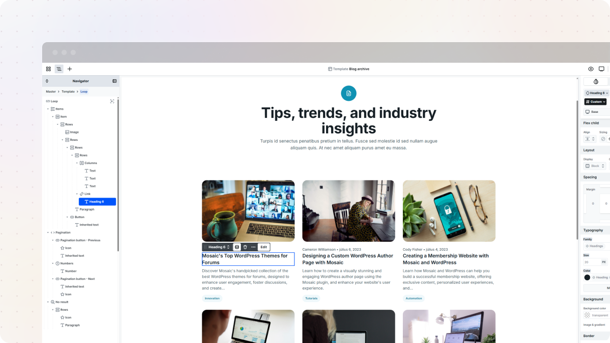
- Pick a Loop type:
- Current site: Great for quick setup. This Loop type gives you ready-made content structures based on the page you’re working on, like automatically pulling in menu items on your homepage. Just keep in mind: it’s simple on purpose. Customization options are limited.
- Configurable (Post or Taxonomy): Perfect if you need more control. Choose exactly what kind of content to loop (posts, pages, categories, tags, and more), and fine-tune how it behaves using filters, conditions, and the Advanced tab. Ideal for building fully custom layouts.
If you want to have more control, take a look at the Advanced tab. There, you can filter your posts, decide how many show up on each page, and adjust the order they appear in.
Here’s a little note: If your posts aren’t showing up, make sure they’re published in WordPress and that you’ve customized them, like adding featured images.
If you’re unsure which structure to start with, look at some page kits in Mosaic to spark ideas.
5. Create a page for your blog
- Add a new page: In your WordPress dashboard, just head over to Pages and click on Add New. You can name your page something like “Blog” or whatever suits your brand best.
- Leave it blank: Don’t put any text on this page. It’s meant to show your blog posts, not for any static content.
- Edit with Mosaic: Click the Edit with Mosaic button (or use the Gutenberg sidebar to assign a template).
6. Assign a template to your blog
When you’re assigning a template, you’ll see three choices:
- New template: Looking to start a new one? This option will lead you directly to the editor, allowing you to create your blog page from the start.
- Existing templates: If you’ve already created your blog template, just choose it, hit Apply Template Assign, and you’re all set.
- Auto template: You can set up a template that will automatically be used for every instance of this type of page.
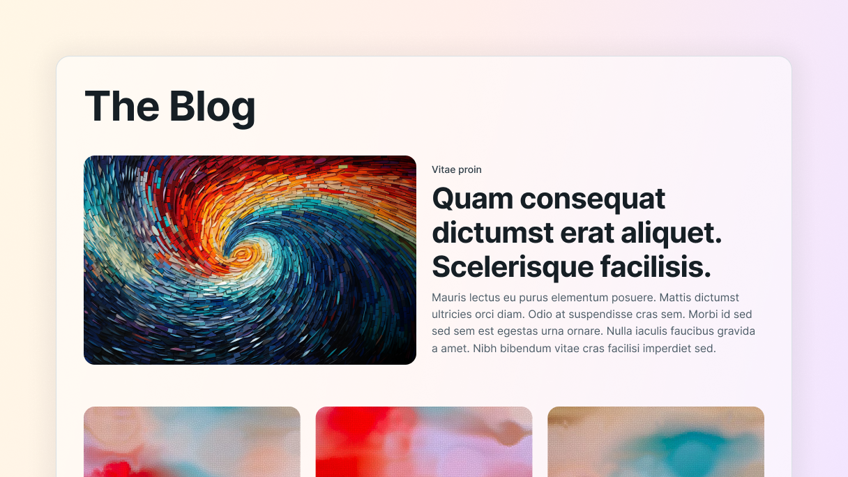
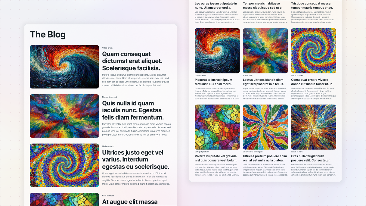
Blog layout examples built in Mosaic
Below are real blog layout examples created using Mosaic. Each one shows a different approach to structure, visual hierarchy, and content type.
Cybersecurity blog
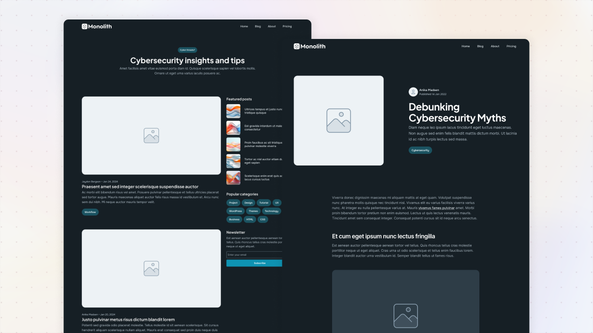
This design might seem a bit tricky at first, but believe me, it’s super simple to achieve. We’ve set up a grid that divides the container into two columns, using an ‘8+4’ subclass. Basically, that means the left side is larger than the right, which gives it this nice feel.
On the left side, the wider column is super simple, just one loop fills the entire area to highlight your latest posts. It’s neat and just draws the eye.
On the other hand, on the slimmer side, we’ve organized our content into three sections:
- A loop highlighting five featured posts.
- A list of categories to guide your visitors in their exploration.
- Textual content with a subscription form to expand your email list.
Personal blog
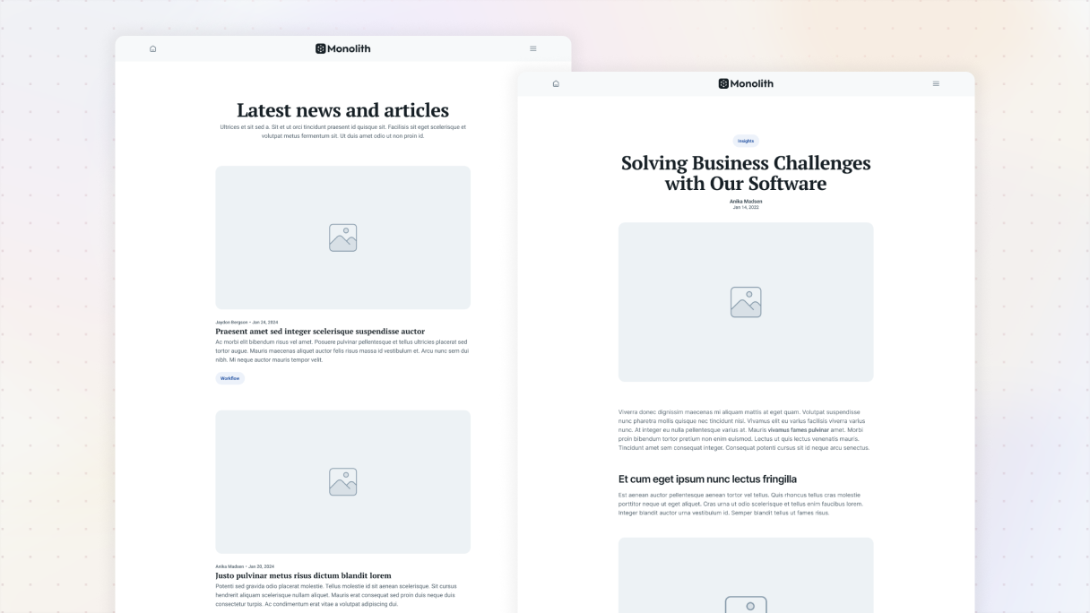
This blog layout focuses on simplicity and cleanliness. It features a single-column design that’s nice to look at, with just enough spacing between elements to maintain an organized look.
Everything is centered perfectly, giving it a balanced feel. A great thing is that it automatically refreshes with dynamic content, such as the author’s name, publication date, and category, so you don’t have to stress about keeping it updated. Plus, getting it all set up is super easy.
Architect blog
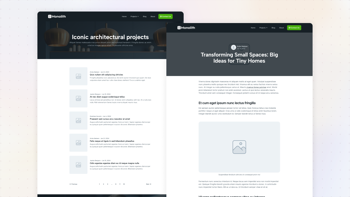
This layout is built in two sections. Up top, you get a simple hero area where the title and a bit of intro text can shine. The soft background with an overlay helps the white text stand out without shouting for attention.
Right under it, the main content loop shows. It’s laid out in a clean grid, so each post gets its own spotlight, a featured image, a title, and whatever dynamic details you want to show. At the very bottom, pagination keeps everything moving if readers want to dig deeper.
For this template, we set it to show five posts per page in its Advanced tab settings, which keeps things feeling balanced and not too crowded.
Finance blog
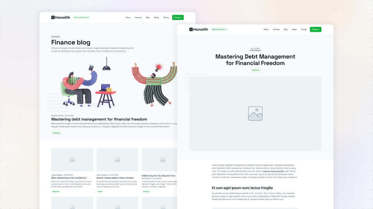
This layout has two separate sections, each showcasing its own unique style. The top part features a straightforward loop that fills up the space in its container. What’s really cool about this loop is that it brings attention to the fourth post. You can achieve this effortlessly by using conditional visibility in the Advanced tab settings for the loop’s item.
The second section takes a different route with a three-column grid. Here, every item in the loop shares the space evenly, thanks to Mosaic’s fractional sizing. You can also adjust how many records show up by using the settings in the Advanced tab.
Agency blog
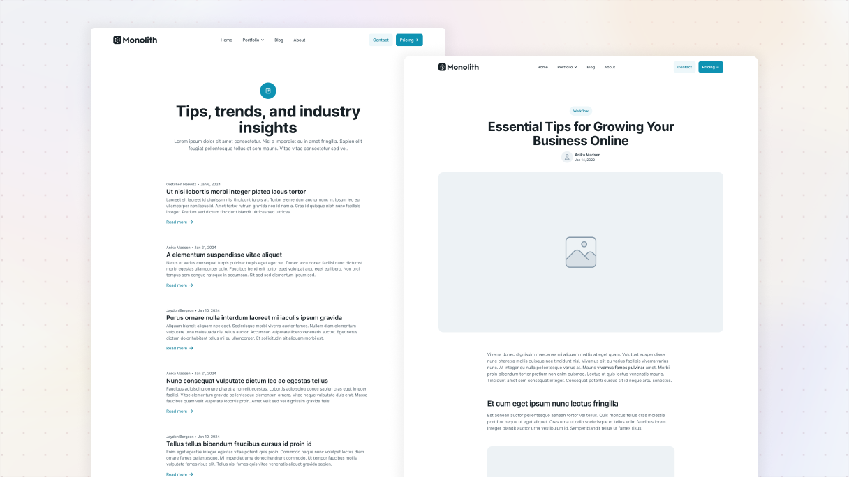
This design is all about simplicity. It doesn’t use any featured images like the previously mentioned layouts do, which allows the text to take center stage. There’s a convenient “Read more” button that invites your readers to explore each post further by linking directly to it.
To ensure every blog post catches the eye, there’s a nice amount of space between each item, keeping the spacing consistent. Each post is organized in rows, highlighting important details like the author, publication date, a clickable title that leads to the full article, a brief excerpt, and the link to the post itself.
Conclusion
Getting a WordPress blog up and running might seem overwhelming at first, but believe me, you’re not alone. Every blogger began their journey just like you. Just take it one step at a time, see what you can do, and don’t hesitate to experiment with new ideas, including trying out different blog layout examples for inspiration.
Keep in mind that a great blog layout is about more than just aesthetics, it really highlights your content and encourages readers to return. Think about the blogs you enjoy the most. What keeps you engaged? Is it the design, navigation, or the overall vibe? Let that inspire you to create a blog that truly reflects your brand.
If all the setup seems a bit too much, don’t worry, Mosaic is designed to simplify everything. It requires no coding skills and lets you create exactly what you have in mind.


