

Intro
Understanding color theory is super important in web design. And no, it’s not just about knowing how colors go together or what they mean, it’s also about understanding how people see them. But a lot of people overlook this or don’t really think about it in a scientific way in their designs.
Nowadays, making websites that your users love is a big deal in web design. And using color theory in your designs makes a huge difference for your brand. For example, we all know Barbie pink and Coca-Cola red. We usually think of those brands when we see those colors. So using color theory and web design together in your branding will create a lasting impression that stays with your audience.
Colors can make people feel all sorts of things, and it’s usually not the same for everyone. It depends on where they’re from and what they’ve experienced. But figuring out which colors go well together and how to use them right can save you a lot of time and money. Plus, it helps designers make websites that their users can really connect with.
And if you’re just starting out as a designer, don’t worry if colors seem confusing. We’ve all been there! In this post, we’ll break it down for you so when you’re finished you’ll feel more confident in your design decisions.
What is color theory in web design?
Color theory is basically how colors affect our minds. In web design, it’s what determines how your visitors feel and behave on your site based on the colors you use. Colors tell your brand’s story and connect with your target audience. They can also guide users through their journey on your website.
Think about it: the colors you choose can make people feel all sorts of things about your brand. Are you fun, trustworthy, or maybe a bit more serious? And at the same time, they help you nudge your users towards taking specific actions, like making a purchase or signing up.
It’s pretty amazing when you think about how much power colors have. They’re one of the first things we notice and they can shape our emotions and perceptions just as quickly.
Here’s a fun fact: it takes less than a blink of an eye for someone to decide if they like your website or not, just 0.05 seconds. So, as designers, we should use color theory and web design to grab people’s attention and communicate effectively with them.
Knowing a bit about color theory makes a huge difference for your websites. It’s not complicated, you just need to understand a few basic things about how light, objects, and people interact with colors.
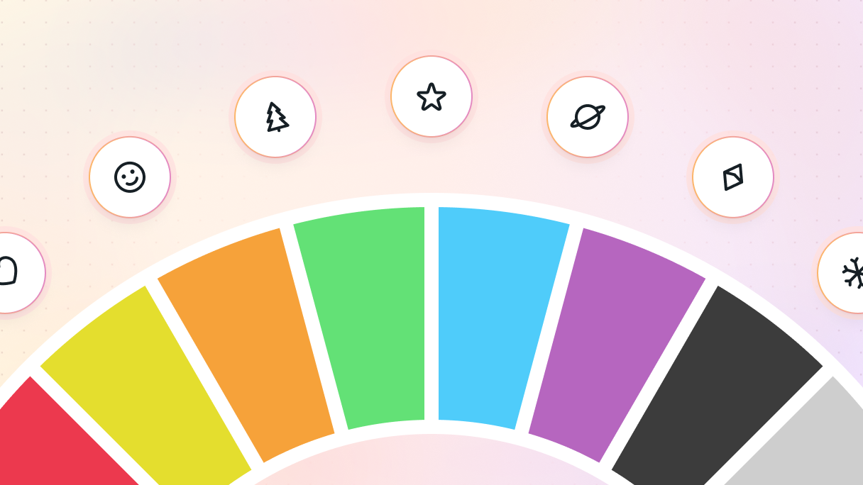
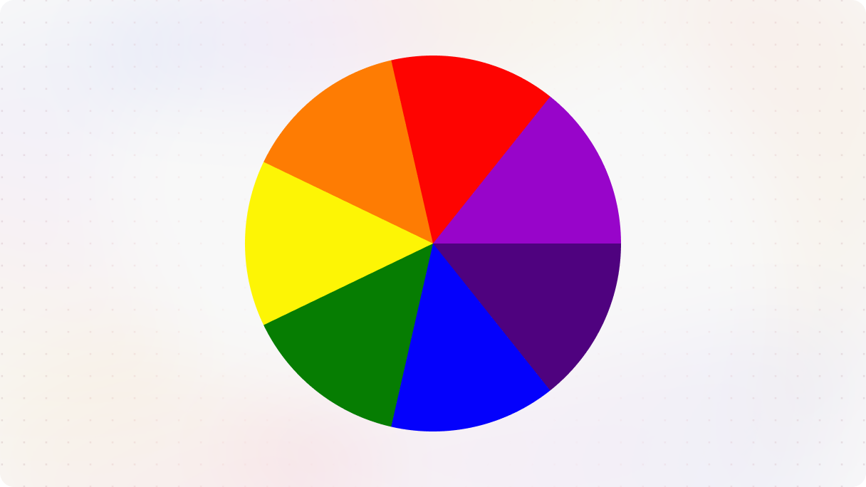
Color wheel
The color wheel is such a useful tool for designers. It helps us put together awesome color combinations that just look right. Understanding how colors work on the wheel makes it way easier to create eye-catching designs.
Newton’s color wheel
Back in design school, Calculus might not have been your favorite, but did you know that the person behind Calculus also had a big impact on the color wheel you use today?
Sir Isaac Newton, way back in the mid-1600s, was experimenting with white light when he discovered the visible spectrum of colors. You might remember “ROYGBIV” (red, orange, yellow, green, blue, indigo, violet) from science class, that’s Newton’s work right there.
He set up a little experiment in a dark room. He let a tiny bit of sunlight through a crack in the curtain and watched it spread out through a prism. And guess what? He found out that white sunlight isn’t really white at all, it’s made up of all these different colors. Newton eventually figured out that these observations happened because light is made up of refrangible rays that bend at different angles when they pass through a prism.
He also found it fascinating that red and violet, despite being at opposite ends of the spectrum, had similarities, both have a touch of red. This led him to rearrange the spectrum into a circle.
See, the color wheel isn’t just a pretty arrangement of colors, it’s rooted in Newton’s experiments with prisms. He figured out that red, yellow, and blue were the primary colors from which all other colors come from. This idea influenced color wheels made in the early 1800s and the one we still use today.
Color properties
Our eyes are pretty amazing. They can see about 10 million colors, all made by mixing the primary colors together. But how is it possible?
When light enters our eyes, it hits a layer at the back called the retina. This part has different cells, like rods and cones.
- Rods help us see in low light, but they only see black and white. For example, animals that see well in the dark have many more rods than humans.
- Cones are what let us see colors. They pick up red, blue-violet, and green and send that info to the brain through the fovea, which is in the middle of the retina. Then, the brain puts all that info together to tell us what color we’re seeing.
So how do we understand color? One popular method in color theory is the Munsell Color System. Basically, Munsell broke down color into three main parts:
- Hue
- Value
- Chroma
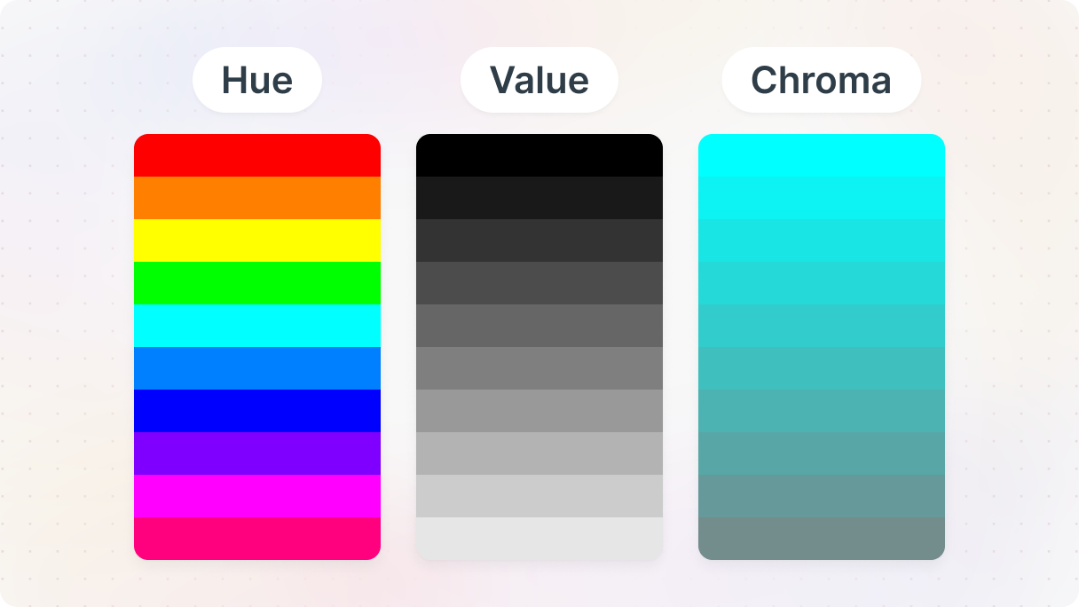
These three things describe every color you can think of. And each color fits into a 3D color system based on these attributes.
Hue
Let’s talk a bit about hue, which basically means where a color sits in the color wheel (also known as the visible spectrum). Remember how we can see colors from red to violet on it? Well, that’s what hue is. Like, is it more on the red side, or yellow, or blue? Different hues come from light with different wavelengths, and we can usually spot them pretty easily.
Sometimes people mix up “hue” with “color”. Here’s the difference: Color is a broad term we use for all kinds of shades and tones. But when we ask, “What color is this?” we’re usually talking about hue. Think of hue as the main colors you see on a color wheel.
You already know that light plays a big role in how we see color. Bright light makes them pop, while dim light makes them look less vibrant. In really low light, we might struggle to see certain colors and tell them apart.
You can also change the hue to get different results:
- Tint: Adding white to lighten a base hue, which softens it and can help balance bold color combos.
- Tone: Mix black and white or gray with a hue to make it more subtle and less intense.
- Shade: Add black to darken a color, giving it a richer, deeper vibe. Shades can be pretty striking and intense.
Value
Value is all about how light or dark a color is. When you add black or white to a color, it changes its value. But color itself is more powerful than value. For example, a gray shade might blend in if everything else is gray too. But if you add it to just one element, it’ll stand out. Its impact depends on the lightness or darkness of the surroundings.
The bigger the difference in value between elements and the background, the more contrast you get. So, if you want to make things stand out in web design, playing with value is a fun way to do it.
In the Munsell color wheel, darkness is rated from 0 to 10, from super black to pure white. They’re lined up vertically from darkest at the bottom to lightest at the top.
Chromaticity
“Chroma” is a fancy term for how strong a color looks, or its saturation. Basically, it’s about how intense the color seems. Colors like red or blue are super intense because they’re pure color. So, the more intense the color, the more saturated it is. On the other hand, less intense, dull colors are called desaturated.
Here’s a cool fact: ever heard of chroma keying or green screening? It’s when they use a bright green or blue background to add cool effects later on. Why green? Because it’s really different from human skin, so it’s pretty easy for computers to spot and change. Plus, digital cameras pick up green really well.
Josef Albers: relativity of color
Josef Albers was a German-born artist who made a big impact on how we understand colors. He had this beautiful way of seeing things, where he believed there was always more than what meets the eye. His ideas are still inspiring designers today.
His color theory mainly focuses on what happens when different colors are shown together. He was really into how colors play off each other and how that affects how we perceive them. He showed that our brains can trick us, especially when it comes to colors, which he demonstrated through his art.
One of his most famous works is a book called “Interaction of Color” (1963). One big idea he had is that colors don’t exist on their own, they’re always influenced by the colors around them.
He also said something pretty bold in his book:
“Color is the most relative medium in art.”
What he means by this is that our perception of color is seriously influenced by everything around it. The lighting, how much of it there is, what other colors are nearby, and even what mood we’re in.
Contrast
Have you ever noticed how certain colors can lead your eyes exactly where you want them to go? Colors can be strategically used to guide your users through the website.
But you know what really grabs our attention? High-contrast. It’s like our brains can’t resist it.
Color contrast is all about how different colors look next to each other. It’s not just about their shades, but also how light or dark they are and how intense their colors appear. Bright yellows are a perfect example because our eyes are immediately drawn to them.
In color theory and web design, contrast is key. One of the best ways to create this contrast is by using an accent color. It’s a color that really stands out against the background and the main colors you’re using. Using them alongside thoughtful website layout design makes the overall readability and user flow much stronger.
Readability
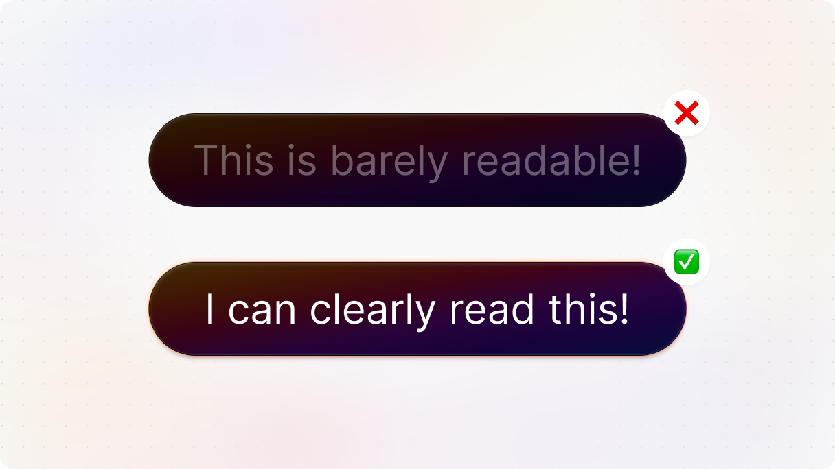
Imagine trying to browse the internet, but you can’t read anything because the colors all blend together. It’s frustrating, right? Unfortunately, this is a reality for many people with vision problems, like color blindness or low vision, and for the elderly too.
Accessible color contrast is a technique that makes sure everyone can read the text on your website. Globally, 2.2 billion people have trouble with their vision, and many could benefit from simple changes in how colors are used on websites. Making sure text stands out clearly is a small change that can make a big difference in how user-friendly your website is.
How to achieve readability?
Using colors that really stand out from each other is key in color theory and web design. It helps your visitors easily see what’s important on the page compared to the background. A simple rule is to pick colors from opposite ends of the color spectrum.
Also, instead of spending ages testing colors yourself, let a contrast checker do the hard work for you. These tools tell you if your colors meet accessibility rules, like the ones from the Web Content Accessibility Guidelines (WCAG). They figure out the contrast between colors automatically, so you can start with a palette that’s easy for everyone to use.
When we talk about contrast, we look at a few different things:
- Normal text
- Large text
- Graphic / UI elements
High contrast is important for any design, but it’s especially useful for designs with text. To make sure your text stands out:
- Use white or light tints against highly saturated colors.
- Use black or dark grays against light tints.
Color psychology
Once you’ve got the hang of color theory, exploring color psychology gets really exciting. Colors can be your secret tools in web design, but if you don’t know how to use them right, they lose their magic. That’s why understanding the effects of different colors, including their shades and tones, is so important.
Have you ever noticed how websites show their best deals in bright colors? It’s because our brains are wired to respond to emotions, and colors play a big role in that. So it’s very useful to know which emotions your target audience associates with what color. So you can trigger the specific feelings you’d like.
Most designers are aiming to stir up specific emotions with their work. Picking the right colors can make users feel all sorts of things, leaving a lasting impression, whether it’s a good one or not depends on the colors you choose. On structured pages like a WordPress blog layout, the right palette can guide the entire reading flow without visitors even noticing.
Emotional meaning
Here is a quick guide on how different colors impact our minds and how we see them in the Western world. Plus, you can learn how to make the most of them in your website designs.
Red
Red is one of the primary colors and a real standout. It’s all about big feelings, like anger, love, and passion. It can be pretty powerful!
In web design, red is like a call to action. It gets people to act, so designers often use it for buttons or to highlight important stuff. But too much red can be overwhelming. It might even freak out your visitors. So, definitely use it wisely.
Yellow
Yellow is a burst of sunshine in the color spectrum. It’s so bright and lively that it’s often used to get rid of mental barriers and encourage fresh outlooks. Just think about it: when you see yellow, you can’t help but feel a bit more optimistic and playful, right? It’s radiating happiness wherever it goes.
And science actually backs it up! Studies show that yellow can actually boost your brainpower and make you more alert and energetic.
However, using yellow isn’t as simple as it seems. If you’re not careful with the shade or how much you use, it can backfire big time. Too much yellow might leave people feeling on edge, even causing some anxiety. So, when you’re using it in your designs, especially on dark backgrounds, be careful. It’s a powerful color, but it comes with its own set of challenges.
Blue
Blue is calm and tranquil. You know how looking at the sky or the ocean just makes you feel peaceful? That’s the magic of blue.
But just like any other color blue has its limits too. It’s awesome for backgrounds, pictures, and adding little pops of color here and there. But if you go overboard, your users might feel a bit chilly.
Still, blue is great for giving off relaxed vibes, and feelings of loyalty and strength, like you’ve got everything under control. Have you ever noticed how a lot of tech and security websites use blue? Now you know why.
But there’s one industry that might want to avoid the color blue: food. Turns out, it can actually make people less hungry.
Orange
Orange is a secondary color, not quite red, not quite yellow, but a mix of both. It’s impossible to miss, so it’s perfect for grabbing attention. It can make your users feel fresh, young, and full of creativity. Kids love it, and most adults do too, so it’s great for targeting grown-up buyers in web design.
Just be careful when you use it for text, it can be a bit tough to read. But it’s perfect for backgrounds with white text or for eye-catching call-to-action buttons.
Green
Green is a mix of blue and yellow. It’s got two meanings: nature and money. It’s also about prestige and power. Just think about it, brands that want to show off their growth often use green.
It’s super versatile in web design. You can use it for backgrounds, pictures, and even buttons. It can be a hit with businesses because it combines the chill vibes of blue with the energetic feeling of yellow.
Purple
Purple is a mix of blue and red. It represents the color of royalty and luxury. It’s got a mysterious vibe to it that’s kind of spiritual. Dark purples feel fancy, while lighter shades give off a feminine, sentimental vibe.
You can use purple in lots of ways in your design, but you have to balance it out. Like in backgrounds, pictures, little accents, buttons, actually everything. Dark purples are great for adding contrast but don’t go overboard, keep things balanced.
Even though we think we’re pretty logical creatures, our emotions play a big role in how we see the world. But there’s a way to understand why we react the way we do. Let’s explore that next.
How users emotionally respond to color in web design
Don Norman developed a model that breaks down how humans process stuff into three parts:
- Visceral
- Behavioral
- Reflective
Basically, it’s about how we feel and react to things without even realizing it, thanks to our brains doing their thing. The key to great design, according to Don Norman, is hitting all three of these levels.
Visceral
The gut reaction, also known as the visceral response. It’s our primal, subconscious reaction, fully driven by our senses. Think of it as that immediate, instinctual feeling when you see something for the first time. This is crucial for grabbing users’ attention, especially on landing pages, where you want to encourage them to explore your website further.
Bright colors are a great example of something that can trigger a positive visceral response. Since these reactions are hardwired into our nervous system, they’re pretty consistent among all people. But even though there are some universal reactions, everyone still has their own quirks and preferences. That’s why it’s important to tailor your design to your target audience.
Behavioral
The emotional side of using a website. It’s kind of like a subconscious feeling you get while you’re using it. But sometimes, your conscious thoughts can play a part too.
Basically, it’s about the enjoyment you get from actually using something. When it works well, it’s like a little victory because you achieve what you wanted to do. But when it’s a struggle, it’s a downer and can leave you feeling pretty annoyed.
Reflective
And this is when you’re fully aware of what you’re feeling. This is where logic kicks in, helping you make sense of everything, including how you felt right after using the product and how you behaved. While visceral and behavioral emotions come and go quickly, reflective emotions stick around.
Designing for reflective emotions is tricky because they’re influenced by so many things, like their background, experiences, and even age or culture. That’s why everyone reacts differently to the same thing. This is the decision-making step. It’s when your visitors think about whether the website really fits their needs. If they have a positive reflective reaction, they’re more likely to stick with your brand and maybe even advocate for it.
How color meanings vary by culture

The Internet can open up a whole world of potential customers beyond your usual crowd, right? So should you design your website the same way for each country? Definitely not. Culture plays a huge role in our lives, so it’s important to think about that when you’re designing for different audiences.
If you want your business to grow globally, you’ve gotta understand the culture of each country you’re targeting. Designing for international markets can be tough, especially if you’re not familiar with their culture.
There’s a lot to think about when it comes to color theory and picking the right colors for these websites. Colors can really sway what visitors think and do on your site. People like websites that feel familiar to them. But what feels familiar in North America might be totally different in the Middle East. So let’s take a closer look at the differences.
South America and Latin America
People here appreciate subtle nods to religion, so using colors like blue or white in your designs can really resonate with them. These colors are great for them because it reminds them of the Virgin Mary’s outfit.
Some other colors they like are red, orange, and yellow. But yellow can be a bit tricky because it can also mean mourning in this region. To play it safe, you might want to go for shades of gold instead. But steer clear of fluorescent and pastel colors, most people here aren’t into those.
Eastern regions
In places like India, Bangladesh, and Pakistan, people tend to stick to more traditional and religious looks. They like dark yellows, oranges, and deep greens and reds. While white and black can work together, they’re not usually used by themselves.
In East Asia, like China, Korea, and Japan, things are a bit different. Here, they prefer reds, blues, vibrant yellows, and oranges. But they’re not big fans of black, grey, or pink.
Europe, North America, and Australia
We’ve previously taken a closer look at these regions. They are pretty open when it comes to mixing colors, and they’re up for trying out new ideas.
Middle East and Mediterranean regions
The Middle East and Mediterranean regions have this air of mystery about them, making them a bit harder to predict. In the Middle East, Islamic culture is a big influence, while Mediterranean users are more varied in their tastes. For these regions, colors like blue, white, red, green, and purple are often considered fitting. Mixing them with complementary or contrasting colors can work too.
Africa
In Africa, people really like bright colors, like red, yellow, green, black, blue, and gold. You’ll notice this in the flags of African countries, they mostly use these rich, deep shades.
Color schemes for web design
So, how do web designers keep everything looking awesome? They start by creating a color scheme. Basically, they pick out a set of two to six colors and use them strategically across the design. Each color scheme has its own strengths and weaknesses, which we’ll dig into below, along with some tips for using them for color harmony.
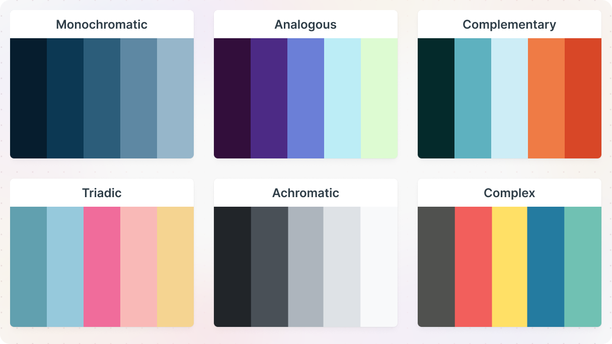
Monochromatic
Mono means one, while chroma means color. So basically Monochromatic design is when you stick to one main color and play around with its different shades, tints, and tones. As an example, imagine a website where everything revolves around different versions of blue or green.
So, when you’re picking colors for your monochromatic website use the color wheel. Start from the middle and work your way out. Each step towards the edge gives you a different shade of your chosen color. Like, if you want to use blues, you’ll find everything from sky blue to navy along that line.
If you are creating a pricing page using these color variations can really help guide your visitors’ eyes. Also switching up tones in different sections can keep them interested.
Just remember, always make sure there’s a clear contrast between the main color and the background. That way, your text will be easy to read.
Tools like Mosaic’s semantic and utility classes make it easy to apply consistent styles across your elements without having to repeat work on every page.
Analogous
It’s like Monochromatic design, but with a bit more variety. They use two or more colors and their shades from the color wheel. Sticking to colors that sit close to each other on the color wheel, covering about one-third of it.
You’ve got your main color (usually a primary or secondary one), a supporting color (usually another secondary or tertiary shade), and maybe a third color that blends the first two or adds a bit of brightness.
The thing is, because these colors are so close, it can lead to a low-contrast look. That’s why it works best with plenty of space around and neutral elements in the mix.
Analogous schemes can be super eye-catching because they offer more color variety. But they’re also a bit trickier to pull off because you’ve got to make sure those main colors don’t blend together too much. Everything else, from images to buttons, should complement the color scheme nicely.
Complementary
They’re the ones that sit right across from each other on the color wheel, like red and green, blue and orange, or purple and yellow.
What’s cool about complementary schemes is that their dominant colors are so different, that they can be used closer together without clashing, because they balance each other out.
Usually, one color still takes the spotlight while the other plays the supporting role. Usually, the cooler color is the dominant color, while the warmer one is the accent color with a bit of contrast. This makes it easier to draw attention to specific areas on your website. Just make sure you find the balance between the two colors.
Triadic
Here you pick three colors that sit evenly spaced around the color wheel, about 120 degrees apart. One color usually takes the lead, while the other two accent it.
Most designers love using these contrasting colors to make important stuff stand out and help people find their way around. With triadic schemes, you can create a kind of roadmap for your visitors’ eyes, with colors and contrasts that catch their attention.
Achromatic
They use black, white, and all the shades of gray in between. You might also hear them called neutrals because they don’t lean toward any particular color.
A black-and-white theme can give your website a bold and striking look. Plus, it’s great for readability. Have you ever noticed how easy it is to read black text on a white background? That’s because of the high contrast.
Sure, achromatic colors might seem a bit lacking in the color department, but that’s kind of the point. Sometimes, less color means more impact. Like when you want to make your images really stand out just surround them with black and white.
Complex
Well, they’re like the most complex color schemes, just like their name suggests. Instead of sticking to just one or two colors, they have three or more, all evenly spread around the color wheel.
But you should use them sparingly because they can easily overwhelm your design if you’re not careful. That’s why it’s essential to balance them out with plenty of white space or keep them in a small visual area.
Branding and color theory in web design
You want your audience to feel a certain way when they see your brand, right? Well, colors are the shortcut to your visitors’ hearts. In fact, studies show that 85% of people pick brands based on color.
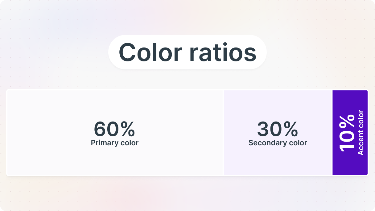
First, figure out your brand’s personality. Then, choose a main color that fits that vibe. And when you are done with that here’s a trick: ever heard of the 60-30-10 rule? It’s a formula for using colors in your web design.
Basically, you use your main color for 60% of the space, a secondary color for 30%, and an accent color for the remaining 10%. It’s a cool way to make sure your brand’s colors look great on your website.
If you’d rather not start from scratch, every Mosaic page kit for WordPress comes with smart color defaults that follow these principles.
Conclusion
Color theory is a blend of science, psychology, and creativity. Colors can speak volumes, but their impact varies based on who’s looking at them.
We’ve looked at how they shape user experiences, define brands, and drive results. From the color wheel to psychology, we’ve explored how they can stir emotions, send messages, and make your web design stand out.
Now you can see that colors aren’t just pretty, they’re powerful communicators. And while you don’t need to be an art genius, knowing basic color theory is essential for web design.
So, when you’re designing your next website, don’t forget that colors are the heart and soul of your design, shaping how people feel and act when they visit your site. So use these color theory tips in your next project, or start from a pre-built theme with smart color defaults.


