

Introduction
Website navigation looks simple until it suddenly is not.
At some point, a basic menu stops doing its job. You add more pages, more products, more categories, more content. Your header turns into a long list of links, dropdowns feel cramped, and visitors start hunting instead of clicking.
A mega menu is a great way to turn navigation into a structured layout. You can categorize links, provide context, display images, emphasize key pages, and lead users without confusing them.
In this blog post, you’ll learn how to build a fully customizable mega menu in WordPress, without relying on rigid plugins or theme-specific limitations.
What is a mega menu?

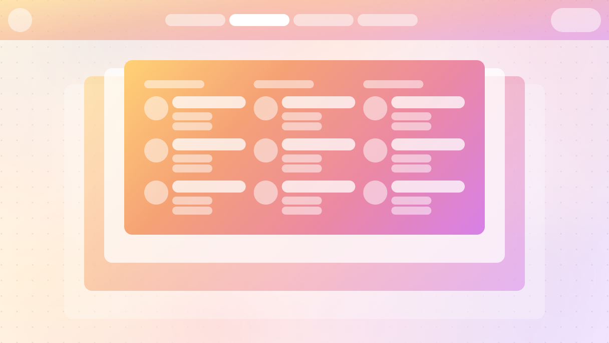
Simply put, a mega menu is a navigation menu that opens up into a larger panel instead of a tiny dropdown. Rather than squeezing everything into one narrow list, it gives you space. Space for groups, headings, icons, images, and short bits of context that help people decide where to go next.
A regular menu just lists links. A mega menu shows structure.
Honestly, a mega menu is more about layout than just being a menu. You can group related pages, clearly label the sections, and highlight key areas, all without making visitors click around and play a guessing game.
That’s why you often see mega menus on bigger websites. When the content expands, basic menus just can’t keep up.
Why is it called a mega menu?
Because it is not just a dropdown that got a little wider.
The “mega” part comes from what it can hold. A mega menu can include:
- Multiple columns of links
- Section titles that explain what each group is about
- Icons or images for easy visual guidance
- Highlighted pages or featured sections
Mega menu vs regular menu: what’s the difference?
At first glance, a mega menu and a regular menu seem to have the same purpose. They help users navigate your website. The difference shows as soon as your site grows beyond just a few pages.
A regular menu is great for simple structures. Just a handful of top-level links, maybe one dropdown, and you are all set. But once you add more sections, subpages, or categories, that simplicity starts working against you.
Regular menus hide complexity
A normal menu usually arranges links vertically. You hover or tap, and another list appears, then sometimes another one after that. This forces visitors to move step by step, guessing where everything is located.
That approach has a few problems:
- It hides the full structure of your site
- It increases the number of clicks needed to access deeper pages
- It complicates scanning, especially on large websites
Mega menus reveal structure
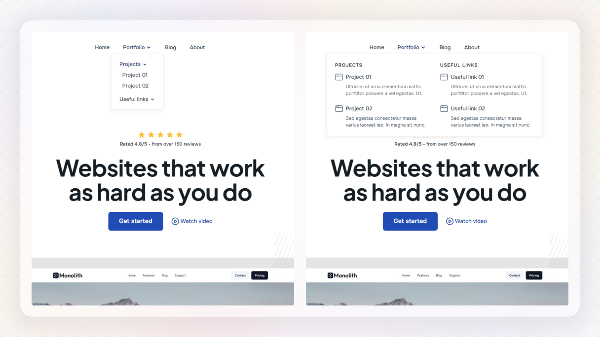
A mega menu does the opposite. It reveals everything at once, allowing people to scan through it all. Rather than having to dig through multiple layers, visitors can view categories, subcategories, and key pages all at one glance.
This is the biggest difference between a mega menu and a normal menu. One hides information until you click, while the other lays out your site clearly from the start.
Mega menu vs hamburger menu
This question comes up a lot: what is the difference between a hamburger menu and a mega menu?
A hamburger menu isn’t meant to replace a mega menu, it’s more like a container. On desktop, mega menus typically appear right in the header. But on mobile, they usually fit inside the hamburger menu to save space.
In other words:
- The hamburger menu determines the location of navigation
- The mega menu dictates how navigation is displayed
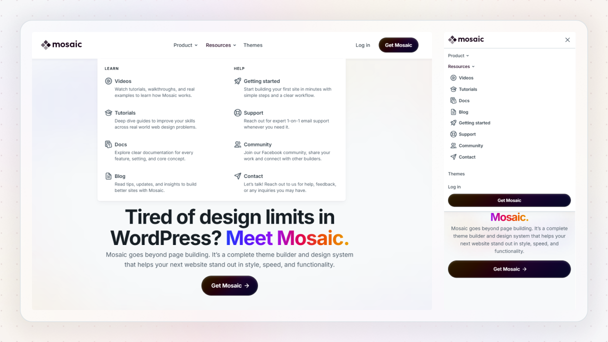
A lot of nicely designed websites actually use both options together. The hamburger menu helps manage what you see on small screens, and the mega menu takes care of the navigation once you open up navigation.
Why use a mega menu in WordPress?
Most WordPress websites start pretty small. Just a homepage, a blog, maybe an about page, and a contact page. At that point, a regular menu seems just right.
Then the website grows.
You add new services, landing pages, resources, integrations, blog categories, and possibly even products. All of a sudden, your navigation has a lot more to handle. This is when a mega menu starts to make a real difference in WordPress.
Mega menus help people find things faster
A mega menu takes away the guesswork. Instead of forcing people to click through several layers, it allows them to quickly scan options and make confident choices. When users can see the structure of your site all at once, they tend to make more informed decisions and get to the right page more quickly.
This matters even more for first-time visitors. They do not know your site yet. A clear mega menu acts like a map.
They scale with your content
One of the biggest advantages of a mega menu is scalability. You can add new sections without breaking the layout or turning your menu into an endless list of links.
Regular menus struggle as soon as depth increases. Mega menus handle growth naturally because they rely on grouping and layout instead of cramming everything into dropdowns within dropdowns.
They improve usability on complex sites
If your website has various services, product types, or content categories, a mega menu can really boost usability right away. Having clear headings and visual separation makes it easier for users to get what you offer and where they should head next.
This also helps lower bounce rates. When visitors quickly find relevant sections, they stick around and explore instead of leaving because they feel lost.
Step-by-step: how to build a mega menu in Mosaic
Let’s turn all of this into something practical.
Mosaic treats mega menus as part of your layout system. You build them using the same elements and structure you already use everywhere else.
And if you want to see it in action, this short video walks through the entire process step by step:
Step 1: Open the header and navbar
Mega menus belong in your header, so that is where we start.
First, open the Template editor and double-click the header. This takes you into the Master, where your global navigation lives. From there, enter the navbar element scope.
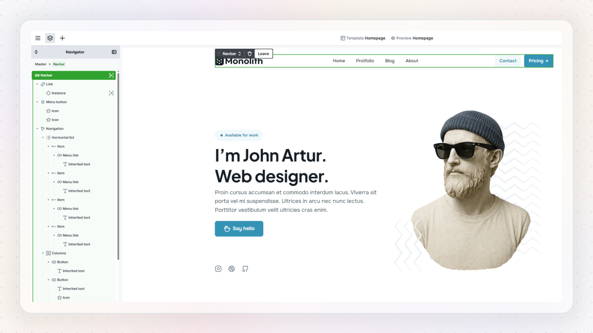
This matters because anything you build here becomes part of your site-wide structure. Your mega menu will automatically stay consistent across all pages.
Step 2: Add a dropdown as the foundation
From the Add panel, drop in a Dropdown element inside the navbar. This dropdown acts as the container for your mega menu.
Once you are inside the dropdown scope, rename it to something meaningful. For example, “Features”. Inside the wrapper, you’ll see a default list. Keep the first item and remove the rest so you can focus on building from scratch.
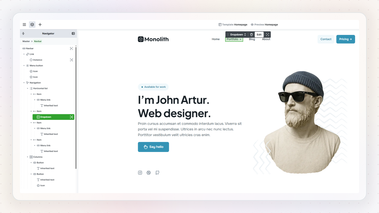
At this point, you have a clean trigger and a blank space to work with. That is exactly what you want.
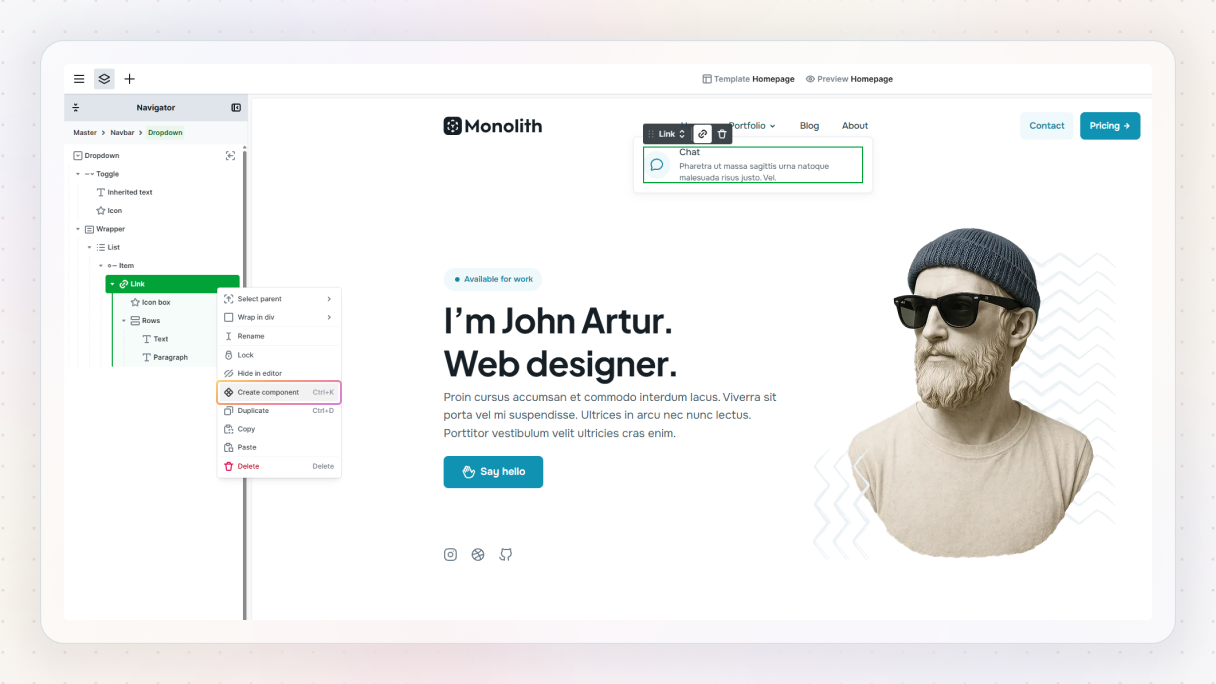
Step 3: Build the first mega menu item
Start with the first list item. Rename it to something clear, like “Chat”. Next, duplicate that text and use the second one as a short description. Then change its element class so it reads as supporting copy instead of another title.
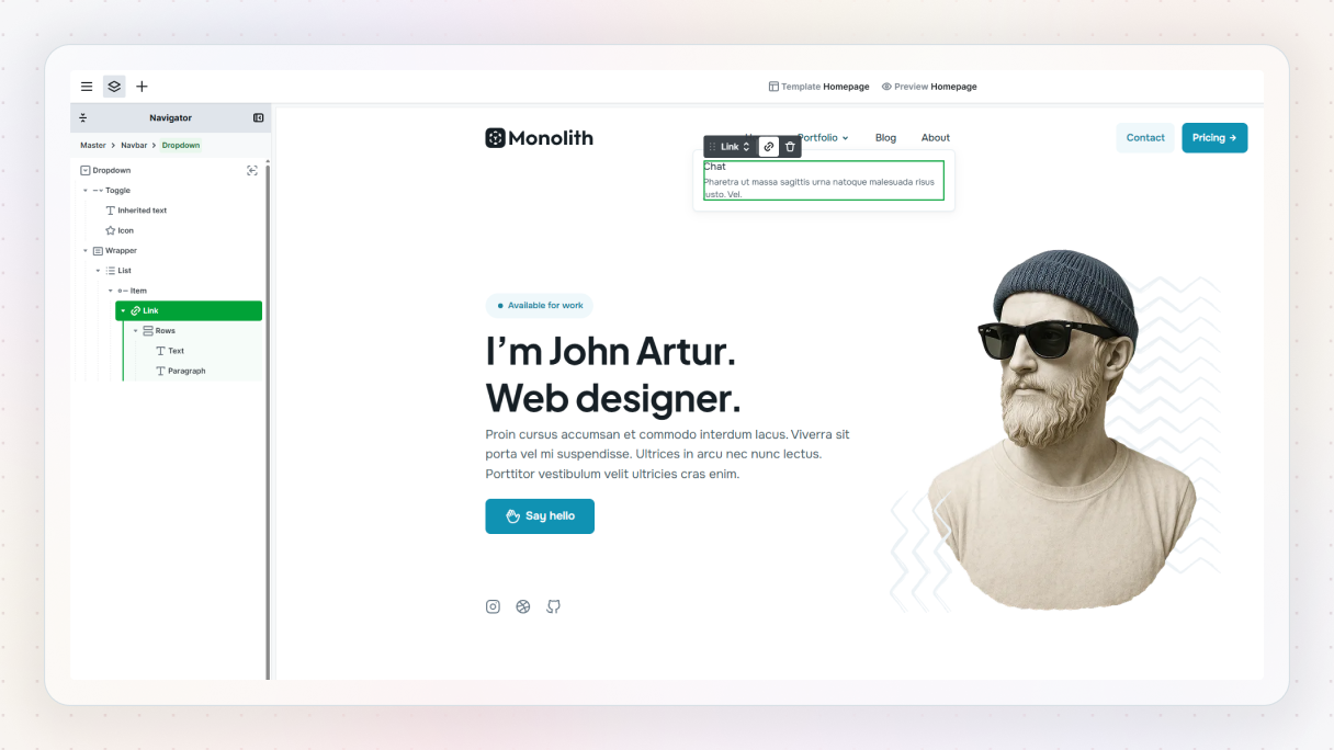
Right now, these two elements sit too close together. Wrap them in a Rows element and add some spacing. If you’re using utility classes, this takes seconds. Small details like this already start making the menu feel intentional instead of thrown together.
Step 4: Add an icon and structure the layout
Icons help users scan faster, so adding one is worth the effort.
Open the icon library, search for an icon that fits the feature, and drop it in. To align everything nicely, wrap the icon and text group in a Columns element. This gives you better control over spacing using utility classes.
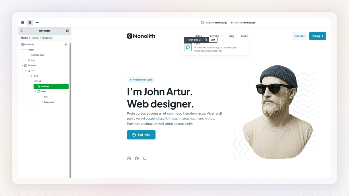
Once everything feels balanced, set up the link. Instead of pasting a URL, you can just start typing the page name and select it directly.
At this point, you are no longer styling a menu item. You are designing a small UI component.
Step 5: Turn the menu item into a reusable component
This is where Mosaic really shines.
Select the entire menu item and turn it into a component, name it something like “Menu link”, and save it as a part. From that point, you can reuse it without rebuilding anything.
Then select either the Item or the list parent on the canvas and, using the plus button, add two more items, swap the text and icons, and you’re done.
Three items in, and you already have a clean structure. But it still doesn’t quite feel “mega” yet.
Step 6: Add visual weight with an image
Mega menus often benefit from visuals, especially when you want to highlight a product, feature, or section.
Drop an Image element into the dropdown. To control layout properly, wrap your list and image together in a Grid.
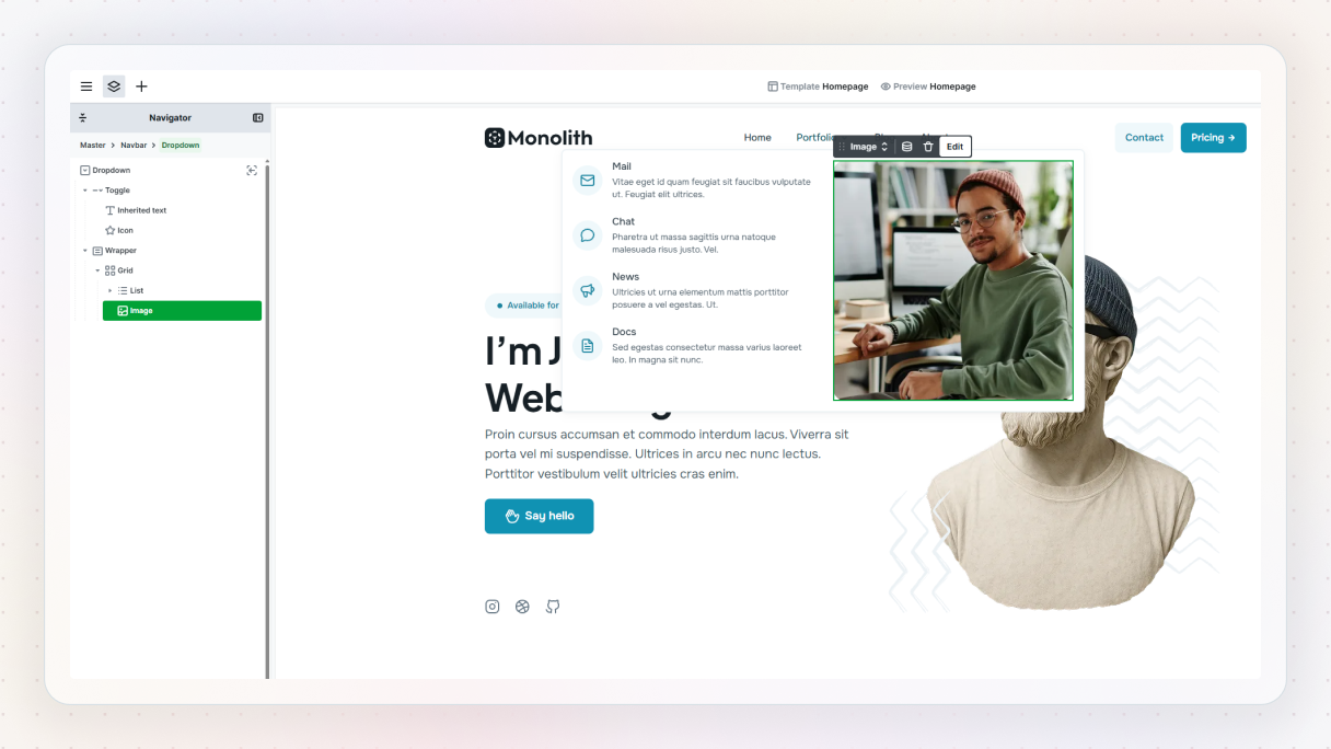
Set the grid to two columns. One side holds the menu items, the other holds the image. Suddenly, the menu feels like a real destination instead of a simple dropdown.
If the layout feels too wide, apply a max-width utility class. This keeps the mega menu focused and readable.
Step 7: Fine-tune spacing and alignment
Now it is time to polish.
Add padding to the left side so the content can breathe. Center items vertically if needed. Adjust the gap between the dropdown and the navbar wrapper so the menu does not feel detached.
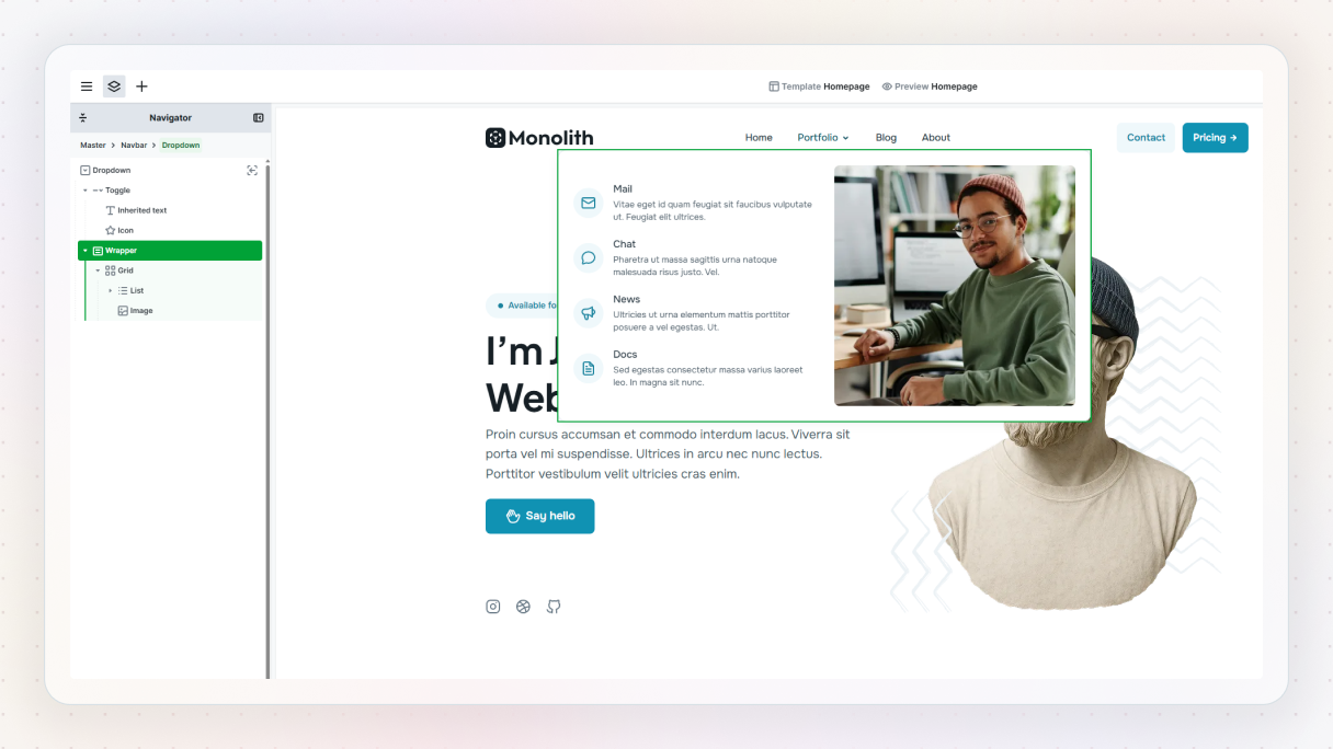
These adjustments take seconds, but they make a huge difference in how the mega menu feels.
Step 8: Configure the dropdown behavior
Open the dropdown settings and choose how the mega menu opens. Hover with a soft fade and a subtle slide down works well on desktop. You can tweak the animation and position, but there is no need to overdo it.
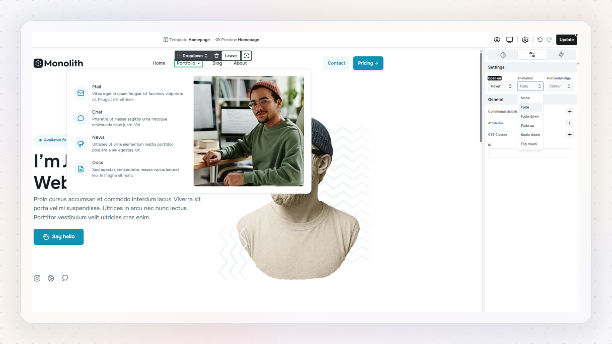
Preview the menu. What you see in the editor is exactly what you get on the frontend. No surprises.
Step 9: Make the mega menu work on mobile
Now switch to mobile view.
This is where many mega menus break, but fixing it here is straightforward. Drop the extra column from the grid so everything stacks vertically. Adjust padding and spacing so links remain easy to tap.
You are not rebuilding anything. You are just adapting the layout for a smaller screen.
And that’s it.
You now have a fully custom mega menu in WordPress that behaves like a real layout, works on desktop and mobile, and scales as your site grows.
And if you don’t feel like building one from scratch every time, you can always start from a pre-built one in the library and tweak it from there.
How to customize a mega menu in popular website builders
This is where many tools start to feel restrictive.
Most website builders claim to support mega menu customization, but that usually means a fixed set of options. You can choose columns, tweak colors, and maybe drop content into predefined areas. As long as your design fits those rules, things work. As soon as it does not, progress slows down.
The most common limits show up fast:
- Layout options feel rigid
- Styling lives in a separate system from your pages
- Mobile behavior offers little flexibility
- Consistency becomes hard to maintain
The core issue is how mega menus get treated. Many builders handle them as special features instead of layouts. That separates navigation from the rest of your design system.
A layout-based approach feels very different. When you design a mega menu the same way you design a section or a page, customization becomes natural. Rows, grids, spacing, typography, components. Everything works the same way.
This is where Mosaic stands out. Mega menus use the same building blocks as the rest of your website. You design once, reuse components, and adapt layouts for mobile without fighting the tool.
Mega menu examples in WordPress
Seeing real mega menu examples makes everything click faster. Below are a few mega menu examples built with Mosaic. Each one takes a slightly different approach, but they all focus on the same goal: clear structure, easy scanning, and navigation that feels intentional instead of overwhelming.
Gibraltar – Joga
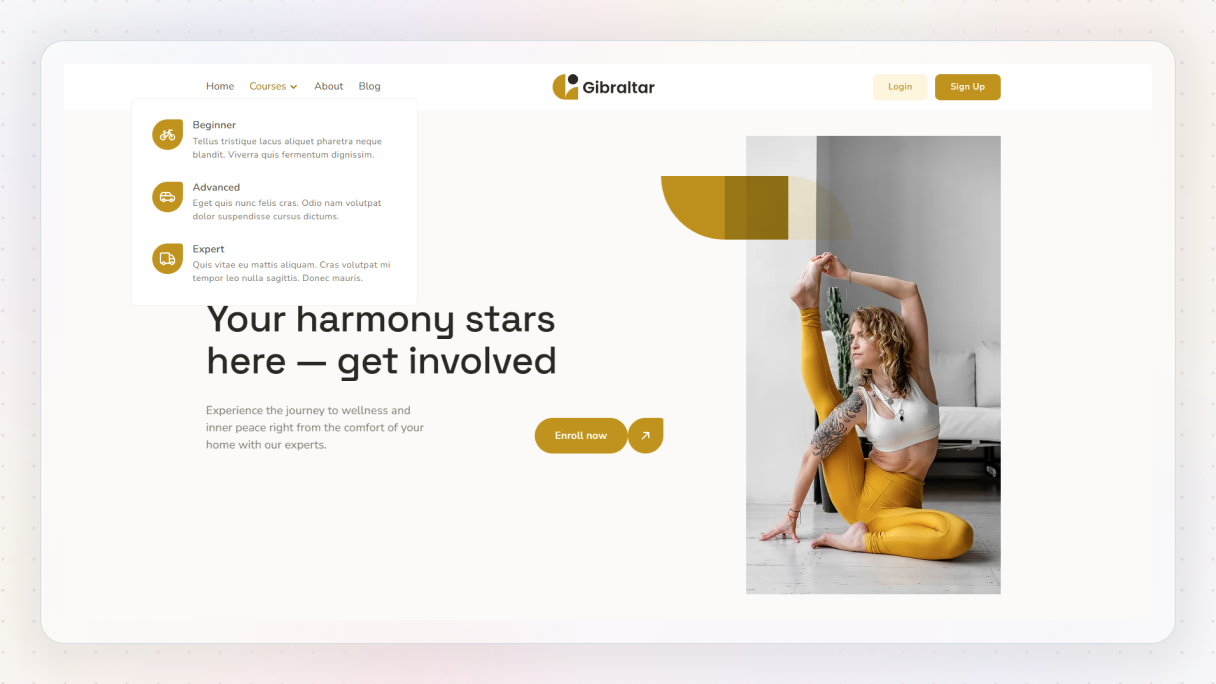
This mega menu feels calm and uncluttered, which fits the yoga theme perfectly. Courses are grouped by experience level under a single menu item, so visitors can quickly spot what makes sense for them. Everything feels spaced out and easy to read, creating a relaxed first impression that works well for a wellness-focused site.
Gibraltar – Life coach
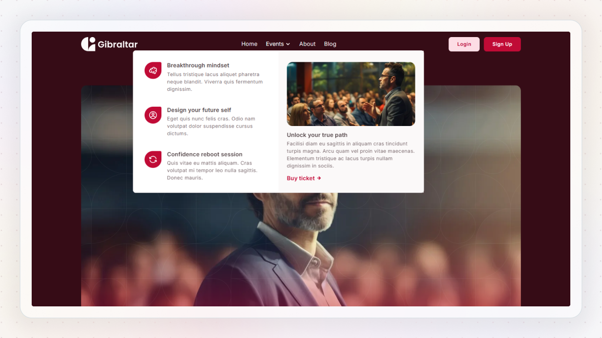
The Life coach’s mega menu feels warm and inviting from the start. Events come with short, friendly descriptions that explain what each one is about without forcing visitors to click through. The supporting image and clear call to action add context, while the overall layout stays light and easy to follow.
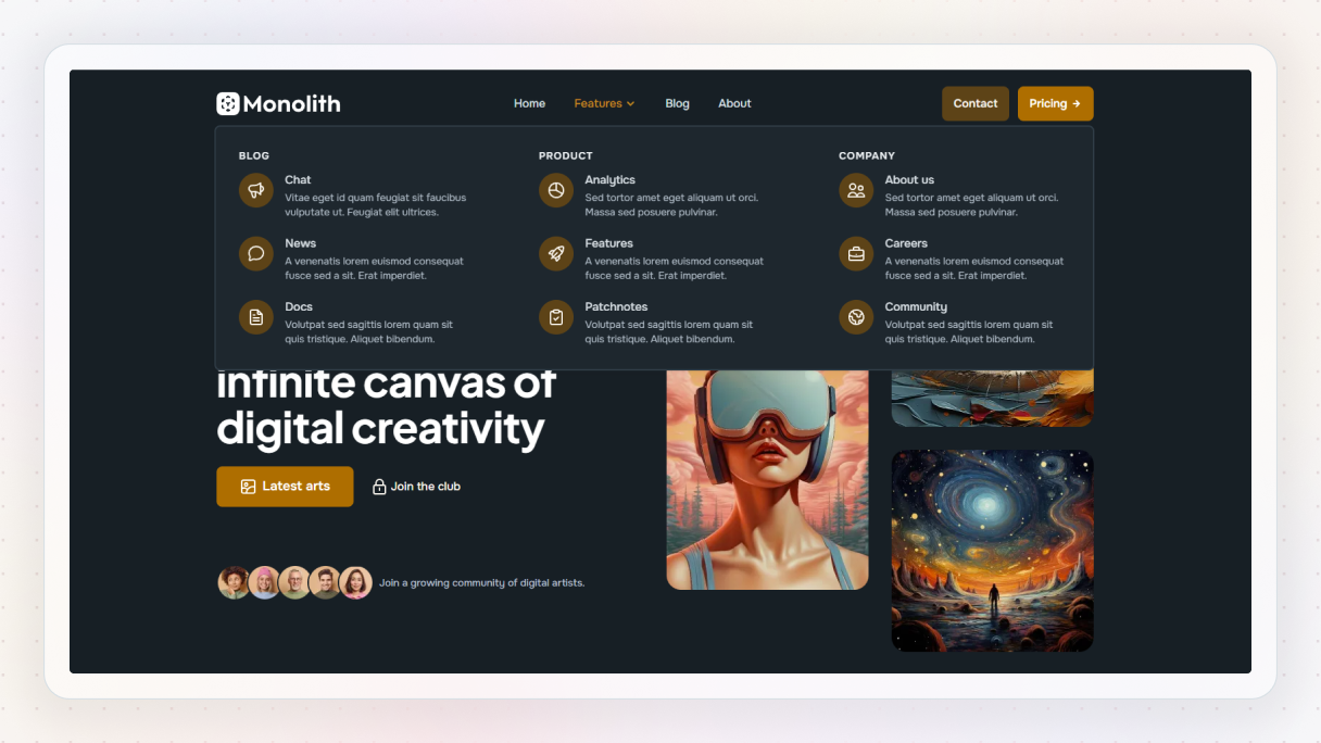
Monolith – Agency
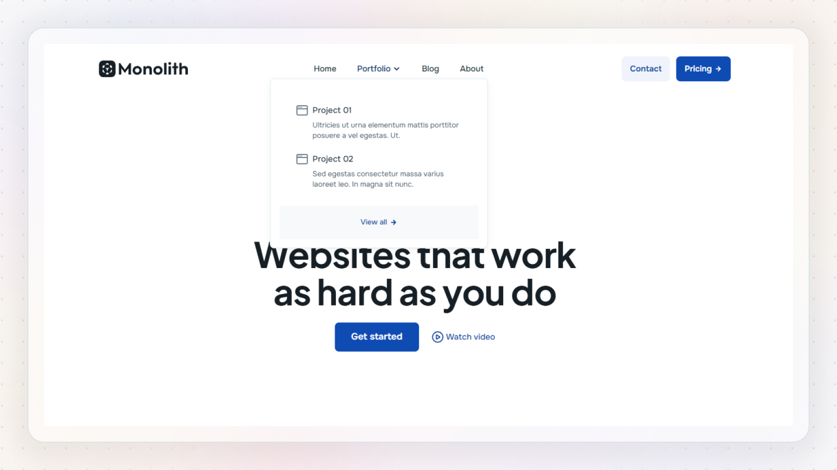
This mega menu takes a practical, no-nonsense approach that suits an agency site well. Instead of listing every project, it highlights a few key ones with short descriptions, giving visitors a quick sense of the work. The “View all” link feels like a natural next step, making it easy to dig deeper if something catches the eye.
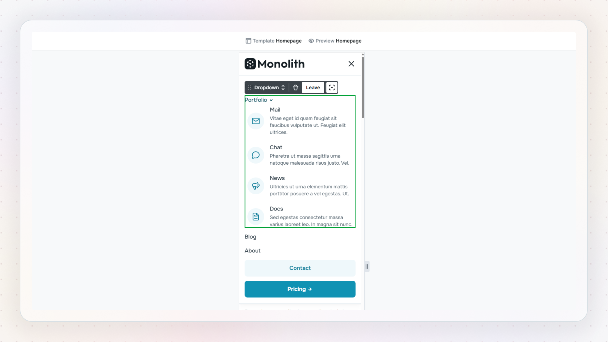
Monolith – Architect
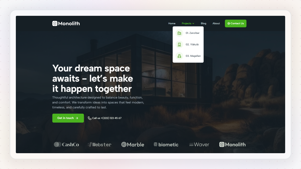
The Architect’s mega menu stays intentionally minimal and lets the projects do the talking. A small selection of their works appears right away, each clearly labeled and easy to scan. Subtle icons and generous spacing guide attention without distraction, keeping the focus on the work rather than the navigation itself.
Final thoughts
Mega menus are not about showing more. They are about making things easier to understand.
When a site grows, navigation becomes a real UX problem. A good mega menu fixes that by showing structure, guiding attention, and helping visitors get where they want without guessing.
The best mega menu examples all have one thing in common. They feel intentional. They stay clear on desktop, usable on mobile, and flexible enough to grow with the site.
In WordPress, that flexibility matters. Tools that lock you into presets make small changes painful. Building mega menus as layouts gives you room to experiment and adjust as your content evolves.
If you want to try that approach, build one in Mosaic. It uses the same elements and layout tools you already use elsewhere, so nothing feels special or fragile.
At the end of the day, good navigation should feel invisible. If your mega menu helps users without getting in the way, you are doing it right.


