


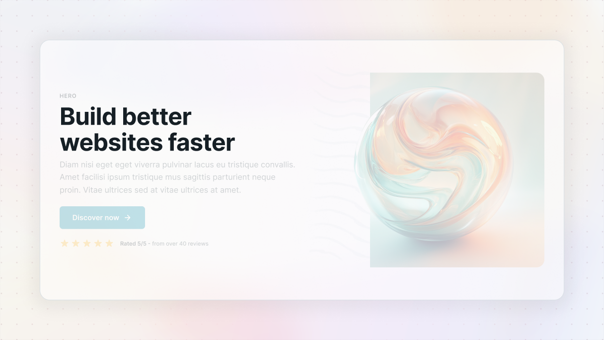
It all starts with a hero
When you’re building a website, the hero section is the first thing people see, and it makes a huge impression. In just a few seconds, it tells them what you’re all about and helps them decide whether they’re sticking around or moving on. A strong hero section example sets the tone for the entire website. Get it right, and you’ll hook your audience instantly. Get it wrong, and they might not even make it past the first scroll.
When done right, the hero section can:
- Catch the eye and hold interest
- Reduce your bounce rate
- Increase your conversion rates
- Strengthen your brand identity
- Direct users to your goal
Unfortunately, it’s not enough to simply know what a hero section is, you also need to understand how to make it effective. This begins with knowing the essential elements that make a hero section impactful.
The anatomy of a hero section
Let’s break down the parts that make a hero section hit different, those subtle choices in design, copy, and layout structure that separate ordinary from unforgettable.
1. Headline
The headline is your chance to hook your visitors and spark their curiosity. In just a few words, you should clearly communicate what you offer and why it’s important to your audience.
Tips:
- Keep it simple
- Focus on the benefits
- Make it punchy
2. Subheadline
The subheadline is there to expand on your main message and provide enough context to keep the visitors’ interest. If the headline grabs their attention, the subheadline is what pulls them in further.
Tips:
- Keep it short
- Guide them to take the next step
- Provide more clarity
3. Call to action (CTA)
While the first two were the bait and the attraction, the CTA is what turns interest into action. Your CTA needs to be straightforward, engaging, and easy to spot. It’s that button or link that guides your visitors on what to do next.
Tips:
- Use words that inspire action
- Make it easy to spot using colors and placement
- Focus on one action
4. Hero image/graphic
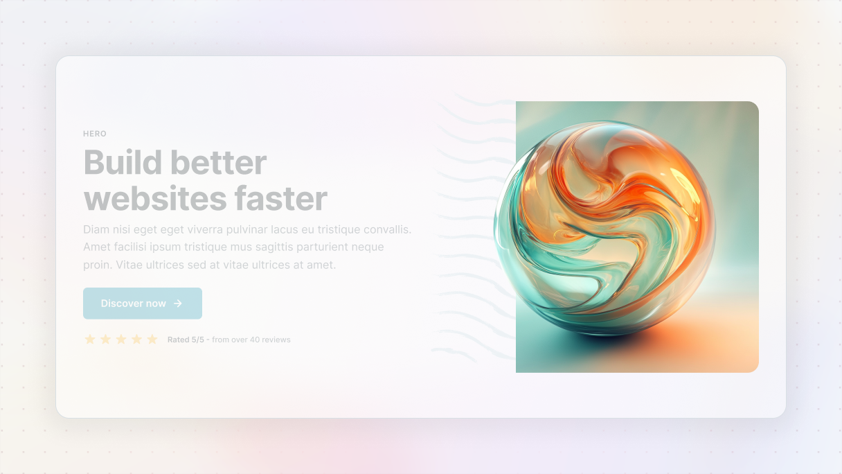
The visuals in your hero section are your opportunity to create a lasting first impression. It can be done with an image, a video, or an illustration. Make sure the visuals support your message, without overwhelming it.
Tips:
- Use high-quality visuals
- Make it relevant
- Don’t overcrowd
5. Supporting elements
Using supporting elements can really drive your message home, but it’s important to use them wisely. This can include things like social proof, such as testimonials or brand logos, scroll cues like little arrows that prompt users to continue scrolling, or animations that add a subtle touch when users engage with the page.
Tips:
- Keep it simple, add value
- Use social proof
- Guide users
Hero section best practices with examples
Now that we’ve gone over the key parts of a hero section, let’s talk about how to create one that really performs in WordPress with some real examples. I mean, sure, anyone can throw a headline and a button together. But creating a hero that truly grabs attention, keeps people interested, and motivates them to take action? That requires some real skill.
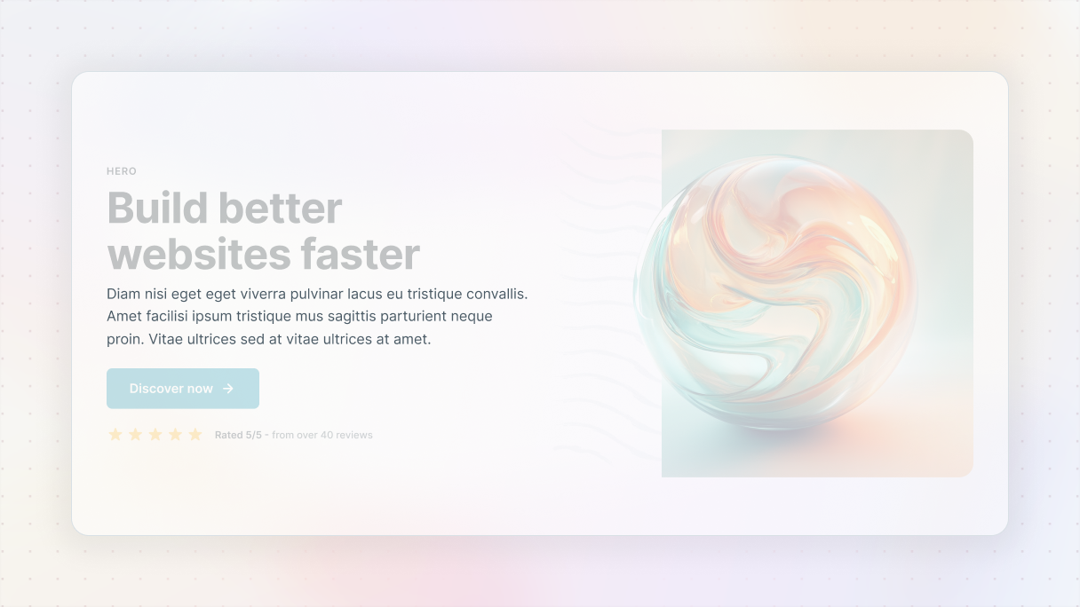
Start with a blank layout: no visuals yet
Before you start adding any visuals, you should start out with a clean look. Concentrate on getting the content right. Make sure you get all the text sorted out first and arrange it in a clear layout.
It’s important to pay attention to spacing as well. Make sure each element has enough space around it to avoid a cluttered look. This initial version should resemble a basic wireframe, but if the message is strong, it will still come across as engaging. Make sure your copy leads with benefits and not with features.
Start this way because visuals should support your message, not carry it. By focusing on the text and layout first, you’ll clarify essential points:
- What are we providing?
- Who is the target audience?
- Why should it matter to them?
Blank theme
If you’re feeling a bit lost on how to get started with your hero section in WordPress, the Blank theme in Mosaic could make it easier for you. It’s not over-the-top, and that’s exactly what makes it great. It offers simple, adaptable wireframes that allow you to concentrate on what truly counts, which is your message and layout.
It’s a basic layout that you can expand upon. Without the distraction of colors, fonts, or design elements, you simply choose one that suits your website. There are various options available for different types of pages and flows, and then you can begin adding your content.
After picking the ones that resonate with you, it’s time to make it your own. You can customize everything. Feel free to adjust the spacing, change out elements, or realign things to match your brand’s style once you’ve got your message down.
Keep it focused
Your hero section shouldn’t be a cluttered ad for all your services, instead, it should provide a quick and impactful introduction. Focus on one main message and a single clear call to action. Overloading this area can weaken your message.
Imagine if someone only views this part of your site, would they understand what you offer and what their next step should be? If the answer is no, it’s time to drop the extra.
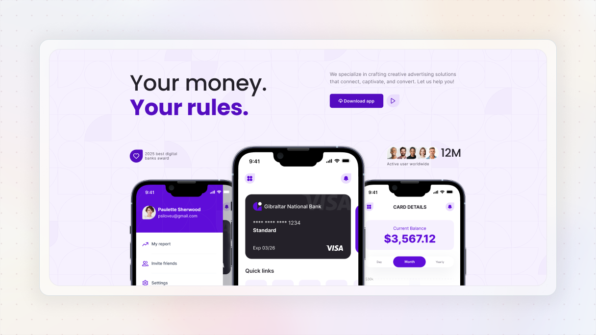
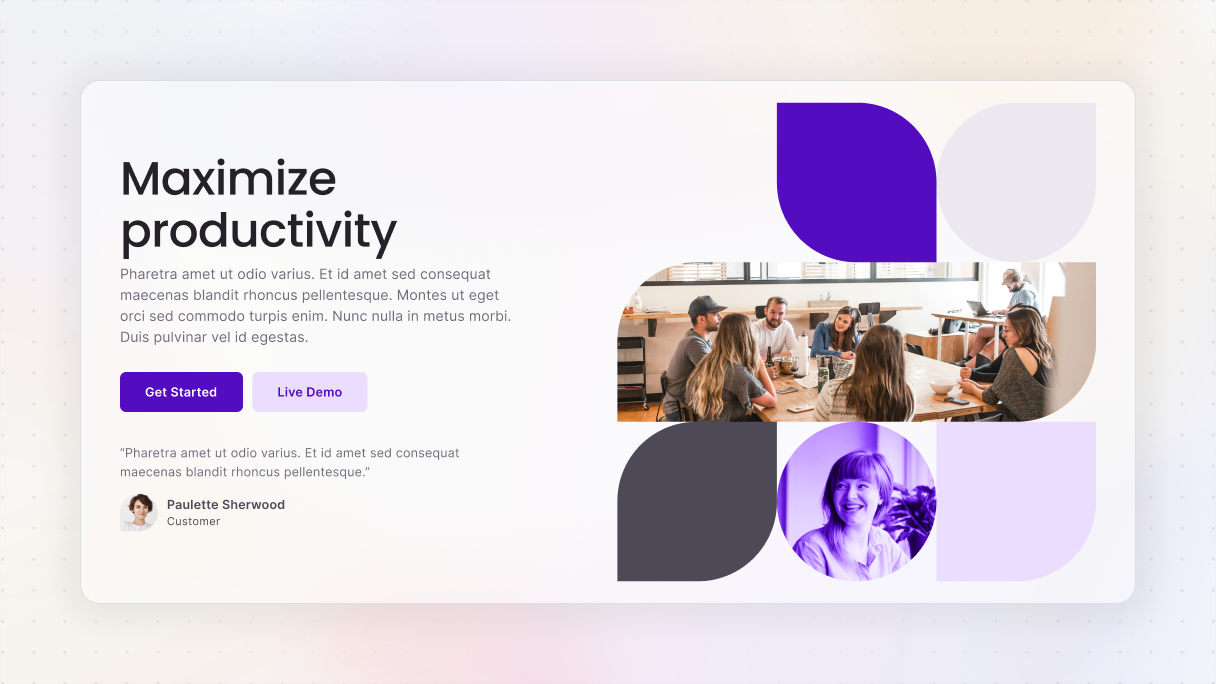
Gibraltar: Hero 15
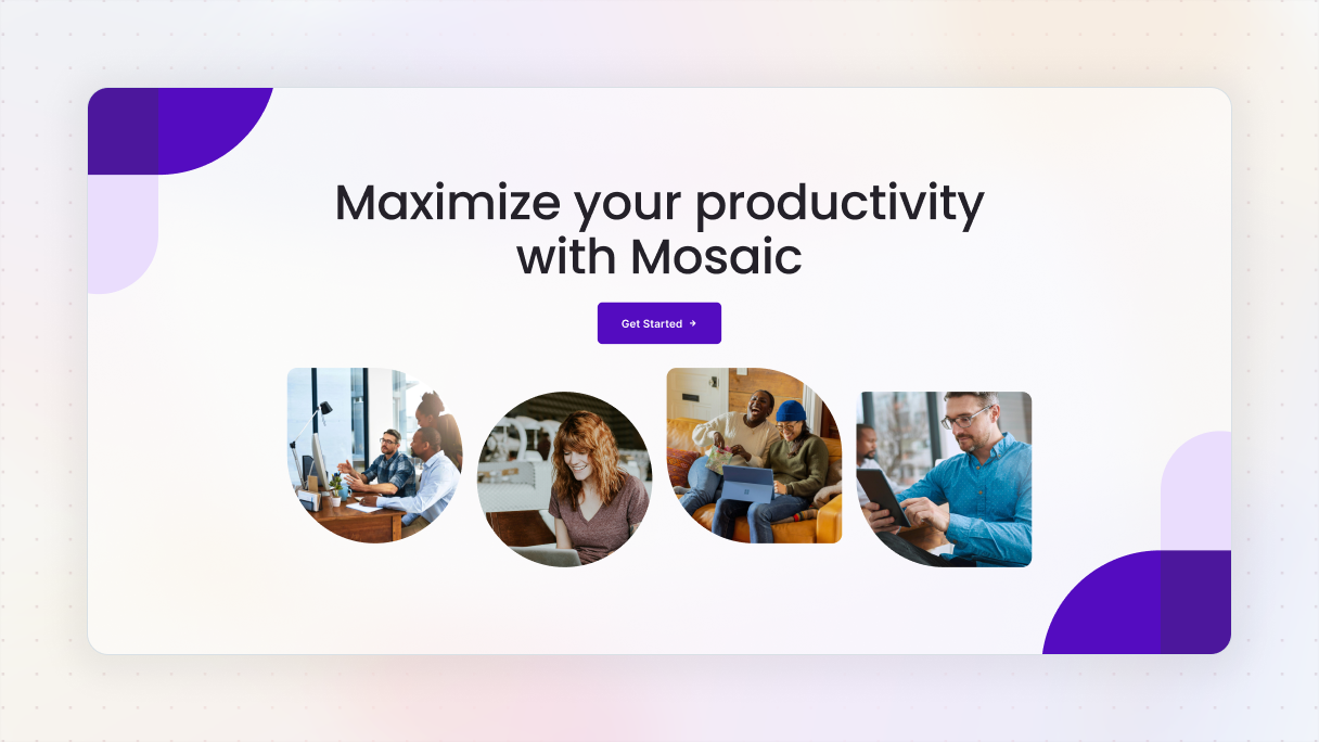
Hero 15 block from the Gibraltar theme is one of the best hero section examples that show how to find the balance between being eye-catching and not overwhelming. It starts with a strong, centered headline and a straightforward call to action, “Get Started”, all against a white background. The purple button pops just the right amount, using a little arrow to nudge you into taking action.
Just beneath that, there are four images of people that bring a personal feel, each comes with uniquely rounded shapes to make things look smoother. Soft purple shapes in the corners support the design without pulling focus from the main message.
Use a strong visual hierarchy
After you’ve finalized your content, lead the visitors’ gaze with a clear visual hierarchy. Your main headline needs to grab attention, while the subheadline should complement it. The call-to-action (CTA) should be the clear next move.
Here’s how to achieve that:
- Play with size and font weight to highlight what’s important.
- Ensure there’s a strong color contrast between the background and the text to maintain readability.
- And don’t shy away from using white space, it really helps direct focus.
Quick tip: Consider the Gaze principle. People naturally follow the gaze of others. If your main image features someone looking towards the call-to-action (CTA), their gaze can gently steer the visitor’s focus to that action. So, when you’re choosing images, keep in mind how the direction of the subject’s gaze or body can help lead your visitors’ attention to the spot you want them to notice.
Monolith: Hero 05
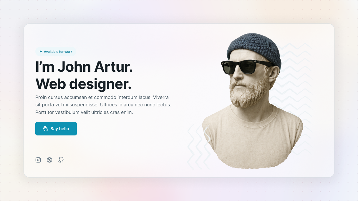
Hero 05 block from the Monolith theme is another one of the hero section examples that perfectly shows off effective visual hierarchy. It has a nice two-column design, with a sculpture on the right turning its head to the left, naturally directing your focus to the text and CTA.
The text is well-organized. First, the headline captures your interest, then a smaller subheadline provides additional information, and finally, the call-to-action is clearly highlighted as the next step. Plus, the contrast improves readability, and the whitespace helps steer your gaze without causing any confusion.
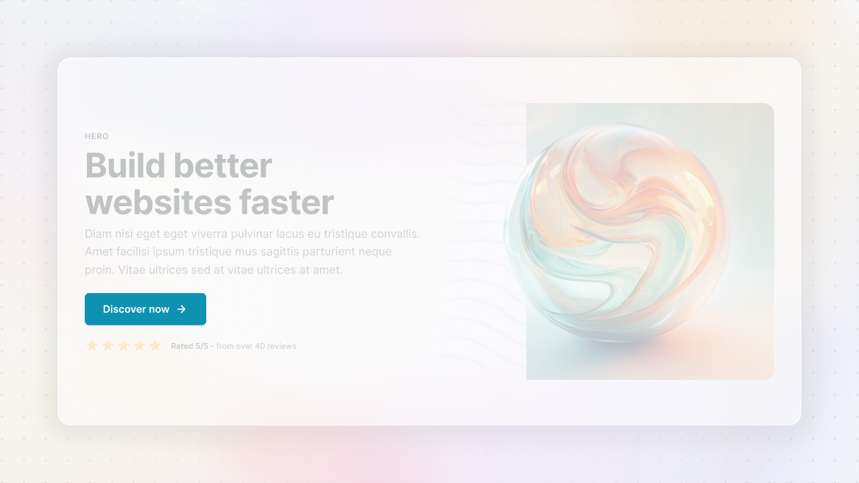
Make your CTA stand out
Your call-to-action is where everything comes together. It should stand out, be straightforward, and easy to find.
Make sure it has:
- High-contrast buttons.
- Direct phrases like “Start free trial”.
- Keep it simple, make sure your button has enough space around it so it doesn’t get lost in the background.
- Overlay color on background
And don’t be afraid to add some microcopy beneath the CTA, like “No credit card needed”. Those little nudges can really boost clicks. You can also encourage them with social proof. When you display how many customers have already engaged with your product, it instantly boosts your credibility. Just adding a line like “Join over 10,000 satisfied users” near your call to action can really encourage visitors to follow the crowd. If you‘ve got numbers, show them off.
Gibraltar: Hero 30
Hero 30 block from the Gibraltar theme is one of those hero section examples that just knows how to use a call-to-action that truly grabs attention. The “Download the app” button features a striking brand color that pops against the background, and there’s just enough space around it, ensuring it remains prominent in the design.
What makes it even more effective is the subtle microcopy nearby. References to awards and a large user base provide a soft form of social proof, reassuring visitors that they’re joining a trusted community.
Monolith: Hero 14
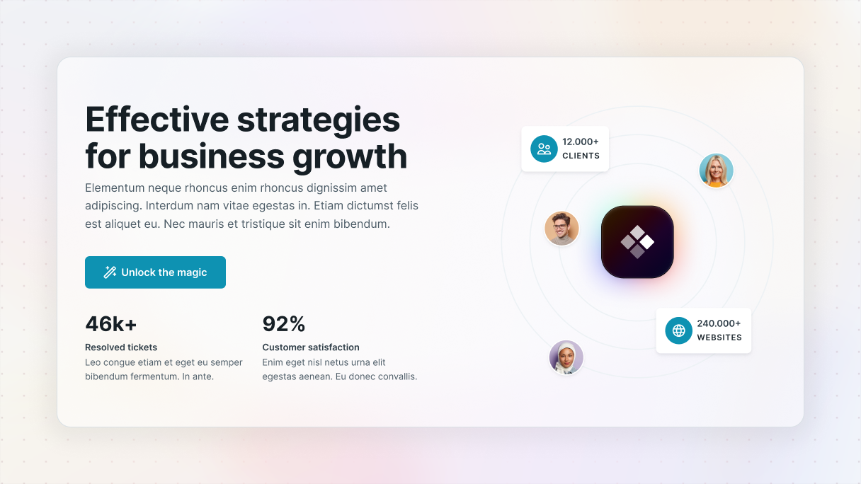
Another one of a call-to-action hero section examples is the Hero 14 block from the Monolith theme, this time featuring a stronger element of social proof.
The design is divided into visuals and statistics on the right, while the clean text is on the left. The CTA button pops against the white background, improved by an emoji and a straightforward wording that makes it feel friendly. The spacing is just right, allowing it to stand out.
What really makes it work are the trust indicators, like user numbers, ticket resolution stats, and satisfaction rates, all displayed in a larger font to definitely catch the eye.
Choose the right visuals
As we’ve mentioned earlier, you should focus on your layout and messaging first before adding visuals or animations. The visuals you choose should strengthen your message rather than take attention away from it.
Some tips to keep in mind:
- Use high-quality images or smooth video loops in the background, without sacrificing performance.
- Avoid at all costs stock photos that come off as impersonal.
- Consider using a color overlay so your text stands out against the background image.
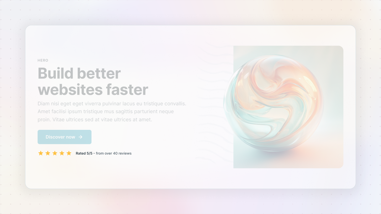
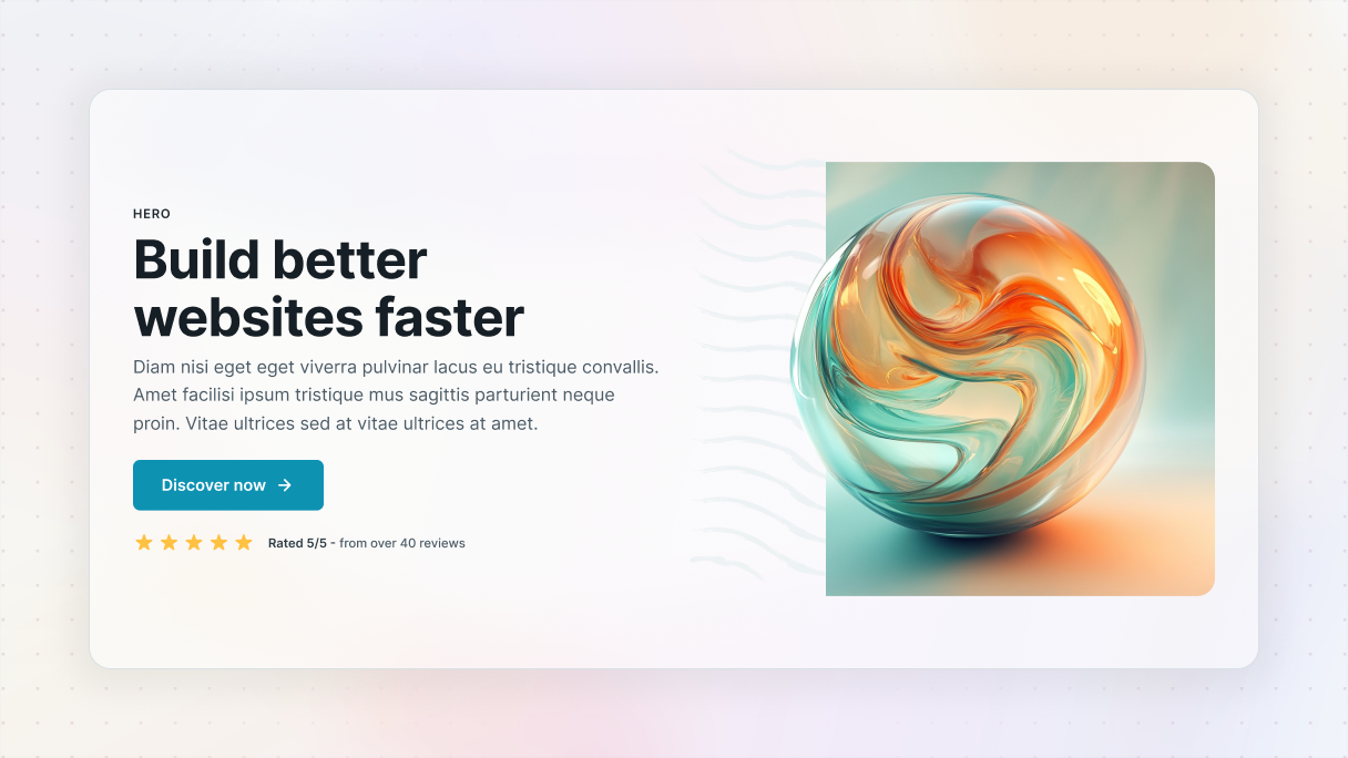
Gibraltar: Hero 10
One of the hero section examples shows that visuals can be simple yet powerful, they just need to work with your message, it’s none other than the Hero 10 block from the Gibraltar theme.
In this section, the content is nicely centered in a clean white div placed over a full-screen background image. The image features a gentle purple overlay that softens it, ensuring it doesn’t compete for attention. Instead, it creates a unique atmosphere and keeps the focus on the text.
The white div provides space for the headline, subtext, and buttons. Speaking of buttons, they stand out beautifully against the white background with their dark and light purple colors, making them pretty easy to notice.
Monolith: Hero 25
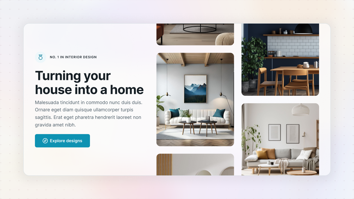
Another one of the great hero section examples is Hero 25 block from the Monolith theme. This design really shows how images can do more than just look nice, they can highlight your worth.
The layout is divided into images on the right side, and text is on the left. The pictures aren’t random, they are actual photos of interior design projects, arranged in a way that feels like you’re scrolling through a small portfolio right in the hero section. This gives immediate trust without needing any words.
On the left side, the text is clear and flows nicely. The headline clearly states the offer, and the call-to-action “Explore designs” stands out. The button’s color contrasts well with the white background, and the little arrow next to the text gives a gentle push, guiding you to the design you’ve got a little taste of on the right.
Balance story and visuals
Split-screen hero sections are awesome when you want to show both text and visuals side by side. One side can handle the message, while the other shows off an image or video. It keeps things balanced so people can take everything in without having to scroll right away.
Here are some suggestions:
- Keep a good balance between text and visuals, neither too much text nor too few images.
- Use whitespace to maintain an easy-to-read layout.
- Position your call-to-action close to the text so visitors clearly understand the next step.
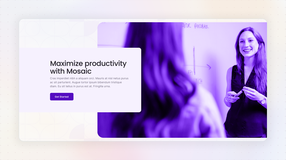
Monolith: Hero 03
Hero 03 block from the Monolith theme perfectly shows a classic split screen layout. With text on the left and an image on the right, it creates a clean and balanced look that’s easy to navigate.
The message is clearly stated on the left, while the vibrant image adds visual interest without overshadowing the words. Plus, the call-to-action is smoothly placed right below the text, making the next step clear and accessible.
This is a great reminder that you don’t have to come up with something completely new, just make sure your content and visuals complement each other instead of clashing.
Gibraltar: Hero 13
Hero 13 block from the Gibraltar theme puts a fun twist on the classic split-screen layout. On the right, it mixes images and divs with different border radiuses to create a unique, eye-catching visual setup.
The left side keeps things simple with well-spaced copy and CTAs that match the color scheme from the visuals, tying both sides together nicely. The buttons feel naturally placed within the text, making the next step super clear without any effort.
It’s a clean, creative layout that keeps things fresh without losing clarity.
Stand out with asymmetrical layout
Try going with an asymmetrical layout to give your design a bit more personality. It’s a fun way to break free from the usual grid setup and make things feel more dynamic. Don’t be afraid to experiment with spacing or layering elements, those little things can really guide the viewer’s eye in cool, unexpected ways.
Here are some tips:
- Use whitespace to direct attention and keep things organized.
- Make sure important elements stick together, like the headline and call-to-action, to maintain a sense of stability.
- Think about where the viewer’s eye is drawn first, second, and third.
Gibraltar: Hero 09
Hero 09 block from the Gibraltar theme is a pretty unique one from our hero section examples, showing how asymmetry can be executed well. It uses a split layout, but with a unique twist, the text overlaps the image just a bit.
For the sake of readability, the text is placed in a white div with a gentle shadow, making it stand out without competing with the image. The image also pops, it has a slight purple overlay that adds contrast and prevents it from blending into the background.
Add interactivity
If you want to make a lasting impression, consider using an interactive hero section with features like hover effects or animations that trigger when you scroll. They can really add to the user experience. Just be careful, though. If there’s too much going on, it might take the focus away from what you actually want people to notice. So keep it fun, but balanced.
Some suggestions:
- Use animations that have a clear purpose.
- Everything should be accessible.
- Always check how your content performs on smaller screen sizes.
Keep it accessible
Last but not least, good design should work for everybody. Make sure that your hero section is user-friendly for people with disabilities.
Best practices for accessibility:
- Choose colors that stand out well against other text and the background.
- Include alt text for your images.
- Buttons should be focusable and clearly labeled for screen readers.
Accessible designs often load quicker and rank better in search results, so it’s a win-win.
Can I reuse a hero section as a component across multiple pages?
Absolutely, you can do that. If you’re working with WordPress, in Mosaic it’s really easy. By reusing a hero section as a component, you can save a lot of time and maintain consistency throughout your website’s design system.
However, even though you’re using the same layout, avoid just copying without any thought. Adding some variety can make a big difference. Mix up the content, change the visuals, or make adjustments to the layout to keep things engaging.
Simple ways to create a component in Mosaic:
- Using the Navigator
- With the Toolbar
- Through the Components menu
- Hitting the Ctrl+K keyboard shortcut
After you’ve created your hero section as a component, you can easily add it to any page you like. Just go to the Add panel, find the Assets section, and you’ll see your collection of saved components in it.
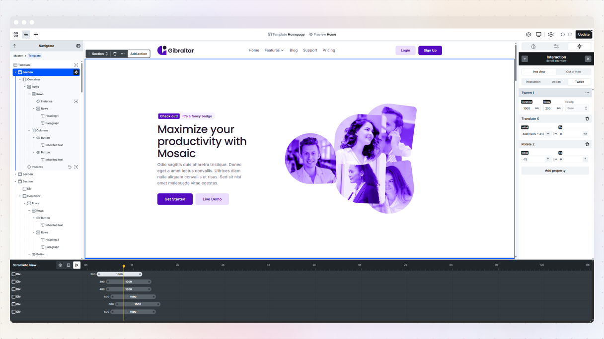
How do I add scroll-based animations or interactions to my hero?
If you’re looking to make your WordPress website’s hero section more engaging, Mosaic has some powerful scroll interaction features. The best part is you won’t have to write any code, just click around and personalize it to your liking.
But don’t go overboard with the animations. It’s easy to want to animate everything, but a more subtle approach is usually better. The aim is to direct your visitor’s focus, not to make your hero section feel like a theme park attraction.
Types of scroll-based interactions you can use in Mosaic:
- Scroll direction change: This activates an animation when the user shifts from scrolling down to up (or the other way around). It’s great for sticky headers.
- Scroll into view: This starts an animation when an element comes into or goes out of view. It’s perfect for smoothly introducing your headline or call-to-action with a fade effect.
- While scrolling: This one continuously animates elements depending on how far the user has scrolled down the page. Think of it as creating parallax effects or revealing content based on progress.
You can start your interaction by selecting a trigger element, which is essentially what kicks off the animation. This could be a button, a specific section, an image, or really anything else you have on your Canvas.
Every type of interaction has its own set of settings, allowing you to customize everything to match your vibe, and for further adjustments, you can use the timeline to adjust the timing, delays, and movements.
The best scroll animations don’t overshadow your content, instead, they bring attention to your message and guide visitors to your goal.
Final thoughts
The truth is, there isn’t a formula for designing the best hero section. Although there are good starting points and common practices, every brand, product, and audience is different. The important thing is to start with a clear plan, test your ideas to see what works, and be ready to make changes as needed.
A great hero section should grab their attention right away and make them think, ‘This is what I need!’. At the same time, it should gently suggest to those who aren’t a good fit that this might not be the place for them, and that’s totally okay. This kind of clear messaging helps attract the right people while keeping away those who don’t quite fit in.
People tend to form quick opinions, sometimes without even knowing it. If your hero section doesn’t clearly show who you are, what you provide, and who you’re trying to reach, you could be losing potential customers before they even begin to look through your content.
Ready for inspiration? Explore more high-converting hero section examples built with Mosaic, many of which come straight from our page kit library, and see what’s possible.


