What is a page kit?
Ever opened up a blank WordPress page and had no idea where to start? You’re not alone.
Building a website from scratch can be kind of intimidating. You’ve got to figure out the layout, the design, the content flow, it’s a lot. That’s why WordPress page kits are such a lifesaver.
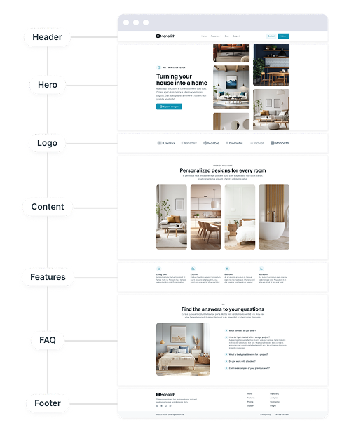
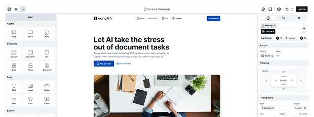
A WordPress page kit is basically your website’s shortcut. It’s a pre-designed collection of page layouts and content blocks that helps you set up your website in no time, sparing you from the frustration of a blank screen.
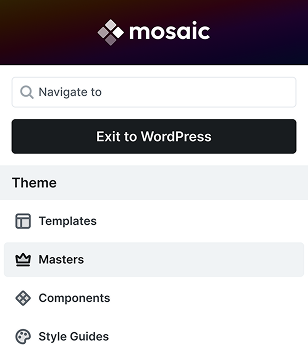
In Mosaic, every theme comes with its own set of custom page kits, which are basically a full collection of stunning, ready-to-use templates targeting different use cases. They speed up the process of creating your website, making it simpler and giving it a professional look right from the beginning with consistent design.
What’s in a page kit?
With a Mosaic WordPress page kit, you get:
- Pre-built page templates: like Home, About, Features, Contact, Blog, etc.
- Reusable blocks: headers, heroes, testimonials, FAQs, footers, and more, with semantic and utility classes keeping the design consistent
- Consistent fonts and colors: no need to play designer, it’s already done for you, with palettes grounded in color theory
- Mobile-friendly layouts: everything looks great on phones, tablets, and desktops
- Helpful placeholder content: so you can visualize the structure before you add your own text and images

Basically, a page kit is a starter pack for your website. You pick the building blocks you need and customize them to match your brand. It’s perfect for anyone who’s brand-new to WordPress or those who just want to save a ton of time.
With Mosaic, you’re not just getting a couple of pages, you’re getting a whole library of WordPress page kits that perfectly match each theme’s design. It’s super easy to use with drag-and-drop features, no coding needed, and honestly, it’s pretty fun to play around with.
Why use a WordPress page kit?
If you’ve ever tried to put together a WordPress website on your own, you know how easily it can go from feeling fun to suddenly turning into a frustrating mess. That’s why a WordPress page kit is a total game-changer for WordPress users who want to achieve professional results without all the stress.
Using a page kit for WordPress means you can forget about layout issues, font clashes, or weird spacing. Everything is designed to fit together perfectly, pages, blocks, colors, you name it. It’s really like having a designer (and maybe even a therapist) by your side, keeping you from spiraling into that ‘why does this look weird?’ moment.
Here’s why they matter:
- You save a ton of time: A page kit gives you a solid starting point. Instead of starting from scratch, you get to work with ready-made pages that already look awesome.
- No design skills? No worries: The hard part is already handled. You just need to adjust the text, change the images, and publish.
- Consistency: Everything matches. Your contact page won’t feel like it’s from a different world than your homepage.
- Better for your brand: When your website looks professionally built, visitors take you seriously. A great first impression builds trust.
Mosaic’s page kit library
Each Mosaic WordPress page kit is organized by website type, like logistics, fintech, coaches, or real estate, so you aren’t starting from zero.
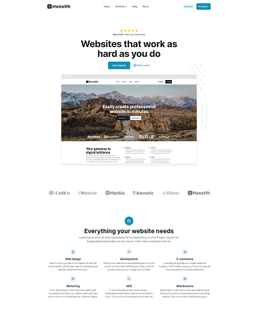
No matter if you prefer the clean, simple charm of Monolith or the striking, modern look of Gibraltar, you’ll have access to a library of page kits that match the vibe and purpose of your theme.
- Monolith has 9 unique page kits
- Gibraltar has 10 unique page kits
Each one has everything you need: homepages, about pages, contact pages, pricing pages, blogs, and so much more. Every detail is professionally built with UX in mind, so your site won’t just look good, it’ll feel good to use.
Let’s take a quick tour of the page kits included in each theme. They’ll all have their own live demos linked, so you can click through and explore them as you go.
Monolith theme
A clean theme with minimalist layouts and timeless design, it’s perfect for highlighting your content and creating a professional, elegant online presence.
Agency page kit

The Agency page kit is built to do one thing really well: showcase your work and earn trust fast.
This kit uses a sleek, minimalist layout that makes navigation a breeze, just the essentials at the top, and everything your clients need exactly where they expect it. From the moment visitors land on your site, they’re met with powerful social proof, clean design, and real-world examples of your work, all laid out in a smart, intuitive flow.
Every page is designed with user experience in mind. The homepage walks visitors through your services, your results, and your pricing, with clear CTAs and zero clutter. The layout guides the eye in a natural reading pattern, making it easy for people to absorb what you do and why it matters.
Need to show off your projects? The dedicated portfolio page highlights your best work with modern visual storytelling and seamless navigation. Want to build trust? The About page introduces your team, shares your values, and invites users to connect in person.
UX highlights:
- Friction-free navigation with just the pages users expect
- Strategically placed social proof (ratings, logos, testimonials) to build trust fast
- Logical, reader-friendly content flow with clear next steps
- Reusable sections like pricing, FAQs, and CTAs to keep things consistent across pages
- Clean, responsive design that looks great on every device
Best for: Agencies, freelancers, design studios, digital marketers, and creatives who want a modern, trustworthy online presence, fast
Included templates: Home, About, Contact, Pricing, Portfolio, Blog, Blog Post, 404
Color: Cyan | Font: Neutral | Mode: Light
Architect page kit

The Architect page kit is perfect for design-focused industries who want to make a bold impression without overwhelming the user. It blends high-impact visuals with thoughtful layouts, creating a seamless journey through your work, your story, and your vision.
What makes this kit stand out is its refined use of contrast. The mix of dark and light sections creates a rhythmic visual flow that guides the visitor naturally from one block to the next. Headers, calls-to-action, and menu items pop beautifully against darker backgrounds, giving your site a polished, professional edge.
Right from the homepage, users experience a sleek dark hero section with overlaid imagery, confident branding, and client logos that build instant credibility. As they scroll, they’re pulled into a clean, light-toned project grid that highlights your work in a modern broken layout.
Each template in this kit has been crafted with user experience in mind. Navigation stays consistent across pages. Calls to action are placed thoughtfully to appear at just the right moment, never pushy, always encouraging.
UX highlights:
- Balanced contrast between dark and light sections for clear content flow
- Visual hierarchy that spotlights projects and builds trust with testimonials
- Reusable hero + CTA sections to reinforce brand identity site-wide
- Smooth transitions between story, services, and contact, no dead ends
- Fully responsive, so your visuals shine on every screen
Best for: Architects, interior designers, creative studios, firms with visual portfolios, and anyone looking to pair bold imagery with clean, structured storytelling
Included templates: Home, About, Contact, Projects, Project Single, Blog, Blog Post, 404
Color: Lime | Font: Geometric | Mode: Mixed (Light + Dark)
Conference page kit

The Conference page kit is built for brands that want a bold, modern look without sacrificing clarity or conversions. Its dark mode design gives off a sleek, edgy vibe, while minimal navigation and a simple footer keep the focus on content.
A strong headline and trusted logos build credibility, and generous spacing keeps everything feeling clean and open.
Scrolling reveals highlights of events, paired with imagery and bold colors. The Contact page is friendly and accessible, backed by logos, testimonials, and an FAQ that covers key questions.
Blog and Post templates use a clean, single-column layout for easy reading, ending with a sign-up form and related content to boost engagement.
UX highlights:
- Consistent minimal style across all pages, giving an uncluttered feel
- Testimonial sliders repeat across pages (Homepage, Contact, Pricing) to reinforce trust
- Scannable pricing page with segmented plans for different buyer personas, clear layout, and a strategically placed sign-up form
- Whitespace and layout make every section easy to digest, despite the dark theme
Best for: Conferences, summits, workshops, and professional speakers who want a smooth, modern design that builds credibility and drives sign-ups
Included templates: Home, Contact, Pricing, Blog, Post
Color: Teal | Font: Modern | Mode: Dark
Cyber security page kit

The Cyber security page kit isn’t just built to look techy, it’s designed to instantly build trust with the people who need it most. If you’re in the business of protecting data, privacy, or networks, this kit has your back with a unique visual style and a UX flow that feels secure and intuitive.
From the start, the dark mode layout paired with its imagery sets the tone: serious, modern, and cyber-ready. But this kit doesn’t just look the part, it’s loaded with smart design choices that guide users toward action and confidence.
Instead of a generic call-to-action, the homepage hits right at the heart of your audience’s concerns with ‘Protect my data’. That kind of clarity sets the tone for a user journey that feels aligned and easy to follow.
Visitors never feel lost, thanks to consistent headers, intuitive navigation, and thoughtful page structure. Even the 404 page feels intentional, offering contact forms, helpful links, and a friendly nudge back to home.
UX highlights:
- Dark mode for a consistent, tech-forward look
- Pricing tables that scale naturally with business size and growth
- Reusable testimonials placed where they add the most impact
- Blog layout with easy browsing and built-in category filters
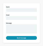
- Contact CTAs and forms embedded where users expect them
Best for: Cybersecurity, IT services, SaaS security, privacy-focused tech brands, digital protection solutions
Included templates: Home, About, Pricing, Blog, Blog Post, 404
Color: Cyan | Font: Modern | Mode: Dark
Finance page kit

The Finance page kit is where clarity meets charm. Built with a light, minimalist layout and elevated by distinctive illustrations, this kit balances professionalism with an unexpectedly friendly visual style, perfect for modern finance brands that want to build trust without looking cold or corporate.
From the very first interaction, the kit creates a smooth and intuitive user experience. The header feels like it’s integrated into the hero section, giving it a unified look, and includes a standout call-to-action, “Read our latest post”. This subtle detail invites engagement without overwhelming.
Rather than relying on stock photography or portraits, the kit uses playful, custom graphics throughout. This gives it a warm, human tone, ideal for finance brands that want to feel approachable, not intimidating.
UX highlights:
- Easy-to-navigate structure with purposeful, page-specific CTAs
- Friendly CTA closes most pages with a clear purpose: newsletter sign-up
- Team section (with illustrated avatars) still feels personable, even without photos
- Frequent testimonial placements build trust across multiple pages
- Z-pattern layout for services provides an effortless reading flow
- Multiple contact methods and detailed FAQs mean fewer friction points for users
Best for: Financial services, accounting firms, fintech platforms, personal finance advisors, tax prep services
Included templates: Home, About, Contact, Pricing, Features, 404, Blog, Blog Post
Color: Green | Font: Futuristic | Mode: Light
Interior page kit

The Interior page kit is perfect for brands that want to make a strong, stylish impression. It mixes clean structure with beautiful visuals and friendly copy to create a website that feels both refined and approachable.
Visitors are greeted with a dual-layer header, practical info on top, branding and navigation below, setting a professional yet welcoming tone. The homepage features a striking broken grid gallery that instantly shows off your work in a modern, engaging way.
Pages are thoughtfully laid out to highlight your visuals, guide users naturally through your services, and keep the experience smooth. FAQs, testimonials, and CTAs are placed with care, making the site as functional as it is beautiful.
UX highlights:
- Two-decked header keeps contact info handy without clutter
- Smart visual hierarchy: full-width image blocks add drama and clarity
- Broken grid layouts + Z-flow sections enhance readability and engagement
- Clear process steps help build client confidence early on
- Friendly tone throughout builds trust and approachability
- Strong footer structure with subtle division keeps navigation clean
Best for: Interior designers, stylists, home decor brands, creative consultants, and anyone who wants a calm, modern, and highly visual online presence
Included templates: Home, About, Contact, Pricing, Showcase
Color: Orange | Font: Neutral | Mode: Light
Personal page kit

The Personal page kit is ideal for creatives who want to show up online with clarity and charm. It’s designed to make visitors feel welcome while still getting your message across.
With a minimalist layout, the navigation stays simple, just a centered logo, a home icon, and a tidy menu. The hero section adds a playful twist with quirky visuals and a friendly “Say hello” call-to-action, giving your brand a warm, approachable feel.
Each page flows naturally. Pricing is clear and easy to scan, with FAQs and testimonials that boost trust. The blog uses a clean one-column layout that’s perfect for sharing ideas, with a gentle newsletter nudge at the end.
UX highlights:
- Minimal layout keeps attention on the message
- Playful visuals paired with smooth color schemes create a friendly vibe
- Strong use of social proof (logos, testimonials, newsletter) builds trust
- FAQ sections throughout reduce confusion and build transparency
- Light backgrounds and generous whitespace enhance readability
Best for: Freelancers, coaches, consultants, creatives, personal brands, and anyone who wants to be approachable and professional at the same time
Included templates: Home, Pricing, Blog, Blog Post
Color: Blue | Font: Timeless | Mode: Light
SEO page kit

The SEO page kit is built for clarity and conversion, addressing pain points and guiding visitors smoothly toward action.
The homepage opens with a centered hero, bold benefit-driven copy, and an email form for easy engagement. Client logos and testimonials follow, reinforcing trust through social proof.
Light blue and white backgrounds create a clean, calming flow, while playful illustrations add warmth and keep the brand professional yet approachable.
Two About page options are included: one for recruitment with roles, values, and team intros, and another highlighting company culture and achievements with subtle job links.
The Features page breaks down services with visuals and Z-patterns, while the Case study page tells a success story with data, imagery, and narrative impact.
UX highlights:
- A conversion-focused email capture sits right in the hero
- The Pricing page tailors plans by business size, reinforced with testimonials and a free session CTA
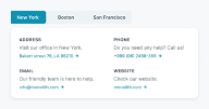
- The Contact page uses a tabbed visual guide with multiple contact options and friendly illustrations
- Even the 404 page becomes an opportunity, offering navigation, service highlights, and a CTA
- A free SEO session CTA appears across pages, encouraging action without pressure
Best for: SEO experts, marketing agencies, consultants, SaaS service providers, and any digital business looking to guide users clearly, build credibility fast, and increase conversions
Included templates: Home, About, About 02, Features, Contact, Pricing, Case study, 404
Color: Fuchsia | Font: Elegant | Mode: Light
Recruitment page kit

Hiring is hard enough, your website shouldn’t make it harder. That’s why the kit is the perfect choice for recruiting: it’s designed in full light mode, giving it a fresh, modern, and approachable feel, just like the companies it’s made for.
From the first click, clarity leads the way. A clean, two-part header keeps everything organized: the top invites visitors to post a job with a prominent call-to-action (that can be closed if they’d rather browse), while the bottom makes navigation simple and direct. A bold “Hire now” button stays in view, so users always know where to click next.
This kit makes the user experience feel effortless. It uses smart design patterns like the Z-layout to guide the eye naturally across content, making even detailed info feel easy to scan. Icons next to benefits give your offering instant visual credibility, and real-person imagery throughout (featuring smiling team members) builds an authentic connection with your brand.
UX highlights:
- Focused messaging that’s clear and conversion-driven
- Strategic CTAs placed exactly where they matter
- Digestible pricing plans and FAQ sections to reduce friction
- Testimonials and client logos that build trust fast
- Consistent layout across pages for smoother browsing
Best for: Hiring platforms, recruitment agencies, job boards, and startups that want a fresh, approachable design to attract talent and build trust
Included templates: Home, About, Contact, Pricing, 404
Color: Violet | Font: Futuristic | Mode: Light
Gibraltar theme
A bold, modern theme with striking layouts and sleek design, it’s perfect for making a statement and showcasing your content with style.
Dentist page kit

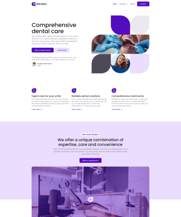
Let’s face it, most people aren’t thrilled about going to the dentist. That’s why this kit goes beyond clean design. It’s built to calm nerves, build trust, and make booking an appointment effortless.
At first glance, visitors see real dentists, real patients, and confident smiles. The hero pairs bold visuals with a warm testimonial and a clear call-to-action, instantly setting a reassuring tone.
Appointment buttons are right where you need them, visible, not pushy. Services are clearly explained on the homepage, and a video adds a personal touch. The About page feels welcoming, with bios, photos, and office hours front and center.
Even the Features page is thoughtfully structured, giving patients all the info they need, with friendly CTAs guiding them the whole way.
UX highlights:
- Emotionally intelligent layout that builds trust through visuals and testimonials
- Clear navigation and repeated CTAs make booking effortless
- Strong hierarchy of information, patients get what they need, right when they need it
- Overlapping content sections and creative layouts add visual interest
- Consistent branding with purple tones adds a consistent, calming feel across every page
Best for: Dental clinics, orthodontists, private practices, pediatric dentists, and any healthcare provider who wants to reduce friction and boost trust
Included templates: Home, About, Features, Contact, 404
Color: Blue | Font: Modern | Mode: Light
EV charger page kit

This kit is built to spark trust from the first scroll. The hero keeps it simple with a bold image, clean copy, and just enough contrast.
Scroll down and you’ll see why their chargers stand out, backed up with smooth visuals, easy buttons, and testimonials that feel real. The About page leans into purpose with a clear mission statement and product photos that do the talking.
Pricing is handled smartly with two clear options for every plan: get started now or chat with sales if you need a nudge. And if questions pop up, an FAQ and support CTA have you covered.
Even the colors work for them, greens woven through buttons and accents quietly reinforce the brand’s eco mission.
UX highlights:
- Minimal hero with strong copy and imagery sets the tone
- Smooth Z-layout keeps long content engaging
- Pricing page balances confidence with support
- Consistent green palette reinforces the eco-brand message
Best for: EV charging companies, green tech startups, energy providers, and sustainable product brands that want a clean, trustworthy site
Included templates: Home, About, Features, Contact, Pricing, Blog, Blog post, 404
Color: Meadow | Font: Tech | Mode: Light
Fintech page kit

The Fintech page kit gives a bold, trustworthy presence, right from the start. From the moment users land, they see real traction: strong copy, vibrant branding, and big social proof numbers that build instant credibility.
Every page is designed with a purpose. The homepage flows naturally through pain points, product benefits, and visual app previews, ending with clear call to actions and built-in FAQs to reduce friction.
The About page humanizes your brand with real faces and values, while the Features page stands out with a bold broken grid layout that keeps readers engaged.
The blog is thoughtfully designed as well, using branded colors, structured layouts, and a post page that puts content and author front and center.
UX highlights:
- Trust-building layout with prominent social proof and visual credibility
- Clear, intentional flow that guides users from awareness to action
- Unique visual design (broken grids, layered elements, rich color use) that keeps readers engaged
- Clean, minimal contact page, everything users need, nothing they don’t
- Seamless content experience, from blog discovery to post readability
Best for: Fintech, SaaS, crypto, and digital product brands that want a modern, conversion-focused site
Included templates: Home, About, Features, Contact, Blog, Post
Color: Indigo | Font: Wide | Mode: Light
Handyman page kit

The Handyman page kit is built for local service providers who want to look professional while keeping things personal. It features a clean, approachable layout with bold blues, smart use of space, and authentic visuals that build trust from the start.
Visitors get a clear picture of your services, pricing, and process, without digging. Unique layouts, overlapping images, and testimonial blocks keep pages visually interesting while guiding users naturally toward contact or booking. Whether they’re browsing your projects or reading a blog post, CTAs and contact options are always easy to find.
UX highlights:
- Consistent hero layout across pages for visual consistency
- Imagery of the handyman at work builds instant credibility
- Overlapping and broken grid layouts keep content engaging but easy to follow
- Essential info, like pricing and contact, is always within reach
- Friendly, personal tone that makes the brand feel approachable
Best for: Handymen, solo tradespeople, local repair services, home improvement professionals, or anyone offering hands-on services and wanting a polished, trustworthy online presence
Included templates: Home, About, Features, Contact, Pricing, Projects, Blog, Blog Post
Color: Blue | Font: Solid | Mode: Light
Joga page kit

This kit balances calm design with clear intent: sign up for courses. The centered header feels unique, with CTAs on both sides of the logo, while warm gold tones run consistently across the site.
The homepage hero leads with an enroll now CTA and a 14-day free trial, supported by benefits, testimonials, and a video of the instructor that builds trust. Courses are previewed in a simple three-column grid, while FOMO copy and repeated CTAs keep visitors moving forward.
The About page introduces the instructor with socials and partner logos, while course pages reuse smart sections, CTAs, FAQs, testimonials, to guide sign-ups. A blog grid, single post layout, and even a styled 404 page round things out.
UX highlights:
- Centered header design makes the site feel balanced and unique
- Warm gold/yellow palette ties design and brand together
- Video, testimonials, and logos build trust and familiarity
- CTAs repeated in smart places, never pushy, always inviting
Best for: Yoga instructors, wellness coaches, fitness trainers, online class creators, or anyone offering courses and wanting a warm, inviting online presence
Included templates: Home, Blog, Post, Author Page
Color: Gold | Font: Bold | Mode: Light
Life coach page kit

If your brand is built around inspiration, connection, or transformation, the Life Coach page kit is the perfect fit. Designed with vibrant colors and personality-packed layouts, this kit helps you connect authentically with your audience while guiding them effortlessly through your content.
What makes this kit special? It’s the thoughtful use of color, image overlays, and layout rhythm. From the homepage hero, where event promos stand out against deep-toned backgrounds, to the carefully shaped testimonial block, every section is created to feel inviting, grounded, and real.
The About page puts faces to names and values to your vision, making your brand feel human and trustworthy. And whether a visitor lands on your blog or event page, they’ll find a clean structure, clear call-to-actions, and content designed to guide, not clutter.
UX highlights:
- Eye-catching hero section with events up front, so users immediately know what’s happening
- Layered backgrounds and overlays that make key info stand out without overwhelming
- Unique image styling (rounded borders) that gives your site personality
- Clean, scannable blog and post layouts, great for content-heavy coaches or speakers
- One-click access to events and ticketing with strong CTA buttons
Best for: Life coaches, wellness professionals, motivational speakers, podcast hosts, event-based businesses, or anyone in the personal growth space who wants to build trust and stay visually bold
Included templates: Home, About, Blog, Post, Events
Color: Crimson | Font: Modern | Mode: Light
Logistics page kit

The Logistics page kit is all about precision and flexibility, just like a great logistics business. Designed for companies that want to look modern and reliable from the first click, this kit combines bold visuals, practical layouts, and a strong user experience to help visitors find exactly what they need. You get two options for most pages, so you can pick the vibe that matches your business best.
From the start, the full-width hero images (broken into eye-catching shapes) give your website a unique edge. These visuals aren’t just for show, they help visitors connect your brand with professionalism, innovation, and trust. Throughout the kit, you’ll see thoughtful use of brand colors and overlays to keep everything consistent, clean, and on-brand.
This kit helps you communicate value clearly and quickly. Show off your services, pricing tiers, team, and values without overwhelming your visitors. Built-in testimonial sections, image-rich layouts, and trust-building FAQs work together to ease doubts and nudge users toward conversion.
UX highlights:
- Visually distinctive hero sections grab attention immediately
- Clear structure for services, pricing, and contact info, no guesswork for visitors
- Reusable decorative blocks add a nice touch without distraction
- Options for each page type let you customize your website’s personality
- Designed to build credibility fast with social proof, team intros, and values
Best for: Logistics companies, shipping firms, warehouses, supply chain managers, delivery services, transport professionals, and businesses needing a high-trust online presence
Included templates: Home 01, Home 02, About 01, About 02, Features, Contact 01, Contact 02, Pricing 01, Pricing 02, FAQ, Blog, Blog Post
Color: Chocolate | Font: Bold | Mode: Light
Real estate page kit

The Real Estate page kit gives your listings the spotlight they deserve with a clean, bright layout and intuitive navigation. It helps you build trust fast and makes browsing easy for buyers and renters.
The layout uses warm visuals, brand-colored accents (in pink), and real photography to create a welcoming feel. A double-tiered header keeps contact info and calls-to-action front and center, while the homepage guides users through featured listings, credibility stats, and client testimonials, all in a smooth, scroll-friendly flow.
Tabbed filters on the portfolio page make it effortless to explore rentals and properties for sale. Clear sections for your team, principles, and FAQs help visitors feel informed and supported at every step.
UX Highlights:
- Clean, image-forward layouts that showcase properties beautifully
- Tabbed browsing for quick access to all, rental, or for-sale listings
- Smart visual hierarchy with soft color highlights to guide attention
- Contact info and CTAs are always within reach, no digging required
- FAQ sections on multiple pages to clear up confusion before it starts
Best for: Real estate agencies, property managers, brokers, and independent agents who want a professional online presence that builds trust and turns views into inquiries
Included templates: Home, About, Contact, Portfolio
Color: Violet | Font: Wide | Mode: Light
Software page kit

The Software page kit is designed to show, not just tell, with visuals from your actual software interface woven right into the layout. This kit helps your product speak for itself, while the layout quietly does the heavy lifting.
You’ll find two homepage options, each tailored for a slightly different vibe. The first puts your software front and center, using screenshots and real data to build trust right away. Clean Z-shaped layouts and smartly placed CTAs guide users through your value prop without making them think twice.
The second homepage leans more human, featuring real faces, social proof logos, and softer calls to action. Whether you want to emphasize product features or customer connection, you’ve got options.
Everything in this kit is built to support user flow. CTAs are visible but never pushy. Contact info is clear and accessible. The design stays sleek, consistent, and true to your brand, especially with the blue color theme that appears across each section.
UX highlights:
- Two distinct homepages to match your brand voice, visual-first or people-first
- Built-in software mockups and testimonial blocks that establish trust quickly
- Thoughtful visual hierarchy and spacing to guide users naturally through the content
- Subtle, stylish design details that elevate the experience without adding noise
- Clear, focused calls to action throughout
Best for: SaaS startups, software companies, product teams, analytics platforms, or any digital product that needs to look polished and trustworthy out of the box
Included templates: Home 01, Home 02, About, Blog, Blog Post
Color: Sky | Font: Tech | Mode: Light
Tax advisory page kit

This kit is designed to feel professional and approachable at the same time. Clean layouts, plenty of whitespace, and smiling team photos build instant trust while keeping things engaging.
The homepage hero combines a bold heading with a broken-grid layout of real professionals, human faces that make the service more relatable. Benefits are laid out in simple grids, FAQs clear up lingering doubts, and testimonials add credibility with authentic client voices.
Content-heavy sections use a smooth Z-layout, and CTAs for consultations are repeated across pages, making it easy to take action. The About page and Features page both lean on team imagery and a clear brand promise, while the Contact page gets straight to the point with a strong “Contact us today” callout.
A consistent blog grid adds depth, and even the 404 page is clean and professional, guiding visitors back without friction.
UX highlights:
- Hero section blends authority with human connection
- Grids and Z-layout keep info digestible
- Testimonials and repeated CTAs build credibility fast
- Consistent use of smiling team photos makes the brand approachable
Best for: Tax advisors, accounting firms, financial consultants, legal offices, or any professional service that needs to appear credible, approachable, and client-focused
Included templates: Home, About, Features, Contact
Color: Gold | Font: Classic | Mode: Light
How to use a page kit for WordPress in Mosaic
Good news is you don’t need to be a designer or a developer to use a page kit for WordPress in Mosaic. Actually, the whole point is making it really simple and even a little fun to get your website up and running.
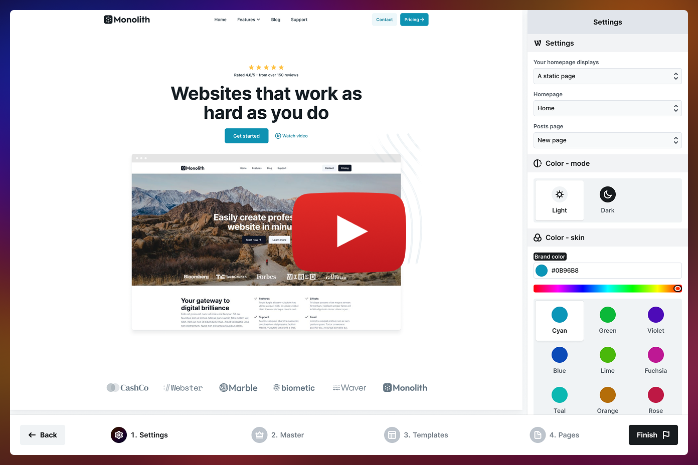
When you set up any Mosaic theme, there’s a setup Wizard that takes you through everything step-by-step. It helps you pick the best layouts, styles, and pages depending on what kind of site you’re aiming to create. Let’s see how the setup process goes.
1. Start the Wizard
When you hit the button to add a new theme in Mosaic, you’ll open up the Wizard. That’s where you’ll first get to pick your theme. After that, it guides you through setting up your website’s basics super easily.
2. Set up the basics
The next step will take you to some important settings:
- Homepage display: Choose whether your homepage shows your latest posts (great for blogs) or a static page (ideal for business or portfolio sites).
- Homepage + Posts page: If you go with a static homepage, pick which existing pages will be used for your home and blog.
- Color – mode: You get to pick and instantly preview how your website will look.
- Color – skin: Choose from a range of stunning color options for your skin, or enter your own hex code to match your brand. The preview updates live, so you can see exactly what works.
- Gibraltar theme options: Indigo, Blue, Chocolate, Gold, Crimson, Sky, Violet, Meadow
- Monolith theme options: Cyan, Green, Violet, Blue, Lime, Fuchsia, Teal, Orange, Rose
- Font – skin: Choose a font combination that reflects your style.
- Gibraltar theme fonts: Modern, Solid, Bold, Classic, Tech, Wide
- Monolith theme fonts: Neutral, Elegant, Timeless, Geometric, Modern, Futuristic
3. Choose your header & footer
Alright, now you’re at the Master setup. This is where you get to choose how your website’s header and footer will look.
Do you want a bold top navigation? Or maybe a simple footer? You can easily preview them and switch them out. And don’t worry, you can always change things or try something new later from the page kit library.
4. Select your page kit templates
Then, you can pick the main page templates for your website, like:
- Homepage
- Blog
- Single Post
- 404 Page
If you choose ‘latest posts’ for your homepage, you’ll skip the homepage template step because your blog page serves as your homepage.
When you’re picking a layout for your blog, you can decide how many posts show up on each page. It’s a small thing, but it’s actually pretty useful.
5. Select more pages from the kits (if you want to)
Need an About page, Services, or Contact? This is the spot where you can add all those extra pages. You can easily browse the page kit library by category to find what suits your website best. Pick as many or as few as you want. And if you decide to skip this part, no worries, you can always add those pages later.
Once you’re all set, just click Finish, and your website will be created, with an aesthetic design, organized layout, and stunning content.
6. Customize your content
Once you set up your WordPress page kit, it’s completely yours to customize. You can replace the content, add your own images, change the colors, adjust the layout, whatever you want. Mosaic is fully visual, allowing you to drag and drop everything. And you never have to touch a line of code.
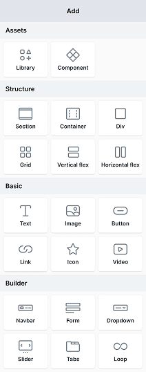
Every Mpsaic WordPress page kit includes reusable Blocks like hero sections, testimonial sliders, pricing tables, and FAQs. You can easily add these to any page, arrange them however you like, or even combine sections from different kits if you feel like it.
You can even add pre-designed page layouts to new pages whenever you want, right from the Mosaic WordPress page kit library. And the best part? Everything will look great on phones, tablets, and desktops since responsive design is already built in.
Tips for getting the most from your WordPress page kit
So you’ve chosen your theme and set up your kit, but if you want to really maximize your WordPress page kit, a few useful tips can make a big difference.
Start with the essentials
We know it’s super tempting to add every page and block you see, but try to hold back on that for now. Just concentrate on the essentials: Home, About, Services, Contact, and maybe a Blog. You can always add more later.
Add real content ASAP
Even if you don’t have the final copy or images yet, it’s a good idea to swap out the placeholder stuff with something that resembles the real thing. It gives you a better idea of how your website will look and helps you spot any layout problems early on.
Don’t forget the library
Just a reminder that the Mosaic WordPress page kit library is always available for you. You can check it out whenever you want, grab a new design, experiment with a new block, or get some ideas from layouts you haven’t tried before.
Keep it flexible
The beauty of a page kit is that it’s built to evolve with you. Need to add a new service? Create a landing page? Just go back into the library, drop in a new layout, and you are good to go. You’re never locked in.
Final thoughts
Building a WordPress website used to mean juggling plugins, searching for CSS fixes, and doubting every design decision. But with WordPress page kits built into every Mosaic theme, that complexity is gone, leaving you with a clear, creative path forward.
They’re the perfect mix of structure and freedom: enough to guide you, flexible enough to make it your own.
Best of all, you’re never locked in. Mosaic’s growing WordPress page kit library is always there when you need a fresh start, whether you’re launching something new or just ready for a glow-up. Swap out layouts, try a new style, and move forward fast, no rebuilding required.
If you’ve been waiting for the right time to start or redesign your website, this is it. Pick a theme, open the Wizard, and let Mosaic do the heavy lifting.