


Introduction
The About us page is a very important part of your website design. Everyone’s curious about who you are, what you stand for, and why they should trust you.
So, how do you create one that actually makes an impact?
That’s exactly what this post is here for. We’re going to go in depth on the ins and outs of About us page design, especially for WordPress. I’ll guide you through everything from what an About us page should include to writing a genuine copy, and even sharing some design ideas and examples that not only look great but also help convert visitors.
What is an about us page for a website?
The About us page is basically your opportunity to tell your story:
- Why did you get started
- What you believe in
- How can you make a difference
It’s all about building trust. When someone clicks on that ‘About’ link in your menu, they’re often feeling curious or a bit cautious, wanting to connect. This is your chance to show them there are genuine people with a reason behind your work.
You might have the best story in the world, but if your page is messy, hard to read, or feels too impersonal, it will drive people away. A great about us page design should be clear, reflect your brand’s personality, and be user-friendly. Everything from your layout and fonts to your images and the way information flows adds to how your story is received.
Each about us page has its own unique touch, but the key ingredients are the same: be genuine, be straightforward, and help others feel like they can trust you.
How to write an about us page for your website?
Creating an awesome About us page isn’t just about cramming in a bunch of stuff and seeing what works. It’s all about finding the right mix of structure and brand personality. Those are the key ingredients that really make an About us page connect with its target audience.
Welcoming headline
Forget the boring About us page header. You’ve got just one line to make a visitor feel at home, so make it impactful. Your headline should create the right vibe and clearly indicate what the reader can expect to learn or experience by continuing.
Start with your story
Skip the jargon and stiff bios. An effective About us page should feel like a chat. Talk about your journey instead of just listing achievements. People relate to genuine challenges and the passion behind what you do.
Let your visitors know:
- Why you started
- What drives you
- What makes you different
Even a short narrative can go a long way in making you memorable.
Put a face to your brand
This one’s simple, but super effective. Stock photos can feel impersonal, but using real people helps establish trust on your about us page. These images create a genuine connection. And here’s a little extra advice, make sure the vibe matches your brand. If your website has a fun and laid-back feel, go for images that are more relaxed and friendly instead of stiff and formal.
Make sure your visuals align with your brand. Your images, layout, and colors should all capture your brand’s vibe. Are you fun and adventurous? Classy? Creative? Everything from your background images to your icons should resonate with your brand identity.
Values, mission, or vision statement
Instead of just sharing what you do, share the reasons behind it on your about us page. This is super important for businesses and nonprofits. People are more likely to support those who share their values.
Make it skimmable:
- A short mission statement
- A few key beliefs or principles
- A look at the impact you want to make
Keep it short and fun
Remember that no one wants to read a long story on your About us page. Keep it simple and fun. Ditch the fancy words, steer clear of stiff language, and break it down into easy-to-digest parts.
Think about those who skim through, so use subheadings and bold text to catch their attention. If someone scrolls quickly, they should still understand who you are and what you do.
Social proof or achievements
You’re not showing off, you’re just supporting your claims. Things like client logos, testimonials, certifications, or media mentions really help build trust. It can be particularly effective for designing the About us page on agency websites.
End with a clear call-to-action
Make sure your visitors know what to do next after they check out your page. A well-designed About us section should lead them to take a specific action.
Here are some CTAs:
- Let’s work together → link to your contact page
- See my portfolio → link to projects
- Follow our journey → link to social media
- Even just a ‘Say hi!’ button can make a difference
Clean, thoughtful layout
Design matters. If your About us page is all messy, people will just bounce. Make sure to use some white space, easy-to-read fonts, and clearly separate sections. Let your text and images have some room to breathe. And if you’re on WordPress, check out builders like Mosaic, which help you create a layout that’s smooth and user-friendly.
About us page examples
Nothing really makes ideas come alive like seeing real about us page examples. You’ve got the structure, so now let’s look at some about page website examples that really hit the mark. All the templates featured here were made using Mosaic in WordPress.
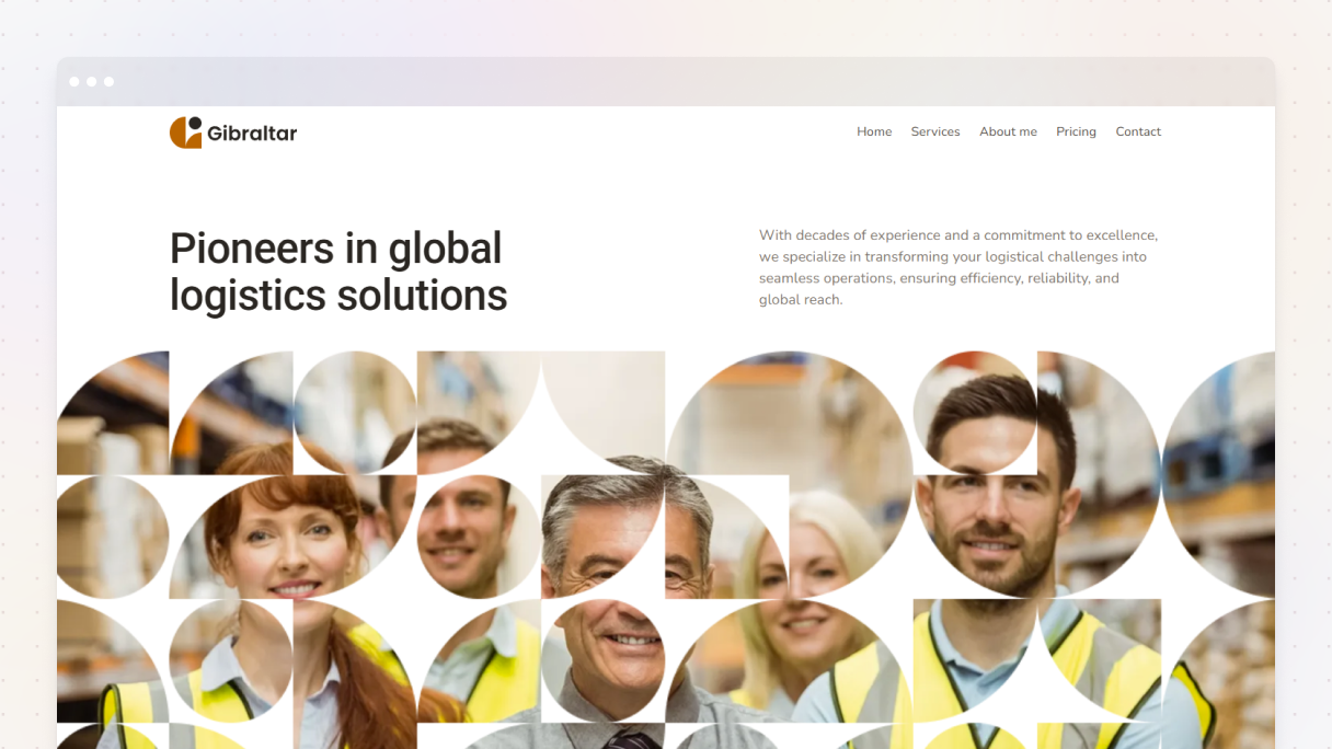
Logistics 02
The Logistics 02 about us page from the Gibraltar theme perfectly blends structure with the brand’s unique vibe. It kicks off with a striking headline and a straightforward call-to-action button that encourages visitors to ask for a quote, no confusion there. Then, it showcases the team with genuine photos snapped in their warehouse, adding a personal and authentic touch to the brand.
Next up is social proof of key achievements, highlighted with bold purple percentages on a crisp white background. This instantly boosts credibility by presenting actual results instead of just empty claims.
At the bottom of the page, there’s a straightforward invitation, along with contact info and a map, so it’s super easy for visitors to get in touch.
Why it works:
- Clear CTAs guide visitors at every step
- Real team photos build connection
- Hard proof (percentages) earns trust
- Well-structured flow makes the next step obvious
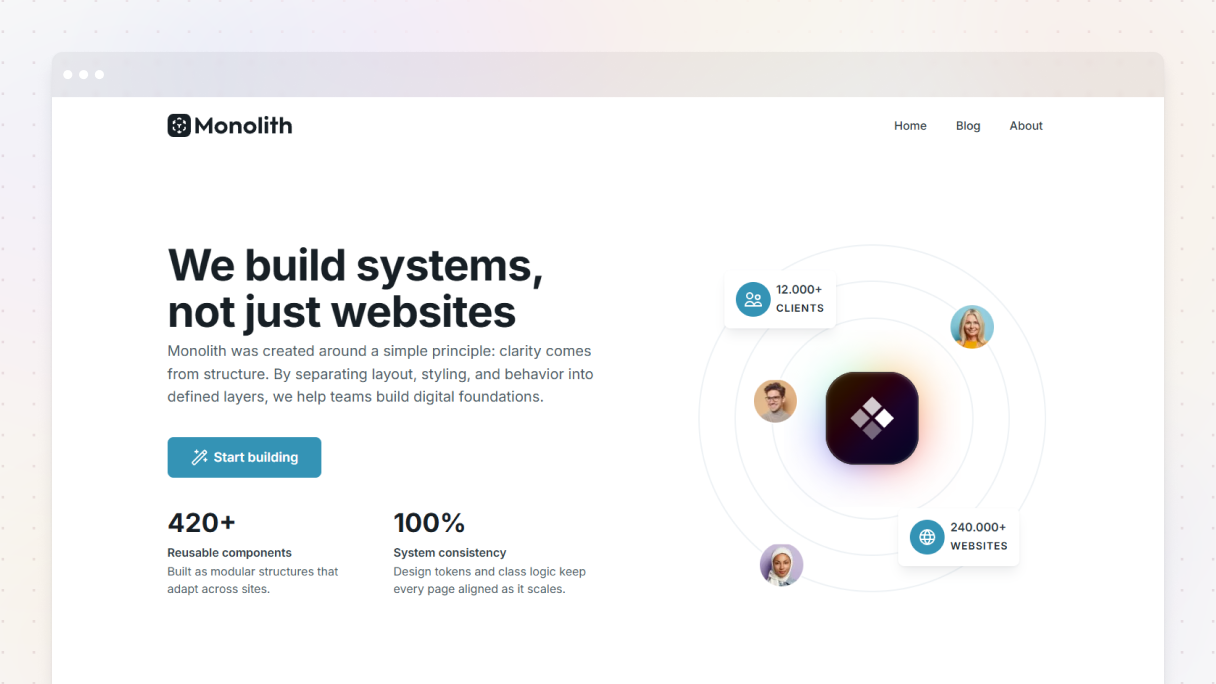
Architect 01
The Architect 01 about us page from the Monolith theme really nails the About us section. It kicks off with a catchy headline, ‘The story of us’, which immediately establishes trust and adds character to the brand, super important for smaller businesses.
It showcases important milestones with team pictures and significant years, then features bold figures that highlight their successes. Customer reviews are presented in a sleek slider against architectural backdrops, creating a visually appealing display of social proof.
The entire team is shown with images, brief bios, and social media links, which adds a personal touch to the brand. Even though there’s plenty of content, the neat design and ample whitespace make it feel effortless and enjoyable to read.
It wraps up with a clear CTA, ‘Let’s work together’, and a ‘Get in touch’ button paired with a contact number so the next steps are obvious for any visitor.
Why it works:
- Storytelling connects with visitors on an emotional level
- Visual milestones and actual stats add credibility
- Stylish testimonials and team intros build trust
- Clear next step keeps visitors engaged and moving in the right direction
Fintech 01
The Fintech 01 about us page from the Gibraltar theme really hits the mark with its straightforward and powerful design. It starts by highlighting major accomplishments, using plenty of whitespace to let those big numbers shine. Plus, it addresses the audience’s challenges head-on, and the customer’s images help build a sense of trust.
It points out four ways they stand out from the competition, urging visitors to consider making a change. The page wraps up with some team pictures, which adds a personal vibe and helps build a connection.
The layout is simple and direct, which makes it easy to navigate and understand its message.
Why it works:
- Clear messaging without fluff
- Emotional connection built through customer imagery and copy
- Clean design makes key points stand out
- Personal touches (team photos) create trust
Interior 01
The Interior 01 about us page from the Monolith theme gets it just right with its fresh and inviting design, making it a perfect match for an interior brand. It starts with a friendly headline, ‘Your style, our passion’, and a gentle subheading, ‘Dream space awaits’, which creates a lovely vibe right from the beginning.
They ditch the formal bios and go for a more personal touch, showcasing team members smiling in nice settings, along with their details and social media links. Plus, they spotlight their accomplishments to create trust right away, all without cluttering the page.
The design is really seamless, featuring stunning interior photos that perfectly align with their brand’s style. To top it off, there’s a friendly contact form at the end that encourages visitors to get in touch with a friendly note saying, ‘We’d love to chat’, plus all their contact info is super easy to find.
Why it works:
- Cozy, friendly vibe that makes visitors feel at home
- No buzzwords, just the essentials that matter
- Genuine team profiles add connection and trust
- Smooth design that reflects the brand’s personality
Dentist 01
The Dentist 01 about us page from the Gibraltar theme really puts visitors first. They kick things off with their opening hours right at the top, which is super useful for anyone needing quick info. Then, there’s a clear call to action that nudges visitors to book an appointment.
This page creates a sense of trust by showcasing cheerful images of satisfied patients and their bright smiles, along with genuine testimonials to calm any anxieties (because, let’s be honest, going to the dentist can be a bit scary). It also features the team with friendly, smiling photos and brief bios, which helps the brand feel more approachable.
A features section highlights the services they offer, and the page wraps up with some quick stats and a simple contact form, so patients can take their time and reach out without any pressure.
Why it works:
- Visitor-first design that’s helpful from the start
- Trust-building imagery and genuine testimonials
- Friendly team introductions ease patient anxiety
- Clear CTAs guide visitors to book
SEO 01
The SEO 01 from the Monolith theme really adds a twist to the About us page, making it super inviting for visitors to join the team. The headline is straightforward, ‘Come be a part of the team’, and there’s a handy CTA button right below that says ‘See Openings’.
It starts strong by showcasing some impressive stats to build trust, then introduces its team with playful doodle-style graphics and even provides ways to reach out to each member. After that, it lists open positions with inviting phrases like ‘Come find your spot’, and there’s a simple apply button for every job.
The page wraps up by highlighting the company’s main values, allowing both sides to determine if it’s a good match before moving forward.
Why it works:
- Clear purpose that encourages action from the start
- Friendly, inviting design builds connection
- Team-oriented approach makes the company feel relatable
- Sharing values draws in the right individuals
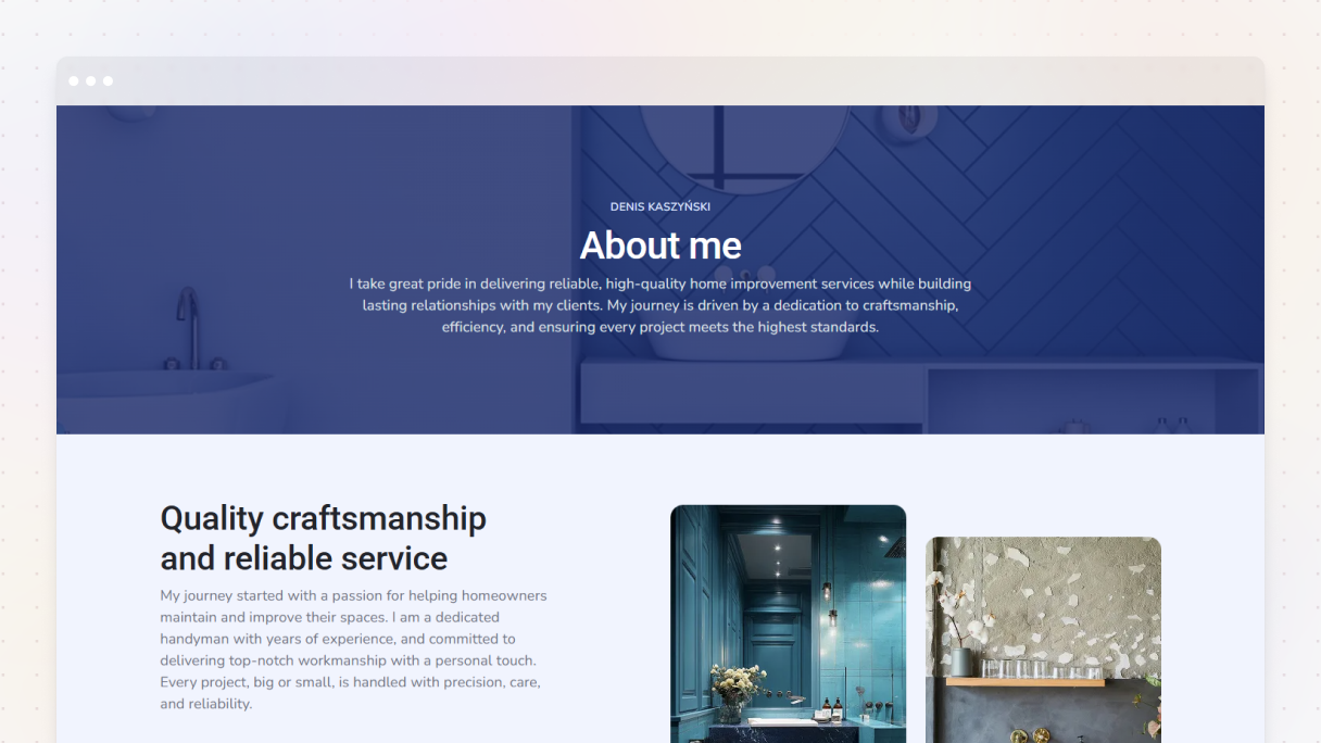
Handyman 01
The Handyman 01 about us page from the Gibraltar theme really shows how impactful an About me page can be. It not only shares business info, but actually shows visitors what the handyman does through a video, which helps build trust and adds a personal touch.
The design really catches your eye with its overlapping sections and a cool broken grid layout that feels edgy. It guides visitors through the handyman’s process, showing real, ongoing work in the images, which makes it feel genuine.
There’s also a glowing review from a satisfied customer to boost credibility. To wrap things up, the page features a straightforward contact section, providing several convenient options for visitors to reach out.
Why it works:
- Quickly builds trust with video storytelling
- Unique layout keeps visitors interested
- Real work imagery adds authenticity
- Clear contact options make it easy to take action
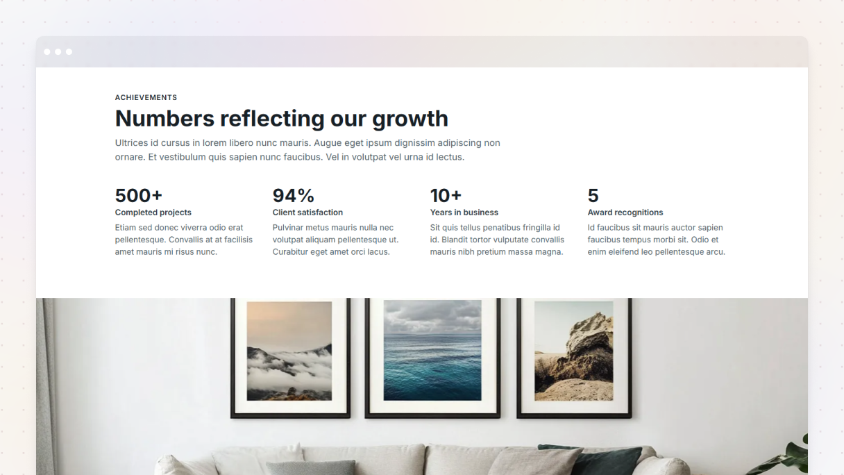
Finance 01
The About us page for Finance 01 from the Monolith theme is really well done. It starts off with a catchy line that sets the vibe, ‘Small team, big expertise’, and features a nice photo of the two-person team in their office, which gives it a personal feel.
To support their bold claim, they present actual statistics organized in four tidy columns. After that, they showcase each team member in a zigzag format, a picture on one side, a brief bio, and social media links on the opposite side.
At the bottom, they emphasize their main values and important achievements, making it easier for visitors to relate to the brand’s mission and boosting their trustworthiness.
Why it works:
- Solid evidence backing the bold claims
- Personal, approachable design builds trust
- Clear values and milestones connect emotionally
- Smooth flow keeps visitors interested
Business 01
Business 01 from the Gibraltar theme gives the About us page a creative twist. The design features varying border radiuses on each image, creating a playful and vibrant atmosphere, enhanced by bright team photos that showcase the people behind the brand.
It showcases the standout features that differentiate them from the competition, making them unforgettable. Next, there’s a fun section introducing the team with the catchy title. Following that, they flaunt their accomplishments with impressive stats. These are supported by client testimonials to boost credibility even further.
The page ends with a simple call to action, featuring a map and all their contact info, which makes it very easy for visitors to get in touch.
Why it works:
- Creative design that grabs attention
- Strong brand personality through playful copy and imagery
- Social proof with achievements and testimonials
- Clear, inviting CTA to guide the next step
Why does about us page design matter?
Because tons of people check it out.
It’s one of the most popular pages on almost every website. And a great About us page design can help:
- Build trust
- Connect with people emotionally
- Showcase your unique vibe
- Boost conversions (seriously!)
When people find something they like, they’re likely to dig deeper. But if it looks dull or unclear? They’ll just leave.
Should I talk about myself or my audience?
Both, but don’t be afraid to focus on you first.
People check out your About us page to learn about the people behind the brand. Share your journey and take pride in it. After you’ve built that trust, show them how you can help. It creates a genuine and personal connection.
Can I add a call-to-action?
Absolutely! Your About us page is a great place to encourage people to take action in a way that feels natural, like:
- ‘Got any questions? Let’s chat’
- ‘Get started’
- ‘Let’s work together’
Just one friendly invitation is enough to guide the next step.
Final thoughts
Your About us page might not seem like the most exciting part of your website, but as you can see, its design is actually super important. It’s your opportunity to share who you are, what you stand for, and why your work matters.
So be real. Be memorable. Tell your story genuinely, and don’t be afraid to get a little creative. Add social proof, highlight what sets you apart, and let your personality shine through every word and design choice.
You’ll notice that when you put thought into your About us page design, it turns into more than just a bio, it creates a connection that can really make a difference.


