


What is a contact us page and why is it important?
If you’re building a website, make sure you pay attention to your contact us page. It might seem like a small thing, but it’s super important. A well-designed contact us page isn’t just a form, it’s a crucial part of your website’s design strategy. In this guide, we’ll explore effective contact us page design, break down high-performing contact us page examples, and share tips to help you improve your own.
So why is the contact us page on your website so important?
Basically, having a straightforward way for customers to reach you is very important. If they can’t find a way to contact you easily, they’ll probably just go to someone else. But if your website is user-friendly, you’re way more likely to convert those curious visitors into actual buyers.
A well-designed contact us page can:
- Build trust
- Improve user experience
- Drive action
- Support SEO and accessibility
Honestly, if your contact us page seems like an afterthought, you really need to rethink it. This one page can actually make a bigger impact on your business than you realize if you put some effort into its design.
What should a contact us page include?
A great contact us page design isn’t about cramming in every possible contact method, it’s about providing a smooth, intuitive experience. When visitors land on your contact us page, they should feel welcomed, guided, and confident about reaching out.
Here are some important elements you should consider using in your contact us page design:
- Simple contact form
- Business contact info
- Clear call-to-action (CTA)
- Social media links
- Map (when it makes sense)
A good contact us page design helps visitors take action and makes them feel heard and supported.
Contact us page design best practices
If you follow these contact us page design best practices, you’ll really see a difference in how your visitors connect with you. Let’s break down what works and why.
Keep it simple
A clean contact us page design with a logical flow and plenty of white space helps your visitors concentrate on what’s important, which is reaching out. If there are too many things on the page, it just creates confusion.
Use a clear CTA
Every great contact us page example includes a strong call-to-action that explains exactly what happens when visitors click the button.
Instead of the boring ‘Submit’, try using CTAs like:
- Send Message
- Get in Touch
- Talk to Our Team
- Request a Call
A good CTA can really help reduce doubts and increase conversions.
Stay on brand
Make sure your contact us page design doesn’t come off as thrown together. Keep your brand’s vibe consistent, whether it’s all serious or laid-back. Even the error messages and button labels should reflect your style.
Offer multiple ways to connect
Not everyone likes forms. Some people prefer email. Others might slide into your DMs. Provide the following as part of your contact us page design:
- A contact form
- Email address
- Phone number (if applicable)
- Social media links
- Live support (if available)
The simpler you make it for people to contact you, the more likely they are to do it.
Solve problems before they’re asked
You should include links to useful resources like FAQs, tutorials, a help center, and return policies in your contact us page design. It’ll help people find what they need without having to contact you directly. Plus, it means fewer random messages filling up your inbox.
Include a map (if it makes sense)
If your business has a location, let people know how to get there by adding a Google Map to your contact us page design. Just make sure it loads fast and doesn’t overshadow the form. If you don’t have a physical office, you can skip the map altogether.
Get to the point
Make sure to explain to users exactly what the contact us page is for and how to get started. A short intro with clear, welcoming language goes a long way. Make sure to explain to users what exactly the page is for and how to get started.
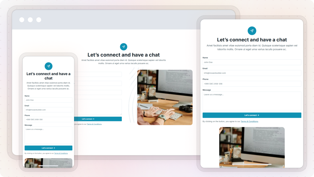
Only ask for what you need
We can all agree that long forms can be a bit scary. Just ask for the essentials on your contact us page, like their name, email, and message. Anything else? Totally optional or just for context. If you need to guide users by topic, try using dropdowns or forms that change based on their answers.
Add a team photo
Showing human faces really helps build trust. If you’re working with a small team or just want to make things feel more personal, consider adding a nice team photo or even just one friendly headshot along with their name and title to your contact us page design.

Include social proof
You should add something like, ‘Join over 10,000 satisfied customers’. Or maybe show some recent reviews or testimonials close to the form on your contact us page. It really helps to build trust.
Display hours of operation
If you provide phone support or services, make sure to let people know your availability on your contact us page. And if you’re not around, just mention that too, along with when they can expect to hear back from you.
Contact us page examples
Now that we’ve talked about the basics, let’s look at some great contact us page examples that showcase thoughtful design, all made in WordPress. These pages do more than just the minimum, they make visitors feel welcome, understood, and ready to take action.
Each one has its own use case, but they all have one important thing in common: they put the user first.
Gibraltar: Fintech 01
The Fintech 01 contact us page design from the Gibraltar theme in Mosaic really shows how a minimal design can still be engaging. It has these clean lines, brand colors, and simple shapes that help guide visitors without making things feel too crowded. Making it a great example for minimalist brands.
At the top, you get three contact options:
- Call
- Address
Each one is nicely placed in a white div that really pops against the slightly darker background. They’re arranged side-by-side, making it super easy to read through. There are no unnecessary details, just the key points.
Below that, there’s a two-column layout encouraging visitors to reach out. The left column provides some extra contact details, while the right features a simple form (just name, email, and message). The call-to-action button has a ‘Send Message’ text with a right-arrow icon, which makes it clear and inviting.
Why it stands out:
- Clean design that’s easy to navigate, with no distractions
- Multiple contact methods clearly displayed
- Branded, modern look without relying on visuals
- Straightforward form with only the necessary fields
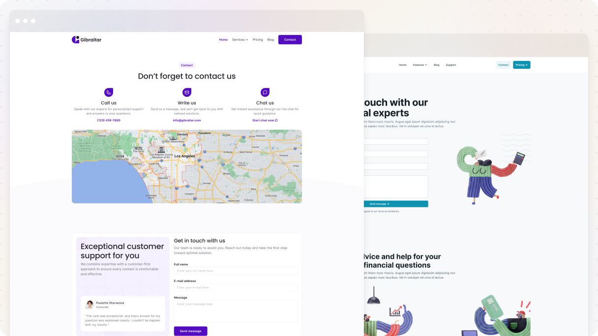
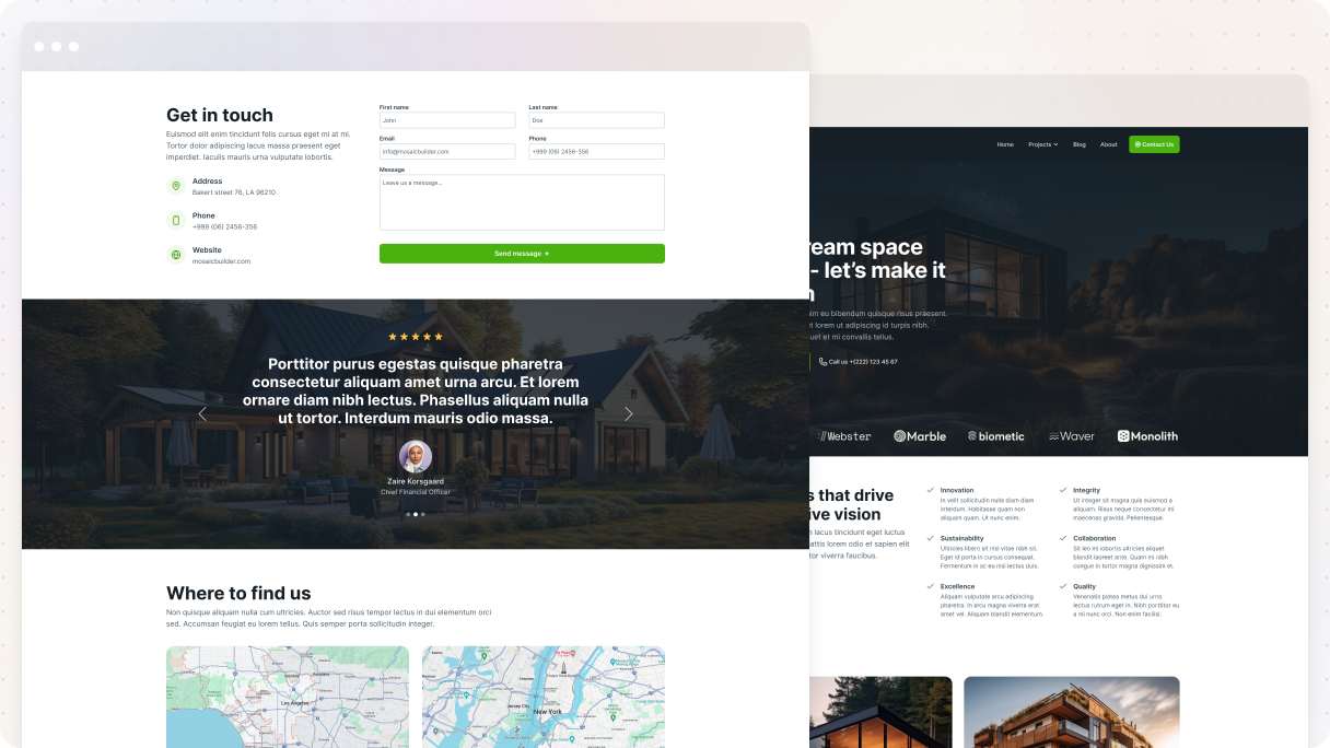
Monolith: SEO 01
The SEO 01 contact us page example from the Monolith theme does a great job of combining warmth and clarity in its design. It kicks off with a big graphic of people shaking hands, which instantly builds trust, along with a welcoming headline, ‘Get in touch with us’.
Just below, you’ll find three straightforward ways to reach out:
- Call us
- Write us
- Chat with us
The following part features a two-column design, with a simple form on the left and a map on the right. The form only requests the basics, and the ‘Send Message’ button is friendly and welcoming.
There’s also a testimonial section, which really boosts credibility. And finally, the last part is pretty cool, interactive tabs guide users through the process of contacting them, complete with images and useful text.
Why it stands out:
- Trust-building visuals and a friendly tone
- Various ways to get in touch
- Clean layout with useful extras like a map and testimonials
- Interactive tabs make the process feel guided and easy
Gibraltar: Handyman 01
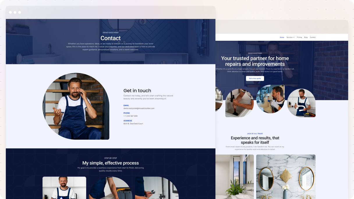
The Handyman 01 contact us page example from the Gibraltar theme really nails it when it comes to building trust and credibility from the start with its design. It features relatable, real-life images, like someone repairing a bathroom, which clearly demonstrates their expertise. It’s not just for show, it gives you a sense of reassurance.
The page is organized into distinct sections, each with its own background color to guide the eye:
- A hero section with an image background and dark purple overlay
- A light purple section with minimal contact info and one clean image
- A darker section with a stylish layout
- And a final light purple section that highlights glowing testimonials
What really stands out is the way the images are styled. Each one has its own unique border radius, giving it a nice vibe. And in the third section, they’ve got the images lined up next to each other, where they guide visitors through the process of working with them.
Why it stands out:
- Real, relevant images build immediate trust
- Clean, color-blocked layout makes each section easy to scan
- Unique image styling adds character
- Testimonials add social proof at the right moment
- Minimal, effective use of text and whitespace keeps it easy to read
Monolith: Architect 01
The Architect 01 contact us page example from the Monolith theme has everything you need for a contact us page design. It’s well-organized, easy to understand, and designed to encourage conversions.
Just under the header, there’s a straightforward contact form along with modern, icon-based contact details that are super easy to read. Following that, a testimonial section helps build trust at just the right moment.
Then, you’ll find maps for in-person visits, along with phone and email information. Plus, there’s a nice social media section that invites visitors to follow for future updates.
The page closes with a CTA section. It has a dark image background that makes the “Get in touch” button stand out, with a right-pointing arrow smoothly leading to the phone number.
Why it stands out:
- Clean layout with helpful details
- Includes trust-building testimonials
- Clear call-to-action
- Multiple ways to connect, all easy to find
Gibraltar: Dentist 01
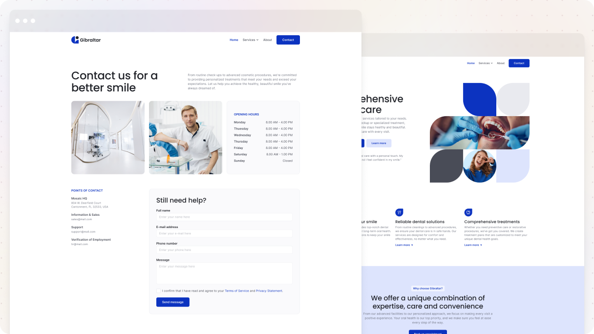
The Dentist 01 contact us page from the Gibraltar theme is a great example of how dental clinics, which have specific hours, should design their contact us page. The design concentrates fully on what visitors need.
It starts with a powerful headline, ‘Transforming smiles, changing lives’, along with branded images showing a dentist in action and a happy patient. The gentle purple overlay connects everything to the brand. On the side, it displays the hours of operation, which is essential for managing expectations.
In the second part, there’s a straightforward contact form that’s a no-brainer to fill out. It closes with a ‘Send Message’ button at the bottom, which stands out with a bold brand color, so it catches your eye without being too aggressive.
Why it stands out:
- Prioritizes opening hours right at the top
- Balanced visuals that reflect the brand and service
- Minimal content, maximum clarity
- Well-structured form with an effective, visible CTA
Monolith: Interior 01
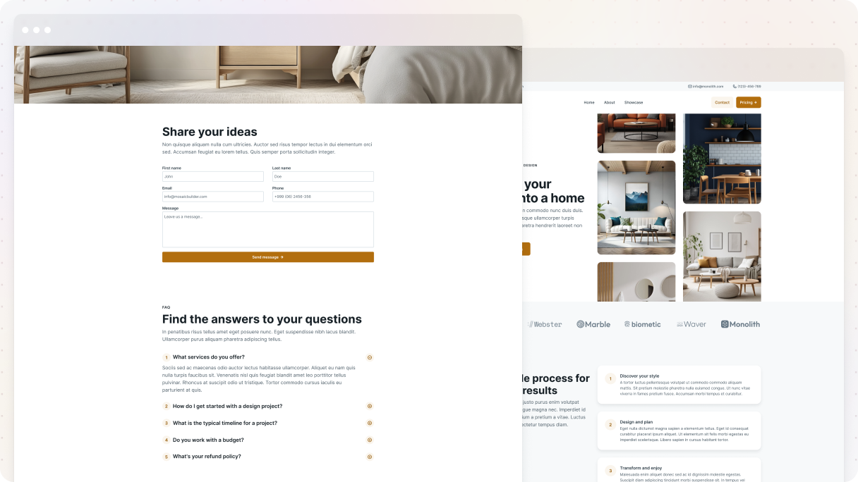
The Interior 01 contact us page example from the Monolith theme perfectly combines style and practicality for its design.
It starts off by encouraging users to share their thoughts via a branded contact form featuring a strong CTA button that really catches the eye.
Stunning full-width interior images create a high-end vibe that instantly builds trust. Plus, there’s a useful FAQ with dropdowns that addresses common questions without making the page feel crowded. They are great for user experience and keeping your inbox tidy.
It wraps up with a testimonial section called ‘How we’ve exceeded expectations’, which really adds to its credibility right before visitors head out.
Why it stands out:
- Nice visuals and layout with a bit of a luxury feel
- Helpful FAQ dropdown
- Clear CTA and simple form
- Strong close with social proof
Gibraltar: Logistics 01
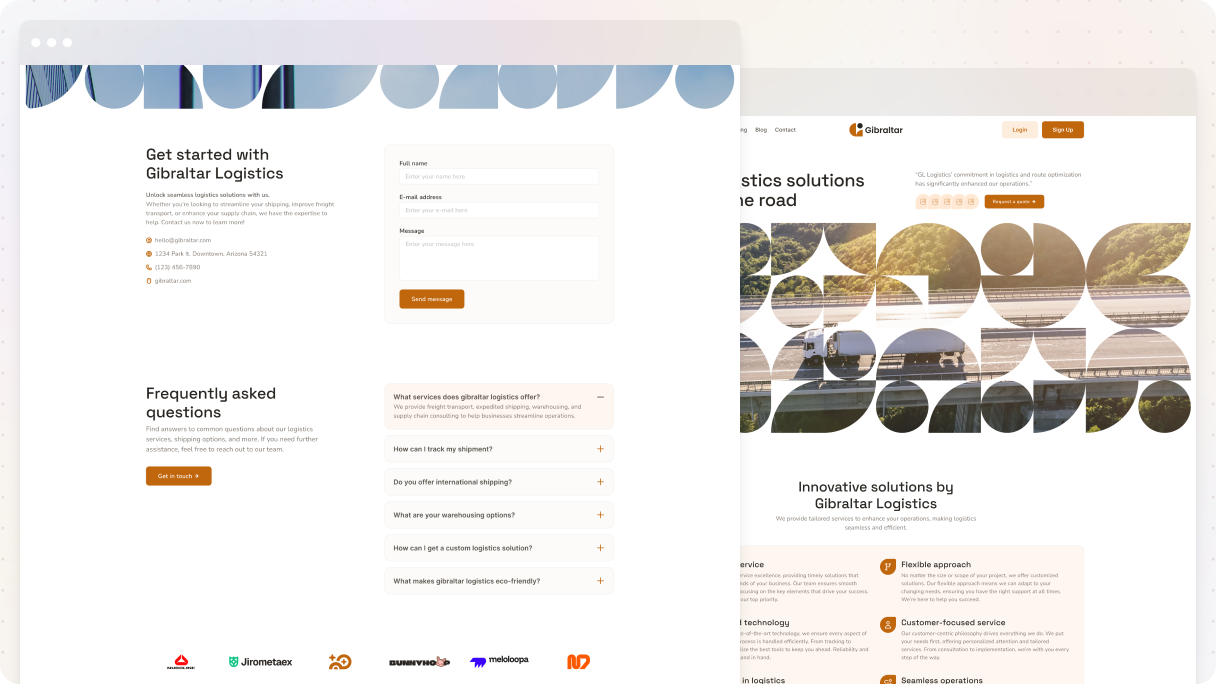
The Logistics 01 contact us page is an effective example that’s perfect for a service-based business’s design. It opens with an attention-grabbing full-width image of a blue sky and an airplane that blends smoothly with the background. Below, a two-column layout pairs clear contact details with a form that uses subtle contrast to draw attention.
The form is short and to the point, with a bold CTA in branded colors. The following section has an FAQ with dropdowns that address common questions and includes a second CTA for added engagement. The page wraps up with a section that displays trusted client logos, subtly building credibility.
Why it stands out:
- Eye-catching hero image with modern design
- Simple, well-placed form with strong CTA
- Smart use of FAQ to handle questions early
- Trusted-by section builds credibility without noise
Gibraltar: Tax advisory 01
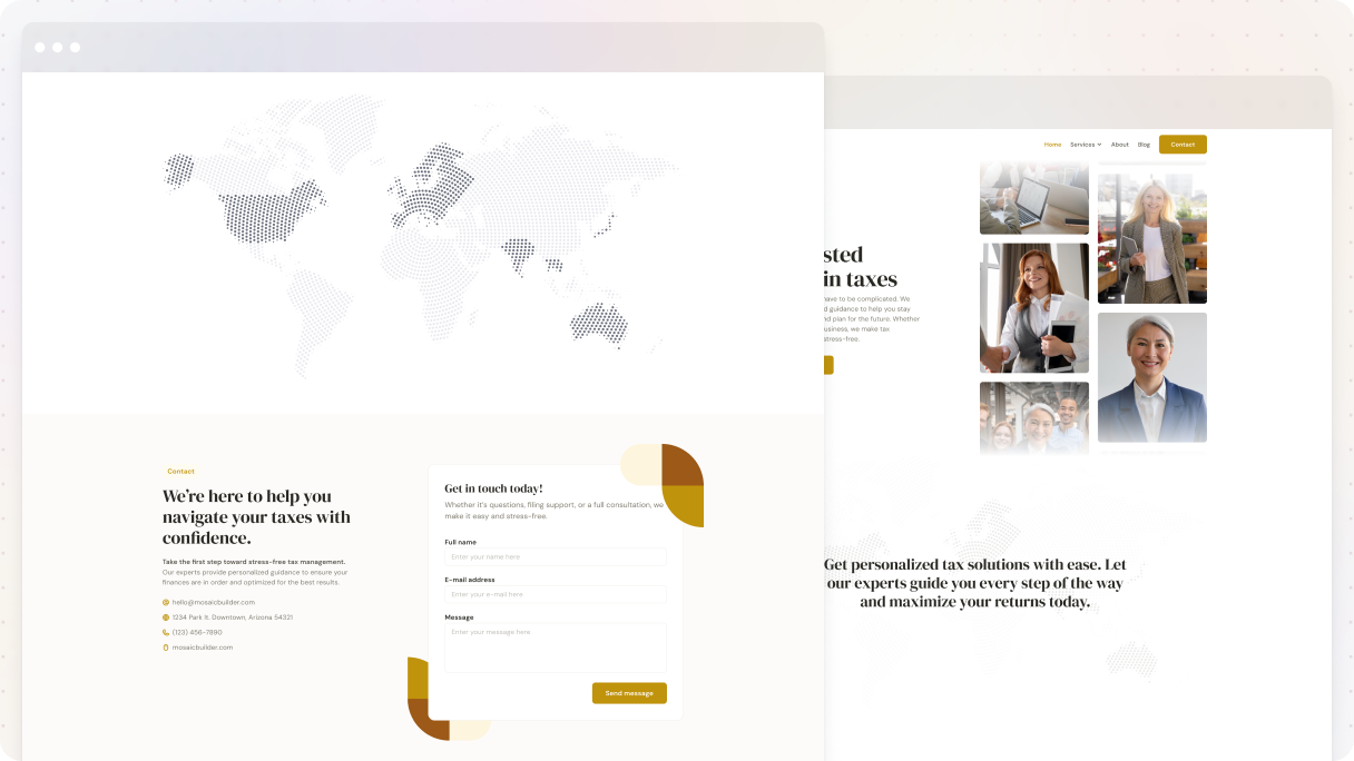
The Tax advisory 01 contact us page example from the Gibraltar theme is to the point, providing exactly what visitors are looking for in its design. It starts with a clear headline saying ‘Get in touch with us’, followed by necessary contact details like phone number, email, and live chat options.
Just below that, there’s a full-width map displaying the business location, and its unique shape adds a nice touch without cluttering the design. The page makes great use of whitespace, making everything easy to read.
It wraps up nicely with a centered call-to-action section that features a bold purple button that really stands out.
Why it stands out:
- Straightforward and focused
- Clean design with smart use of whitespace
- Multiple contact options, clearly shown
- Bold, eye-catching CTA
How to design a contact us page that converts?
Make it simple and straightforward. That means:
- Minimal distractions
- One clear call-to-action
- Easy-to-use form (ideally short)
- Mobile-first design
- Strong brand voice
- Helpful context (e.g.: what happens after submitting the form)
Don’t leave them guessing, guide them, and motivate them to take action.
Mobile-friendly contact us page design tips?
Here’s what you need:
- Big, tappable buttons and input fields
- Minimal scrolling
- Simple layout (1 column works best)
- Test on multiple screen sizes
Just a heads up, if it’s annoying to use on mobile, people will just bail.
Should I add a map, social links, or an address to my contact us page?
Absolutely, but only if they have a reason to be there:
- Map: Only if people visit you in person
- Social links: Awesome for giving people other ways to reach out
- Address: Builds trust and is useful for local SEO
Don’t add them “just because”. Make sure they are intentional.
Why do users visit the contact us page but don’t fill out the form?
Common reasons:
- Too many required fields
- Confusing layout
- Not clear about what happens after hitting submit
- Not mobile-friendly
How to edit/create a contact us page in WordPress?
If you want to create a contact page on your WordPress website, just go to your dashboard first. Click on ‘Pages’ and then select ‘Add Page’ to create a new one and name it. I recommend using a theme builder, like Mosaic, because it makes it super easy to design a custom contact page with a form and all your info.
After you install the Mosaic plugin, just open your new page and select ‘Edit with Mosaic’. You can adjust the layout, add your contact details, and make it look exactly how you want. When you’re satisfied with everything, go ahead and publish your contact page.
Conclusion
Let’s be real, the contact us page is often treated as an afterthought. But it’s actually one of the most important moments in your site’s journey. When someone goes to this page, they’re probably ready to talk, ask a question, or even start working with you. That’s a big deal.
So don’t fumble it. A great contact us page design should feel easy, friendly, and helpful. It should answer questions before they’re asked, give clear ways to reach you, and give people the confidence to click that ‘Send’ button.
All the contact us page examples we’ve gone through show how a simple, thoughtful design can go a long way. It doesn’t have to be fancy, just clear, on-brand, and built with the user in mind.
So if you’ve been putting off updating your contact page, now’s a good time. Give it the attention it deserves, and you might just turn more visitors into real connections.


