

Introduction
I bet you’ve thought about making it easier for people to explore your WordPress website. The secret is always in an awesome WordPress navigation menu.
The navigation menu is super important for how people engage with your content. It guides visitors on where to go next, and if you nail it, it can really boost engagement, lower bounce rates, and give your site a professional vibe.
We’ll cover what navigation menus are and how they function, and we’ll show you how to create, edit, and personalize them using the built-in WordPress features as well as a powerful theme builder, Mosaic.
You’ll also learn how to:
- Use the WordPress navigation block in the block editor (Gutenberg)
- Build and edit a responsive WordPress dropdown menu
- Customize mobile menus and layouts
- Style your menus with icons and custom designs
- Create advanced layouts like mega menus
What are WordPress navigation menus?
Let’s start with the basics, because if you’re new to WordPress, the term navigation menu might sound more technical than it really is.
A WordPress navigation menu is simply a collection of links that helps your visitors move around your website. You usually find it in the header (top) of your site, but you can also place menus in sidebars, footers, or even inside pages using the WordPress navigation block.
Think of it like the table of contents for your website, it helps people quickly find the content they’re looking for.
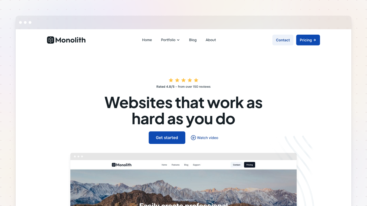
What does a navigation menu look like?
Most of the time, you’ll find links to your most important pages in your WordPress navigation menu, like these:
- Home
- About
- Blog
- Services or Products
- Contact
You know when you hover over a menu item and a bunch of links pop up underneath? That’s a WordPress dropdown menu. They’re really useful for sorting content into categories or subpages, especially if you’ve got tons of stuff to share.
What is the difference between a navigation bar and a navigation menu?
This can be really confusing for many, so let’s clear it up.
- The navigation menu is a list of links, like Home, Blog, and Contact.
- The navigation bar is the area, usually at the top of your website, where all those links are displayed.
Basically, the menu is the content, and the nav bar is like the frame that keeps it all together.
Where can you add navigation menus in WordPress?
You can display menus in different places in WordPress, depending on the theme you choose. The usual spots for menus are:
- Primary menu (usually in the header)
- Footer menu
- Mobile menu
- Sidebar menu
- Custom menu inside a page/post
Why is the navigation menu important?
Your navigation menu shapes how visitors interact with your website, how quickly they can find what they’re looking for, and whether they decide to stay or leave. So, let’s break down why having a solid menu is so important.
It makes your website easier to use
Nobody enjoys searching endlessly for your content. If your visitors can’t locate what they need in just a few clicks, they’re likely to bounce. An organized navigation menu makes all the difference.
If you have tons of content, like blog posts or service pages, it’s even more important to keep things organized. A WordPress dropdown menu can really help by grouping similar pages under one main link, which keeps your design user-friendly.
It improves the mobile experience
Having a solid mobile navigation menu really makes it easier for users to find what they’re looking for on their phones. If your menu is tricky to use or doesn’t display right, you could lose visitors quickly. That’s why a lot of the newer themes, especially those for WordPress, come with features to make menus responsive or to turn them into a hamburger icon.
Looking for more control? You can actually adjust the breakpoint, the screen size when your mobile menu appears, by using custom settings in certain builders, like Mosaic.
It boosts SEO and website structure
Your navigation menu is important not just for visitors but for search engines as well. When your menu links to your main pages, it helps Google figure out how your website is organized. Internal linking is a big deal for SEO, and your main menu is a powerful way to show which content matters most.
What’s the difference between pages, categories, and custom links in a menu?
So, now that we understand the importance of navigation menus, let’s go through what they are made of. WordPress offers a ton of options for creating your navigation menu, but honestly, it can be a bit overwhelming at the beginning.
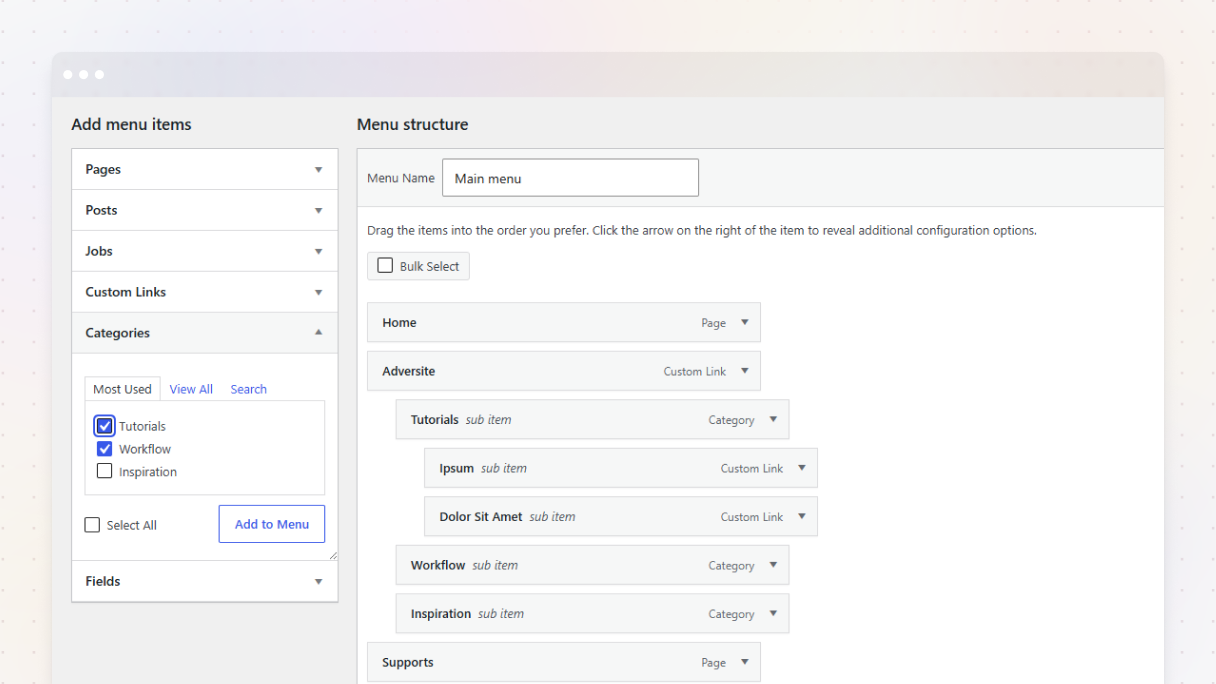
When you’re editing your WordPress menu, you’ll come across options like Pages, Categories, and Custom Links. Ever wondered what each of them means and when to use them?
Pages
Those pages you set up in WordPress, like your Home, About, Services, Contact, or Privacy Policy, pretty much stay the same and are the foundation of your website. When you create a menu, including these pages helps your visitors to easily access your main content.
Use Pages in your menu when:
- You want to link to important, permanent content
- You’re structuring your website around specific services or topics
Categories
Using categories is a smart way to organize your blog posts. Instead of going through the struggle of adding each post to your menu (which can get messy really quickly), you can just link to a category page. That way, it automatically shows all the posts that belong to that category.
Imagine you have a travel blog with different categories like:
- Europe
- Asia
- Travel Tips
You can include all those categories in your menu, and WordPress will automatically create archive pages for each one.
Use Categories in your menu when:
- You want to group related content
- You want your menu to update automatically with new blog posts
Custom links
You can add any URL to your menu with custom links. Link to an external website, a landing page, a file download, or just a placeholder menu item.
You could create a custom link for things like:
- A newsletter signup on a different platform
- A temporary campaign page
- A parent item that opens a WordPress dropdown menu, without actually linking to anywhere (just use # as the URL)
Use Custom links when:
- You need to link to something not listed in Pages or Categories
- You want full control over the URL and how it works
How to create and edit a navigation menu in WordPress
Alright, now that you’ve got the basics of a WordPress navigation menu down, it’s time to create one. You can either use the classic menu editor in the WordPress dashboard or try out the newer navigation block in the block editor. We’ll go through both options.
Creating a navigation menu using the classic WordPress menu editor
This method works perfectly when you want to quickly edit a WordPress menu without using advanced tools.
- Go to your dashboard
- Log into your WordPress website
- Head to Appearance → Menus
- Create a new menu
- Click ‘create a new menu’
- Give your menu a name (this is just for your reference, visitors won’t see it)
- Click ‘Create Menu’
- Add menu items
- On the left, you’ll see tabs for Pages, Posts, Custom Links, and Categories
- Check the items you want, then click ‘Add to Menu’
- Drag and drop items to rearrange them or nest them to create a WordPress dropdown menu
- Assign the menu to a location (this depends on your theme)
- Look for ‘Menu Settings’ under your menu structure
- Choose a location
- Click ‘Save Menu’
How to edit a WordPress navigation menu
If you’ve already got a menu and just need to make some changes, here’s how you can do it.
- Go to Appearance → Menus
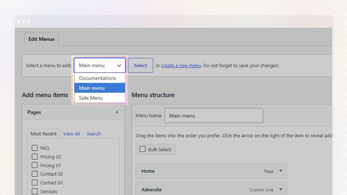
- Select the menu you want to edit from the dropdown
- Make your changes, like adding new items, renaming labels, or rearranging them using drag and drop
- Click ‘Save Menu’ when you’re done
You can also remove items by clicking the arrow next to a menu item and selecting the Remove option.
Creating a WordPress navigation menu using the navigation block
If you’re using the Block Editor (Gutenberg), you can add a menu right inside any page, post, or template using the WordPress navigation block.
Here’s how:
- Open the page or template you want to edit.
- Click the + Add Block button and search for Navigation.
- Select or create a new menu.
- Use the interface to add links, arrange them, or create submenus.
- Customize the alignment, style, and layout from the block settings panel on the right.
Switching between WordPress navigation menus
You can set up different menus in WordPress, like you can have one for the header and another for the footer. Just go to the Manage Locations tab next to the ‘Edit Menus’ tab to choose where each menu shows up.
How to create a WordPress dropdown menu inside your navbar?
If you want to organize your main menu and make it easier for people to find stuff, you should use some WordPress dropdown menus. They help group similar pages or categories under one main menu item, keeping your navigation bar organized while still allowing users to explore more detailed content easily.
What is a WordPress dropdown menu?
A dropdown menu (also known as a nested or sub-menu) is a type of menu that opens up to show more links when you move your mouse over it or click on it. This helps you add more links to your menu without making it too crowded for your visitors.
How to create a dropdown (nested) menu in WordPress?
- Go to Appearance → Menus
- Add your menu items as usual (Pages, Categories, or Custom Links)
- Drag and drop the items you want nested under a parent menu item slightly to the right
- Save your menu
Build a WordPress navigation menu in Mosaic
If you’re using Mosaic, you’re in for a treat. This powerful visual theme builder lets you completely customize your website’s layout, including the WordPress navigation menu.
In case you want a straightforward top menu, a cool mobile nav, or even a mega menu, Mosaic makes it super easy to do everything visually, no coding required.
Let’s go through how you can create flexible and mobile-friendly navigation menus for your WordPress website, and we’ll also address some common questions about menus along the way.
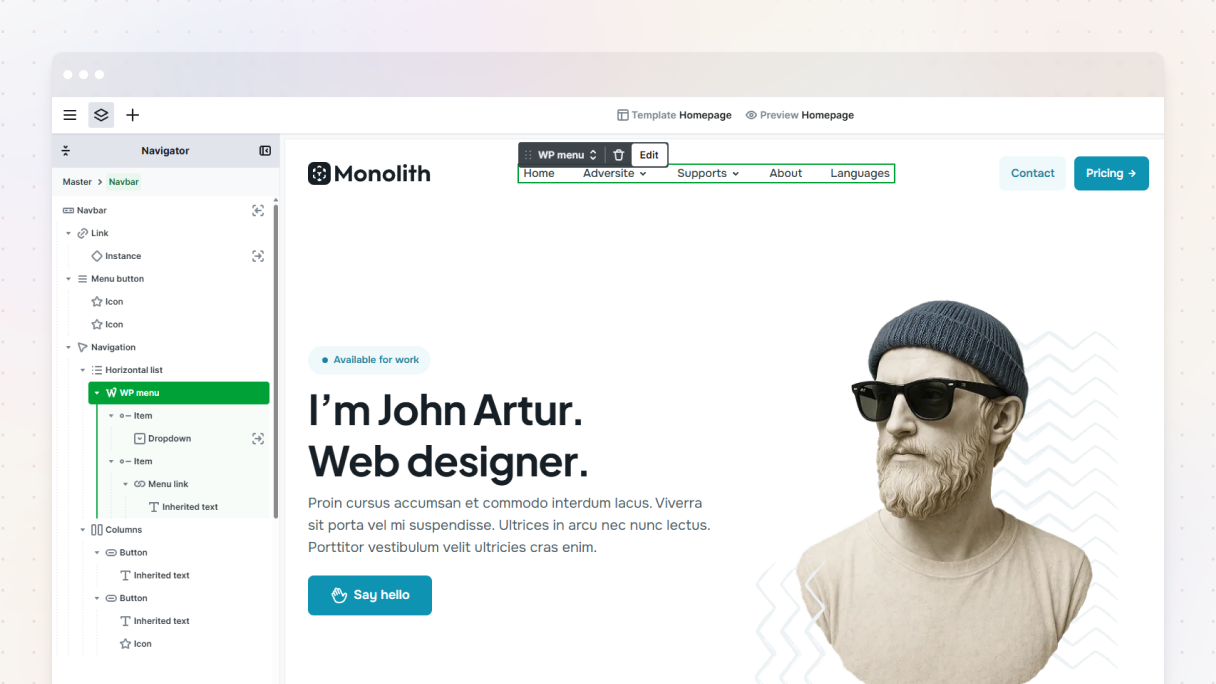
Is this an alternative menu editor for WordPress?
Yes, and a major upgrade at that. You can still handle your main menu items through the WordPress dashboard → Appearance → Menus, but with Mosaic, you can actually design, position, and style your menus visually using its Navbar and Menu features.
This opens up a whole new way to customize your menus:
- Edit how each menu looks and feels.
- Place different menus in different parts of your website.
- Add icons, dropdowns, animations, and more.
- Adjust the menu’s behavior on different devices using states and breakpoints.
What does a navigation menu look like in the builder?
When you add a Navbar element to your Master layout, it already has a built-in structure:
- Link element: for your logo, usually on the left
- Navigation element: holds all your menu links
- Menu button element: for mobile views (hamburger style)
In Mosaic, you can edit everything. Feel free to add icons, images, and dropdowns directly into your menu. If you need a footer navigation, just use the Menu element, it’s great for static links like your privacy policy or terms of service.
How to build a mobile navigation menu?
Let’s see how to build a responsive mobile navigation menu in Mosaic:
- Add a Navbar to your Master.
- Then add the links you need to your Navigation.
- Mosaic automatically includes a Menu button that replaces the navigation on mobile.
- In the Advanced tab, you can adjust the mobile menu breakpoint to decide when it switches to mobile view.
- Use the Toolbar actions to preview how it looks in its open and closed states right on the Canvas.
You can add some animation for when the menu opens and closes, stop the body from scrolling while the menu is open, and customize the dropdown in its open state.
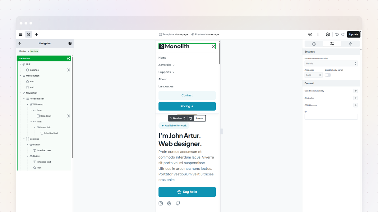
What is the best way to customize the mobile menu?
The trick is using states. Mosaic has prebuilt states like:
- Navbar opened
- Navbar opening
- Nested dropdown mode
This means that you can customize how the mobile menu looks when it’s open, transitioning, or closed, and more. Feel free to tweak the padding, background color, font size, icon visibility, and pretty much anything else you want.
And yes, you can totally change the mobile menu breakpoint to fit your design. If you want it to activate at 768px, just head over to the Advanced tab of the Navbar and make the change.
How to change the navigation menu on scroll?
Even though Mosaic doesn’t have a simple one-click option to shrink when you scroll, you can create a similar effect by using custom interactions. This way, your navigation stays in view but doesn’t get in the way as people scroll.
How to show a full-width menu on mobile instead of a collapsed one?
If you’re not a fan of the collapsed hamburger menu, you have a few other options:
- You can completely remove the Menu button.
- Make your Navigation element visible on all breakpoints.
- Style it with flex or grid layouts to stretch it across the full width.
You can use a Dropdown wide that stretches across the entire width of the browser. It’s great for big menus that need a bit more room.
How to create a custom menu in WordPress?
Here’s how to create it:
- Go to Appearance → Menu in your WordPress dashboard.
- Set up your menu by adding Pages, Categories, or Custom Links.
- Then, in Mosaic, just add a WP Menu element into your Navbar.
- Finally, head over to the Advanced tab and pick the menu you just made.
You can now customize and arrange this menu using Mosaic’s visual tools, or if you want, you can create your entire menu directly in Mosaic instead.
Can I have different menus on different pages?
Totally, and this is where Mosaic really stands out. You can set up different layouts for specific pages or types, making it super easy to swap out the Master so you can have a unique menu for:
- Landing pages
- Logged-in users
- Shop pages
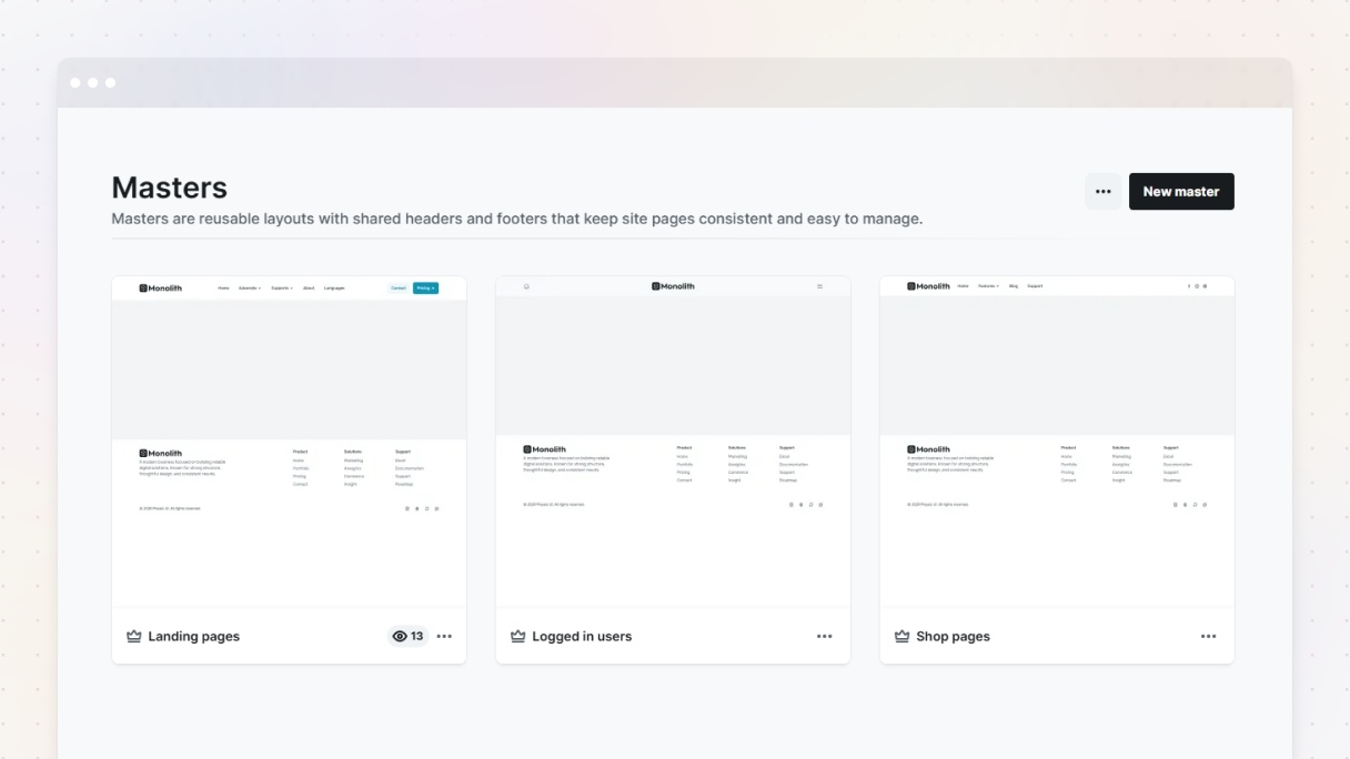
How can I style or add icons to my menu items?
Everything in Mosaic is customizable.
To add icons, just drag an Icon element into your Menu link. Then you can edit the SVG and adjust its spacing, color, alignment, and other settings in the Right panel.
Can I change the breakpoint where the mobile menu appears?
Absolutely, if you check out the Navbar’s Advanced tab, you’ll see the option to set the mobile menu breakpoint.
By default, it’s set to Mobile, but you can change it to none, base, and tablet too if you want the Menu button to show up on those views. This gives you precision over how and when your WordPress navigation menu changes based on screen size.
How to build a mega menu without custom code?
Mosaic has a feature called Dropdown wide, which is a ready-to-use element that simplifies creating mega menus.
Here’s how to use it:
- Add a Dropdown wide element to your Navbar.
- Adjust the layout with some columns in that dropdown’s Wrapper.
- You can fill it up with links, icons, images, or even some call-to-action buttons.
- Customize the layout and style using the Style tab.
- Control how the dropdown opens (hover or click) and its animation in the Advanced tab.
It works perfectly on all devices, without having to write any custom code.
With Mosaic, creating a WordPress navigation menu becomes a visual, intuitive process. You won’t be limited by your theme or have to mess around with CSS. You get total creative freedom and the ability to design stunning, mobile-friendly menus that work exactly how you want them to.
Best practices for WordPress navigation menu layouts
Good navigation isn’t simply putting links at the top of your page. It’s about making it easy for visitors to explore your site. How you organize everything can really affect how users feel about your site. Let’s see how to set up your WordPress navigation menu the smart way.
How many items should be in a navigation menu?
There’s no specific magic number, but generally, 5 to 7 main items work best. Why? It helps keep your layout tidy, makes it easier to skim through quickly, and looks nicer on mobile and tablet screens.
If it turns out you have more than 7 main items, consider using dropdowns or organizing the content under relevant parent categories.
What’s the best layout for a navigation menu?
It really depends on your website, but here are some classic layouts that work well.
Left-aligned navigation menu
If you want to keep everything clean and easy to follow, the left-aligned navigation menu is the way to go. Check out the Gibraltar theme’s Header 03 example, it’s got all the main links nicely arranged on the left, and the two call-to-action buttons are placed on the right.
This setup is ideal for blogs, agencies, or business sites where having clear access to important actions is crucial.
Centered navigation menu
This is ideal for personal brands or simple designs where simplicity is key. Everything looks balanced, allowing your visitors to concentrate on what’s really important.
If you want a neat and stylish look, a centered navigation menu could be just what you need. In the Header 09 example of the Gibraltar theme, the menu is placed right in the center, looking organized, with no messy full-width look.
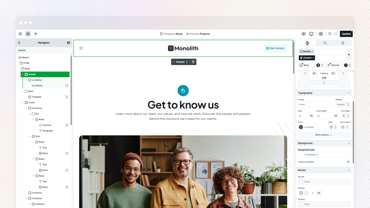
Logo in the center with navigation on either side
If you’re after something a little different, check out the Header 09 layout from the Monolith theme. It nails that minimal yet user-friendly vibe. The logo is right in the center, there’s a hamburger menu neatly on the left, and a smooth call-to-action button on the right.
Just a quick tip, getting this look can be a bit challenging without a theme builder like Mosaic, but with it, your header will definitely grab attention.
Hamburger icon for mobile
Check out the Gibraltar theme’s Header 2 mobile design, it’s practical and looks great on any device.
When screen space is limited, simplicity wins. This mobile-friendly design features a clean layout with a logo on the left and a brand-colored hamburger menu on the right. It’s a clever way to maximize space while ensuring navigation is straightforward and user-friendly.
Mega menu header
Got lots of content to organize? A mega menu header is the way to go. Check out Header 11 in the Gibraltar theme, it shows just how simple it is to set up a nice, roomy menu with columns and various types of content.
You can highlight categories, links, or even stunning visuals, and customize them however you like. It’s ideal for bigger websites that want to stay organized without bombarding their visitors.
Two-tier header
Need to pack in a bit more info without making your design look messy? A two-tier header solves this. Check out Header 13 from the Monolith theme, it does this really well.
The top row has a softer look with lighter text, which is perfect for showing details like your opening hours on the left and contact info on the right.
Right underneath, the main header row showcases your logo, navigation links, and call-to-action buttons. It’s a clever method to include extra info while keeping your design nice and user-friendly.
Search-centric navigation
If you want your visitors to quickly find what they’re looking for, a navigation layout focused on search is definitely the way to go. Check out Header 16 from the Monolith theme, it even has a two-tier design for added flexibility.
The best part is the big search bar on the right that really catches the eye and makes people want to use it. On the left, you’ve got the logo and menu items all organized, which keeps things balanced and user-friendly. This setup is ideal for sites packed with content where search is super important.
Mosaic makes it super easy to build all these layouts without needing any custom code.
Should I use a sticky (fixed) navigation bar?
Sticky nav bars are super helpful, especially on long-scroll pages. They let you quickly jump to important sections without having to scroll all the way back up, and you can always see your call-to-action buttons.
Just remember to keep it small and out of the way, especially on mobile. You might want to make the menu a bit smaller after scrolling down a bit, but don’t worry, Mosaic can smoothly handle that.
Should I repeat navigation items in the footer too?
It’s a good idea to repeat the navigation items in the footer. A lot of people scroll down looking for links. You could either use the same main menu down there or make a simpler footer menu with just the key links.
Is it better to keep the menu minimal or include every major link?
Keep it simple. Don’t feel like you have to cram every page into your main menu. Think about what your users really need to see right away.
Ask yourself:
- Which pages are essential for newcomers?
- What do returning visitors check out frequently?
- Could some links be tucked away in dropdowns or the footer?
Just remember, your menu should help guide users, not confuse them.
Final thoughts
Now you’re fully equipped to create and edit a WordPress menu using both the classic editor and the WordPress navigation block. Whether you’re building a simple menu or an advanced WordPress dropdown menu, this guide ensures your site navigation stays clear and user-friendly.
And if you’re using Mosaic, you’ve got a serious edge. It allows you to create menus visually right in your Master layout, so you can fully customize their appearance for any screen size and adjust every interaction without writing any code.
So, menus can actually be pretty simple. If you have the right tools and a solid plan, you can make your website’s navigation just as intuitive and nice as the content it leads to.


