


Why small design mistakes matter more than you think
When someone lands on your website, they’re not there to figure things out, they expect it to just work. If something feels confusing or unclear, even in a small way, it can be enough to lose their attention. And that’s where a lot of common web design mistakes start to cause problems.
The tricky part? It’s usually not because of one big, obvious problem. More often, it’s a handful of small design mistakes that slowly add up, making the experience feel harder to navigate than it should be.
And the worst part is, most of these issues are easy to miss when you’re building. You might not even notice them until your website starts feeling harder to manage or your visitors stop engaging the way you expected.
5 web design mistakes to avoid
Here are some of the most common web design mistakes, and more importantly, how to fix them. Each one comes with a simple, practical approach you can apply right away, so your website doesn’t just look better, but actually works better too.
Mistake 1: Your page has no clear hierarchy
If everything on your page feels equally important, visitors won’t know where to look first. That’s when things start to feel messy, even if your content is actually good.
You might have all the right elements, headings, images, buttons, but without structure, it just turns into a wall of content. People end up scanning randomly, missing key information, or leaving altogether.
This becomes even more noticeable on content-heavy pages like blogs, where layout and spacing have a huge impact on readability.
Fix it with a layout system
Instead of placing elements wherever they “look right”, you build your layout using a clear system. In Mosaic, that system is made up of a few core building blocks:
- Sections
- Containers
- Grids
- Rows
- Columns
- Divs
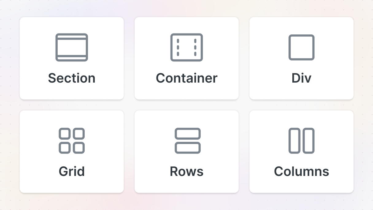
They might sound technical at first, but they’re actually pretty straightforward once you see how they fit together.
Start with sections and containers
Think of sections as the big chapters of your page. Each one represents a different part, like a hero section, features, or testimonials. A simple rule here, every time you move to a new idea or topic, start a new section. This keeps your page organized and easier to scan.
Inside each section, you’ll usually work with a container. This controls the width of your content and keeps everything nicely centered, especially on larger screens, making your layout feel clean and readable instead of stretched or uneven.
Use rows and columns for alignment
Once your main structure is in place, you can start arranging content inside it. Rows are great for stacking things vertically, like a heading, some text, and a button. You can control spacing easily, so everything has room to breathe.
Columns handle horizontal layouts. They’re perfect when you want elements side by side, like icons next to text or multiple features in a row. Together, they give you a simple way to control alignment without guessing spacing every time.
Use grids when things repeat
When you’re working with repeating content, like cards, features, or testimonials, a grid makes things much easier.
Instead of manually aligning everything, the grid keeps your layout consistent automatically. You can quickly switch between different column setups and keep everything lined up without extra work.
Use divs when you need flexibility
And then there’s the div, which is basically your all-purpose building block. You can use it for grouping elements, creating custom wrappers, or adding small visual details. It’s flexible, so whenever you need a bit more control, that’s where it comes in.
Mistake 2: Your navigation makes people work too hard
When someone lands on your website, one of the first things they look for is where to go next. If your navigation isn’t clear, everything else becomes harder. Even if your content is great, people won’t stick around if they can’t find it.
This usually shows up in small ways. Menus that feel cramped, too many links in a dropdown, or options that don’t really tell you what’s behind them. Instead of guiding users, the navigation slows them down. And the more pages your site has, the worse this gets.
Fix it with a mega menu
A simple dropdown works fine for smaller sites. But once you have more content, it quickly runs out of space. That’s where a mega menu comes in.
Instead of stacking links in a long list, you can group them into sections, add descriptions, and even include visuals. It turns your navigation from something people have to figure out into something they can scan instantly.
Start with a dropdown
To build one in Mosaic, start in your header. Open the navbar, then add a Dropdown element where you want your menu to appear. This will be the base of your mega menu.
Once you’re inside, update the main label, something like “Features” or “Services”, so it’s clear what the menu is about.
Build a better menu item
Instead of just adding plain links, you can make each item more descriptive. Take one item and turn it into a small content block:
- Add a title (like “Chat”)
- Add a short description underneath
- Wrap them in a Row to control spacing
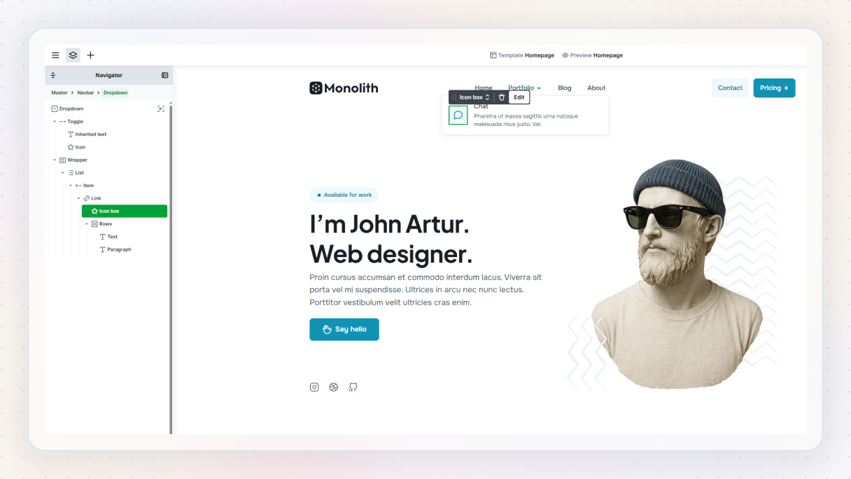
This already makes a big difference. Instead of guessing what a link does, users get context right away. You can also add an icon to make it more visual and easier to scan.
Use columns for layout
Now let’s improve the structure. Wrap your menu item in a Columns element. This lets you place the icon next to the text and control spacing more precisely.
Once you have one item set up, you can duplicate it to create more menu items. This keeps everything consistent and saves time. If you want to reuse it later, you can even turn it into a component.
Turn it into a real mega menu
At this point, you’ve got a clean set of menu items. But to make it feel like a proper mega menu, you need a bit more structure.
Wrap everything in a Grid, then switch it to a two-column layout. This lets you place your menu items on one side and something else, like an image or visual, on the other. It adds more presence and makes the dropdown feel more intentional.
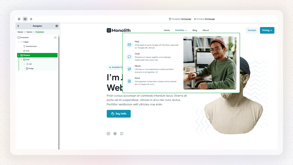
You can also adjust spacing and width so it doesn’t feel too stretched or too cramped.
Add interaction and polish
Head into the dropdown settings and set it to open on hover. You can also add a subtle animation, like a fade or a slight slide, to make it feel smoother.
Don’t forget to check how it looks on mobile. In most cases, you’ll want to simplify the layout, for example, by removing extra columns so everything stacks nicely.
Mistake 3: Your website feels too static
A lot of websites technically work fine, but still feel a bit… flat. Everything is there, the content, the layout, the structure, but nothing really pulls you in.
There’s no sense of movement, no feedback, nothing that makes the page feel alive. And when that happens, people tend to scroll less, interact less, and leave sooner.
The good news is, fixing this doesn’t mean turning your website into a full-on animation showcase. In most cases, a few small, thoughtful interactions are more than enough.
Fix it with simple interactions
Instead of adding motion everywhere, focus on places where it actually improves the experience. Two of the easiest ways to do that are:
- making elements respond to user actions (like videos)
- adding subtle movement on scroll (like parallax)
Both are simple to build, but they make a big difference.
Option 1: Make videos feel more intentional
Let’s start with the video. By default, video players come with built-in controls. They work, but they don’t always match your design, and they can feel a bit disconnected from the rest of the page.
A small improvement here is to replace them with custom controls. Start by adding a video element and selecting your file. Then head to the Settings tab and disable the default controls.
Now add a button that will act as your play trigger. Go to the Interactions tab, create a new interaction, and set it to Click. Set the target to your video, then in the Action panel choose Player → Play.
Preview it, and now your video plays when you click the button. Simple, but already more intentional.
Turn it into a play / pause toggle
You can take this a step further by turning it into a proper toggle. Add a second button, so you have both play and pause states. Then place them on top of each other:
- Set the parent container to relative
- Set both buttons to absolute
Now go back to the interaction and use odd/even clicks.
On the first click:
- Play the video
- Hide the play button
- Show the pause button
On the second click:
- Pause the video
- Show the play button again
- Hide the pause button
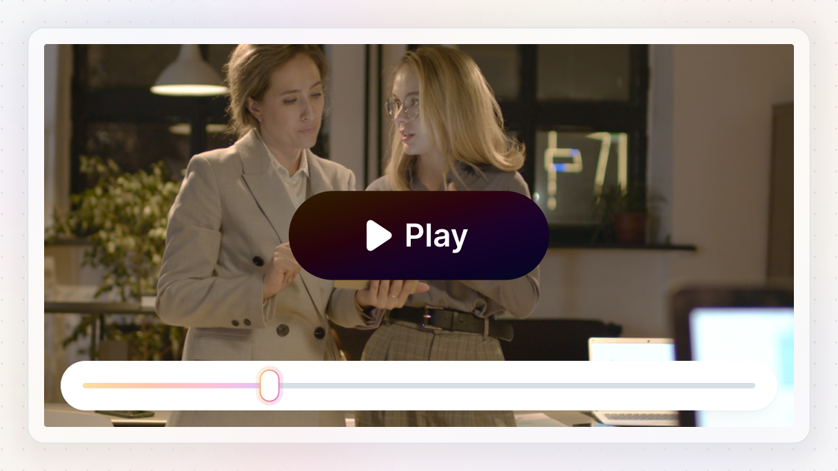
You can control visibility using opacity and keep the transitions quick so everything feels responsive.
Add a simple video overlay
Another nice touch is a video overlay. Place a container on top of your video, add a play icon, and stretch it to cover the full area. A slightly transparent background works great here.
Then add a click interaction:
- Fade out the overlay (opacity → 0%)
- Trigger Player → Play on the video
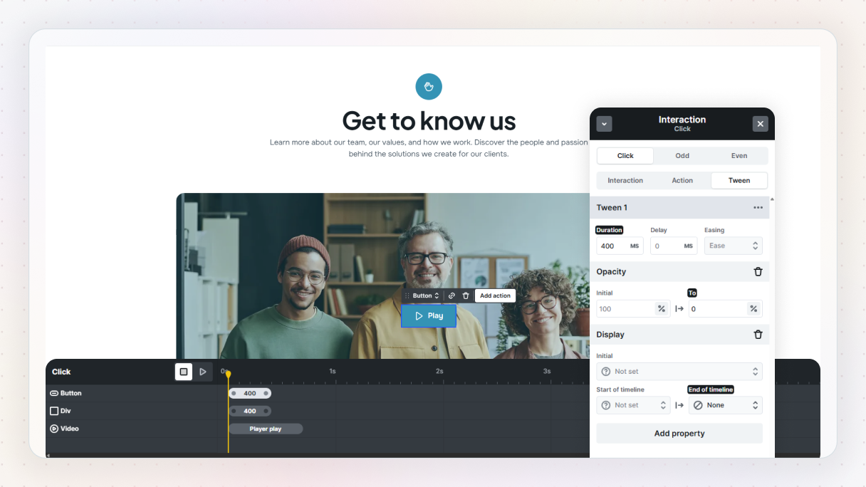
Now, when someone clicks, the overlay disappears, and the video starts. It feels clean and intentional, without adding complexity.
Option 2: Add movement with parallax
Now let’s look at scroll-based motion. A simple way to add life to your layout is a horizontal parallax effect, where content moves as you scroll.
Start by adding some content, for example, a testimonial block from the Library. If it has any layout classes you don’t need (like a three-column setup), clear them so you have more control. Then duplicate your content so you have multiple items to work with.
Build the horizontal layout
Wrap everything in a Grid, and set the grid flow to columns. This places your content side by side instead of stacking vertically.
Give the columns some space (around 400–500px works well), and center the layout so it doesn’t drift off to one side.
Add the scroll interaction
Now for the animation. Select the section, go to the Interactions tab, and add a While scrolling interaction. Set the target to your grid, then add a Translate X action:
- Initial value: 10%
- End value: -10%
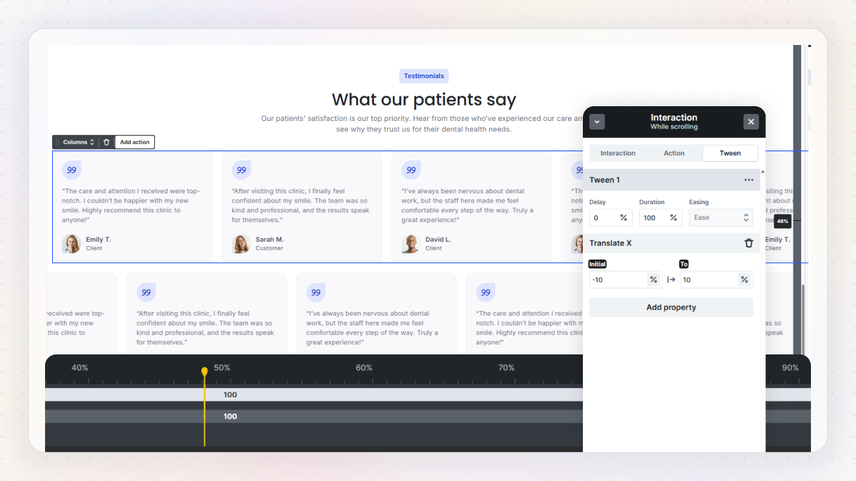
Preview it, and you’ll see the content move smoothly across as you scroll.
Make it feel more dynamic
If you want to push it a bit further, duplicate the grid and reverse the values:
- Initial: -10%
- End: 10%
Now the rows move in opposite directions, which adds a bit more depth without making things too busy.
You can also adjust the duration and start/end points to fine-tune how it feels.
Mistake 4: Your CTA disappears too quickly
You’ve probably seen this before. A page looks great, the content is solid, everything feels well put together… but there’s no clear next step. Or worse, there is a CTA, but it’s buried somewhere at the bottom where most people never even reach it.
When that happens, users don’t convert, not because they’re not interested, but because the path forward isn’t obvious. And that’s a pretty common web design mistake. The CTA is there, it’s just not visible enough at the right moment.
Fix it with a sticky CTA
One of the easiest ways to solve this is to keep your CTA visible as people scroll. Instead of showing it once and hoping users come back to it, you give it a fixed place on the screen so it’s always within reach.
A sticky CTA does exactly that. It stays in view, feels natural, and gently reminds users what they can do next.
Start with a simple button
Let’s build one. Start by adding a button inside your layout. Once it’s in place, switch it to an L variant (like a primary L button) so it stands out a bit more.
Update the text so it clearly communicates the action, something short and direct works best. You can also add an icon next to it to make it more noticeable and easier to scan.
Center and size it properly
Next, make sure the button sits in a good position visually. Set the alignment to center, then adjust the width:
- Set the width to 100% so it stretches nicely
- Add a max width so it doesn’t feel too wide on larger screens
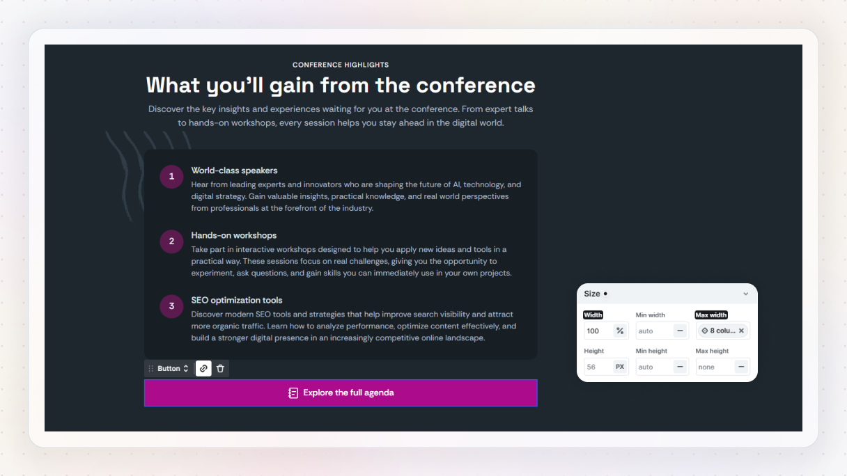
This keeps it balanced and easy to click.
Make it sticky
Now for the key part. Set the button’s position to sticky, and place it slightly above the bottom of the screen, around 30–40px works well.
Preview it, and you’ll see it stays in place as you scroll. Already, this makes a big difference. The CTA is always visible, without interrupting the content.
Add a subtle background effect
To make it feel more polished, you can add a bit of transparency. Lower the background opacity slightly so the content behind it shows through just a bit. It keeps the button visible without feeling too heavy.
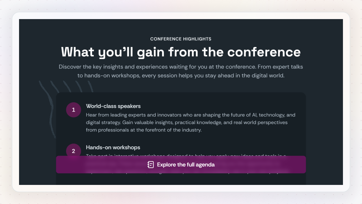
Then add a backdrop blur. This softens whatever sits behind the button and helps it stand out without needing a solid background.
Mistake 5: Your visuals don’t support the content
Even if your layout is solid and your content is clear, weak visuals can still make your website feel unfinished. This usually shows up in subtle ways. Missing icons, inconsistent styling, or sections that feel a bit plain and harder to scan.
Nothing is wrong, exactly, but nothing really stands out either. And when that happens, people have to work a bit harder to understand what they’re looking at.
Fix it with simple visual details
You don’t need complex graphics or heavy design work to fix this. A few small improvements, like icons or visual effects, can make your content easier to scan and a lot more engaging. The goal isn’t to decorate your site, it’s to support what’s already there.
Option 1: Use icons to guide attention
Let’s start with icons. They’re one of the easiest ways to add clarity to your layout. A small icon next to a button or a piece of text can instantly give context and make things easier to understand.
To add one, open the Add panel and drop in an Icon element. From there, you can choose from a large icon library or upload your own SVG. This gives you full control over how things look.
Keep sizing and spacing consistent
Once your icon is in place, it’s worth adjusting the size so it fits naturally with the rest of your design. In the Style panel, you can tweak width and height. A simple trick is to set one value and let the other follow automatically, so everything stays proportional.
Use color intentionally
Color plays a big role here too. Instead of setting colors manually every time, it’s better to use color variables. That way, everything stays consistent across your site, especially when you’re trying to build a clearer visual hierarchy and better readability.
You can also set icons to use the current text color, which makes them adapt automatically based on where they’re placed. It’s one of those small things that make your design feel more connected.
Add structure with icon styles
If you want to go a bit further, you can turn icons into small visual elements.
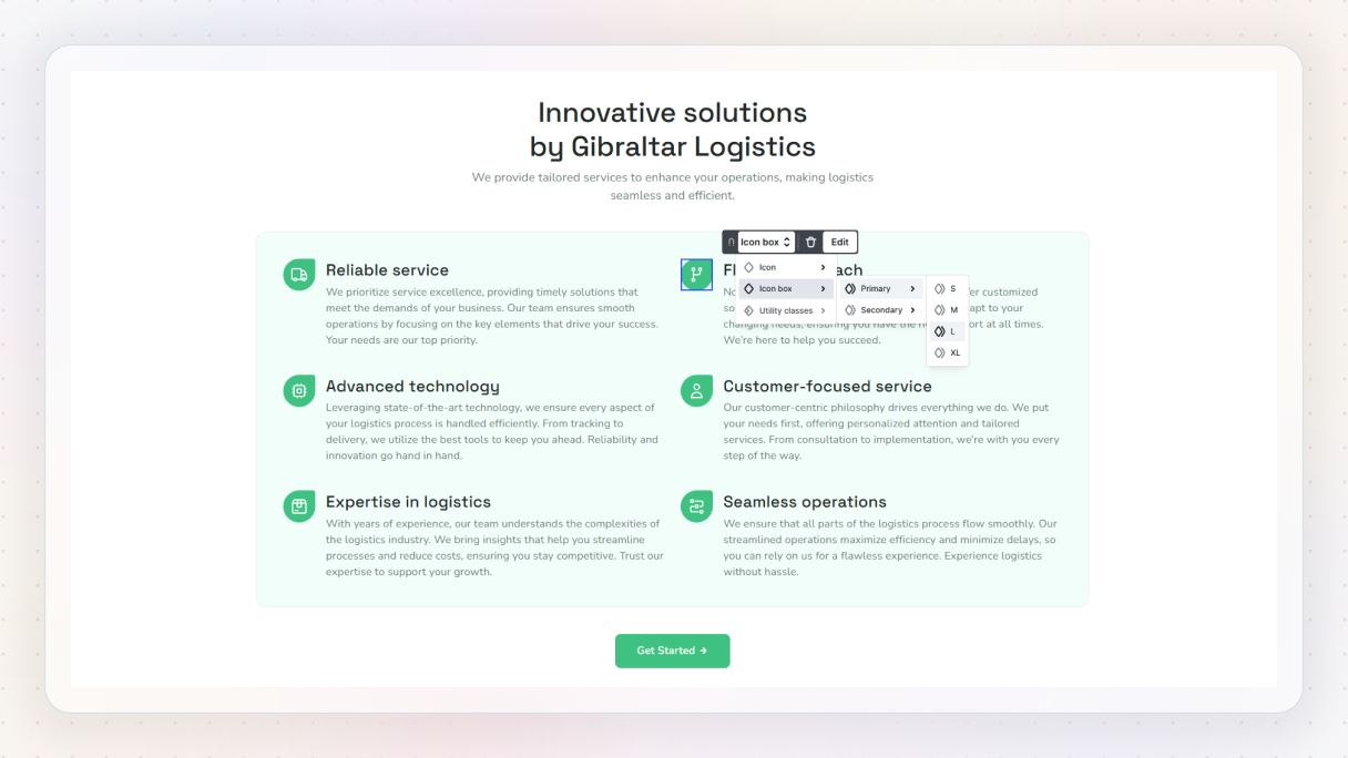
For example, switching to an icon box style gives you a background and more presence. It helps break up sections and makes content easier to scan. You can align them, space them out, and reuse the same styles across your site.
Option 2: Add a simple visual effect
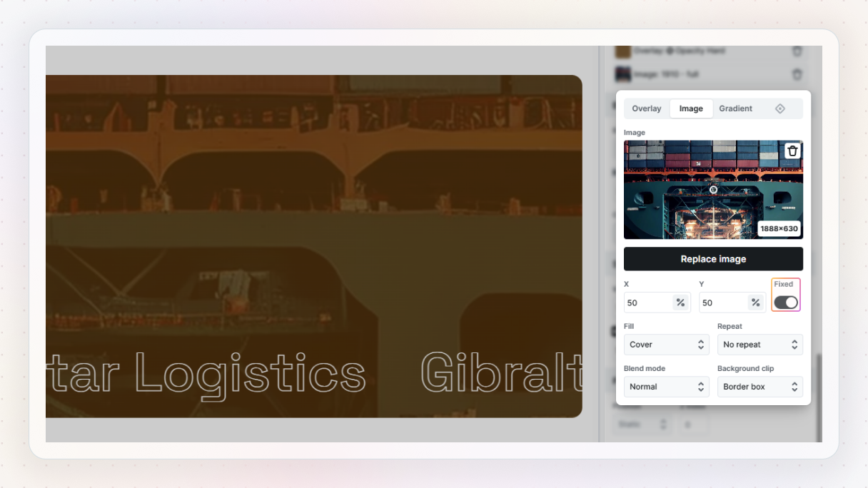
Another easy way to improve visuals is with something like a background clip effect. This lets you place an image inside your text, which instantly makes headings feel more dynamic.
To do it, select your text and add a background image. Then set the background clip to “Text”, and change the text color to transparent so the image shows through.
Add a bit of movement
If you want to take it one step further, you can enable a fixed background for that image. Now, as you scroll, the image stays in place inside the text, which adds a subtle bit of motion. Again, nothing overwhelming, just enough to make things feel more polished.
Fix the system, not just the symptoms
Design mistakes are pretty normal, especially when you’re building and improving a website over time. The important thing is not just fixing them once, but understanding why they happened in the first place.
Because a website is often one of the first impressions people get of your business. If the layout feels confusing, the navigation is hard to use, or the CTA is easy to miss, visitors might leave before they ever get to see what you actually offer.
That’s why it helps to think beyond one-off fixes. Instead of adjusting the same things over and over again, it’s much better to build with a design system from the start.
This is where a tool like Mosaic can make a big difference. With reusable layouts, components, style variables, and built-in interactions, you can create a structure that keeps your design more consistent across the whole website.
So when you improve one part, you’re not just patching a single section. You’re making the whole design easier to manage, update, and scale later on.


