

Why Mosaic feels different at first (and why that’s a good thing)
You open a new builder, start clicking around, and within a few minutes, you already have something that looks decent. That approach works in most builders. You click, tweak, adjust things as you go, and eventually something comes together. But that’s also why Mosaic can feel a bit different when you first try it.
It was built around a different idea of what a WordPress builder can be, so there’s more going on, more control, more possibilities, and it’s totally fair if your first thought is just: where do I even start? If you’ve already tried clicking around, you probably had a moment where some things made sense, others didn’t, and the overall feeling was a bit messy.
That’s a pretty common experience. You’re not expected to understand everything right away, and you don’t need to. Mosaic is more about building something that holds together as your site grows. That takes a slightly different way of getting started.
So instead of trying to figure everything out, we’re going to keep this simple. In the next 30 minutes, you’ll get familiar with it and make a few meaningful changes that actually feel like something. Nothing fancy, just enough to get a feel for how things work. And once you go through that, things won’t feel nearly as random anymore.
One thing to keep in mind before you jump in
Before you get started, it helps to look at it a bit differently. Mosaic isn’t really about making quick edits and moving on. It’s closer to shaping something that holds together as you go. So instead of thinking in small, isolated changes, it helps to think a bit more in terms of how things connect, even if it’s just loosely at first.
You don’t need to plan everything or understand the whole system yet. Just know that what you’re doing isn’t meant to stay a one-off. Small decisions can carry through, and that’s where things start to feel easier, not harder.
And that’s also what makes it a bit more predictable once you get used to it. You’re not rebuilding things over and over, you’re building on top of what’s already there.
One small thing that can help along the way: if you’ve used a bit of HTML or CSS before, some parts will feel more familiar. But it’s absolutely not a requirement, you can get comfortable with it as you go.
Where to begin
At this point, you might be wondering what the actual first step should be. The easiest way to start is to actually follow along with something.
Fortunately, Mosaic has its own tutorial videos that walk through different parts of the builder, from quick tips to more in-depth guides. You don’t need to go through everything, but watching one or two while you’re getting started can make things feel a lot less random.
You’ll also find some great content from creators on YouTube showing real builds. Those can be really helpful once you’ve seen the basics.
Just go with the Wizard’s guided setup
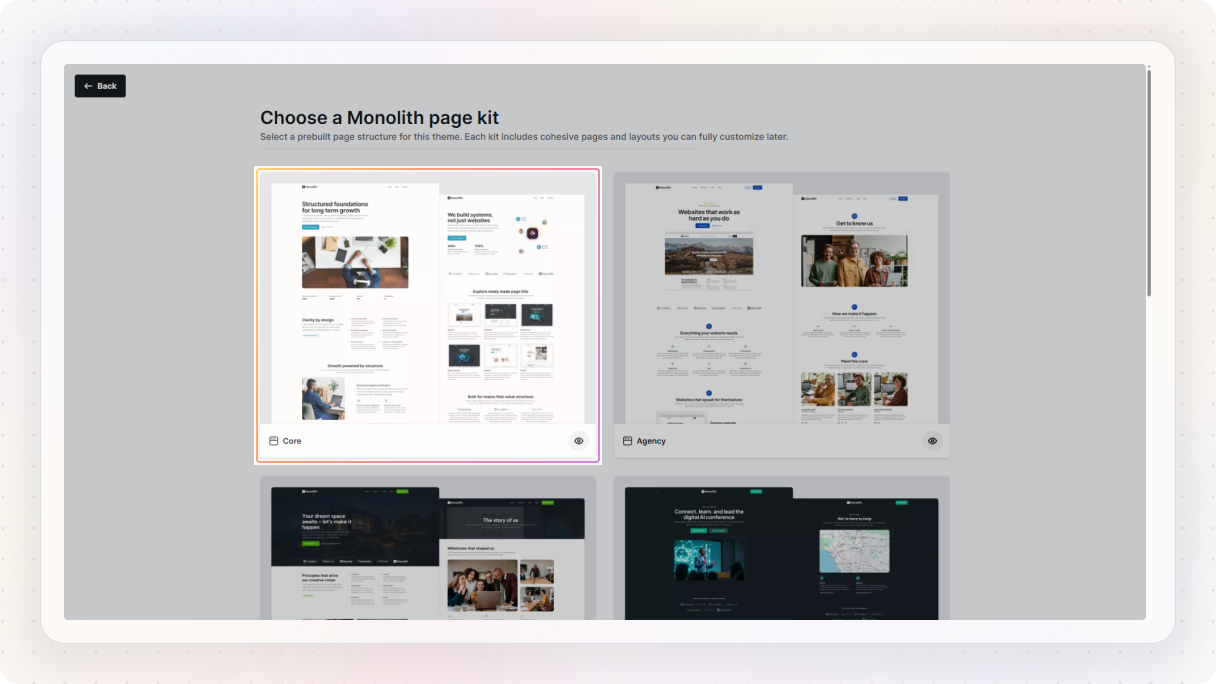
Once you’re ready to jump in, the best place to start is with the guided setup of the Wizard. After installing Mosaic, you’ll be taken through a short setup flow that helps you make a few initial decisions. Nothing complicated, just enough to give you a starting point that actually makes sense.
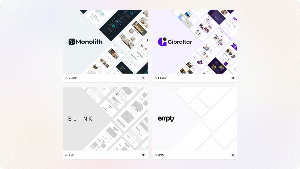
One of the first things you’ll choose is a theme. Some of them come fully built out with pages, styles, and structure already in place, while others are more minimal. If you’re just getting started, it’s worth picking one of the pre-built options. Not because you have to stick with it, but because it gives you something real to explore and build on right away.
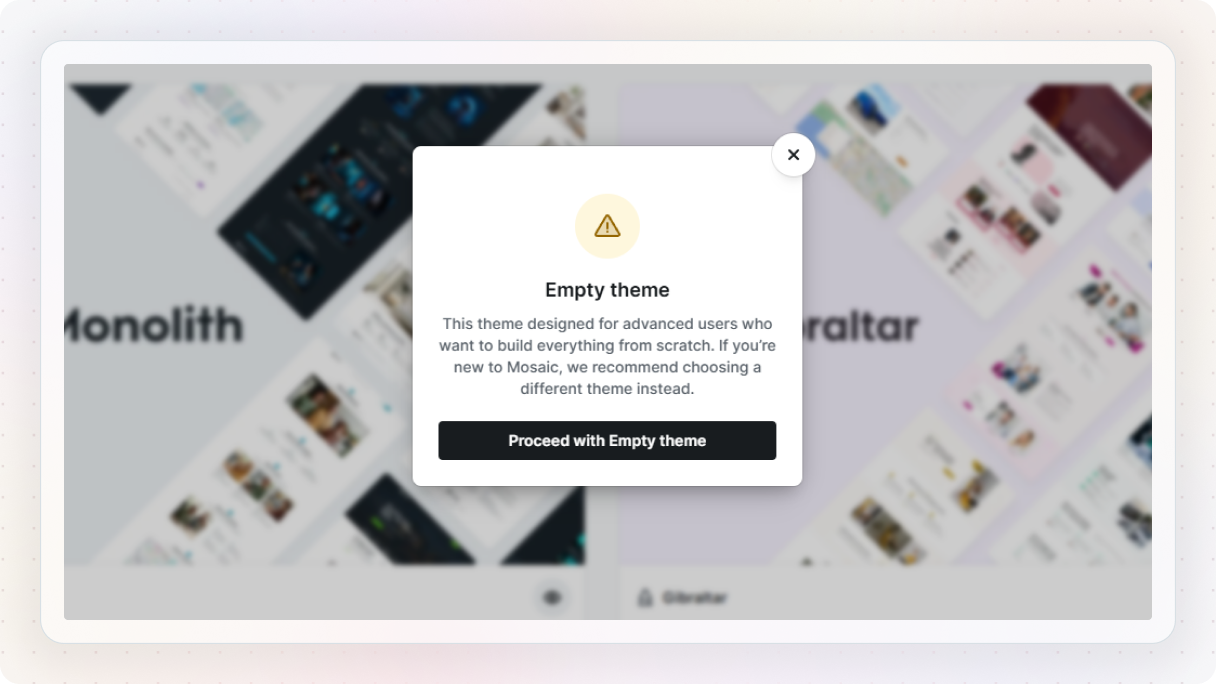
Starting completely empty is always an option. But honestly, that’s not the best place to begin if you’re still getting familiar with how things work. It’s much easier to understand Mosaic when you can see how everything is already put together, and then tweak it from there.
Let it give you a head start
From there, you’ll also pick a page kit. It’s basically a ready-made starting point, a set of pages and sections that already work well together.
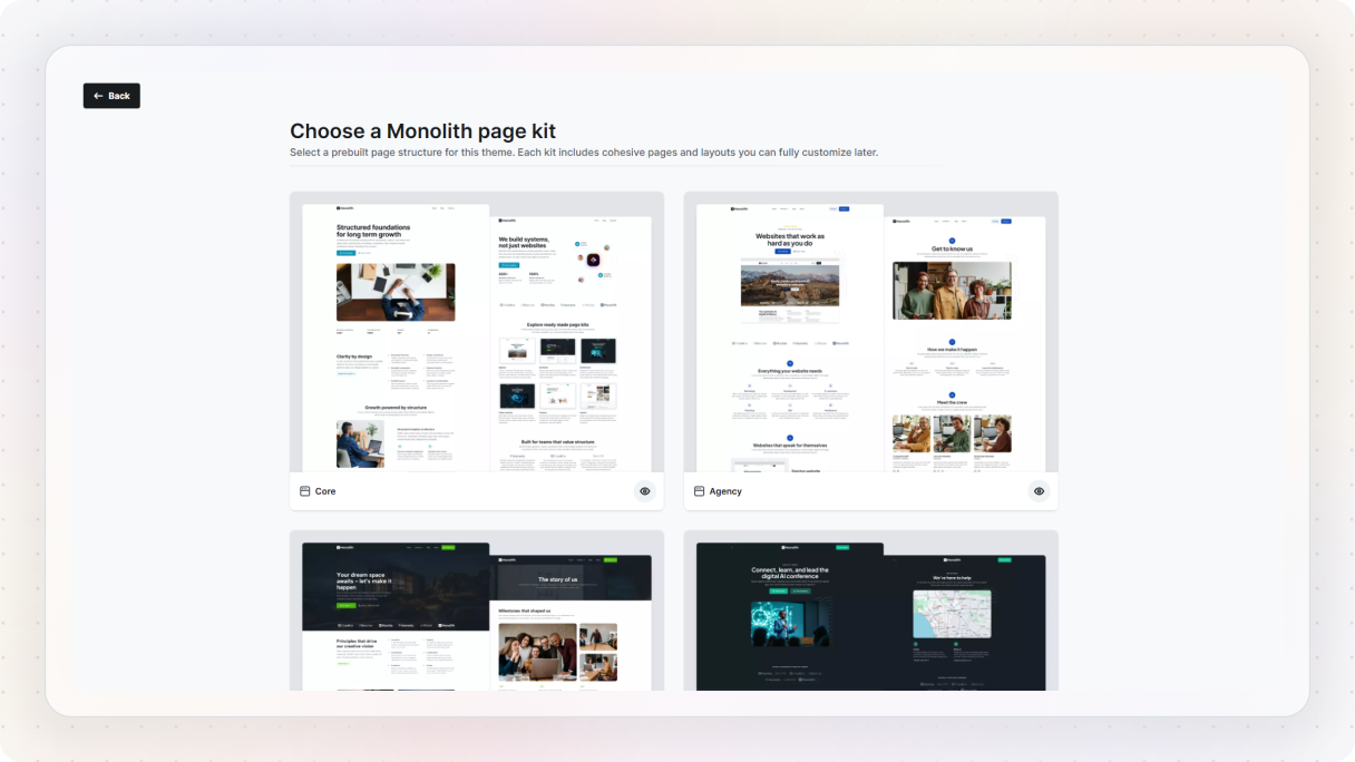
You can change everything later, but it saves you from staring at a blank screen and wondering what to do next.
Don’t overthink these early choices
You’ll also make a few basic decisions like fonts, colors, and structure. Don’t stress about getting these perfect. You can always change them later. The goal here is just to get to a point where you have something you can actually work with.
By the time you’re done, you won’t just be looking at an empty editor. You’ll have a starting point that already feels like a real project, and that makes everything that comes next a lot easier.
Familiarizing with the interface
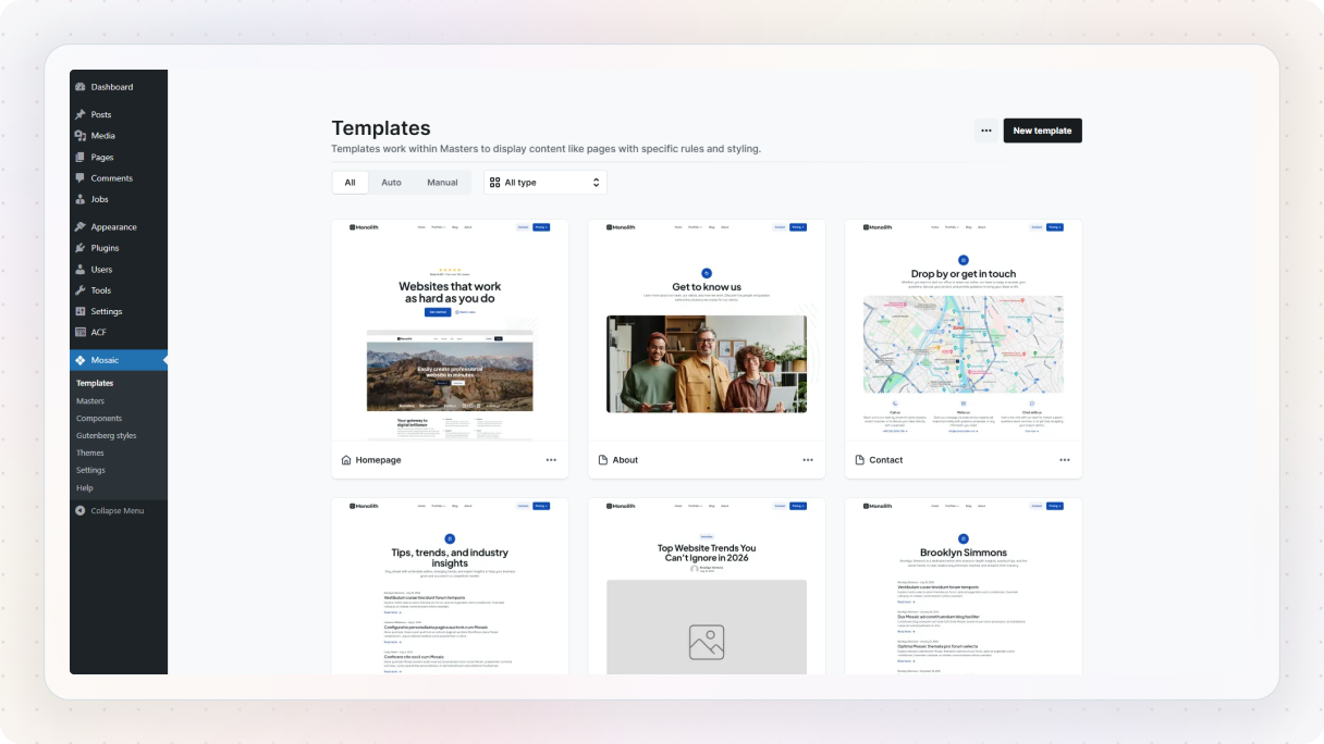
Once the Wizard is done, you’ll land in Mosaic’s Admin area, more specifically in the Templates area. This is basically where your website’s structure starts to come together. From here, you’ll also notice a few other important areas in the menu, like Masters, Components, Gutenberg styles, Themes, Settings, and Help.
You don’t need to learn all of these right away, but it helps to know what they’re there for.
- Templates control what a page looks like and what kind of content it should display.
- Masters are where your shared header and footer combinations live.
- Components are for reusable elements you want to use across your site.
- Gutenberg styles lets you style native WordPress blocks so they match the rest of your project.
- Themes is where your test and live themes live, and the rest is pretty much what it sounds like.
For now, the main thing is this: once you open a template, you’ll end up in the Editor, and that’s where you’ll spend most of your time.
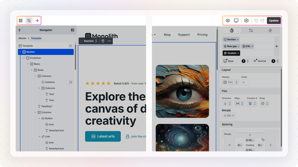
The left side is where your structure lives
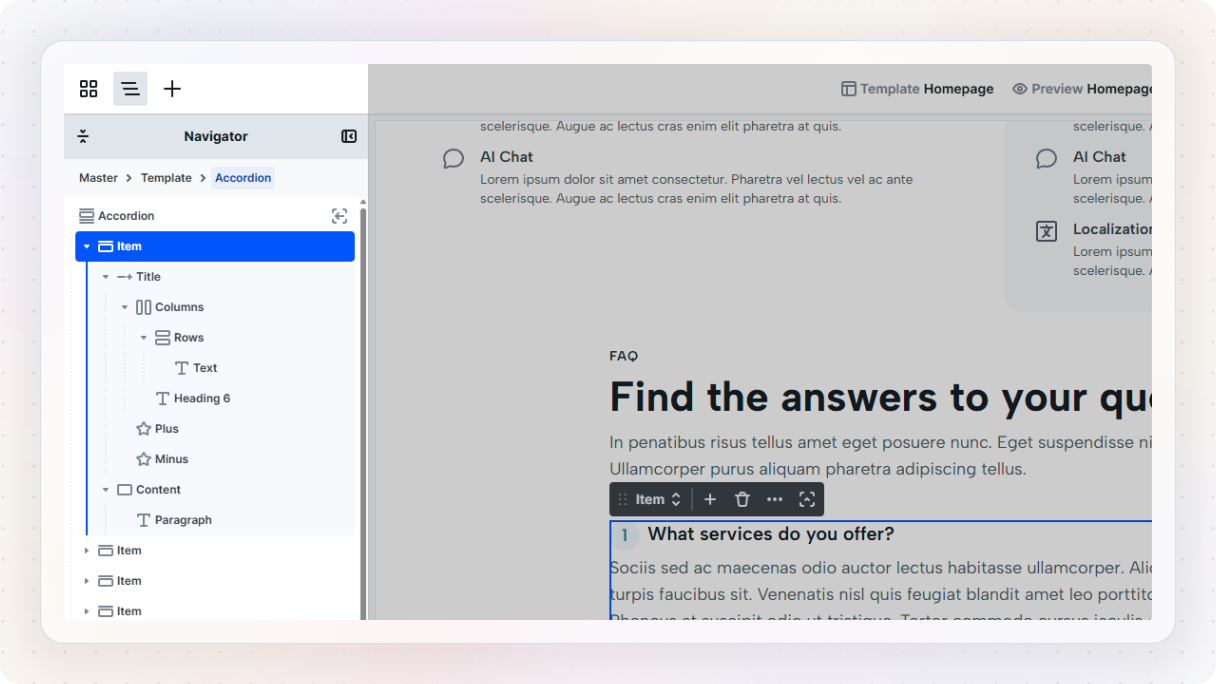
Probably the most important thing to get comfortable with early on is the left side. This is where you’ll find the Navigator, which shows the structure of everything on the page.
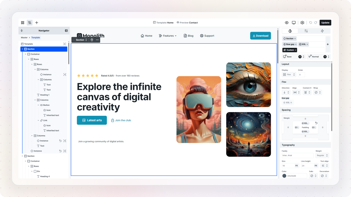
The easiest way to think about it is this: if it’s on the Canvas, it’s in the Navigator too. The order you see on the page is the order you’ll see in the Navigator, so it gives you a much clearer, more structured view of what’s going on.
This becomes really helpful once your page starts filling up with more elements. Instead of clicking around and hoping you grab the right thing, you can use the Navigator to see the hierarchy properly.
And that hierarchy matters. In Mosaic, you’ll usually organize your content with sections and containers. Sections are the main full-width building blocks of a page, things like your hero, content areas, testimonial sections, and so on. Inside those, containers help you line things up and keep the content organized. Once you start seeing pages this way, the Editor feels a lot less intimidating.
The Top panel helps you move around
Then there’s the Top panel, which is basically where your main Editor controls live. From here, you can get to the Menu, open the Navigator, access the Add panel, preview what you’re working on, switch breakpoints, and update your changes.
No need to explore every single option yet, but it’s good to know that this is where the main navigation and actions are. The Add panel in particular is one you’ll be using a lot, since that’s where you actually bring things into the Canvas.
The Add panel is where you build
When you open the Add panel, you’ll see different kinds of things you can work with. Some are basic elements, and some come from the theme itself.
This is also where Mosaic starts to feel a bit richer than a typical builder. You’re not just adding standalone elements. You also have access to Assets, like ready-made pages, blocks, and parts that come with the theme, plus Components you’ve already created for reuse.
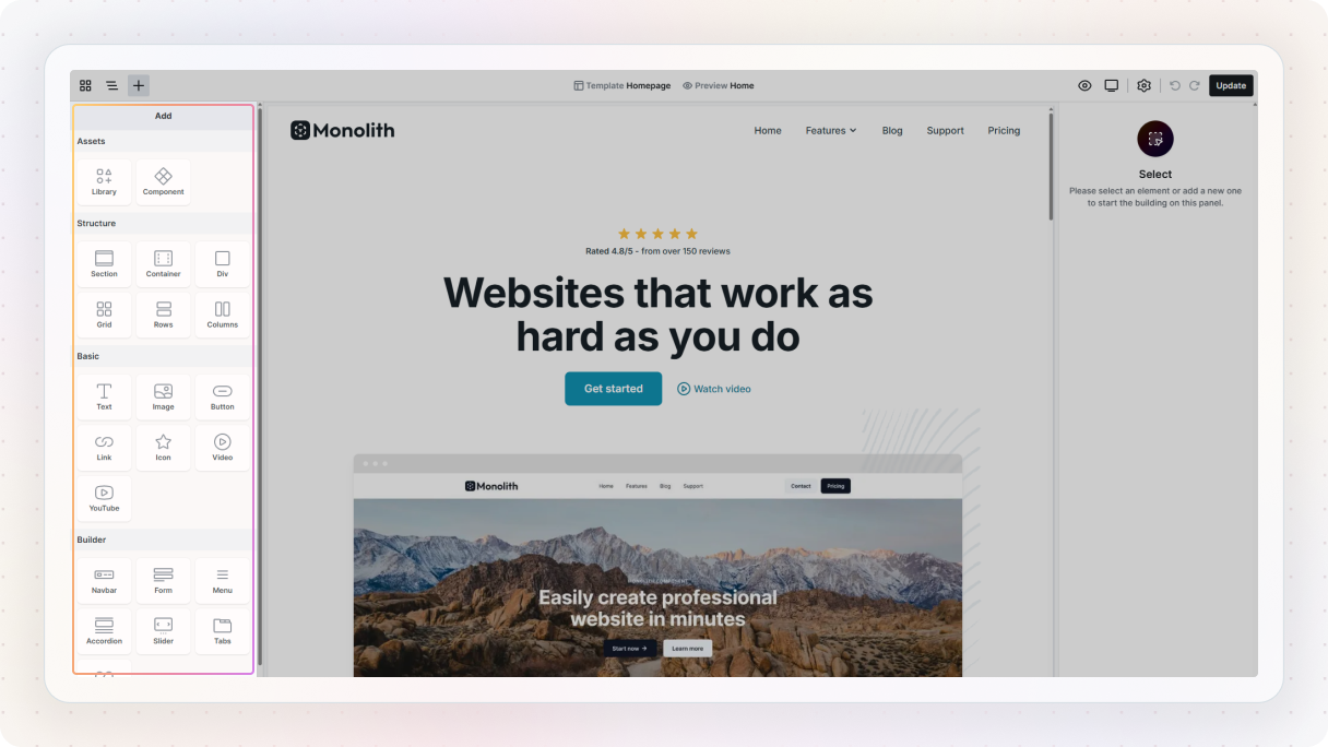
That means you’re not always starting from zero. A lot of the time, you’re building with things that already have some structure and logic behind them, which makes the whole process feel faster once you get used to it.
Mosaic gives some elements their own workspace
One thing that’s worth knowing early on, because it makes the Editor much easier to understand later, is that some elements in Mosaic have their own dedicated workspace.
In a lot of builders, once a page gets more complex, the element tree can turn into a mess. Mosaic handles that with something called scopes. Instead of dumping every child element into the main Navigator, some elements let you “go inside” them and work there separately.
So if you open something like a Menu or Navbar, you’re taken into that element’s own little workspace. Once you’re inside, the Navigator only shows the structure for that element, and the Add panel updates to show the kinds of elements that make sense there, like menu links, dropdowns, or a WordPress menu.
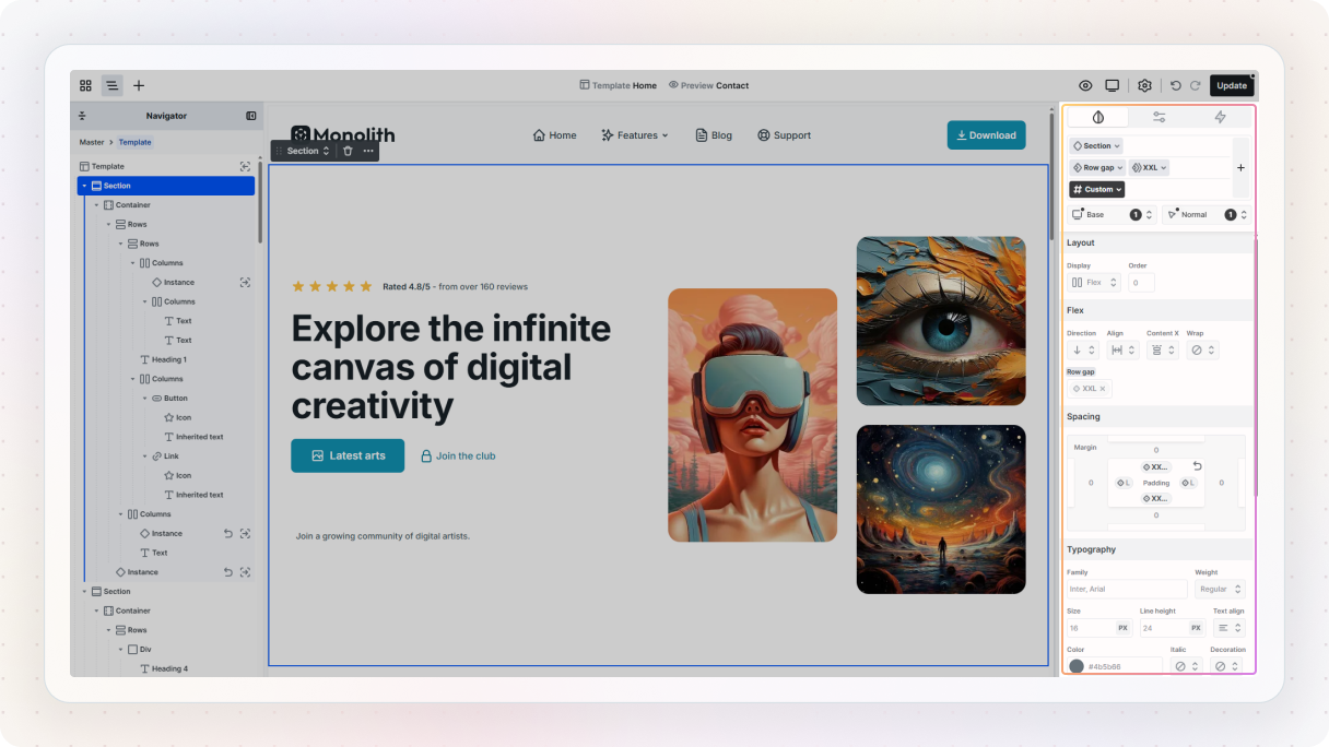
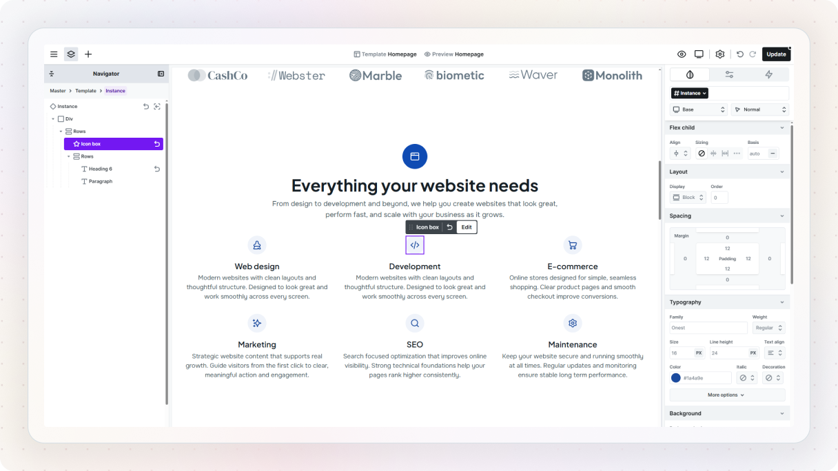
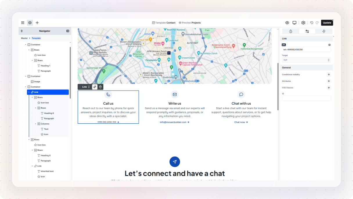
The right side is where your changes happen
On the right side, you’ll find the controls for whatever element you currently have selected. The main tab you’ll use here is the Style tab. This is where you’ll adjust things like spacing, typography, positioning, colors, and all the visual details of the elements you’ve added to the Canvas.
This is also where you’ll eventually work with states like hover styles, and where classes come into the picture, but you don’t need to go too deep into that just yet.
Next to that, you’ve got the Settings tab. This one is more about the selected element itself, things like adding a link to a button or setting conditional visibility.
And then there’s the Interactions tab. This is one of the most powerful parts of Mosaic, because it lets you build animations and more advanced behavior right inside the Editor. But for your first session, you can safely ignore it. It’ll still be there later when you’re ready for it.
You really don’t need to learn all of this at once
The most important thing right now is not memorizing every panel or understanding every option. It’s just knowing roughly where things live, so the Editor feels a bit less overwhelming when you start using it.
Left side for structure. Top panel for navigation and actions. Right side for styling and settings. That’s more than enough to get moving.
Explore before you edit
Before you start changing things, it’s worth taking a minute to just look around. If you followed the earlier step and picked a pre-built theme, you already have something solid in front of you. Instead of jumping straight into editing, try to understand how it’s put together. Look at the structure, not just how it looks.
You’ll start to notice that things aren’t placed randomly. Sections group related content together, containers help keep things aligned, and elements are layered in a way that follows a clear hierarchy. What sits inside what, and in what order, matters more than it might seem at first.
Think in building blocks
A simple way to think about it is like building with LEGO. You’re not creating everything from scratch each time, you’re combining pieces that already exist and fit together in a certain way. Some pieces are more structural, others are more visual, but they all work together, which is essentially the thinking behind a design system.
That same idea shows up here. Most of what you see already has some logic behind it. Text, buttons, sections, they come with styles and structure that are meant to be reused, not rebuilt every time. That’s why it’s helpful to pause for a second and see how those pieces are used before you start changing them.
Things are already connected
You might also notice that when you select different elements, they already have styles attached to them. Those are based on classes, which is how Mosaic keeps things consistent across the page. You don’t need to fully understand how that works yet, just know that it’s there, and it’s part of what makes everything feel connected.
Once you start seeing pages this way, not as a collection of individual edits, but as a set of connected pieces, the Editor starts to make a lot more sense. And that’s really the goal of this step.
Understand what you’re editing, and what’s meant to be reused
Now, the best thing you can do is stop reading for a second and actually edit something. Pick something familiar, like a hero section. Change the heading, swap out the button text, adjust the spacing a little, maybe try a different color. Starting with something simple makes it much easier to see how the Editor responds without getting lost in too many decisions at once.
Let’s try it on a real example
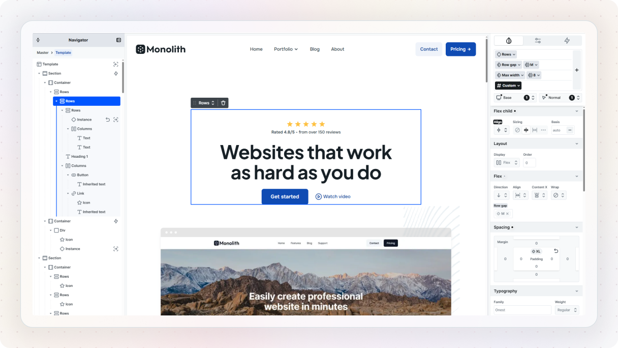
To make this a bit more concrete, let’s use the Core page kit from the Monolith theme. It already comes with a solid homepage layout, including a hero section, so instead of building something from scratch, we’ll just tweak what’s already there and make it our own.
If you take a quick look, you’ll notice the structure is already doing most of the work. There’s a main section, and inside it, a few containers organizing the content, one for the text, one for the visuals, and one for some extra details. This is a good example of how things are usually put together in Mosaic.
Make a few simple changes
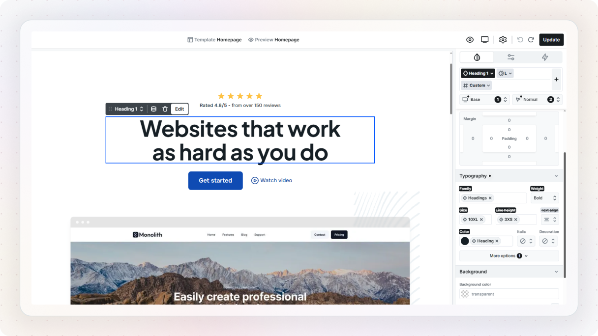
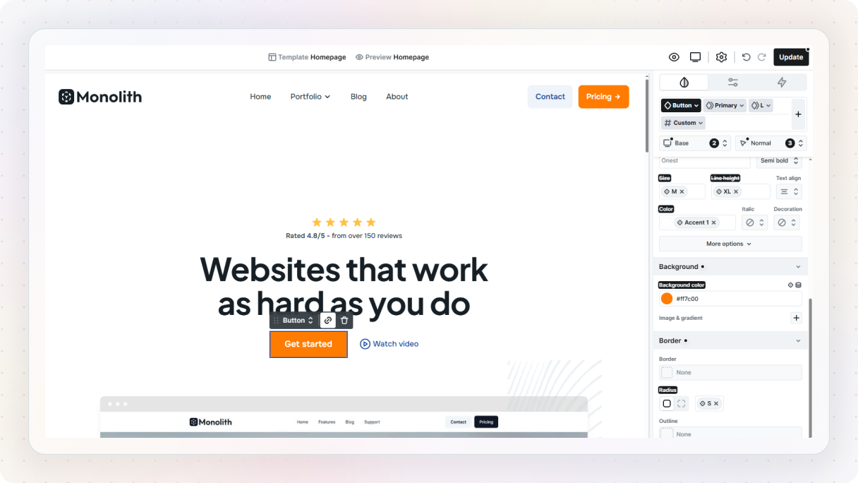
Let’s start with something simple. Pick the main heading, either directly on the Canvas or from the Navigator. Once it’s selected, you’ll see a blue outline around it. From there, you can either click the edit option in the toolbar or just double-click the text and start typing. Change it to something that fits your idea. Press enter, and you’re done.
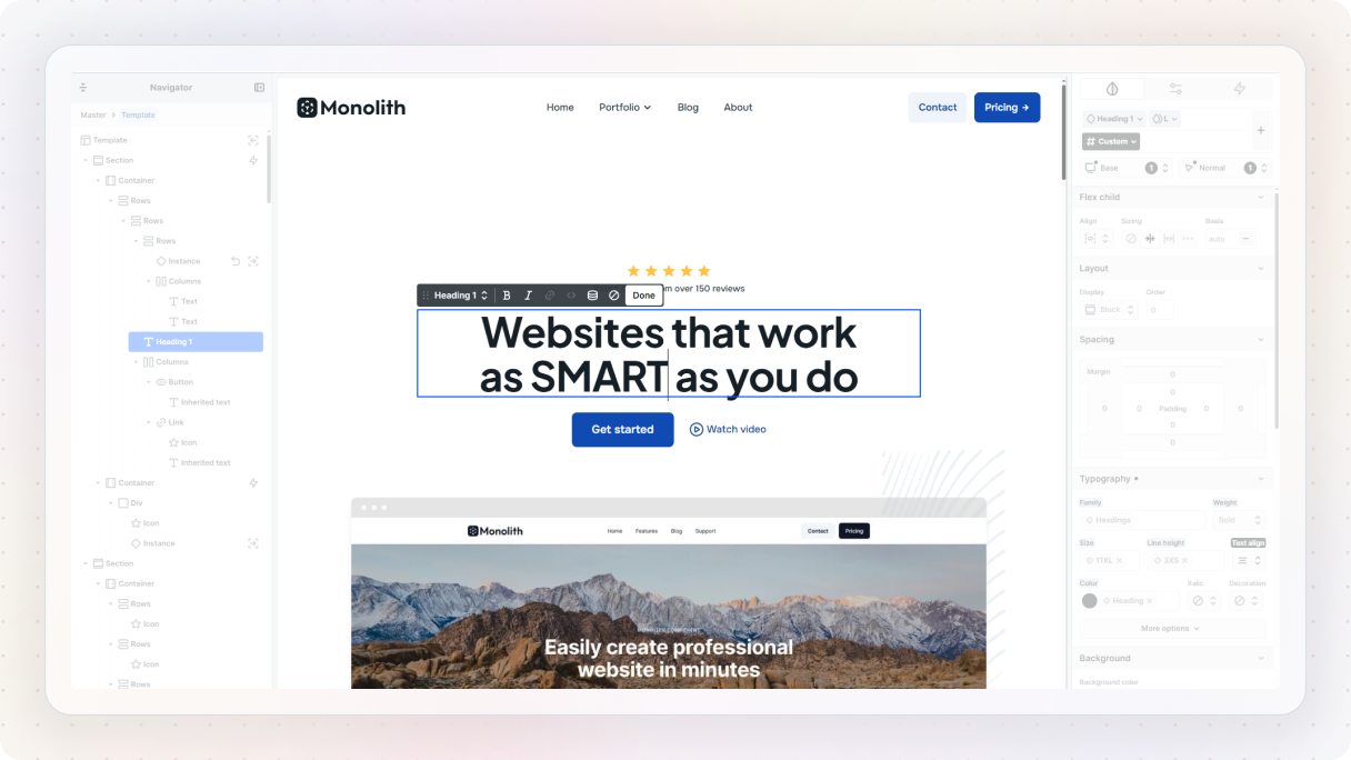
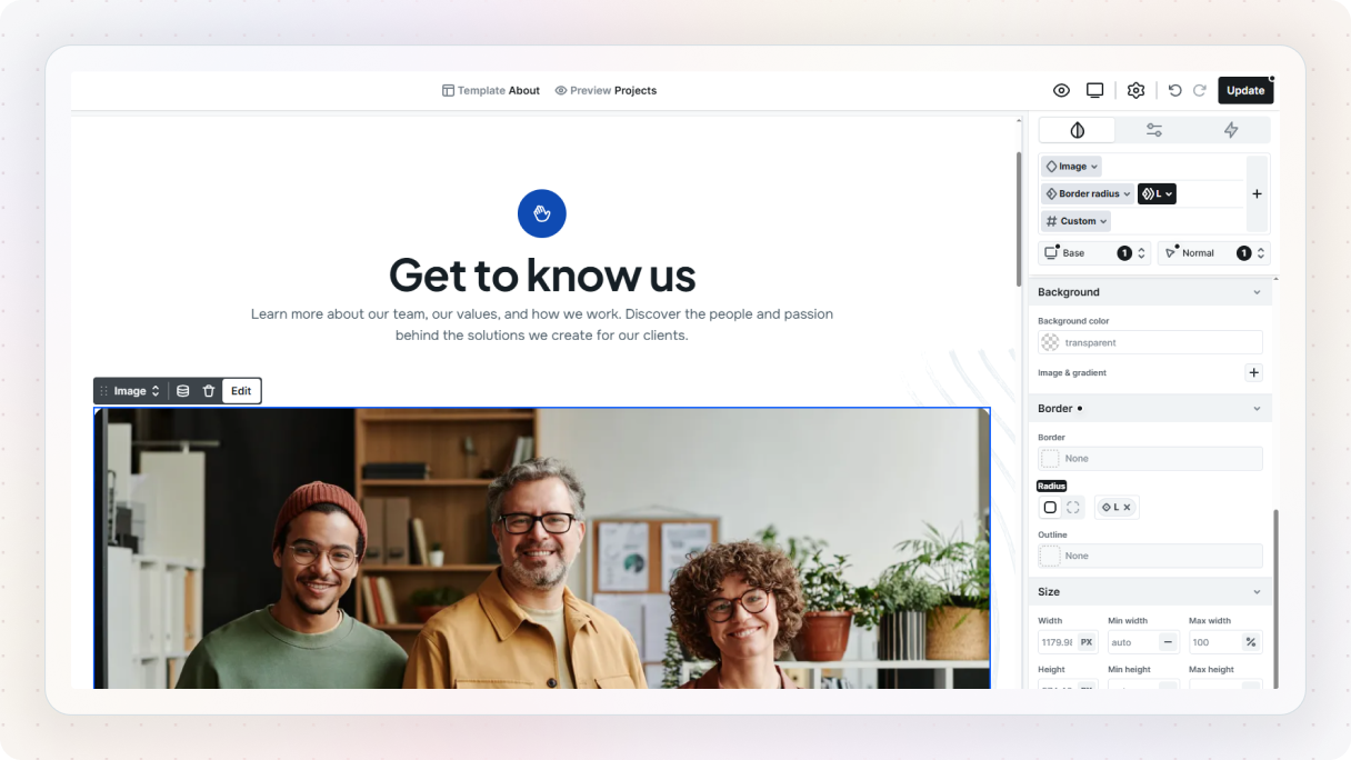
Next, let’s update the image. Double-click it, choose something that fits your direction, and drop it in. You can always fine-tune it later from the right side panel, but for now, just swapping it out is enough. At this point, it should already feel a bit more like yours.
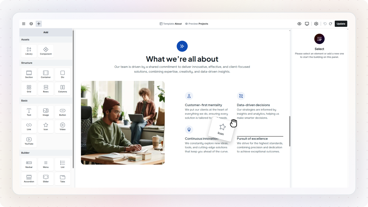
If you want to take it a step further, try adding something new. Open the Add panel using the plus button, grab an element, and drag it onto the Canvas. As you move it around, you’ll see a gray line showing where it will land, and the Navigator will update at the same time so you can see exactly where it fits in the structure.
Notice what’s actually happening
As you do these, one thing starts to become clear pretty quickly: not every change works the same way. Some edits are just for that one element. You change the text in a heading, and that heading changes. You add a link to a button, and that button now points somewhere. Simple enough.
But other things are a bit more connected than that. A lot of what you see in a Mosaic theme already comes with some structure and styling built in. Text, buttons, sections, links, these aren’t just random pieces dropped onto the page. Most of them already have classes attached to them, which is part of what keeps everything consistent behind the scenes.
Classes: what connects your styles
As you start working with classes, you’ll notice there are a few different types. They all do slightly different things, but once you see the pattern, it’s actually pretty straightforward.
Element classes: your foundation
Every element you add comes with an element class by default. This is what defines the base look of that element. So all buttons share a base button style, all Heading 1s share a Heading 1 style, and so on.
If you change an element class, every element using it updates. This is what gives your design its consistency right out of the box.
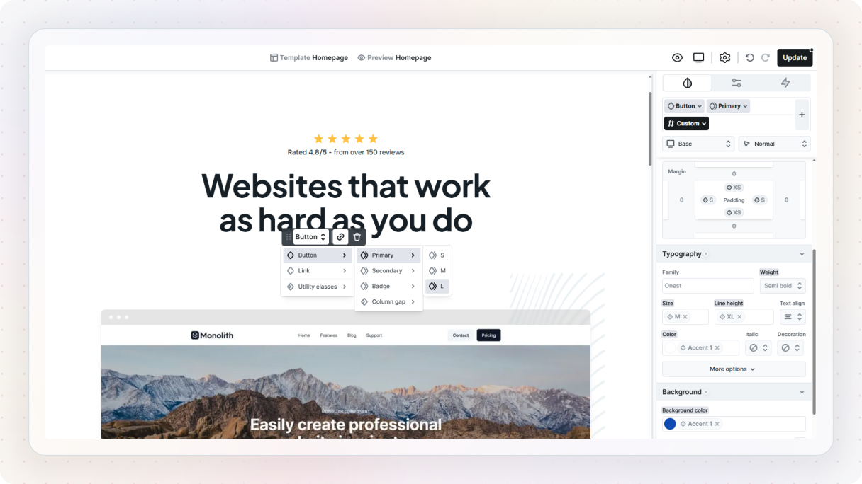
On top of element classes, you can create subclasses. These are basically variations on top of the base style. So instead of changing the main button style, you might create something like a “primary” or “secondary” version of it. These still stay connected to the base button style, but let you adjust specific things like color, size, or spacing.
A quick example
Let’s say you change the background color of a button. You select it on the Canvas, go to the Style tab, update the background color, and it looks good. But then you notice there are other buttons on the page. Do you have to go and update each one manually? Thankfully, no.
When you select an element, you’ll usually be working on a custom class by default, which only affects that one specific element. But if you want your changes to apply everywhere, you can select the element class instead. Once you do that and update the style, you’ll see the change ripple through all the matching elements.
Now, what if you don’t want every button to look exactly the same? That’s where subclasses come in. Instead of breaking the connection, you can create a variation. Add a subclass, give it a simple name, and style it however you like. Then apply it only to the buttons you want to look different. So instead of styling everything individually, you’re building on top of a shared foundation.
Utility classes: reusable styling across elements
Utility classes work a bit differently. They’re not tied to a specific element. Instead, they’re small, reusable styles you can apply anywhere. For example:
- adding consistent spacing
- applying a border radius
- setting a shadow
Instead of repeating the same styling over and over, you define it once and reuse it wherever you need it.
A quick example
Now let’s say you want to add something simple, like rounded corners. Not just to your buttons, but to other elements too, like images or cards. Instead of styling each one separately, you can create a utility class for it.
You create it the same way as before, give it a clear name, and then you can use it across different elements whenever you need that same look. So instead of repeating the same styling over and over, you define it once and reuse it wherever it makes sense.
And just like with element classes, utility classes can also have subclasses. These let you create more specific variations of a utility.
So instead of one generic border radius rule, you might have small, medium, and large variations. They’re optional, but useful when you want a bit more control without creating completely new styles each time.
Custom classes: for one-off changes
And finally, there are custom classes, which are selected by default in the Editor. These are unique to a single element and don’t affect anything else. They’re perfect for small, one-off adjustments when you don’t want to impact the rest of your design.
Just something to use carefully, because if everything becomes a one-off, you lose the benefit of having a system in the first place.
Variables: change it once, update it everywhere
You’ll also come across variables, which work a little differently from classes. If classes define how something looks, variables define the values behind those styles.
Think of things like colors, spacing, font sizes, or even layout-related values. Instead of setting those directly on every element, Mosaic lets you define them once as variables and reuse them across your entire site.
So instead of picking a color manually every time, you might be using something like an “accent color” variable, and that can be applied to buttons, text, backgrounds, wherever you need it.
Let’s try a simple example
Let’s say you want a primary background color for your site. Most of the time, that might just be white. Instead of setting that manually on different sections, you create a variable for it.
To do that, open the Style variables panel from the settings icon in the Top panel. From there, make sure you’re in the color section, and you’ll see the variables your theme already comes with.
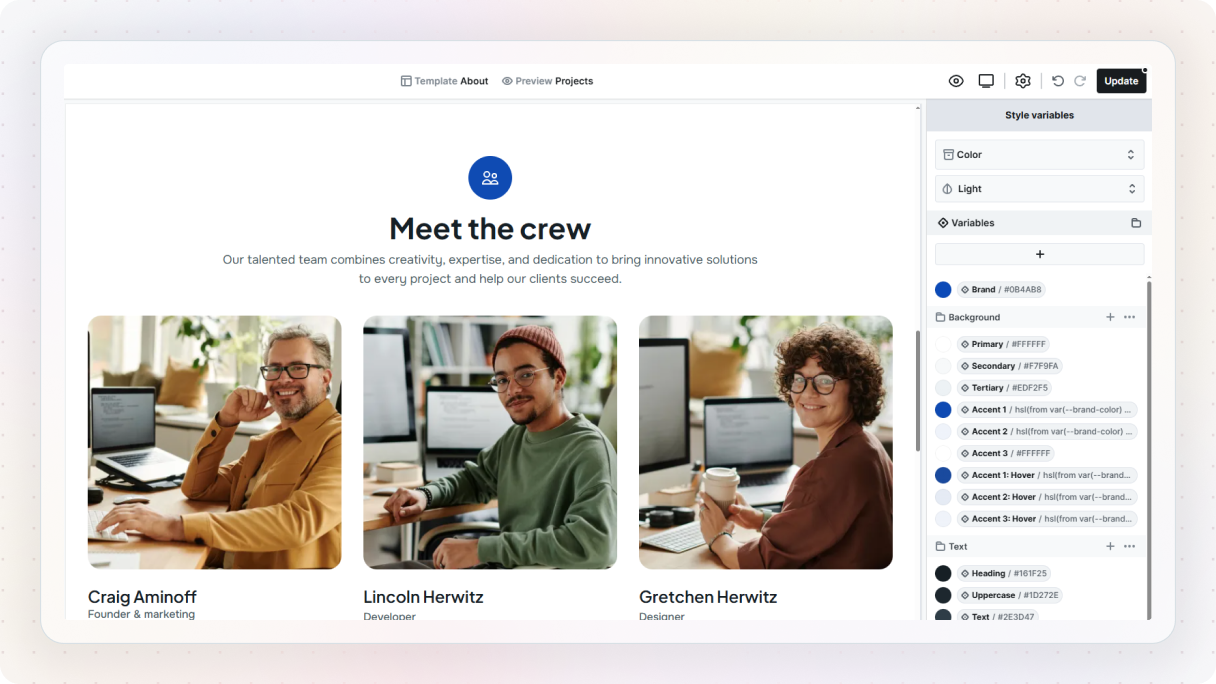
You can either edit one of those, like the primary background, or create a new one using the plus button. Give it a simple name, set your color, and you’re good to go. Now, instead of picking a color directly in your styles, you can apply that variable.
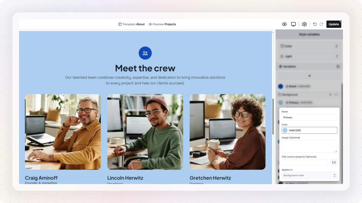
Whenever you’re styling something, you’ll notice a small variables icon next to certain properties after hovering over them. Click that, and you can choose from your variables instead of setting a raw value.
Where it really becomes useful
The real benefit shows up when you change it later. If you update that one variable, every place that uses it updates automatically. You don’t have to hunt down each and fix it one by one.
That’s what makes variables feel so powerful. They separate the decision from the implementation. You decide what your colors, spacing, or typography should be in one place, and the rest of the site follows.
Components: reuse more than just styles
And then there are components. If classes help you reuse styles, and variables help you reuse values, components help you reuse entire pieces of your design.
A component is basically a reusable element or group of elements that you want to use more than once. It could be something small, like a button group, or something bigger, like a card, CTA block, or testimonial layout.
Once you create it, you can place it in different parts of the site as an instance. Those instances stay connected to the original component, so if you update the source, the others update too.
That’s a really big shift, because it means you’re no longer rebuilding the same things again and again, but starting to think more in terms of how to build a design system.
Let’s see how it behaves
You’ll recognize component instances pretty easily, they’re highlighted in purple on the Canvas and in the Navigator.
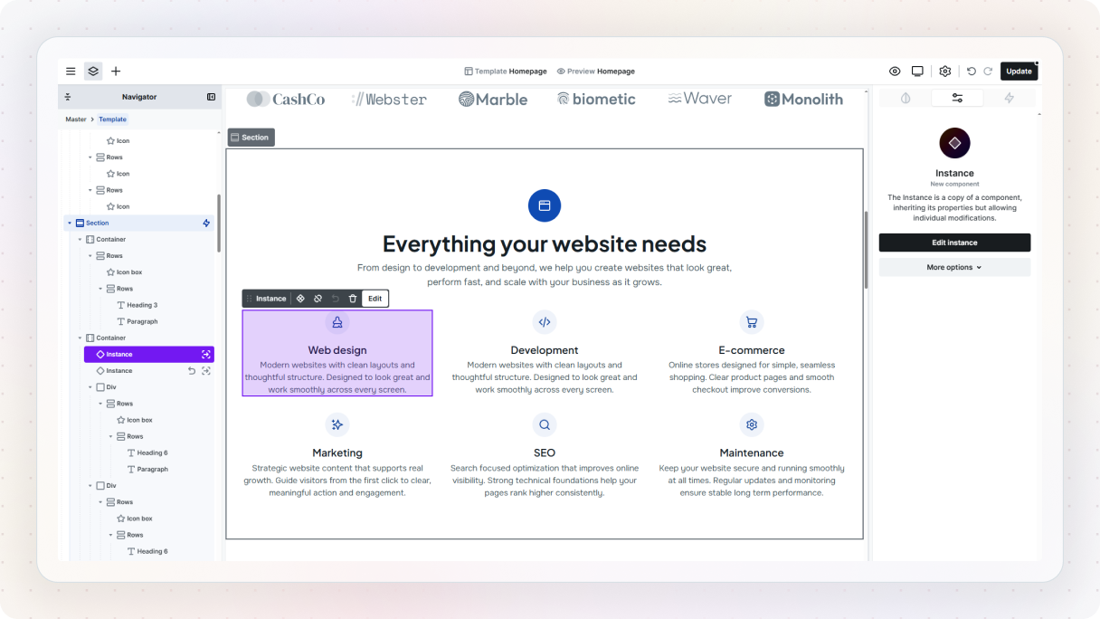
Click into one of them using the component icon. Now you’re editing the original version of that component. Change something simple, like the text, or add an icon to a button. Then look around. You’ll see that same change applied everywhere else the component is used.
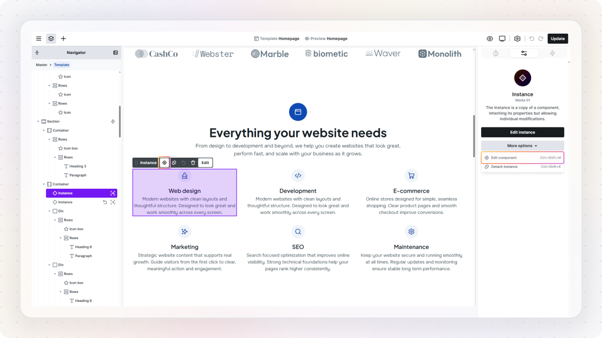
Now, what if you want one of them to be a bit different? In that case, just double-click the instance to edit it on its own. This lets you make small changes without affecting the rest. So you’re not locked in, you can keep things consistent, but still adjust individual pieces when you need to.
And whenever you’re inside a component like this, you’ll notice that same purple highlight, that’s your cue that you’re editing something shared.
A simple way to try this is to create a card or a small CTA block and turn it into a component. Then place it somewhere else and change the original. Once you see the other instance update too, the value of reuse becomes much more obvious.
A small detail that makes a big difference
And while you’re experimenting, it’s worth noticing something else. Mosaic stays very close to how the web actually works.
For example, if you place something inside a link, the whole thing becomes clickable. So if you put an entire card inside a link element, the whole card becomes the clickable area, not just a little bit of text inside it. That sounds small, but it’s one of those details that makes the Editor feel more predictable once you notice it.
You definitely don’t need to master all of this right away. The main thing to understand for now is the difference between making a one-off edit and creating something you can reuse.
What to do if you get stuck
At some point, something won’t make sense. That’s just part of the process. The good news is, you’re not on your own here.
When something feels confusing, the easiest way to get unstuck is usually to watch someone else do it. Mosaic has its own set of tutorial videos, from quick walkthroughs to more detailed guides, so you can usually find something that matches what you’re trying to do without digging too much.
And once you’ve seen the basics, it’s also worth checking out some creators on YouTube. A lot of them share their workflows and real builds, and seeing how someone else approaches the same problem can make things click much faster.
If you’re looking for something more specific, the documentation is a good next step. It goes a bit deeper and is especially useful when you want to understand how something works or where to find a certain setting.
And if you’re still not sure what to do next, or just want a second opinion, the Discord and Facebook community is a great place to ask. Most of the time, someone’s already run into the exact thing you’re dealing with.
If all else fails, you can always reach out to support. Sometimes a quick answer from someone who knows the tool inside out is all it takes to get moving again.
The main thing is, you don’t have to figure everything out on your own. There’s always a way forward when you get stuck.
Best practices for your first week in Mosaic
Once you’ve gone through your first session, the next step is just to keep building. Not bigger projects needed right away, just more practice.
One of the easiest ways to get better quickly is to recreate something you like. Pick a section from a website you admire, a hero, a pricing block, a simple layout, and try to rebuild it in Mosaic. It forces you to think about structure and reuse in a really practical way, especially once you start putting together larger website layouts.
As you build more, you’ll also start to notice patterns in how you work. That’s where things like classes come in.
You don’t need a perfect system from day one, but it does help to keep things a bit organized. Give things simple, clear names, reuse styles where it makes sense, and try not to style everything as a one-off. It’ll save you a lot of cleanup later.
It’s also worth keeping things simple at the start. There’s a lot you can do in Mosaic, especially with interactions and more advanced features, but you don’t need all of that right away.
Another small habit that helps: take a minute before you start building something new and think about what you actually want to create. It doesn’t have to be a full plan, just a rough idea of the structure. It makes everything feel a lot less messy as you go.
And if you ever feel stuck or unsure, don’t forget you’ve got the community and resources to lean on. A lot of people are figuring this out at the same time, and that’s actually a big advantage.
What to do next
At this point, you’ve probably started to get a feel for how things work and how everything connects. The next step isn’t to learn a bunch of new stuff, it’s just to use it a bit more intentionally.
In the next guide, we’ll build your first real project in Mosaic. Nothing too complicated, just something a bit more structured, where you start thinking about what repeats, what stays consistent, and how things fit together from the start.
And if you’ve already made something, even something small, it’s worth sharing it with the community. Seeing how others approach things (and how they solve the same problems) helps a lot.


