
Introduction
Building a website today isn’t just about getting content onto the page. Attention is short, expectations are high, and static layouts often don’t do enough to guide people through the experience. That’s where animation can make a real difference, not just by making your website look nicer, but by helping direct attention, signal interactions, and make everything feel more intuitive.
The problem is, a lot of WordPress users still assume that adding those kinds of effects means reaching for another plugin or writing custom CSS and JavaScript. And that’s usually where things start to get messier than they need to be. More tools often mean more complexity, more inconsistency, and more performance risk.
But if your builder already supports native interactions, you may not need that extra layer at all.
In this guide, we’ll look at 5 WordPress animation effects that actually improve UX, and show how you can build them natively in Mosaic without adding extra plugins.
Why animations matter for UX
Animations work because our brains are naturally drawn to movement. Think about it, if something moves on a screen, your eyes go there almost instantly, even if it’s just for a split second. That’s exactly why animation is so useful in web design.
But it’s not just about grabbing attention. Animations help guide your visitors through your website. They can show where to look next, highlight important elements, and make interactions feel clearer and more natural. Instead of users trying to figure things out on their own, the website gives them small visual hints along the way.
There’s also some science behind it. Motion can help reduce decision time by narrowing focus, and interactive elements tend to be more memorable than static ones. In simple terms, people notice things faster and remember them better when there’s meaningful movement involved.
And then there’s the overall feel of the site. Subtle animations, like hover effects or smooth transitions, make everything feel more responsive and polished. It’s one of those things users might not consciously notice, but it shapes how they experience your site.
So animations aren’t just there to look cool. When used the right way, they help users understand, navigate, and engage with your website more easily.
What makes a good WordPress animation
So, how do you actually know if an animation is good for your website?
The best way is always to test it. See how real users interact with it, whether it helps or gets in the way. But even without testing, there are a few simple principles you can rely on to stay on the right track.
One of the biggest things to keep in mind is that animation naturally attracts attention. That’s both its biggest strength and its biggest risk. Used well, it guides users to important elements. Used poorly, it quickly becomes distracting or even annoying.
That’s why purpose matters. Just because you can add an animation doesn’t mean you should. Every effect should have a reason behind it, whether it’s highlighting something important, showing that an element is interactive, or helping users understand what’s happening on the page.
It’s also important to keep things balanced. Larger or more noticeable animations can easily overpower your content if you’re not careful. The goal is to support the content, not compete with it.
Speed plays a role too. Animations should feel quick and responsive. If they delay actions or slow down the experience, your visitors will feel it immediately.
And finally, good animations reinforce structure. They help create hierarchy by guiding the eye and showing what matters first, second, and third.
A simple way to think about it: if the animation helps users understand your site faster or navigate it more easily, it’s doing its job. If it distracts them or gets in the way, it’s probably not.
How WordPress animations work in Mosaic
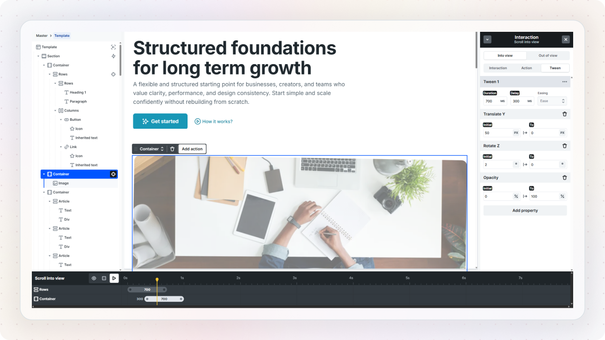
It all happens inside something called Interactions. This is where you define how elements respond to what users do, like hovering, clicking, scrolling, or even moving their mouse.
At the core, every interaction is pretty simple. There’s something that triggers it, and something that happens because of it.
Think about hovering over a button and seeing an image fade in. The hover is the trigger, and the change in opacity is the action. That’s the basic idea behind everything you’ll build.
To get started, you’ll head over to the Interactions tab and click “Add interaction”. From there, you can choose between different types, like a simple interaction (for things like hover or scroll into view) or a continuous one (like animations that react while scrolling or moving the mouse).
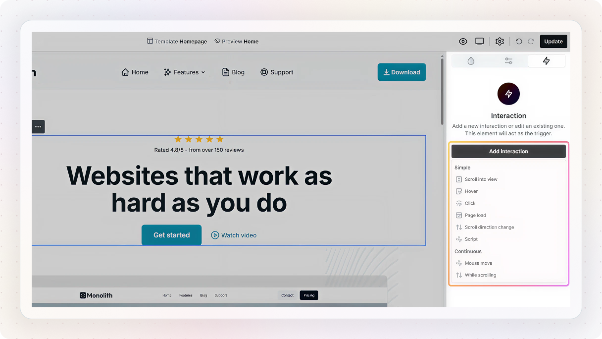
Once you add one, you’ll see a few key parts you’ll work with:
- Trigger element: the element you select on the canvas (like a button or section)
- Interaction type: how it behaves (hover, click, scroll, etc.)
- Trigger: what exactly starts it (for example, hover in or scroll into view)
- Target: the element that will animate
- Action: what happens to that element (translate, scale, etc.)
After that, you’ll move into the Action / Animation panel, where you can actually build the effect. This is where you set things like opacity, position, or scale, and define how the animation moves from one state to another.
In Mosaic, animations are built using tweens. A tween is simply the transition between two states. For example, going from 0% opacity to 100% opacity creates a fade-in.
You’ll also notice a timeline, where those tweens live. This lets you control when things happen, add delays, or layer multiple animations together. For example, you can make one element fade in first, then another one slightly after it.
If you want to refine things further, you can adjust timing, duration, and easing to make everything feel smoother. And if needed, you can even set conditions, like running an animation only on desktop but not on mobile.
The 5 best WordPress animations
With the basics out of the way, let’s look at what this actually looks like in practice. These 5 animation effects are commonly used in modern web design because they do more than just add movement. They help users navigate, understand interactions, and stay engaged. And instead of relying on extra tools, you can build each of them natively in Mosaic.
1. Background parallax
This is one of those effects you’ve probably seen everywhere, even if you didn’t notice it. As you scroll, the content moves, but the background stays in place. It adds a bit of depth and makes the whole section feel more dynamic without being distracting.
To build it, start by selecting the section you want to work with on the canvas. This is the part that will get the background image.
Over in the Style panel, find the background settings and add your image. Replace the placeholder with something that fits your design. This works especially well with large, high-quality images, like landscapes or textures.
Now for the main part, once your background image is set, enable the “Fixed” option. That’s what creates the parallax effect.
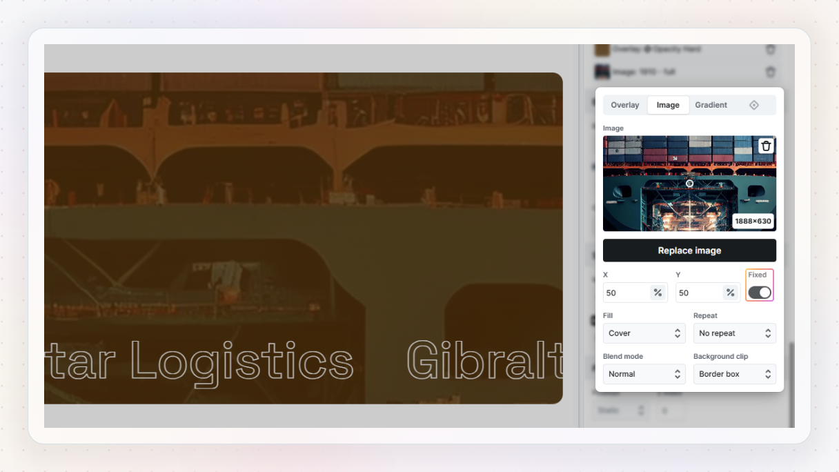
That’s it, if you preview the page and scroll, you’ll see the content move while the background stays in place. It’s a really small change, but it instantly adds a bit more depth and makes the layout feel more alive.
A quick tip: this works best when you don’t overuse it. Try it on key sections like hero areas or separators between content blocks, where it can add visual interest without getting in the way.
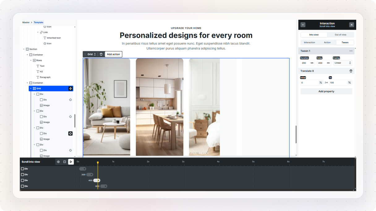
2. Horizontal parallax
If you want something a bit more dynamic than a fixed background, this is a great next step. Instead of the background staying in place, the content itself moves horizontally as you scroll. It adds motion to the layout and works really well for things like testimonials, galleries, or feature sections.
Set up your content
To build it, start by adding some content to work with. Head over to the Add panel, drop in a Library element, and choose something like a testimonial layout. This gives you a good starting structure.
Once it’s on the canvas, select the main container and remove any layout classes you don’t need. For example, if there’s a three-column setup applied, you can clear it so you have more control over the layout.
For this effect to feel right, you’ll need a bit more content. Open the navigator, duplicate your rows, and stack them so you have multiple items to work with.
Set up the horizontal layout
Next, we’ll set up the horizontal layout. Wrap your rows inside a Grid, then select the grid and go to the Style panel. Change the grid flow to columns so everything sits side by side instead of stacking vertically.
It’ll probably look a bit tight at first, so give the columns some space. Set a wider column width (around 400–500px works well), then center the whole thing by selecting the parent container and adjusting the horizontal alignment.
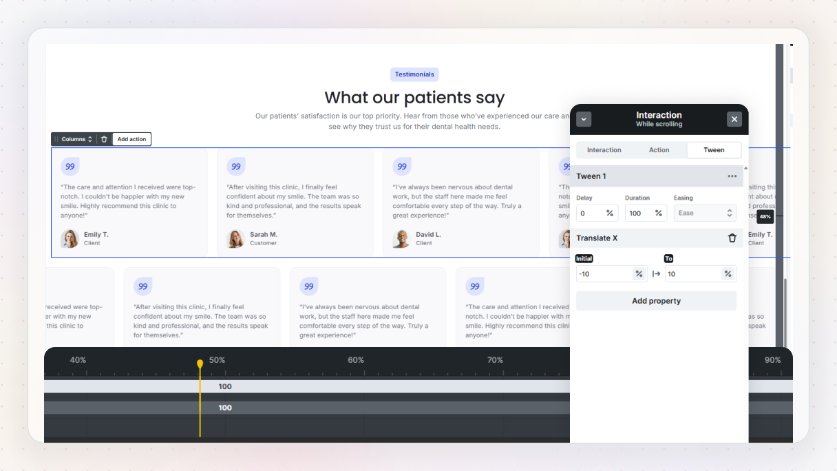
Add the scroll animation
Now for the animation. Select the section, head over to the Interactions tab, and add a new interaction. Choose “While scrolling”, since we want the movement to happen as the user scrolls.
Set the target to your grid, then add an action using Translate X:
- Set the initial value to something like 10%
- Set the end value to -10%
Preview it, and you’ll see the content smoothly moving sideways as you scroll.
Fine-tune the effect
From here, you can fine-tune the feel:
- Adjust the duration to control how quickly the movement happens
- Tweak the start and end points so the animation begins as the section enters the viewport
If you want to make it more interesting, you can duplicate the grid and apply the same animation in reverse. Just flip the values (-10% to 10%), and now the rows move in opposite directions. It adds a bit more depth without making things too busy.
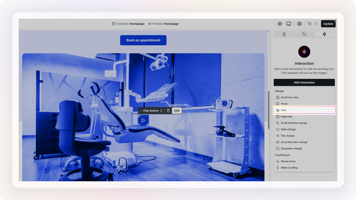
3. Video interactions (custom play/pause controls)
This one is a bit different from the others, but it’s just as important. Instead of adding motion for visuals, you’re improving how users interact with video. Small touches like custom controls can make your site feel much cleaner and intentional.
Play on click set up
Let’s start simple. First, add a video element to your layout and select your video file. Then head over to the Settings tab and disable the default controls. We’re going to replace those with our own.
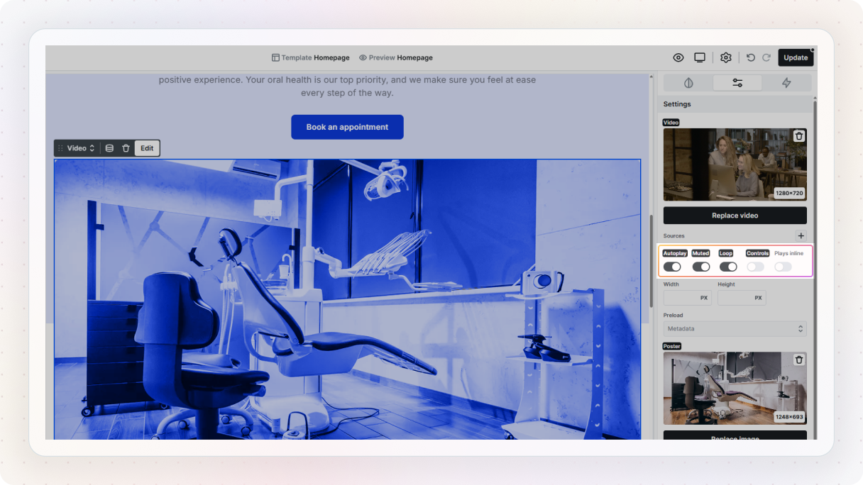
Next, add a button to the page. This will be your play button. Select the button, go to the Interactions tab, and create a new interaction. Choose Click as the interaction type. Then set the target to your video element.
In the Action tab, choose Player → Play. Then, preview it, and you’ll see the video start playing when you click the button.
Turning it into a toggle (play / pause)
Now let’s make it a bit more advanced. Add a second button so you have both a play and a pause control. Style them however you like, then place them on top of each other. The easiest way to do this is:
- Set the parent container to relative
- Set both buttons to absolute
This way, they overlap in the same position.
Now go back to the Interactions tab and create a new Click interaction, but this time use odd/even clicks.
On odd clicks (1st, 3rd, 5th…):
- Set the video to play
- Hide the play button (set opacity to 0%)
- Show the pause button (set opacity to 100%)
On even clicks (2nd, 4th, 6th…):
- Set the video to pause
- Show the play button again
- Hide the pause button
You can control the visibility by adjusting opacity in the animation settings, and keep the transitions quick so it feels responsive. Preview it, and now you’ve got a proper toggle, click once to play, click again to pause.
Bonus: video overlay with play button
You can also take this a step further with a simple overlay. Add a container (like a row) on top of your video, and place a play icon inside it. Then:
- Set the parent wrapper to relative
- Set the overlay container to absolute
- Stretch it to 100% width and height so it covers the video
- Add a semi-transparent background
- Center the icon using flex alignment
Now for the interaction:
- Select the overlay container
- Add a Click interaction
- Animate its opacity to 0% (so it fades out)
- At the same time, add a Player → Play action to the video
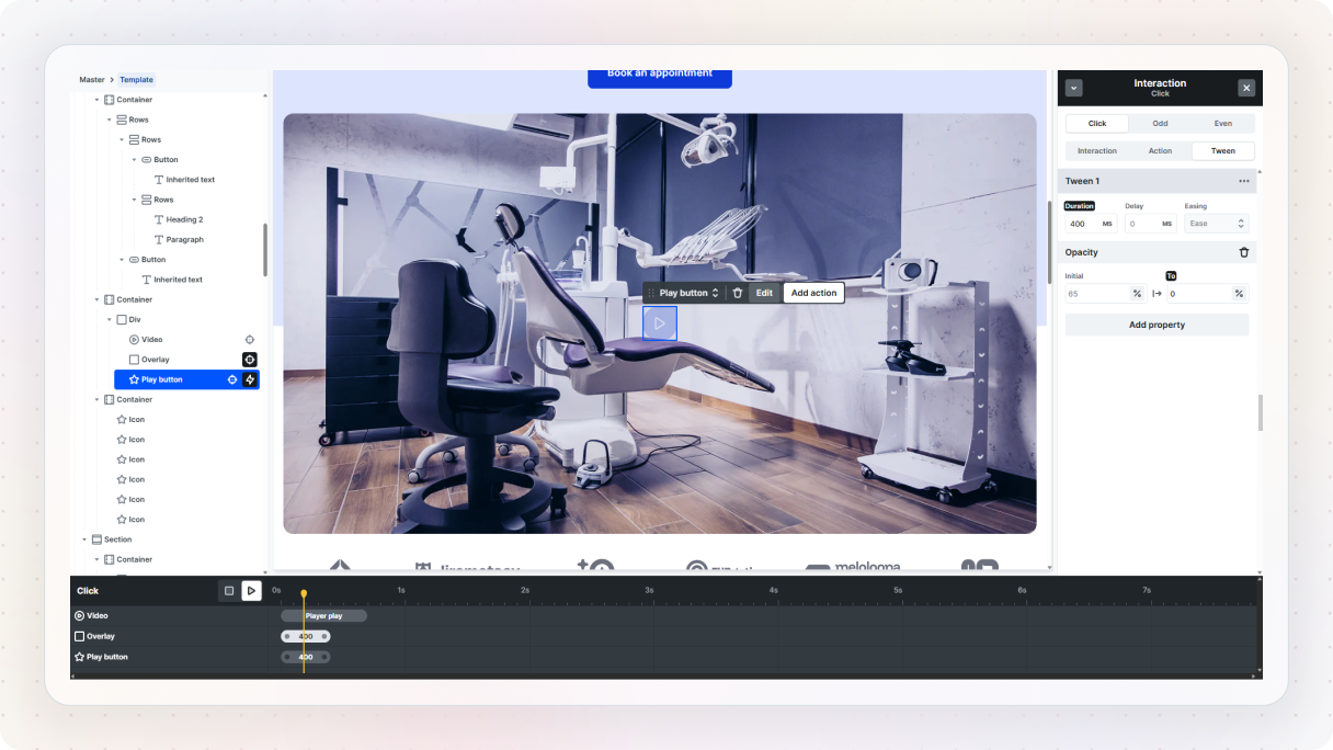
Preview it, and you’ll get a clean result, click the overlay, it fades away, and the video starts playing.
4. Shape dividers
This is one of those small details that can make a layout feel much more designed. Instead of hard edges between sections, you get a smooth transition that adds a bit of personality without being distracting.
Add the shape
Let’s build one. Start by getting an SVG shape. You can download one from any free SVG library. Once you have it, head over to the Add panel in Mosaic and drop in an Icon element.
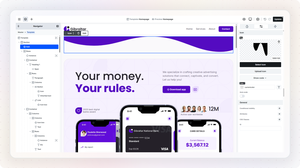
With the icon selected, go to the Advanced options and upload your SVG file. That will bring your shape into the layout.
Style and position it
In the Style panel, set:
- Width: 100% (so it spans the full section)
- Height: auto (so it keeps its proportions)
Next, we’ll position it properly. Set the element to absolute positioning so it floats instead of pushing content around. Then place it where you want it, usually at the top or bottom of a section.
If it overlaps your content, that’s normal. You can fix that with z-index:
- Lower the shape’s z-index so it sits behind
- Or raise the section content so it stays on top
Now for the color. If you set the SVG to currentColor, it will automatically inherit the color from the element settings. That makes it really easy to experiment, just change the color value and the shape updates instantly. Pick something subtle so it complements your design instead of overpowering it.
At this point, you already have a responsive shape divider. If you preview and resize the screen, you’ll see it adapts nicely.
Adding a simple animation
To make it a bit more interesting, we can animate it. First, go to the Transform settings and set the transform origin (Y-axis) to 0%. This makes sure the shape scales from the bottom instead of the center.
Now head over to the Interactions tab and add a new interaction. Set it to run on page load.
For the action:
- Choose Scale → Scale Y
- Set the initial value to around 70%
- Set the end value to 100%
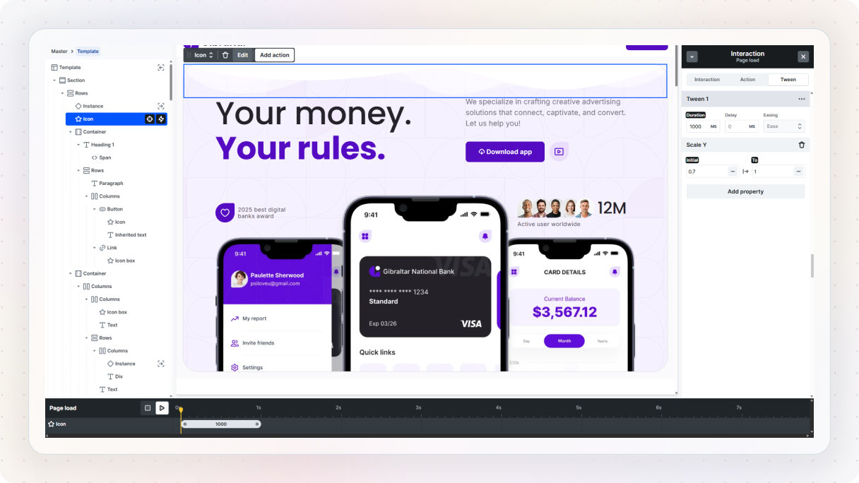
Preview it, and you’ll see the shape smoothly grow into place. If it feels too fast, just increase the duration to slow it down.
You can also make it loop by duplicating the animation and reversing the values, then enabling looping in the interaction settings. That creates a subtle, continuous motion.
5. Reading progress bar
This one is simple, but really effective, especially for longer pages. It gives users a sense of progress as they scroll, which makes the experience feel smoother and more predictable.
Set up the progress bar
Let’s build it. Start by adding a Div above your main content section. This will be the container for the progress bar. Rename it something like “Outer” so it’s easier to keep track of.
With it selected, head over to the Style panel and set it up:
- (Optional) add a light background color
- Set position to Sticky
- Set top to 0 so it sticks to the top of the page
- Increase the z-index so it stays above your content
- Set overflow to hidden
At this point, you’ve got a fixed container that stays visible as users scroll. Now let’s add the actual progress bar. Inside the “Outer” div, add another Div and rename it to “Progress Bar”. Give it a background color (something like your accent color works well), and set its height to around 6–8px.
Adding the interaction
Right now, it’s just sitting there. To bring it to life, select your post content (or the main section you want to track). This will be the trigger. Go to the Interactions tab and add a new “While scrolling” interaction.
Now select the Progress Bar, and add an action using Translate X.
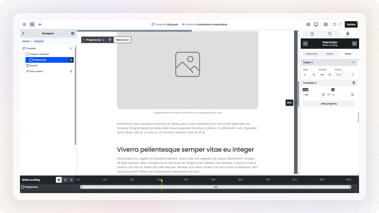
- Initial value: -100% (starts fully off-screen to the left)
- End value: 0% (fills the container as you scroll)
To make the movement feel smooth and consistent, change the easing to Linear. Preview it, and you’ll see the bar gradually fill as you scroll down the page. You can always adjust the colors, thickness, or position to match your design, but even in its simplest form, it works really well.
Skip the setup with pre-built interactions
If you don’t feel like building everything from the ground up, you don’t have to. Mosaic comes with Page kits and pre-built sections in the library, many of which already include interactions. You can drop these into your layout and instantly get more advanced animations without setting them up step by step.
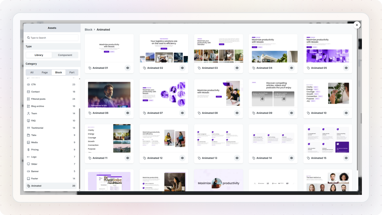
But they’re not just there to save time, they’re also a great way to learn. You can add any of these blocks, check how the interaction is set up, and tweak it to see what happens. It’s a much faster way to understand how things work compared to starting from a blank canvas every time.
And when you’re working on a real project, they can speed things up a lot. Instead of building everything from scratch, you can take a pre-built interaction and adjust it to match your design. It’s a simple approach, you just reuse what’s already working, learn from it, and then make it your own.
Conclusion
As you’ve seen, adding animation to a WordPress site doesn’t mean turning everything into a full-on motion experience. In most cases, it’s the smaller details that make the biggest difference. A subtle hover effect, a smooth scroll animation, or a simple progress bar can go a long way in making your site feel more engaging and easier to use.
Of course, if you do want to go further, you can. Mosaic’s Page kits come with built-in interactions, so you can start with more advanced animations right away and customize them to fit your design.
The key thing to remember is that animation is a bit of a balancing act. When it’s used with purpose, it helps guide users, improve flow, and make your site feel more polished. But when it’s overused or added without a clear reason, it can quickly become distracting.
And just as important, having a builder with native interactions makes the whole process a lot smoother. Instead of relying on extra plugins or workarounds, you can build and control everything in one place.


