


Introduction
The whole dark mode vs light mode thing has really gotten people talking, web designers, developers, and even everyday users have given their opinions. And if you’ve been working on a new website or just playing around with your phone settings, you’ve likely faced the choice between dark mode and light mode. So, which one takes the crown, and does it even make a difference for your website?
In this post, we’re going to explore the whole debate between dark and light themes. We’ll go through some important questions like:
- Is dark mode better for your eyes?
- Does light mode drain the battery?
- Is dark or light mode more readable?
We’ll also share some practical examples, tips on how to set them up, and examples from our WordPress theme builder to help you figure out which theme works best for your site.
What are dark and light website themes?
Light themes have been the go-to design for websites and apps for ages. They usually have a white or light background paired with dark text and elements. These themes work really well in bright settings since they resemble printed paper, which makes them easy for users to navigate and feel comfortable with.
There’s this whole other side to things with dark themes. Instead of the usual light backgrounds, they go for a dark or black one with bright text and design features. It has this cool, modern feel that screams futuristic. Lately, they’ve really taken off, especially since you can find them in the settings on devices like iPhones, Androids, and desktops. Both themes bring their own unique looks and benefits.
Today, understanding the difference between dark vs light mode is crucial for web designers.
Is dark mode better than light mode?
The debate over whether dark mode is better than light mode isn’t straightforward. It really comes down to personal taste, the setting you’re in, and what your website is meant to do.
User preferences
Dark mode is super popular with people who are in low-light settings or just like that modern vibe. Meanwhile, light mode gives off a classic feel, which makes it a go-to for people who appreciate clear and simple designs.
Environment matters
When it’s dim, dark mode helps cut down on glare and is gentler on your eyes. But when you’re in a bright space, light mode is usually easier to read and less tiring for your eyes.
When you’re thinking about your website, it’s important to think about how and when your audience will engage with your content.
Purpose of your website
The kind of website you’re creating really affects whether a dark or light theme works better for you. For example:
- Light mode works best for:
- Websites with a lot of content, like blogs, news outlets, and educational platforms, need to be super easy to read, no matter the situation.
- Dark mode works best for:
- Think about portfolios, gaming sites, or tech-focused platforms. They all have that look that really stands out.
So, as you compare dark vs light mode, consider the context: user environment, device, and your website’s goal.
Is dark mode better for your eyes?
In the dark mode vs light mode debate, one of the main reasons people love dark mode is that they think it’s better for their eyes. But is it really? The truth is a bit more complicated than it looks.
The science of eye strain
Eye strain happens when your eyes are overworked trying to focus, which can happen because of bad lighting, too much time in front of screens, or a high contrast between the text and the background. Using dark mode can really ease this strain in dim lighting since it gives off less light, cuts down on glare, and makes the screen easier on the eyes.
However, in brightly lit environments, dark mode can have the opposite effect. The low brightness of the screen in dark mode forces your eyes to work harder to distinguish text, which can lead to more strain. Light mode, in this case, performs better because it mimics natural light and provides higher readability.
Blue light and sleep
One of the other benefits people talk about with dark mode is that it helps cut down on blue light exposure. You know how blue light from screens can mess with your sleep? Well, by default, dark mode helps reduce that. So, it’s especially useful for anyone who tends to use their devices in the evening or at night.
The pros and cons of dark mode
Dark mode is super popular with both designers and users, but it does have its downsides.
Pros of dark mode
- Reduces eye strain: We’ve discussed that dark mode is perfect for late-night scrolling. It dims the brightness, cutting down on glare and making it way more comfortable for your eyes than a bright white screen.
- Saves battery: Using dark mode on OLED screens can really help extend your battery life. Since it uses way less power compared to when you have brighter colors on the screen.
- Modern Aesthetic: Dark mode really brings a modern vibe to websites. It fits perfectly with gaming, tech, and entertainment websites.
- Highlights visuals: Dark themes really make colors, images, and videos stand out. If your website is focused on creative visuals, going with a dark theme can really improve how your work is presented.
Cons of dark mode
- Reduced readability: Reading long paragraphs on a dark background can really hurt your eyes, especially when the room is bright. For websites that are text-heavy, using a light theme can be a better option.
- Accessibility issues: Dark mode can be tough for some people with specific visual impairments. For them, it can be hard to read light text on a dark background.
- Design challenges: When you’re creating something for dark mode, you really need to pay close attention to how colors and contrasts work together. If you pick the wrong colors, it can make the text tough to read or give everything a faded look.
- Bright environment challenges: Dark mode is great for low-light situations, but it can be tough on the eyes when it’s bright out.
Does light mode drain battery?
When you’re designing your website and choosing whether to use dark vs light mode, consider what devices your audience is using. If a lot of your visitors are on mobile phones with OLED screens, having a dark mode can really improve their experience, especially during long browsing sessions. On the other hand, for visitors using desktops or devices with LCD screens, battery life isn’t as big of an issue, so you might want to focus more on readability and accessibility.
What is the best color for a dark website?
Creating a dark mode website design means you really have to think about your color choices. Picking the right colors not only makes it easier to read but also boosts the overall look and feel of your site. Let’s explore some tips for selecting colors for a dark-themed website.
- Focus on contrast, but don’t go overboard: It’s super important to have a good contrast between your text and the background so that everything is easy to read. But if the contrast is too harsh, like using bright white on deep black, it can really hurt your eyes. In this case, a better approach is to go for off-white shades, like a light gray, for your text and use darker grays for the background.
- Go for soft and subtle color tones: When it comes to secondary elements, it’s best to stick with softer shades. Steer clear of bright colors since they can clash with a dark background and feel a bit off.
- Add accent colors strategically: Using bright accent colors can really make certain features stand out, like buttons, links, or CTAs. Some great options are blues, greens, and oranges. Just remember to use them moderately so everything stays balanced and doesn’t overwhelm the users.
- Steer clear of colors that clash: Be careful with using too many bright colors or mismatched shades, as that can make your site seem a bit messy. It’s best to go for a color palette that has colors that work well together for the best appearance.
The best dark mode website examples all use carefully balanced contrast and color harmony.
How to do dark mode on a website?
Many dark mode website examples today are created on WordPress using flexible builders like Mosaic, where adding a dark mode is easier than you’d expect. The builder comes with user-friendly tools that let you easily switch between dark and light modes. Let’s go over how to set it up.
1. Choose your theme
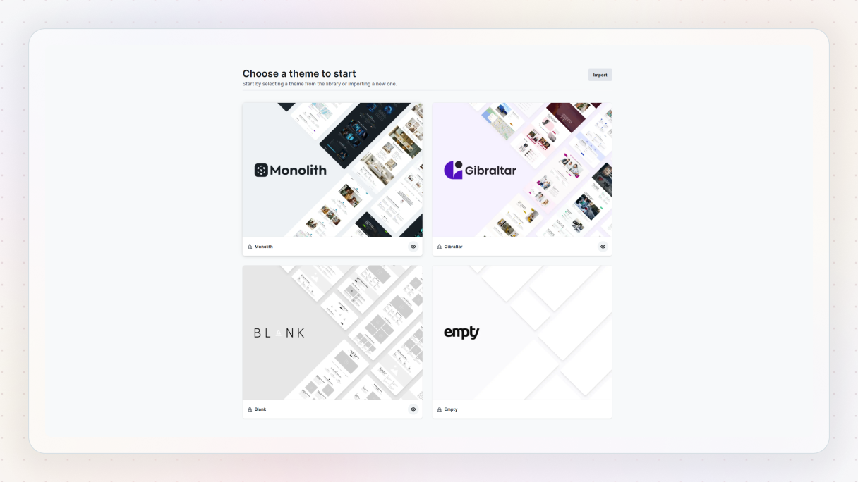
First, you need to choose your theme. These themes make it super easy to switch between different modes and customize how everything looks.
2. Use the Wizard to turn on dark mode
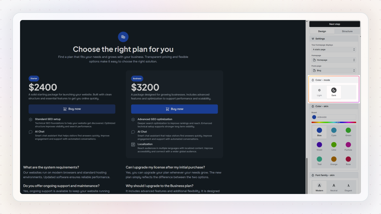
When you’ve picked your theme, select the ‘Start wizard’ button, which walks you through the setup process.
In the Wizard, you’ll find choices like Light mode and Color mode (which is basically dark mode). You can also pick a color skin, which is like your color palette. The best part? You can see all of them in real-time on your pages, so you’ll have a clear view of how your website is coming together.
If you want to know what colors your skin is made up of in light and dark modes, you can check out all the details in the editor and customize them however you’d like, after you’ve set up your theme.
3. Customize your colors in the editor
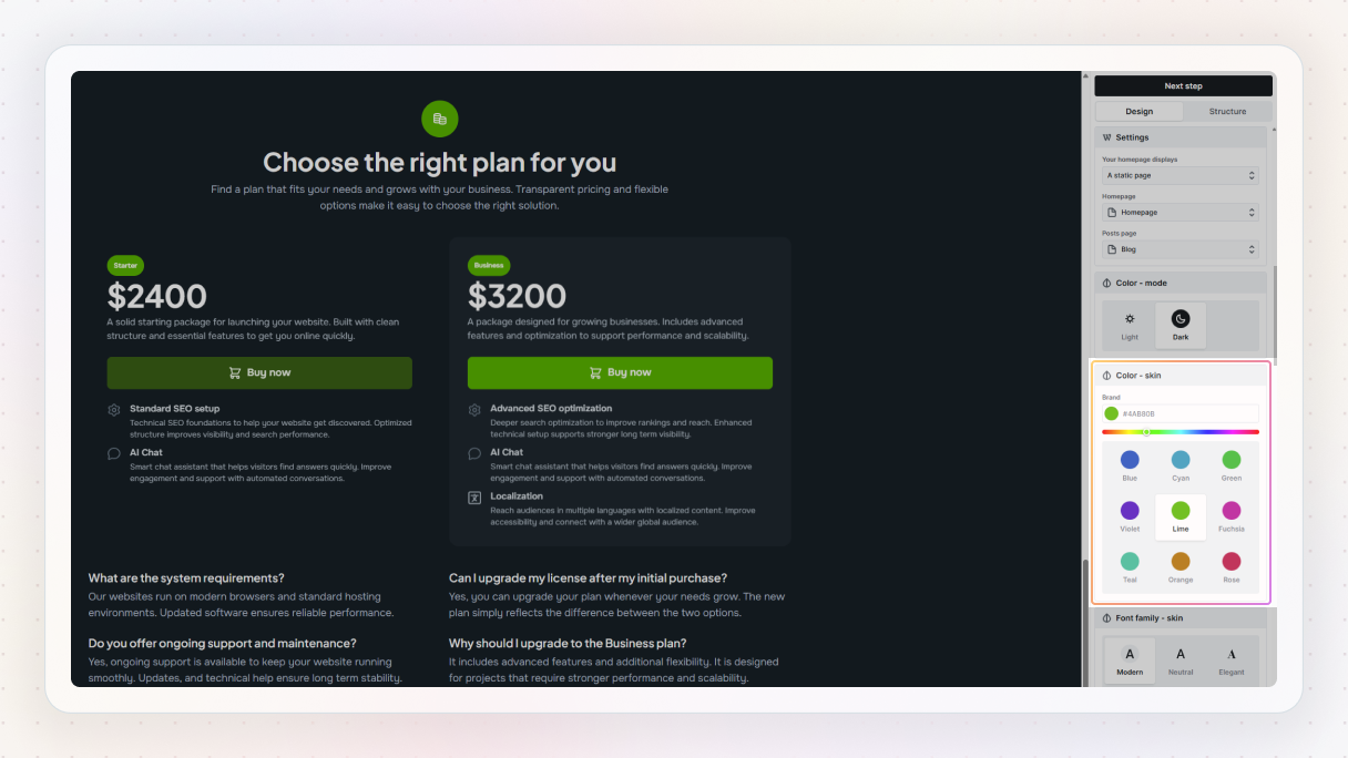
When you’re ready to make some adjustments, go to the Top bar in the Editor and find the Style variables option. This will take you to the Color variables panel. You can explore the colors for both light and dark modes here.
If you feel like adjusting a color, reorganizing them, or creating a brand-new palette, you can also do that here. Once you’ve got your palette set up, it’ll pop up as a convenient panel in any color picker across the editor if you select the variable icon next to its label.
When you change your color variables, it updates all over your site without you having to do anything extra. If you ever want to switch just a part of your design to dark mode or light mode, it’s really simple. Just go to the Style tab and switch between the options. It’ll only change the specific element or section you’ve selected from your theme, so you can customize things just the way you like without messing up the rest of your design.
Is it better to use dark mode or light mode?
We’ve talked about the pros and cons of dark vs light mode, including what to consider when designing for both. Now, the big question is: which one should you choose for your website? The truth is, there’s no one-size-fits-all answer to that.
It really depends on what you’re going for. Dark and light themes each have their pros and cons, so the ‘best’ option is to actually base it on your audience, the type of content you’re sharing, and what you want to achieve.
Dark mode has that cool vibe, while light mode gives off a classic and comfortable feel. Plus, they both affect things like usability, readability, and even how our eyes feel after staring at screens.
Dark mode
- Eye comfort: Best in low light
- Battery life: Better on OLED
- Readability: Better for visuals
- Vibe: Modern, sleek
Light mode
- Eye comfort: Best in bright light
- Battery life: Neutral
- Readability: Better for text
- Vibe: Traditional, clean
All in all, it comes down to what matches your content, your audience, and the atmosphere you want to build.
Dark vs light mode examples
Here are some dark vs light mode website examples from Mosaic that are worth your attention.
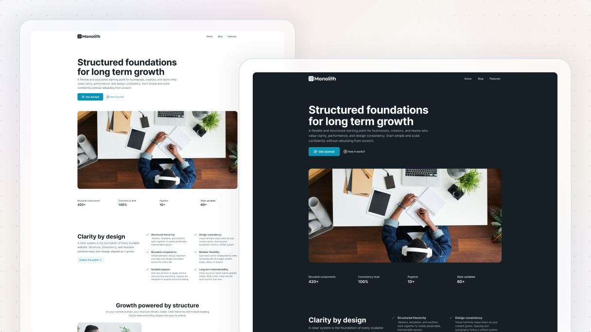
Hero 03 Block
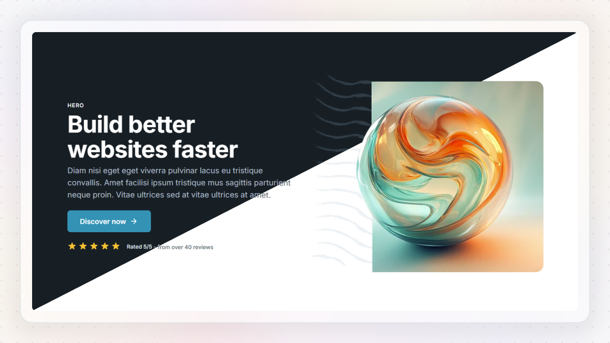
This one’s all about first impressions.
- In light mode, it feels clean and familiar, which is great for brands that want a clear, welcoming vibe.
- Change to dark mode, and it takes on a sleek, modern feel. It’s a solid dark mode website example for tech companies or anyone who wants that bold, futuristic look.
Features 04 Block
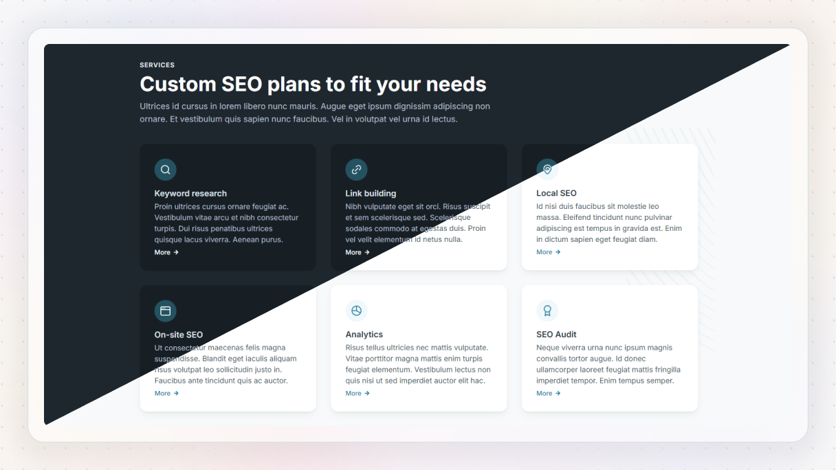
Here you’ve got a classic features layout that’s super versatile.
- Light mode keeps things bright and easy to scan, perfect for service pages or SaaS products.
- The dark version really makes the icons and text pop, it’s a stylish dark mode website example that still feels professional.
Features 36 Block
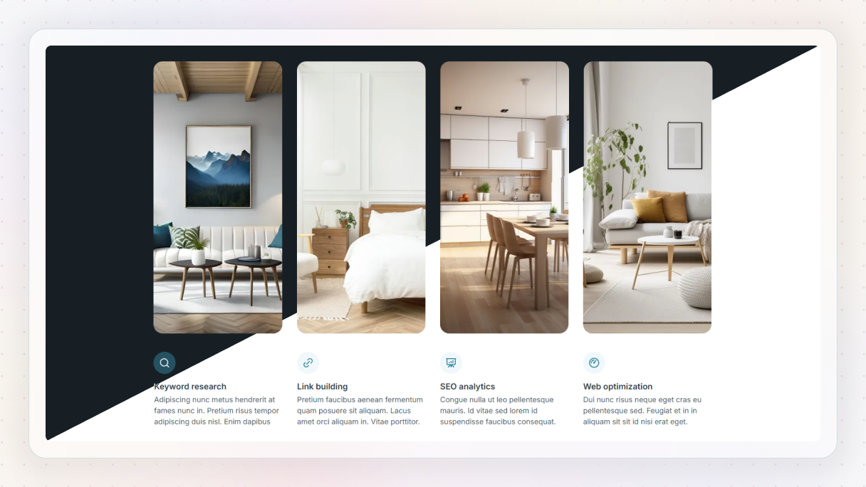
This one’s all about visual impact.
- With light mode, the layout feels clean and gallery-like, and it puts the spotlight on each image without distractions.
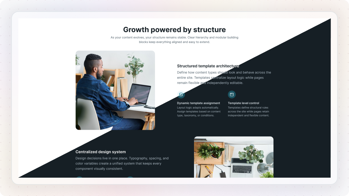
- Switch to dark mode, and the visuals really pop. The deep background adds contrast that makes colors and details stand out beautifully. If you’re looking for a dark mode website example that shows off imagery, think photography, portfolio, or product highlights, this one’s a winner.
Content 15 Block
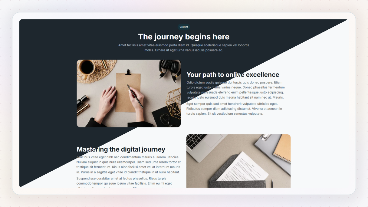
A great choice for telling your story or explaining what you do.
- The light version is super readable and ideal for content-heavy sections.
- In dark mode, it feels more cinematic, still easy to read, but with a bit more personality. A good balance if you’re aiming for a modern dark mode website example, without sacrificing legibility.
CTA 24 Block
This block is all about growing your email list.
- In light mode, it feels open and approachable, great for encouraging visitors to drop their email without hesitation.
- In dark mode, the contrast draws attention right to the form field and CTA button, making it a strong dark mode website example for newsletter sign-ups.
Contact 16 Block
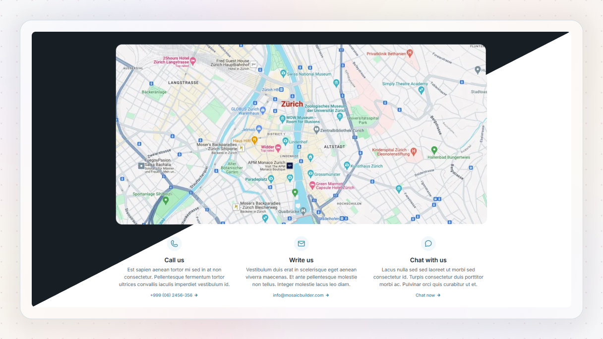
This contact section is all about making it easy to reach you, with a map that shows exactly where to find you.
- In light mode, everything feels clean and business-like, with the map and form clearly visible for quick action.
- The dark mode version gives it a sleek, modern vibe, ideal for agencies, studios, or local businesses. It’s a great dark mode website example for showing location and inviting conversation without overwhelming the page.
Blog 11 Block
If you publish articles or updates, this one’s for you.
- The light version is airy and inviting, easy to browse.
- The dark mode version gives it more depth and intensity, making it perfect for blogs in gaming, design, or tech. A really strong dark mode website example for content creators.
Team 16 Block

Let’s put some faces to your name.
- In light mode, it’s clean and polished, great for showing off your team in a professional way.
- The dark mode version brings out more contrast, helping the photos stand out. A strong dark vs light mode showcase for branding.
Pricing 04 Block
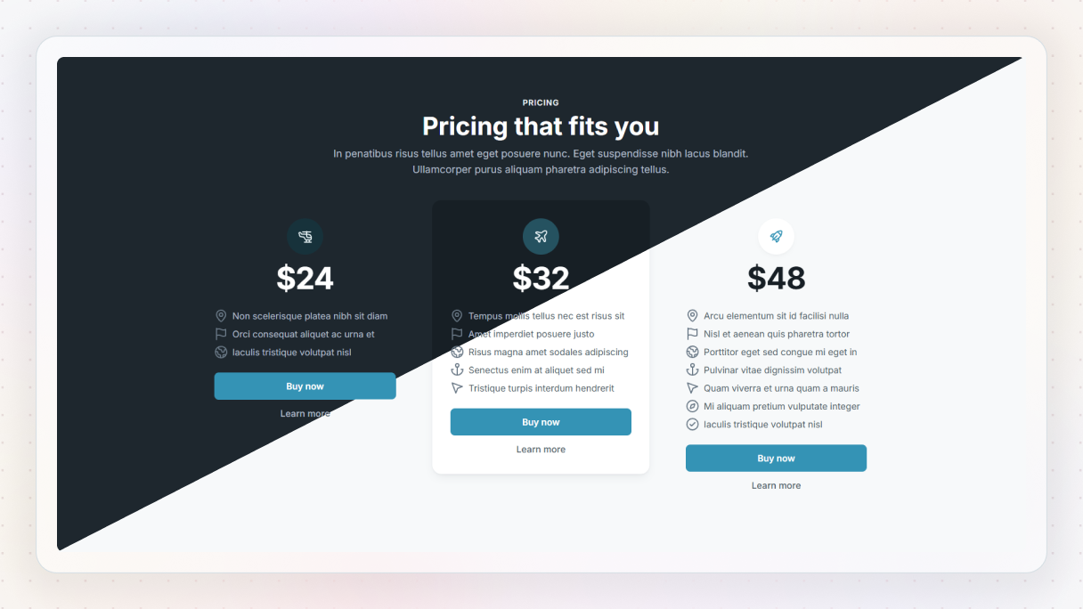
Clear, simple pricing, just the way users like it.
- The light version feels transparent and easy to compare at a glance.
- In dark mode, it’s punchier, with bold highlights that draw the eye. If you want your plans to really pop, this is a great dark mode website example to follow.
Slider 06 Block
Got visuals to show off? This layout slides in smoothly.
- In light mode, it’s clean and content-forward.
- But the dark version gives your images a whole new level of atmosphere. A slick dark mode website example that’s perfect for product showcases.
Final thoughts on dark vs light mode
As we’ve seen, the dark vs light mode debate isn’t about which one is objectively better, it’s about what works best for your audience, content, and goals.
Both modes offer unique advantages:
- Dark mode delivers a sleek, modern vibe that’s easier on the eyes in low-light environments and ideal for portfolios, tech platforms, and creative visuals.
- Light mode remains a reliable choice for text-heavy websites like blogs, educational platforms, and corporate sites, offering high readability and familiarity.
Still not sure which way to go? Take inspiration from the dark mode website examples shared above, and test both versions to see how your users respond.
Pro tip: If you’re using Mosaic’s WordPress theme builder, you don’t have to choose just one. Easily switch between dark and light modes with just a few clicks.


