Breakpoints play a crucial role in making sure a website looks great on various screen sizes without affecting the actual content. They are predefined points that help the layout adjust for different devices, like smartphones, tablets, and desktops, providing a smooth and user-friendly experience.
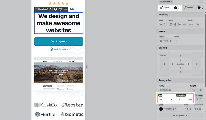
When a breakpoint is reached, it triggers changes in the website’s appearance, things like font sizes, spacing, or image sizes, to better fit the screen dimensions. You can adjust these settings directly in the Style tab, and each change can be applied device-specifically for the selected breakpoint.
Importantly, these adjustments are purely stylistic, the content itself remains unchanged, so everyone accesses the same information no matter how they view the site.
Where to find breakpoints
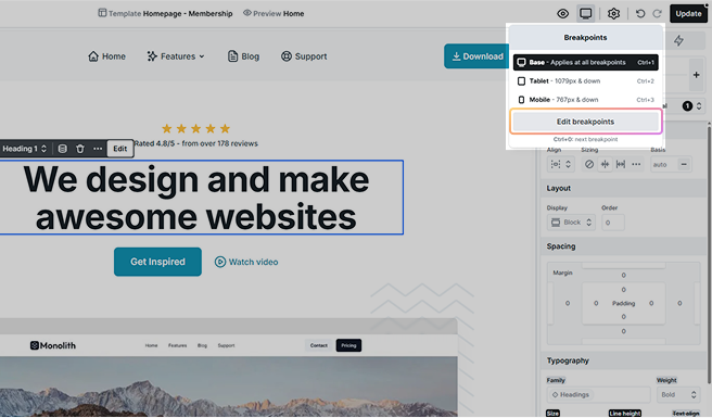
You can find the breakpoints in the Editor on the right side of the Top panel. Click on the monitor icon to see a list of your existing breakpoints. When you click a breakpoint, the Editor quickly shows you how your website looks on that device. Then you can change the styles for that specific device.
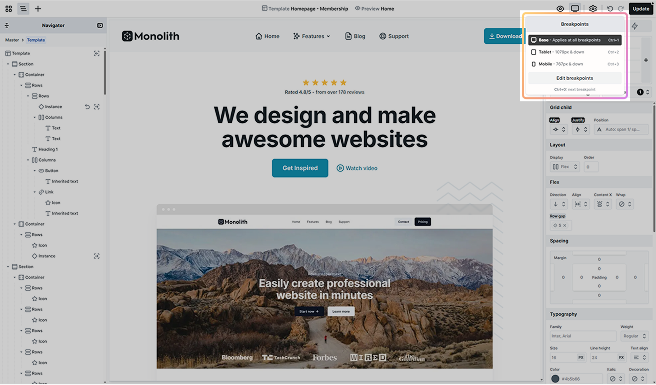
Mosaic comes equipped with three built-in breakpoints, each designed to optimize the website’s appearance for different device views:
- Base: This breakpoint applies universally to all views, regardless of the device size.
- Tablet: Affects views on screens that are 1079 pixels wide or smaller, aligning with standard tablet dimensions.
- Mobile: Designed for the smallest screens, it impacts views at 767 pixels and below, which is common for mobile phones.
In addition to these preset breakpoints, you have the freedom to customize the settings for the tablet, and mobile breakpoints to better fit your specific design needs. If these don’t cover all your requirements, you can create new breakpoints.
Working with breakpoints
Styles in your website can be defined in two ways: Specific breakpoint and Inherited breakpoint. These determine how styles are applied across different screen sizes, ensuring a responsive and consistent design.
Specific breakpoint
When you select a breakpoint, the editor switches to the corresponding view, allowing you to apply styles specific to that device. Any modified styles are marked with a black background, making it easy to identify changes.
Inherited breakpoint
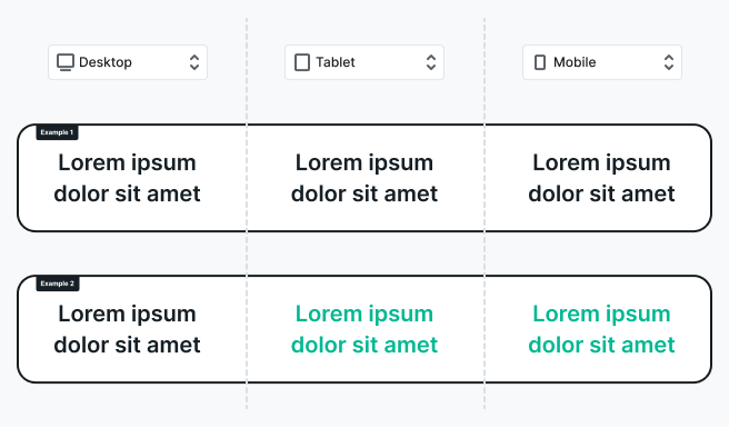
If you don’t modify a style for a specific breakpoint, it inherits the values from the previous breakpoint.
Example of inheritance:
- Suppose you set the text color to black in the Base view.
- If no changes are made in the Tablet view, the text will remain black.
- If you later change the text color to something else in the Tablet view, the Mobile view will inherit that color, while Base view remains black.
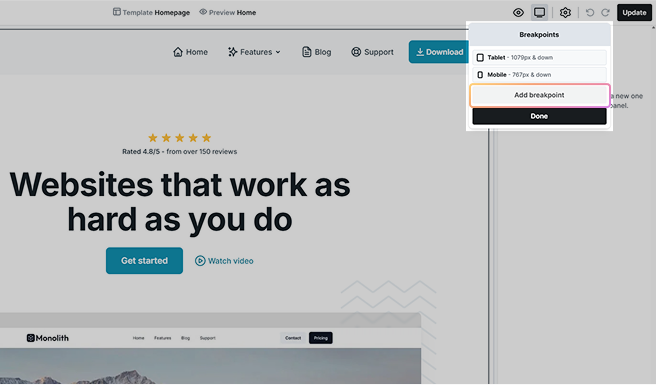
Editing breakpoints
Editing breakpoints is quite simple. Just follow these steps:
- Click on Edit breakpoints in the dropdown.
- Then, you can change or remove existing breakpoints or even add new ones.
Breakpoint settings
Breakpoint settings allow you to control when your layout adjusts based on screen size or other conditions. You can choose between Simple or Custom breakpoints, depending on whether you need basic or advanced control over your layout changes.
Simple
These settings are for quick and straightforward adjustments. They are suitable for common scenarios where you want to set basic conditions for your layout changes.
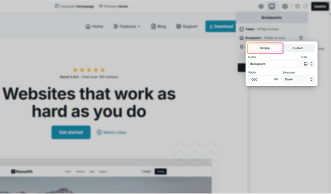
- Name: Assign a descriptive name for easy identification (e.g., laptop, large tablet, small mobile).
- Icon: Choose an icon to identify the breakpoint visually.
- Width: Set the browser screen width where the breakpoint activates.
- Direction: Decide if the breakpoint starts under (down) or over (up) the given width pixel value.
Custom
Custom settings give you extra control and are a bit more advanced. If you have special needs or want to decide when your layout changes with specific conditions, custom settings let you create your own rules using media queries.
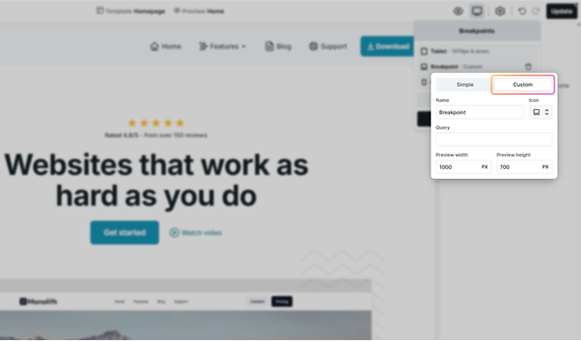
- Name: Assign a descriptive name.
- Icon: Choose an identifying icon.
- Query: Write a media query definition for the breakpoint. For example:
(orientation: landscape) and (max-width: 650px)for landscape on small screens, or
only screen and (orientation: portrait) and (min-width: 600px)for portrait on larger screens.
Leave out the @media rule at the beginning of the expression.
- Preview Width and Height: Set how big the editor and preview should be when you’re looking at this breakpoint.
Content by breakpoint
You can’t directly change the content of elements for each device type. However, you can use the following method to display different content based on the device.
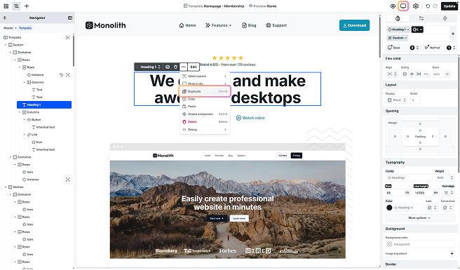
1. Duplicate desktop text
- In Base view, duplicate your desktop text to have a tablet version with the same design.
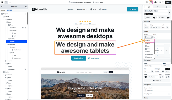
2. Modify the tablet text
- Then, modify the tablet text to what you would like to show.
3. Hide tablet text in Base view
- With the Display setting set to None, hide the tablet text. As you are in Base view, this affects all views.
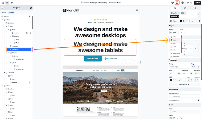
4. Switch to Tablet view
- Switch to Tablet view.
- Select the invisible tablet text from the Navigator.
- Change its Display setting to Block to make it visible.
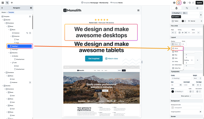
5. Hide desktop text in Tablet view
- In Tablet view, set the Display setting for the desktop text to None to hide it.
- Now, you have different texts displayed for desktop and tablet views.
The tablet text will also appear in the Mobile view due to breakpoint inheritance. Manage your texts there as well if you want different results.