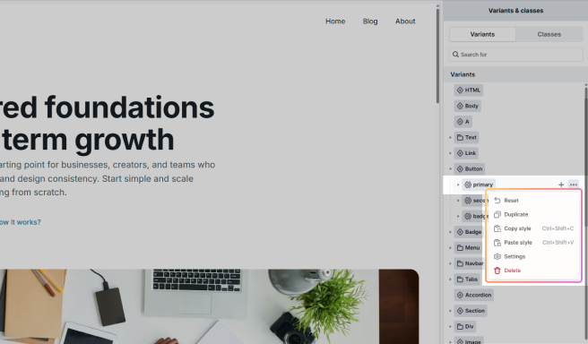
The class system in Mosaic offers an efficient way to style multiple elements effectively, building upon CSS fundamentals. Leveraging this class system can significantly speed up the editing process, making it an essential feature for a seamless design experience. It consists of Variants, Variant Sub Classes, Classes, and Sub Classes, plus per-element Local Styles. The name you give a class is the real CSS class rendered in your page, so you can target it from your own CSS or tracking tools.
Each element is designated a Variant, which establishes its initial appearance. Some elements offer multiple Variants to choose from, but only one can be selected at a time, allowing them to achieve different looks. Variants are built in — you choose one, you don’t create them. They can be further refined using Variant Sub Classes, allowing for detailed customization.
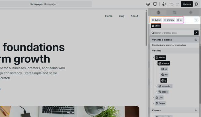
For example, the Button Variant might have primary and secondary as Variant Sub Classes. These Variant Sub Classes can, in turn, be extended with additional nested Variant Sub Classes, enriching the styling options available.
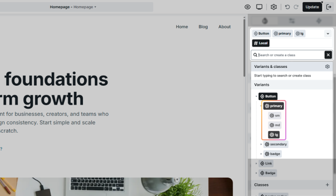
Using Variants and Variant Sub Classes is recommended because they maintain a hierarchical structure that is directly linked to the elements. On the other hand, Classes, including their Sub Classes, are universal and can be applied to any element without restrictions. This flexibility makes Classes a versatile tool, though they operate outside the hierarchical system of Variants and Variant Sub Classes.
Working with classes
Classes can be selected in the Editor on the active element’s style panel. These classes are connected to the style settings of the given element. As you can see below, state properties are part of them too.
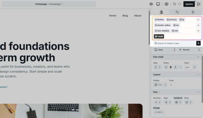
Every styleable element has a Variant and its Local Styles by default, plus any number of Variant Sub Classes, Classes, and Sub Classes. If you want to edit the current element only, use its Local Styles. If you want to edit multiple elements together, use one of the shared classes.
- Variant: All elements with the same Variant share their styles. It is built in and can’t be created by you.
- Variant Sub Classes: Variant Sub Classes let you define new, reusable variations based on a Variant. They are optional.
- Classes: Classes provide a way to apply consistent styles across various elements on your website. They are optional as well.
- Sub Classes: They are a way to fine-tune your styles by building on the Classes you already have. Attaching one brings its parent Class along, and they are fully optional.
- Local Styles: Unique to each element, applying specific styles only to that element.
Create, add, or select
Within Mosaic you can create Variant Sub Classes, Classes, and Sub Classes, but not Variants. Variants are an integral, built-in part of the system.
1. Create a Variant Sub Class or a Class
Click the + button on the right side of the class list. It gives you the option to create either of them.
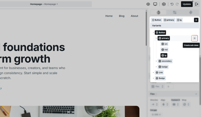
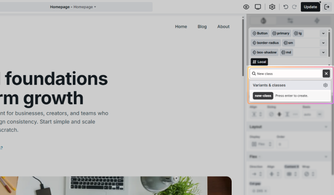
2. Create a completely new class
Write down its name and press Enter. The name you enter becomes the actual class rendered in your page, so give it a clear, meaningful name. If you want to select an existing class, you can find a list of your classes under the search/create field.
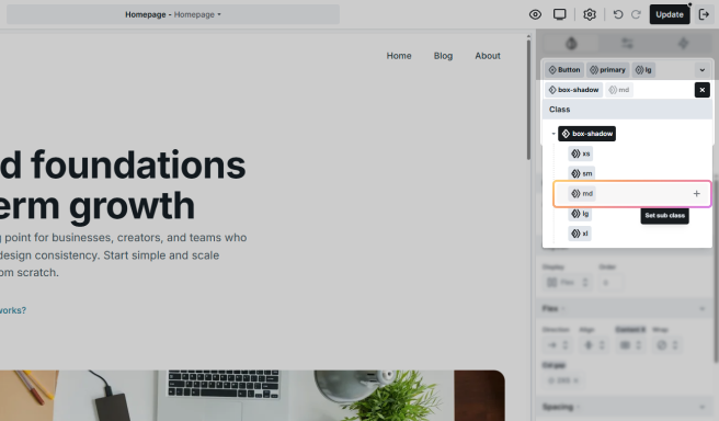
3. Add a Sub Class to an existing Class
Go to the Class tab and pick the Class you want to add a new one to. Once selected, this Class will appear in your class list, allowing you to add a Sub Class using the create/search field.
4. Select the Variant
In some elements, you can choose from predefined Variants. You can do this in two ways:
- Use the dropdown on the right-hand side panel.
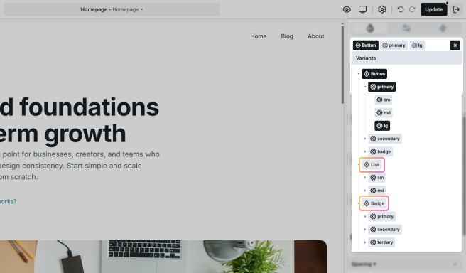
- Select directly on the Canvas.

Class selector
In the Toolbar, you can easily choose Variants, Variant Sub Classes, Classes, and Sub Classes for your elements, making the styling process more efficient.
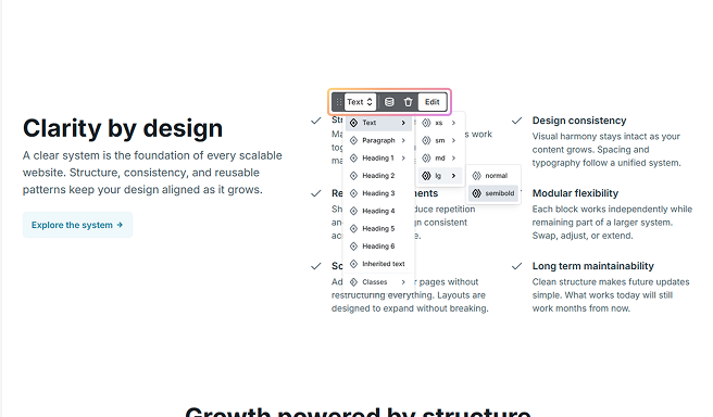
You can find the same menu in the Class manager. Simply use the dropdown menu of your classes to access all their available classes located within their Variant, Variant Sub Class, or Class menu points.
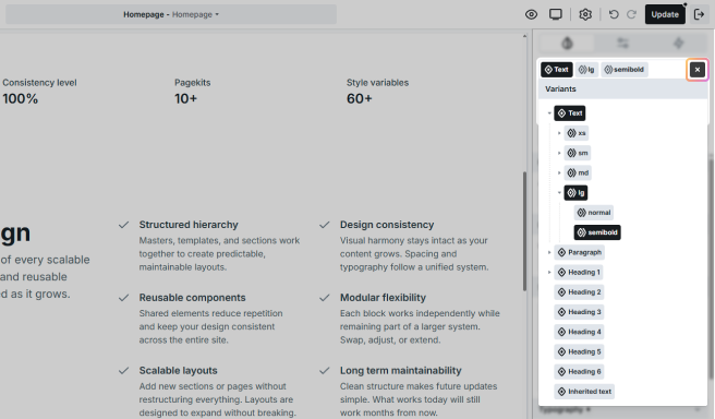
Actions
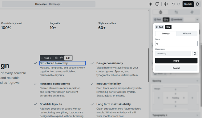
Each class has an Actions list containing options specific to that class type. These are the possible options you can find:
- Duplicate: Create a new class with the style settings of the current class.
- Rename: Rename the current class. Because the name is the real CSS class, renaming also changes what renders in your page.
- Assign as default: By default, when you select an element, its Local Styles will be selected. You can change that by marking a different class as default.
- Copy style: Copy the style settings of the selected class.
- Paste style: Paste the style settings to the selected class.
Best practices
When you are creating classes, we suggest keeping things clean and well-organized. Here are some tips to help you maintain a structured approach.
Add meaningful names
Name your classes in a way that makes them easy to recognize. Because the name you type becomes the actual CSS class in your published page, clear names also make it easy to target a class from your own CSS, Google Tag Manager, or analytics. Instead of generic names like “text a” and “text b”, opt for descriptive names such as “description” and “title”.
Variant Sub Classes first
Start with Variant Sub Classes as they often have a strong connection to the element you’re working on. It helps maintain a logical hierarchy.
Don’t over-specify a single level
Try not to get too specific on a single level. Instead, use nested Variant Sub Classes to create variations. For instance, a text element’s first Variant Sub Class could represent its size, while nested Variant Sub Classes could stand for different font weights.
Classes for common styles
Create Classes for styles that are commonly used across various elements. For example, a consistent border radius and box shadow could be applied to both image and button elements.
Strength in styling
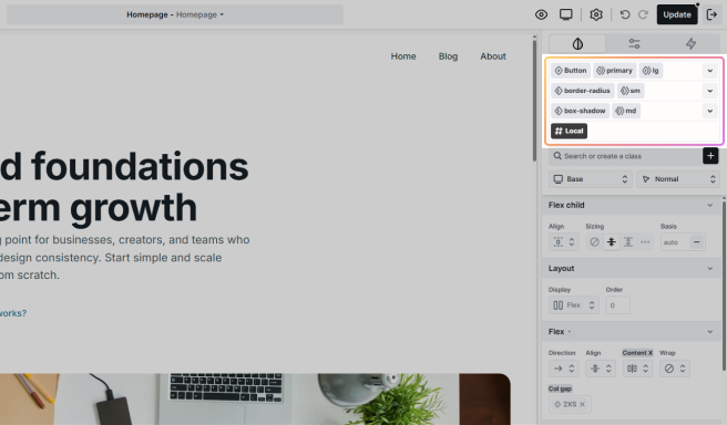
Your class types are listed in separate slots, and any extra Class will show up on additional slots. This vertical setup sets the style hierarchy from top to bottom. Plus, for all slots except Local Styles, the order from left to right also matters, so your styles are affected by both the horizontal and vertical arrangement of your classes.
Let’s break this down with an example. A text element has all possible classes: a Variant, a Variant Sub Class, a Class, a Sub Class, and Local Styles. Let’s set the following styles.
1. Set the Variant
- Text: Red font color
- M: No specified font color
- Box shadow: No specified font color
- S: No specified font color
- Local Styles: No specified font color
→ This way your text will be red.
2. Style the Variant Sub Class
- Text: Red font color
- M: Blue font color
- Box shadow: No specified font color
- S: No specified font color
- Local Styles: No specified font color
→ The text will become blue.
3. Add color with a Class
- Text: Red font color
- M: Blue font color
- Box shadow: Green font color
- S: No specified font color
- Local Styles: No specified font color
→ The text will have a green color.
4. Set a color on the Sub Class
- Text: Red font color
- M: Blue font color
- Box shadow: Green font color
- S: Yellow font color
- Local Styles: No specified font color
→ The text will have a yellow font color.
5. Use Local Styles
- Text: Red font color
- M: Blue font color
- Box shadow: Green font color
- S: Yellow font color
- Local Styles: Violet font color
→ You will end up with a violet text.
Breakpoint selector
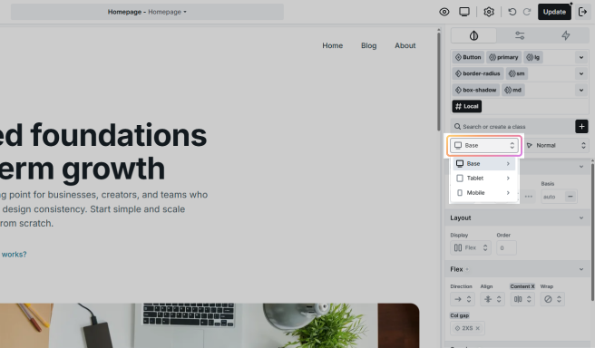
You can edit the style settings device specifically. To help this process, you can find the same breakpoints in the Class manager as you would in the Toolbar. Each breakpoint shows the available hover states.
State selector
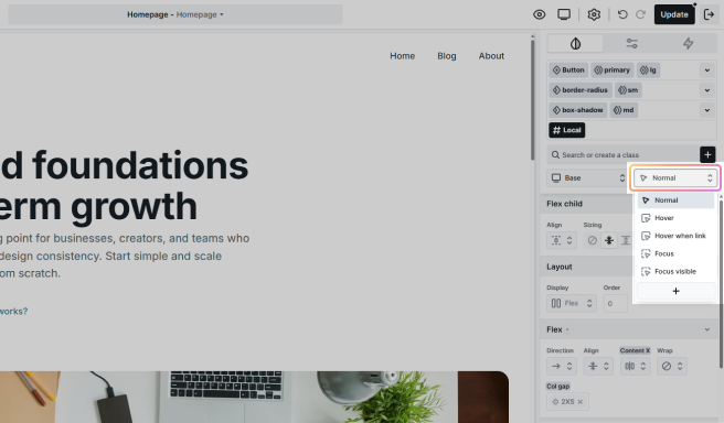
Customizing the appearance of buttons and links when you hover over them is a common practice. In our Editor, you can easily define distinct styles for these interactive states.
To explore more styling options, look for the Hover and other states under the class list. This allows you to enhance the visual experience of your buttons and links based on different user interactions.
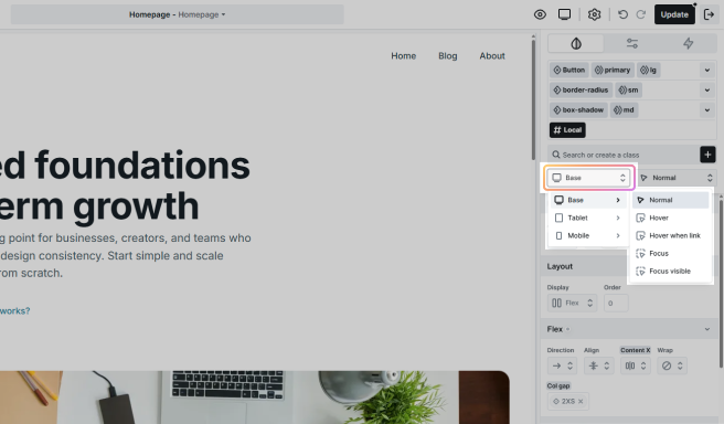
You can set these states for specific devices for a more customized user interaction.
Custom states
You can use the + sign to define extra states, this allows you to create more complex styling scenarios.
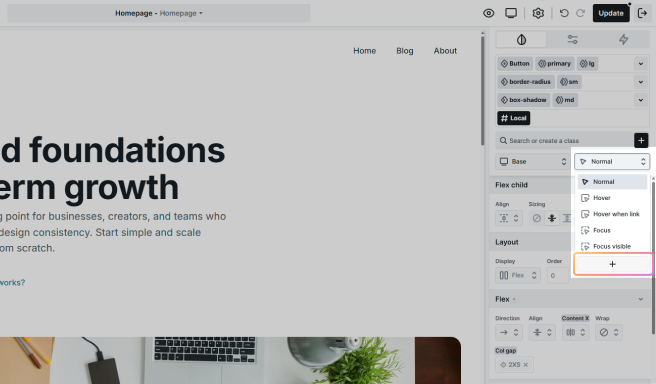
In the selector field, the & sign represents your element’s class, like in Sass or SCSS. For instance, define an after pseudo-element as follows.

Unlock your creativity by combining states. Imagine you have a <div> element containing various elements, including links (<a> elements). To create an engaging effect, let’s explore how to simultaneously change the styles of all links within the <div> when hovering over it.
- Define the hover state for the <div> element using &:hover
- Adding a after &:hover specifies that the styles apply to all <a> elements inside the hovered <div>

Styles
Each state is directly linked to the style settings listed below it, which determine its appearance and behavior. These settings play a crucial role in defining the overall design and functionality. You can learn more about the style settings here.
Class manager
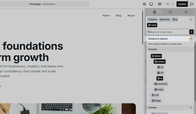
Effortlessly manage and organize your classes through the Class manager. Use it to easily handle tasks such as deleting, renaming, and performing other functions with your classes. You can access it in one of two ways.
1. From the class list
- Click on the Add button.
- In the popup, click on the cog icon to manage Variant Sub Classes, or you can find the same icon under the Class tab to manage Classes.
2. From the Top panel
- Alternatively, you can access the Class manager through the Top panel‘s settings.
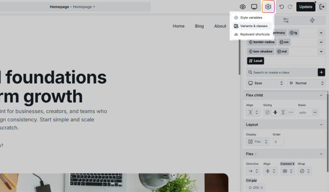
Once in the Class manager, you gain the power to:
- Reset: Restore a class to its default settings.
- Duplicate: Create an exact copy of a class.
- Rename: Give your classes more meaningful or updated names. The name is the real CSS class, so a rename also updates what renders in your page.
- Favored elements: Mark specific classes as favorites for quicker access and organization.
- Delete: Remove classes that are no longer needed.