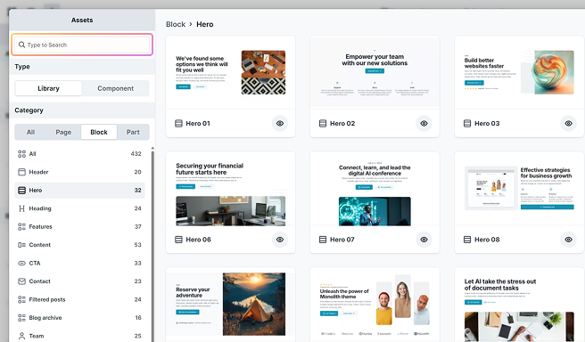
The Library section provides access to reusable design elements, including Components and a Library of pre-designed layouts. Once Library is selected in the Add panel, you can access designs through the Assets pop-up panel.
The Library belongs to the theme you’re working in, and each theme ships its own. The designs in it are built to suit that theme, so the same category (heroes, for example) looks different from one theme to the next, and a design from one theme isn’t available in another.
Themes differ in what their Libraries are for. Gibraltar and Monolith include fully designed layouts with finished imagery, ready to use as they are. The Blank theme’s designs are intentionally plain, using placeholder images and minimal styling, which makes them a good starting point when you want the structure and intend to apply your own design.
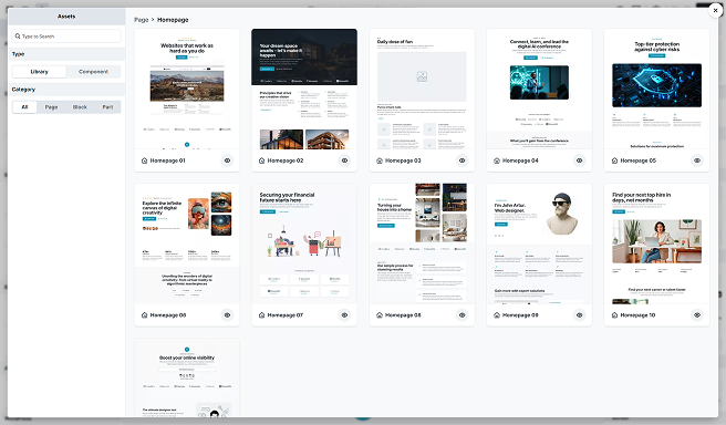
Type
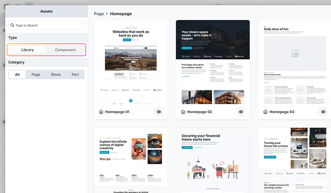
Choose from various types of reusable design elements, organized into two main groups:
- Library: The Library is a pre-built collection included with your Themes, and it features commonly used layouts.
- Components: These are the designs you create. Once a component is created, it can be reused anywhere. For more details, check out the Components documentation.
You can filter elements to display layouts from either group individually or view all available prebuilt elements together.
Category
Designs are organized into three main categories. Depending on the category you choose, you can also select a subcategory to further organize your layouts. Using subcategories helps keep designs manageable. Rather than viewing everything in the All tab, you can filter to quickly find what you need.
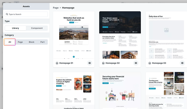
Page
A Page stores a complete design for an entire page layout. It can be made up of multiple blocks and parts.
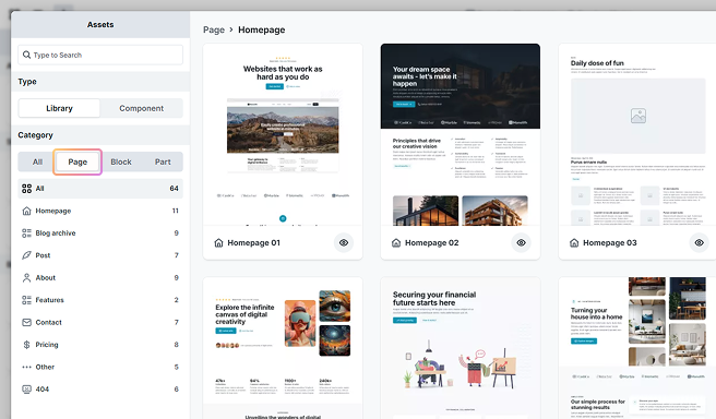
Selecting a Page does not overwrite your current page, it is added to your layout.
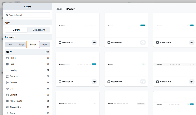
Block
A Block stores the design of a specific section within a page. It can be made up of multiple parts.
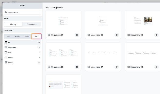
Part
A Part represents a specific, smaller design element within your layout. They don’t fit into the major categories like heroes, footers, or forms.
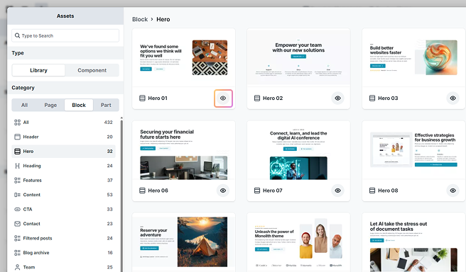
Preview a design
To preview a design before adding it, click the eye icon located in the bottom right corner of the layout. In the preview window, you have the option to either Add the design to your Canvas or go ← Back to the Assets panel.
Search designs
You can search for library designs and components within this popup panel. First, select a category, then enter a relevant keyword related to that category in the search bar to find what you are looking for.