Interactions are a key part of designing an engaging and interactive website. They let you define specific behaviors that trigger animations or other actions that happen in response to user actions or browser events, like page load, scrolling, or mouse movements. By adding interactions, you make your site feel more dynamic, visually appealing, and intuitive, enhancing the overall user experience and keeping visitors engaged.
Managing interactions
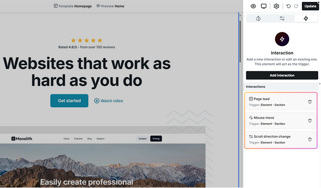
To add an interaction, go to the Interactions tab and click the Add interaction button. From here, you can choose the type of interaction you want to create based on how it should be triggered.
Interaction categories
Each interaction type gives you flexibility in how elements respond to user behavior. They are separated into two main categories based on how they are triggered.
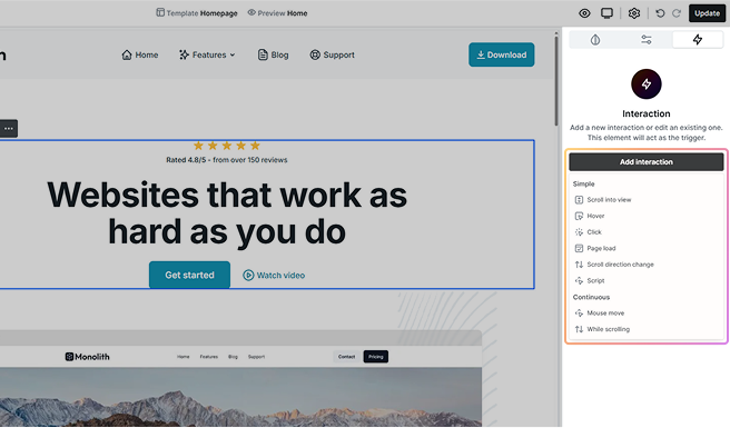
Simple
Simple interactions happen instantly when triggered. There’s no continuous animation. They activate as soon as the user performs an action.
- Scroll into view: Triggers an animation when an element enters or exits the visible area of the screen.
- Hover: Triggers when the user moves their cursor over or away from an element.
- Click: Triggers an animation when the user clicks on an element.
- Page load: Triggers as soon as the page finishes loading.
- Scroll direction change: Triggers an animation when the user switches between scrolling up and down.
Continuous
Continuous interactions respond dynamically as the user interacts, they keep on changing based on movement or progress.
- Mouse move: Animates elements based on the position of the user’s cursor.
- While scrolling: Continuously animates elements based on how far the user has scrolled.
Interaction indicators
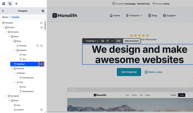
When you add an interaction, visual indicators appear on the Navigator to show which elements have interactions applied. These elements are marked with the lightning icon, making it easy to find and manage them.
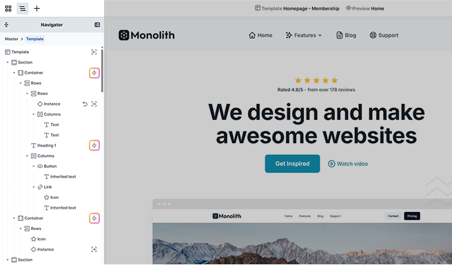
Clicking the lightning icon opens a dropdown where you can quickly access and switch between all interactions applied to that element.
Create an interaction
Once you’ve selected the interaction type based on how it should be triggered, you’ll find various setting options under the Interactions tab. These settings may vary depending on the interaction type, but many are shared across most interactions.
For interaction types with unique settings, additional details will be provided in their respective sections under Interaction types.
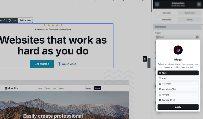
Trigger
The trigger element is what the user interacts with to start an animation. It could be anything, like a button, a section, or any element you choose on the Canvas or in the Navigator.
By default, the trigger is the element you’ve selected, but you’re not limited to it. You have flexibility in choosing which elements will trigger the interaction.
- You can start the interaction with just the element you’ve selected.
- Or select from the class-based trigger options in the list and apply them.
- This gives you the option to trigger animations on multiple elements at once.
Store at a separate location

Sometimes, you may want to store an interaction on a different element than the one it’s actually happening on. This is especially useful when you need to keep track of interactions globally.
For example, say you want to track an interaction across your entire site, you could add the interaction to the body element but store it on a specific page template instead. This way, the interaction stays connected to a central element but is stored somewhere that makes sense for organization.
Name
You can change the interaction name here to make it easier to identify. It can help you manage complex animations, especially when working with multiple interactions on a page.
ID
You can assign a custom ID to an interaction if you want to reference it elsewhere, such as in actions or advanced workflows.
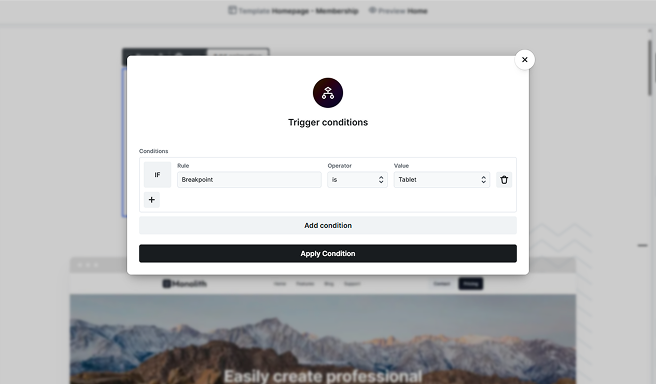
Conditions
Control when an interaction runs by setting specific rules. This helps ensure animations only trigger under certain conditions, like on specific screen sizes.
Trigger once
This setting ensures that an interaction runs only a single time, preventing it from repeating every time the user action happens.
- Completed after: You can choose when the interaction is considered “complete” based on specific animation events. For example:
- In a Hover interaction, you can set it to complete after Hover in, Hover out, or Any.
Other interactions may have different completion options depending on their type.
Trigger once is not available for the Page load interaction type. Since page load interactions already run once by default, this setting isn’t needed.
Out of view
This setting controls what happens to an animated target when it leaves the visible screen area. By default, nothing changes, but you can choose different behaviors:
- Do nothing: The element keeps running normally, even when it’s off-screen.
- Suspend: Pauses the animation while the element is off-screen, and resumes it when it comes back.
- Reset: Stops the animation and resets the element to its starting state when it leaves the screen.
A common use case is for continuous animations like a spinning icon. You can suspend them to save performance while they’re off-screen, or reset them so they start over when visible again.
If you choose Suspend or Reset, you’ll also see the Out of view offset setting (measured in VH). This lets you define how far outside the viewport the element must go before the rule takes effect.
Delay
The Delay setting lets you postpone a Page load interaction so the animation doesn’t start immediately when the page loads.
Interaction types
Each interaction type has unique behaviors and settings, offering flexibility in how they trigger and respond to user actions. The following sections will outline their features and use cases to help you choose the best option for your project.
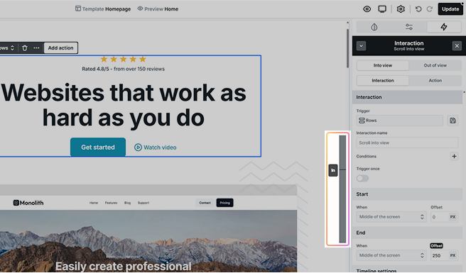
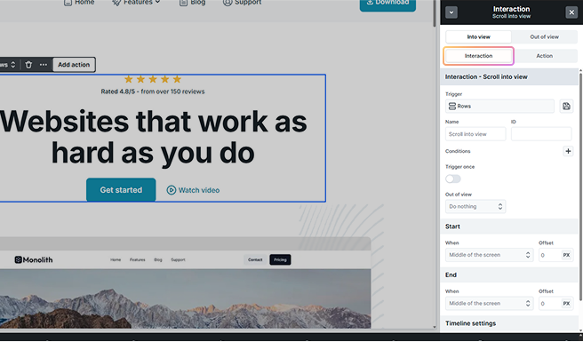
Scroll into view
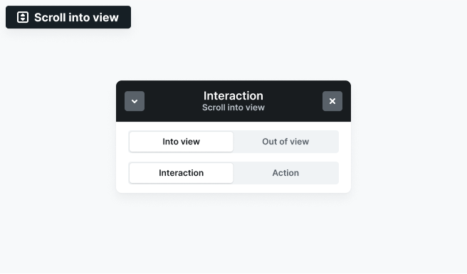
The Scroll into view interaction triggers animations when an element enters or exits the viewport as the user scrolls.
You can define animations for both:
- Into view: Triggers when the element enters the viewport.
- Out of view: Triggers when the element exits the viewport.
Use cases:
- Revealing elements as they come into view
- Fading out elements when they leave the screen
- Animating sections dynamically based on scroll position
Interaction settings
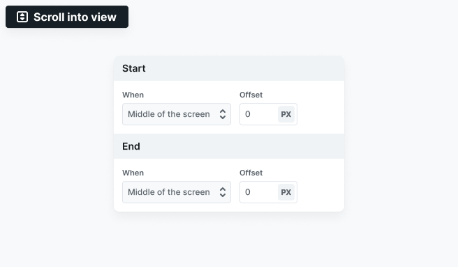
- Start: Define when the animation begins. You can also set an offset to adjust the trigger point.
- End: Define when the animation stops. An offset can also be applied.
Hover
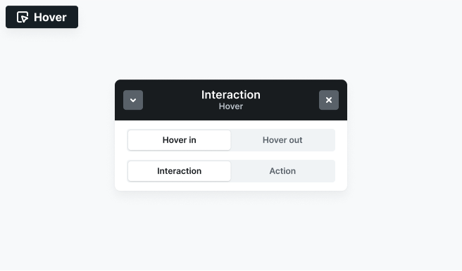
The Mouse hover interaction triggers when a user hovers over an element. This interaction type includes all basic interaction settings.
You can define separate animations for when the cursor enters (Hover in) and leaves (Hover out) the element.
- Hover in: Runs when the cursor moves over the element.
- Hover out: Runs when the cursor moves away from the element.
Use cases:
- Button hover effects
- Revealing elements
- Changing opacity or transforming elements on hover
Click
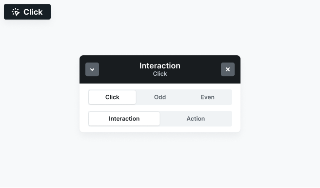
The Mouse click interaction triggers when a user clicks on an interactive element like a button, link, or any other clickable part of the website. This interaction type includes all basic Interaction settings.
It allows you to define different animations based on whether it’s a simple, even, or odd click.
- Click: Runs on every click.
- Odd: Triggers on the first, third, fifth, etc. clicks.
- Even: Typically used to reverse the action from the click/odd click (e.g.: open on odd, close on even).
Use cases:
- Expanding or collapsing sections
- Play/pause toggles
- Showing and hiding elements
Page load
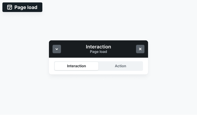
The Page load interaction triggers automatically when the page finishes loading. Since it runs as soon as the page loads, it’s best used for elements at the top of the page, as users might not see it if placed further down.
Use cases:
- Creating entrance animations for hero sections
- Delaying animations for a smoother load experience
- Triggering scripts when a page is fully loaded
This interaction always runs on page load, so it doesn’t have the usual Trigger once setting.
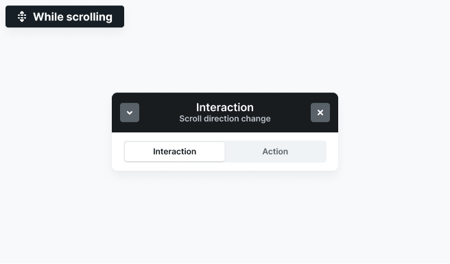
Scroll direction change
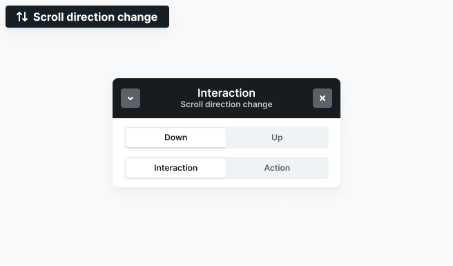
The Scroll direction change interaction triggers when a user scrolls either down or up on the page. This allows you to create animations that respond dynamically to scrolling behavior. This interaction type includes all basic interaction settings.
It allows you to define animation for:
- Down: Triggers when the user scrolls downward.
- Up: Triggers when the user scrolls upward.
Use cases:
- Hiding or revealing navbars based on scroll direction
- Changing backgrounds or section styles when scrolling up or down
- Creating dynamic transitions between content sections
Interaction settings
- Offset: The Offset setting defines how much the user must scroll in pixels after changing scroll direction before the interaction triggers.
Mouse move
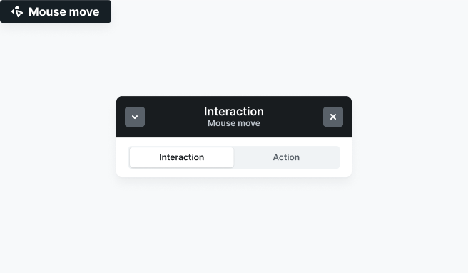
The Mouse move interaction allows elements to respond dynamically to the user’s mouse movement.
Use cases:
- Parallax effects that shift elements based on cursor position
- Interactive hover effects that change based on mouse movement
- Custom elements that follow the mouse
Interaction settings
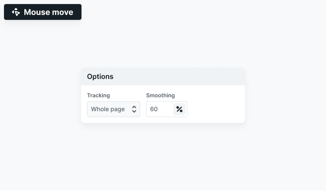
- Tracking: Defines how the animation responds to mouse movement across the page or within the trigger element.
- Smoothing: Controls how smoothly elements transition between positions to prevent sudden jumps. Higher values create a more fluid motion.
While scrolling
The While scrolling interaction continuously updates animations based on the user’s scroll progress.
Use cases:
- Parallax effects that move elements at different speeds
- Progress-based animations that reveal or transform elements
- Background or text effects that change as the user scrolls
Interaction settings
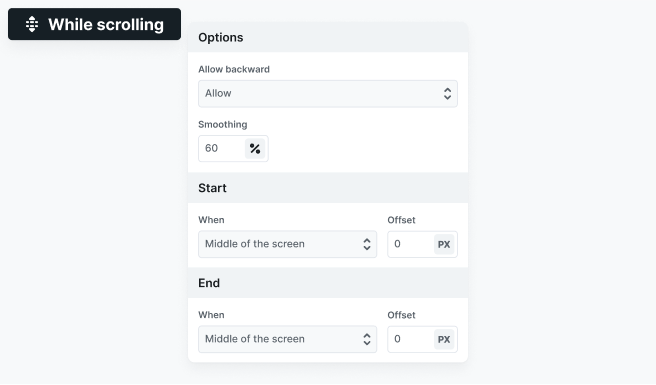
- Allow backward: Determines whether the animation should play in reverse when scrolling up.
- Smoothing: Adjusts how smoothly the animation progresses to prevent sudden jumps.
- Start: Define when the animation begins. You can also set an offset to adjust the trigger point.
- End: Define when the animation stops. An offset can also be applied.
Slide change
The Slide change interaction triggers when a specific slide becomes active or inactive — for example when a slide slides into view or moves out during navigation.
This interaction is primarily linked to the slide element, but it also works on elements inside the slide, making it easy to animate text, images, or buttons when the slide changes.
Use cases:
- Animating slide content when a slide becomes active
- Fading out elements when the slide leaves
- Creating staggered animations inside a slider
Interaction settings
- Plays in when: Defines when the “in” animation should trigger.
- Plays out when: Defines when the “out” animation should trigger.
Tab change
The Tab change interaction triggers when a tab is activated or deactivated.
It works on both the Tab and TabPane elements, and also applies to their children, allowing you to animate tab content whenever the active tab changes.
Use cases:
- Animating tab content on switch
- Showing/hiding highlights when a tab becomes active
Accordion item change
The Accordion item change interaction triggers when an accordion item is opened or closed.
It’s linked to the accordion item element, but it also works on its children, making it ideal for animating content inside the item when it expands or collapses.
Use cases:
- Animating content reveal inside an accordion item
- Rotating icons when the item opens/closes
- Smooth open/close transitions
Interaction settings
- Plays open when: Defines when the “open” animation should trigger.
- Plays close when: Defines when the “close” animation should trigger.
Dropdown change
The Dropdown change interaction triggers when a dropdown is opened or closed.
It is connected to the dropdown element, and also applies to its children, so you can animate dropdown content, icons, and menu items based on the dropdown state.
Use cases:
- Animating dropdown menus when opening
- Fading in menu items
Interaction settings
- Plays open when: Defines when the “open” animation should trigger.
- Plays close when: Defines when the “close” animation should trigger.
Element interactions
You can add more than one interaction to a single element. Once you’ve added an interaction, you’ll see two buttons at the top of the interaction type’s panel:
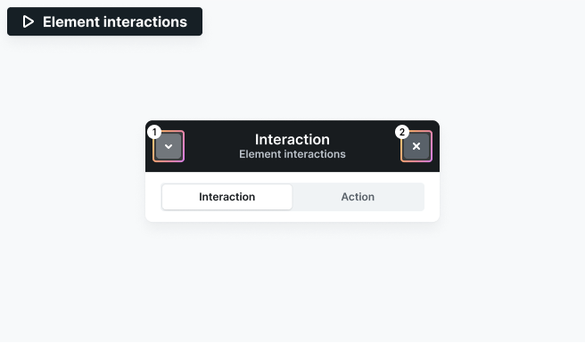
- Minimize (↓): Hides the editing panel but keeps the interaction open, moving it to the bottom of the right-side panel.
- Close (X): Completely closes the interaction and exits editing mode.
In both cases, you’ll be taken to the Interactions tab in the right sidebar. Here, all interactions assigned to the selected element are listed, each showing:
- Interaction type
- Trigger element
You can select any interaction to edit it or remove it using the trash icon. To start editing an interaction, simply click on it.
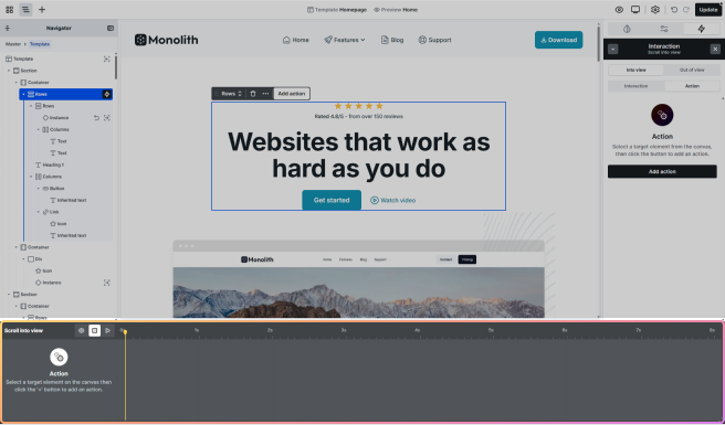
Create an action
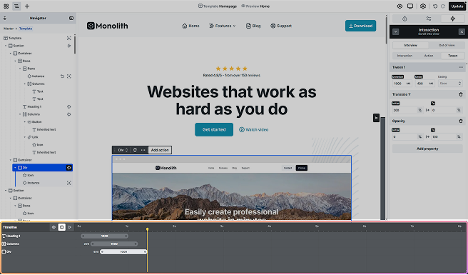
When you create an interaction, a visual Timeline appears, showing all the actions associated with that interaction. The Timeline allows you to define the progression and sequence of each action, giving you full control over how they unfold. For more details on how to use the Timeline, see the Timeline section.
Additional interaction settings
Timeline settings give you precise control over animation sequences. However, they’re only available for simple interaction categories and are not supported for continuous triggers, like Mouse move and While scrolling.
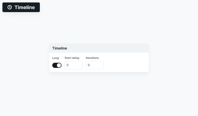
- Loop: This setting makes your animation repeat continuously instead of playing just once.
- Start delay: Defines how long the animation waits before the first loop begins. This delay only applies at the start, once the animation begins, it will repeat continuously without additional pauses.
- Iterations: It controls how many times the animation repeats before stopping.
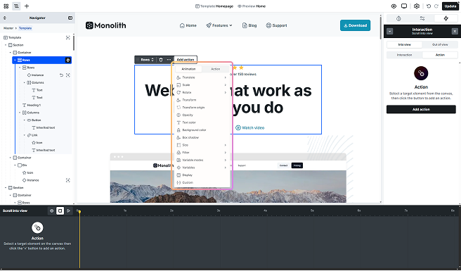
Under the Action tab of your interaction, you can choose to add either an Animation or an Action. This is where you define what should happen when the interaction is triggered.
Animation types
Animation types represent the overall behavior of your animation and can involve multiple Tweens (keyframes) to define the entire process.
To add an animation, go to the Action tab in your interaction settings and click the Add action button.
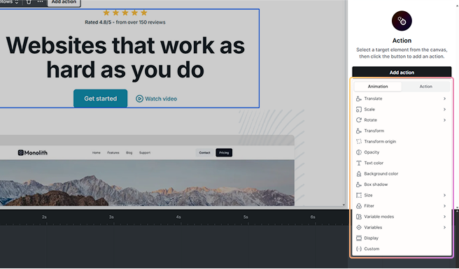
You can also add an animation directly from the selected target element’s toolbar by clicking Add action. From there, simply choose the type of animation you want to create.
- Translate: Moves an element along the X (left/right), Y (up/down), and Z (depth) axes. By adjusting the Z-axis, you can change the perceived depth of an element.
- Scale: Resizes an element along the X (width), Y (height), and Z (depth) axes. You can use it to make elements grow or shrink, or even create a 3D scaling effect by adjusting the Z-axis.
- Rotate: Rotates an element along the X, Y, and Z axes, enabling both 2D and 3D rotations. By default, rotations on the X and Y axes will appear flattened. To see full 3D effects, make sure you set up the necessary settings.
- Transform: A “stack” field for advanced cases. It supports multiple transformations in one place, including translate (X, Y, Z), rotate (X, Y, Z), skew (X), and matrix-based animations. Use this field only when you need complex combinations that go beyond the dedicated Translate, Rotate, or Scale properties.
The Transform field and the Translate/Scale/Rotate properties stack on top of each other. This means their effects combine. For example, a translateX set in Transform and another in Translate will both apply, shifting the element by the sum of the two.
- Transform origin: Change the point around which an element is transformed (like rotating or scaling). By default, transformations occur around the center of the element, but you can adjust the origin to any part of the element.
- Opacity: Adjust the transparency of an element. You can change it from 0% (completely transparent) to 100% (fully visible).
- Text color: Change the text or background color of an element.
- Background color: Change the background color of an element. Useful for hover highlights, state changes, or transitions between different sections.
- Box shadow: Add or animate a shadow around the element. You can adjust its position, blur, size, and color to create depth or emphasis during the animation.
- Size: Adjust the width and height of an element. This can be applied to both the element’s overall dimensions or to individual ones (width or height).
- Filter: Apply various visual effects to the element or its background.
- Variable modes: Adjust the element’s color properties based on your theme’s light or dark mode.
- Variables: Adjust elements based on your reusable variables.
- Display: Change the element’s display property during an animation.
- Custom: Create your own animation using specific properties.
To enable 3D movement and depth, ensure that you set a Perspective in the Style tab for the parent element and enable Preserve 3D on the child element. This applies to the Translate, Scale, Rotate, and Transform animations.
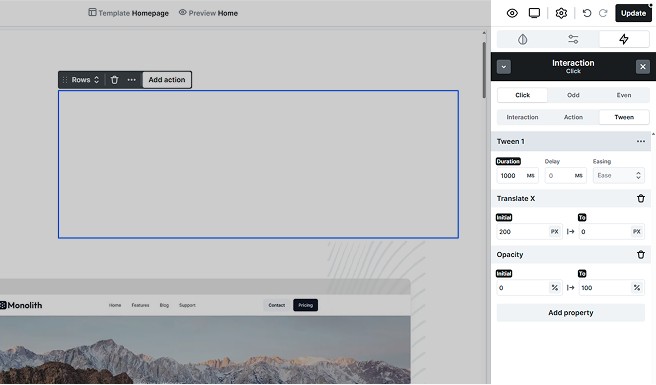
Tween
A Tween is the transition that controls how a specific property of an element changes over time. It defines the actual animation and how the element moves from one state to another. With a Tween, you can adjust properties like translate, size, or opacity and specify how they evolve during the animation.
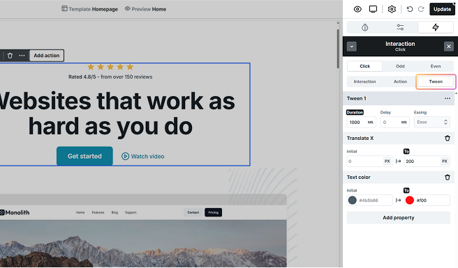
Available settings:
- Duration: Control how long the animation takes to complete, measured in milliseconds.
- Delay: Set the time before the animation starts after being triggered.
- Easing: Choose from different easing types and control how an animation speeds up or slows down over time.
Initial and End values
The Tween’s editing options allow you to define both the Initial and End values for the property you’re animating.
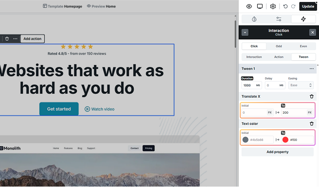
- Initial value: The starting state of the element before the animation begins, think of it as step 0. It applies only to the very first tween. If left empty, the element’s current style is used automatically. If defined, the animation always begins from this set value, which is especially useful for creating reliable loop animations.
- From value: Defines the starting state of the element for a tween after the first one. Each following tween uses a From → To pair, letting you chain multiple steps in one animation.
- End value: This is the final state you want the property to reach by the end of the animation. It’s completely customizable.
For animations that need to repeat, setting an initial value ensures that the animation always begins from that specific style.
Apply multiple properties
With the Add property button, you can apply multiple properties to a single Tween, animating several aspects of an element simultaneously.

However, keep in mind that the same property cannot be added twice to the same tween. If you need to remove a property, just click the trash icon next to its name.
Let’s say you want to animate an element to both move and fade at the same time. You can add Translate and Opacity as properties in one Tween.
For example, set Translate Y to move the element 200px from the bottom to its final position at 0px, and adjust Opacity to fade from 0% to 100%.
Adding tweens
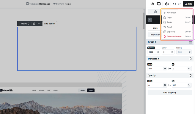
To add a new Tween, click the three dots in the Tween tab and select Add tween.
Action type
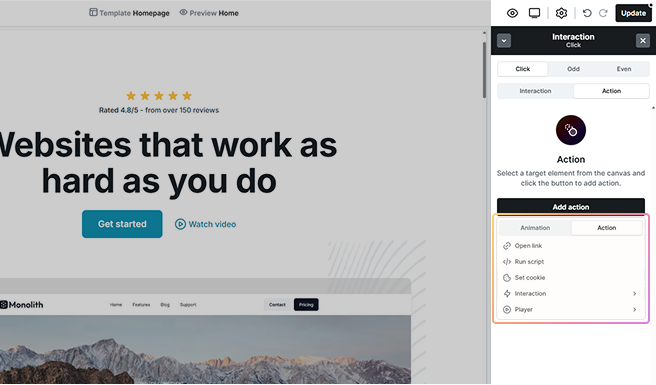
You can add an Action type in the same way you add an Animation. Open the Action tab in your interaction settings and click the Add action button. Then, switch to the Action tab within the selection panel to browse available action types:
- Open link: Set up your animation to redirect the user to a specific page or URL when triggered.
- Run script: Run custom JavaScript when an interaction is triggered.
- Set cookie: Create or update a browser cookie when the interaction is triggered.
- Interaction: Control other interactions by resuming, suspending, or resetting them. This allows you to coordinate complex behaviors, for example, pause one animation until another finishes.
- Player: Manage media playback by triggering play or pause on a video element when the interaction runs.
Alternatively, you can add an action directly from the selected target element’s toolbar by clicking Add action. From there, choose your desired option from the Action tab.
Open link
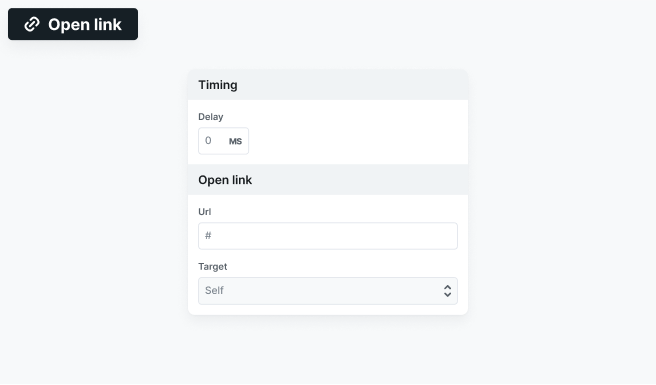
The Open link action allows you to attach a URL to an interaction, so users are redirected when the interaction is triggered. In the Action tab, you can set a delay before the link opens, define the URL, and choose the target, such as opening the link in the same tab, a new tab, or a specific frame.
Run script
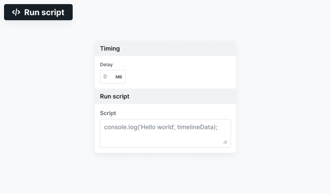
The Run script action allows you to execute custom JavaScript when an interaction is triggered. In the Action tab, you can set a delay before the script runs and add your code in the Script field.
Set cookie
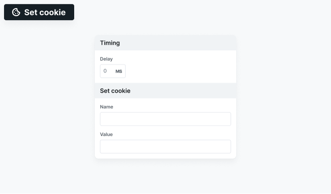
Creates or updates a browser cookie when the interaction is triggered. In the Action tab, you can define a delay before it runs, and enter the cookie’s name and value in their separate fields.
Interaction
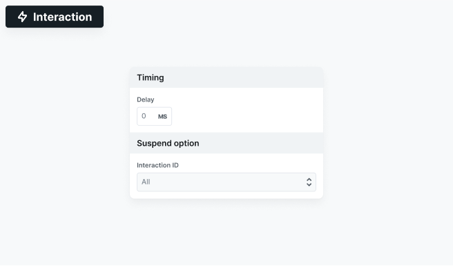
Controls other interactions with three options, Resume, Suspend, or Reset. After choosing one, in the Action tab you can set a delay before it runs. A dropdown lets you apply the action to All interactions or target a specific one by its ID. In the image example, the Suspend option is shown, but each choice displays its own field names in the same way.
Player
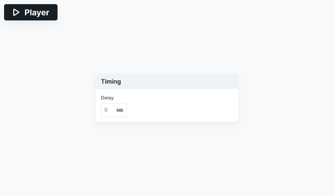
Controls media playback with two options, Play or Pause. In the Action tab, you can also set a delay before the action runs.
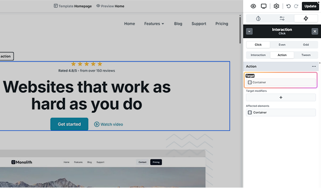
Action target
By default, the Target of an interaction is the element you selected as the Trigger. But you’re not limited to just that, you have flexible options for choosing which elements the interaction affects.
You can define a target for all animation and action types, except for the Open link action.
A Target can be:
- Only the selected element: The interaction applies to just this one element.
- Class-based options: Any element that shares the same classes as the one you’ve selected from the list will be affected.
Instances can also be set as Targets, but animations apply to their children, not the instance itself. For example, rotating an instance will rotate each child around its own center point.
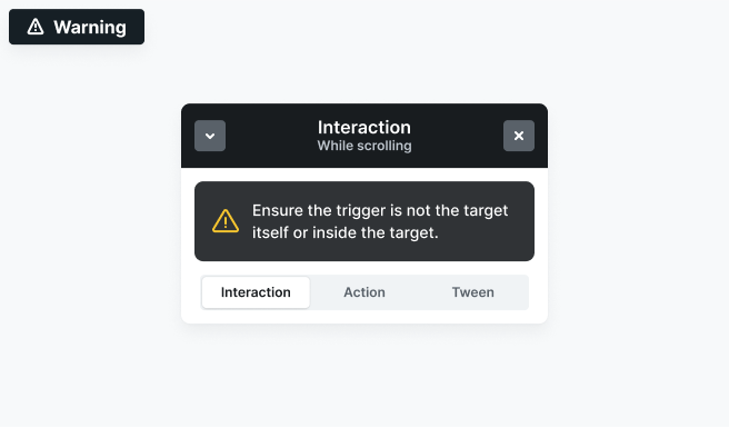
In Scroll into view, While scrolling, and Mouse move interactions, the Trigger must not be the Target or inside the Target of the animation. If the same element is mistakenly assigned as one of these, the following notice will appear to prevent errors.
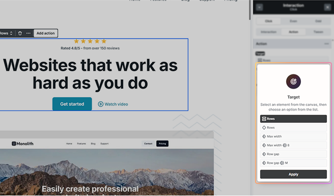
Target modifiers
If you need more control, you can go even deeper by selecting a specific element to target and limiting the interaction to the following:
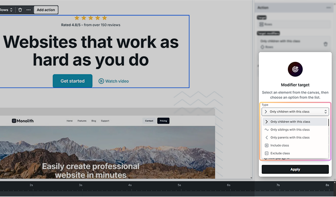
- Only children with this class: Affects only direct child elements that match the selected class.
- Only siblings with this class: Targets elements at the same hierarchy level that share the class.
- Only parents with this class: Affects only parent elements that match the class.
- Include/Exclude class: Choose whether to apply or ignore the animation for elements with certain classes.
Affected elements
It continuously displays the elements that are the targets of your interaction. These elements are clickable, so you can easily view them directly on the Canvas.
Target indicators
When you add a Target to an interaction, visual indicators appear in the Navigator to show which elements have that target applied. These elements are marked with a target icon, making them easier to locate.
Timeline
The Timeline gives you a clear overview of when actions start, how long they last, and how they interact. It automatically appears at the bottom of the Editor as soon as you add an interaction.
Manage actions
Interactions can include multiple Keyframes and affect different Targets at the same time. All timing controls can be adjusted visually in the Timeline.
- Reorder actions by dragging them into place.
- Adjust delays between keyframes directly on the timeline.
- Resize keyframes to extend or shorten the animation’s duration.
For Action types, keyframes can only be dragged to adjust their timing or delay. They cannot be resized, as they do not have a duration. These keyframes will display the action name instead of a duration value, and their visual size does not reflect how long they take to run.
Playhead indicators
Real-time indicators in the timeline show the current progress of an animation as it plays. These moving Playheads track the timeline from left to right, helping you see exactly where each tween and property change happens.
For Mouse move interactions, there are two playheads, one for the X-axis and one for the Y-axis. These indicators update as the mouse moves, showing how properties change in real time.
Preview on the canvas
The timeline includes preview options to test how your animations behave. Simply click to enable or disable them.
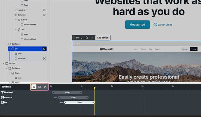
- Preview: This makes the animation respond to real interactions on the canvas. Not availabale for Click and Page load interactions.
- Reset: It halts the animation and returns the playhead to the start.
- Play: Plays the entire animation continuously until you stop it, helping you review the full sequence.
Scroll indicators
For scroll-based interactions (Scroll into view and While scrolling), the Preview adds visual markers on the right side of the Canvas. These indicators show exactly when an animation starts or ends, making it easier to adjust trigger points as you scroll.