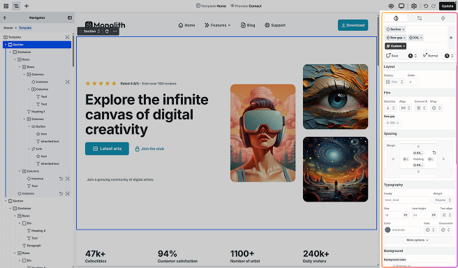
In this tab, you can adjust the style settings of your elements to customize their appearance. For example, you can change the color of your text to match your design or modify the width of an image to better fit your layout. Additionally, you can adjust other visual aspects of your design to create a more polished look.
Classes
The class system provides a smart way to style various elements, building upon CSS fundamentals. It can really speed up your editing, making it a must-have for a smooth design experience. Learn more about Classes here.
Style sections
The settings in these sections control various styles and CSS properties of your elements. As you make changes, you’ll see them instantly reflected on the Canvas, so you can always preview your adjustments in real time.
Layout
Layouts are the backbone of your website, shaping how everything is arranged on the page. They control not just where the current elements go, but also how any of its children elements are arranged.
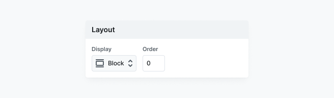
Display
With Mosaic, you have the freedom to design layouts in all sorts of shapes and sizes. Depending on the Display setting, you’ll often unlock different settings in the Style tab that let you customize your layouts even more.
None
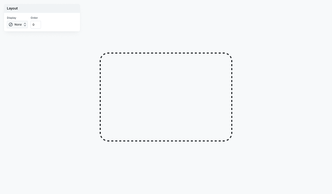
If you want to completely hide an element from view and ensure it doesn’t take up any space in your layout, you can use the None display setting. This effectively removes the element from the visual display, which can be particularly useful for optimizing content layout on mobile screens.
Hiding content this way can be an issue for screen readers, which rely on accessible content. If you still want the element to be available for screen readers but not visible on the page, consider using the visibility property instead, setting it to hidden. This way, the element won’t be displayed, but it will still be accessible to assistive technologies.
Block
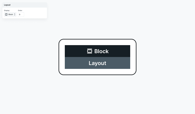
By default, many elements are set to display as blocks. Some common examples of these are Divs, Text elements, and Images. When you use a block-level element, its child elements stack vertically, one on top of the other. This means that each block-level element naturally takes up the full width of its parent container.
Flex
Flex allows you to control the layout of child elements along a single axis. In Mosaic, positioning (like arranging elements side by side) is always defined on the parent element, not the children. You’ll mainly work with two types of settings:
- Flex (parent elements set to display as flex)
- Flex children (elements inside a flex parent)
Depending on whether the direction is set to Row or Column, the settings will adapt to that main axis as well. Changing the direction also impacts how other alignment properties (like Justify and Align) behave by switching the orientation of the main and cross axes. By default, changing to a Flex display will set the layout direction to Row.
Direction: Column
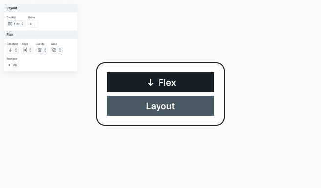
- Direction: For Rows, this is the default setting as they arrange their children from top to bottom in vertical rows. However, here you can change this behavior.
- Align: Controls how child elements are aligned along the cross-axis, which is horizontal for the column direction.
- Justify: Controls how child elements are distributed along the main axis, which is vertical in this setting. This helps you adjust the vertical spacing between elements.
- Wrap: By default, they try to stack all children in one vertical line, even if they overflow the parent’s height. The Wrap setting allows you to control whether children should break into multiple columns.
- Wrap align: When using the wrap setting, you can also control how the multiple rows of children are aligned horizontally using the Wrap align option.
- Col/Row gap: This setting allows you to specify the space between child elements both in vertical (row) and horizontal (col) stacks.
Direction: Row
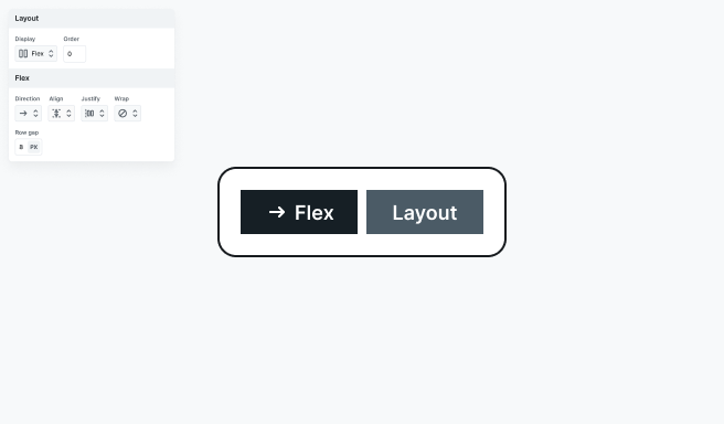
- Direction: For Columns, this is the default setting as they arrange their children from left to right horizontally. You can change this behavior here.
- Align: It controls how child elements are aligned along the cross-axis, which is vertical for a row direction.
- Justify: It controls how child elements are distributed along the main axis, which is horizontal in this setting.
- Wrap: By default, children remain on one line, even if they overflow the width of the container. This setting controls whether children should break into multiple rows when they exceed the container’s width.
- Wrap align: When wrapping is enabled, you can control how the wrapped columns are aligned along the vertical axis
- Col/Row gap: This setting allows you to specify the space between child elements both in vertical (row) and horizontal (col) stacks.
Flex child settings
The Direction setting defines the main axis of the flex container and, consequently, impacts the settings of its children.
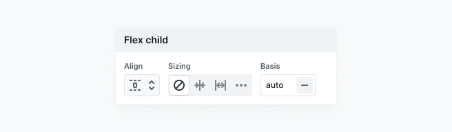
- Align: This allows you to override the alignment of a flex child, independently of the parent’s overall alignment settings. Depending on the parent’s direction, this means vertical alignment for a row direction and horizontal alignment for a column direction, thus affecting how the child element is positioned along the cross-axis.
- Sizing: Control a flex child’s growth and shrinkage independently of the parent. Options include None (no resizing), Shrink (limits size reduction to avoid overflow), Grow (expands to fill available space), and Manual (sets specific growth or shrinkage values relative to siblings).
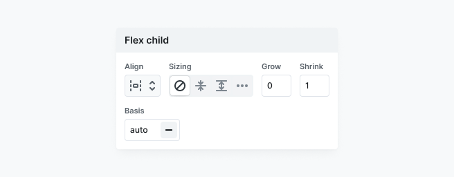
- Basis: Defines the default size of the flex child before any growth or shrinkage is applied. By default, this is set to auto, which means the child’s size will either be determined by its pre-set width and height or, if those aren’t specified, by the size of its content.
- Order: Flex children are initially rendered in the order they’re added to the parent element, but you can change their position using this setting. A child with a higher order value will be placed later in the flex layout, while a lower value moves it earlier.
Learn more about flex layouts here.
Grid
Grid allows you to manage your content in two dimensions, both columns and rows. You’ll mainly work with two types of settings:
- Grid (parent elements set to display as grid)
- Grid children (elements inside a grid parent)
Grid settings
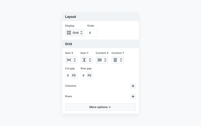
- Item X/Y: Here you can position grid elements within the grid vertically/horizontally.
- Content X/Y: Control the alignment of all grid items as a group inside the grid vertically/horizontally.
- Col/Row gap: Sets the space between the columns/rows of a grid.
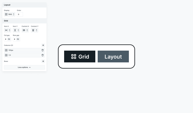
- Columns and Rows: By default, grid items are arranged in rows, but you can customize the layout with both rows and columns. To add more, click the plus button next to rows or columns. To remove one, click the trash icon, or use the circle icon with a diagonal line to delete all.
Some advanced settings are hidden by default. Click the More options button to expand and reveal them when you need finer control.
More options:
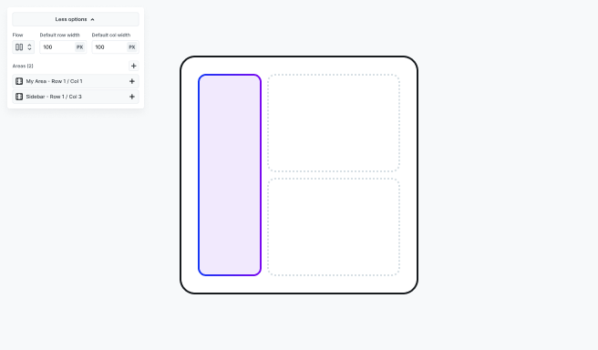
- Flow: Define how grid children are placed, either by rows or by columns.
- Default row/col width: Set the default width size of rows and columns.
- Areas: Name sections of the grid for easier layout management. Set a unique name for each area, define the starting and ending column lines for a grid item, and specify the starting and ending row lines for precise placement.
Grid child settings
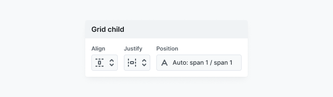
- Align: Control how an individual grid child is aligned along the vertical axis.
- Justify: Control how an individual grid child is aligned along the horizontal axis.
- Position: You can position grid children in specific areas, with each spanning multiple columns and rows. Auto lets you define the number of columns and rows a child covers, Manual allows precise placement with specific start and end points, and Area assigns children to named areas in the grid container.
- Order: Allows you to change the order of child elements in the grid. Children with lower values will appear first.
Grid sizing
To resize grid columns and rows, select the desired column or row in the Style tab and add your preferred value. There are several sizing options available:
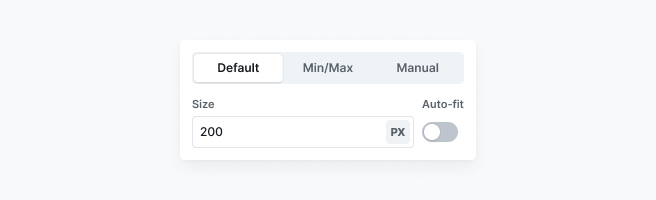
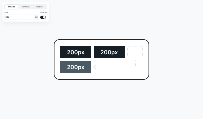
- Default: You can set your preferred size using any unit. Auto-fit makes your grid fully responsive by automatically collapsing columns when space is limited, preventing squishing. As space increases, columns expand and more can be added. With Auto-fit, you only need to define one column, and the grid adjusts to fit any screen size without extra configuration.
- Min/Max: Define minimum and maximum values to ensure that grid children don’t shrink or expand beyond certain limits.
- Manual: If you prefer more control, you can manually set the size for your columns and rows as needed.
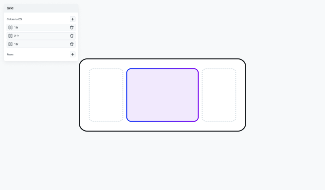
You can use fr units in grid layouts to automatically divide available space based on gaps and the overall area. Each fr unit represents a fraction of the total space, making it ideal for creating responsive, flexible layouts that adapt to different screen sizes.
For example, with a grid of three columns set to 1fr, 2fr, and 1fr, the available space is divided into four parts. The first and third columns take up one part each, while the second takes up two parts. This allows your layout to adjust proportionally to any screen size.
Learn more about grid layouts here.
Inline
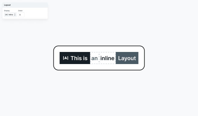
Inline elements are arranged side by side, creating a seamless horizontal flow in your layout. Unlike block-level elements, their width and height are automatically determined by the content they contain, meaning you can’t set these dimensions manually.
However, you do have control over their appearance. You can adjust the margins and padding of inline elements to customize spacing and improve the overall look of your design.
Inline block
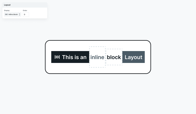
Inline block elements allow you to set specific width and height values for your elements while maintaining an inline layout. This means you can arrange them horizontally, similar to inline elements, but with the added advantage of having full control over their size.
Inline flex
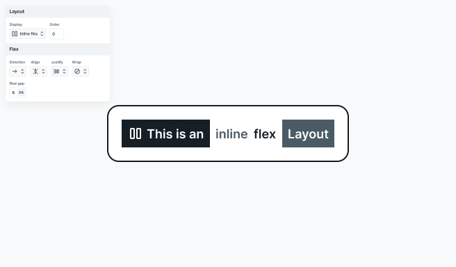
Using Inline flex transforms the flex container into an inline element, allowing its child elements to be laid out as flex items. This approach combines the advantages of flexbox with the ability to maintain a horizontal arrangement.
Inline grid
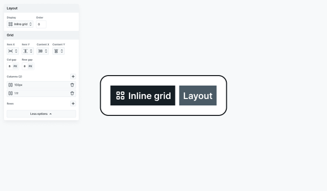
Similar to Inline flex, the Inline grid combines the inline-level behavior of the parent element with the capabilities of a grid layout for its child elements. This setup allows you to maintain a horizontal alignment while fully utilizing the flexibility that the grid system offers.
Contents
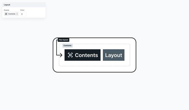
The Contents display is really helpful when you want to ignore a wrapper element in CSS Grid or similar layouts. It allows you to treat the child elements as if they are directly part of the parent container.
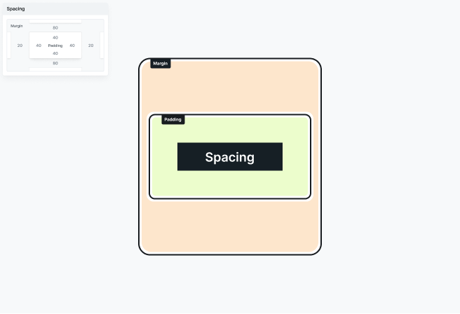
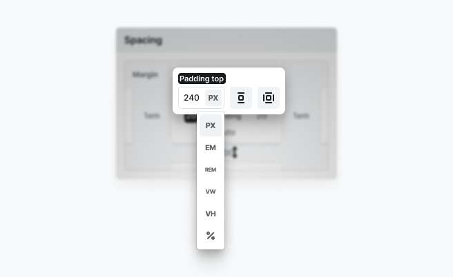
Spacing
To create space around or within the element you’re working on, use the Margin and Padding settings. Margins create space outside an element’s border, while padding adds space inside the element, between its content and its border.
You can adjust the margins and paddings in two ways:
- Manually by entering numbers
- By dragging the margin or padding value left/right
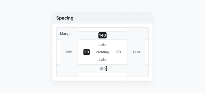
When adjusting spacing, you can apply it to one side, two opposite sides (like top and bottom), or all four sides at once. Just click on any of the spacing values, and you’ll see options to choose how you want to apply it.
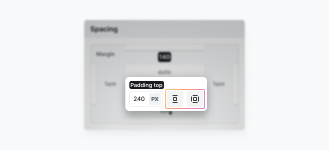
You can also change the unit of measurement in the same window. The default is pixels, but you can switch to another unit by selecting it from the dropdown menu next to the spacing value.
If you ever need to reset a value, simply click the arrow in the top-right corner of that section to revert it back to default.
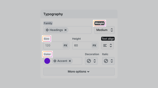
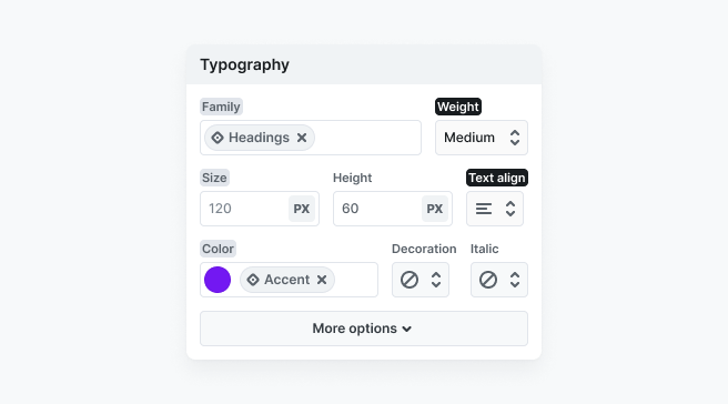
Typography
You can find a variety of font-related settings here that allow you to customize the appearance of your text. These options help you adjust the font style, size, weight, and more to achieve the perfect look for your design.
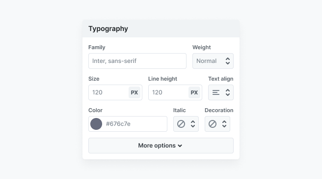
- Family: Here you can choose specific fonts for your text. All fonts are defined as style variables — learn more about them here.
- Weight: Adjust the thickness of the font.
- Size: Here you can specify the size of your text.
- Line height: Determine the vertical spacing between lines of text.
- Text align: Align your text horizontally.
- Color: Set your text’s color.
- Italic: Apply a slanted style to your text.
- Decoration: Add visual effects to your text, such as Underline, Overline, Line through, or remove any decorative lines with None.
Press More options to explore settings that are less frequently used.
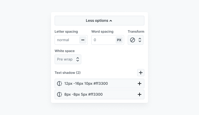
- Letter spacing: Adjust the spacing between individual characters in a text.
- Word spacing: Adjust the spacing between words in a text.
- Transform: Modify the text case, using Lowercase, Uppercase, Capitalize, or maintain the original casing with None.
- White space: Control how spaces and line breaks are handled in the text with Normal, No wrap, or preserve them with Pre.
- Text shadow: Add a shadow effect behind the text.
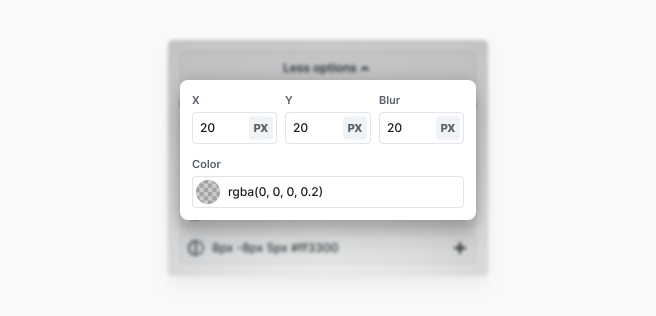
- X/Y: Control where the shadow is placed horizontally (X) and vertically (Y).
- Blur: Control the softness and sharpness of the shadow. A higher value results in a softer shadow, while a lower one creates a sharper one.
- Color: Specify the color of the shadow applied to the text.
While many typography units on the web default to pixels, you actually have a variety of other options to choose from when styling your text. Here are some alternatives you can use in Mosaic:
- Ems
- Rems
- Percentages
- VW (viewport width)
- VH (viewport height)
Background
Customize the background of the selected element by choosing a solid color, an image, or a gradient. This allows you to create a visually cohesive design that enhances the overall look and feel of your project.
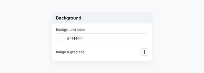
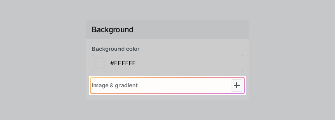
Image & gradient
Click the + button to add an image or gradient as your background. After adding one, you can fine-tune its appearance by adjusting its options.
Overlay
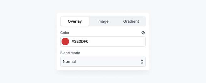
- Blend mode: Control how the content of an element, like text or images, blends with what’s behind it.
- Color: Set a background color.
Image
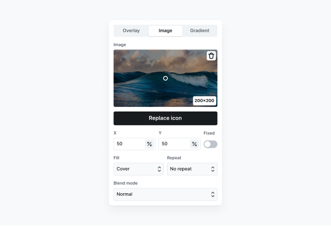
- Image: You can set an image as the background, remove the existing one, or replace it with a new one.
- X/Y: You can adjust the focal point of the background image manually by shifting it along the x- and y-axes, or by dragging the dot on the image above.
- Fixed: If this is turned on, the background image will remain in a fixed position relative to the browser window, while the rest of the page’s content scrolls as usual.
- Fill: Here you can define how the background image is sized to fill the container.
- Repeat: Here you can define how the background image is repeated to cover the background of an element.
- Blend mode: Control how the content of an element, like text or images, blends with what’s behind it.
Gradient
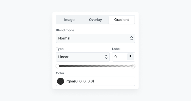
- Blend mode: Control how the content of an element, like text or images, blends with what’s behind it.
- Type: Create smooth transitions between colors. There are two main types. Linear, which blends colors in a straight line, and Radial, which transitions colors in a circular pattern from a central point.
- Size: You can control how the gradient is sized relative to its container. Available for the radial types.
- Left/Top: Position the gradient’s center point within its container. Available for the radial types.
- Angle: Specify in which direction the gradient should flow. Available for the linear type.
- Gradient stops: Define the points along the gradient where colors should change. You can add new ones as well by clicking on the bar.
- Color: Set a background color.
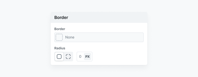
Border
In the Border section, you have the flexibility to customize the look of your element’s borders. You can easily adjust the border radius to create rounded corners or set borders for one or more sides.
In the Border settings, you can control each side’s appearance all at once or individually.
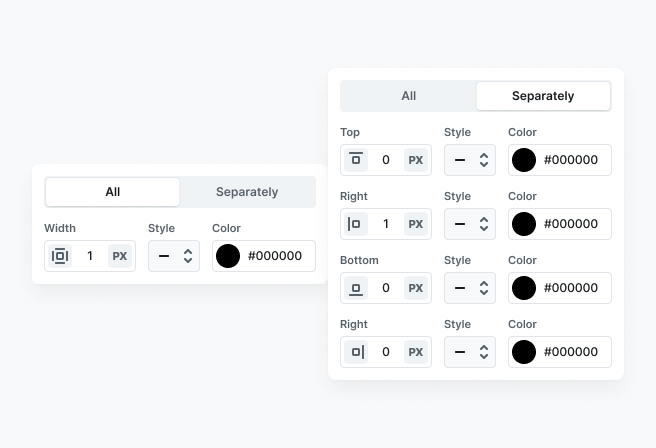
- Width: Define the thickness of the border surrounding the element
- Style: Choose between different styles for your border, like solid, dashed, or dotted.
- Color: Set the color of the border.
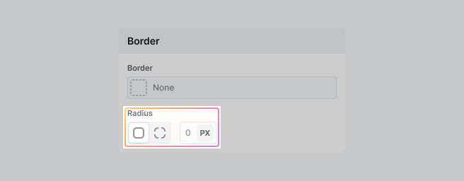
When adjusting the Radius, you can either change all four corners at once or adjust each corner separately. By default, the radius is measured in pixels, but you can switch to a different unit using the dropdown menu next to the value.
Size
Using the Size settings, you can easily adjust both the Width and Height settings of the selected element to fit your desired dimensions.
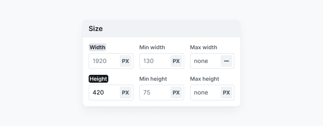
- Width: Control your element’s horizontal space.
- Min/Max width: Define the minimum and maximum horizontal space your element can occupy.
- Height: Control your element’s vertical space.
- Min/max height: Define the minimum and maximum vertical space your element can occupy.
Position
Configure the Position settings of the selected element to control its placement within the layout, ensuring it appears exactly where you want it in relation to other elements on the page.
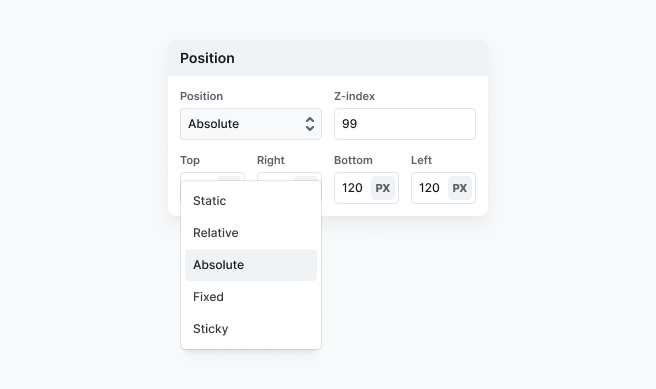
- Position: Determine how elements are positioned within their containing elements and how they interact with the rest of the page using the options Static, Relative, Absolute, Fixed, and Sticky.
- Z index: Control the stacking order of elements that overlap, with higher values appearing in front of lower values.
Other
Here, you’ll find additional settings to fine-tune your element’s appearance, including advanced options for positioning, transitions, and more.
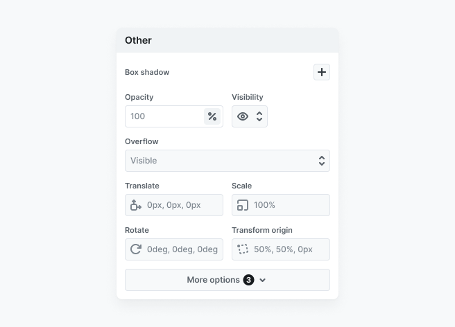
- Box shadow: You can add shadows either inside or outside your element’s rectangular boundary. Adjust the shadow’s position along the X and Y axis, set its blur and size, and even change its color.
- Opacity: You can adjust the opacity of the current element by setting a percentage. At 100%, the element is fully opaque, while 0% makes it completely transparent.
- Visibility: Here you can set whether an element is visible or not.
- Overflow: Handle how the content that exceeds the size of its container is handled.
- Translate: Moves the element along the X, Y, or Z axis. Use this for everyday positioning animations or layout adjustments.
- Scale: Resizes the element horizontally, vertically, or in both directions. Useful for enlarging or shrinking an element.
- Rotate: Rotates the element around the X, Y, or Z axis. Use this for standard rotations.
- Transform origin: Defines the pivot point around which the element transforms. By default, it’s the center of the element, but you can change it to any value.
Press More options to reveal all available settings.
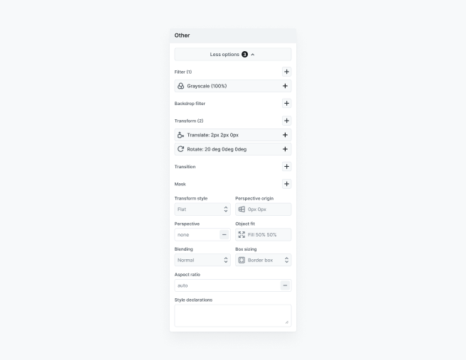
- Filter: You can change the appearance of the entire element by applying various visual effects.
- Backdrop filter: Add effects to the area behind the element.
- Transform: This field should only be used for very specific 2D cases, such as skew or complex combined transforms. For normal movement, rotation, or scaling, use the dedicated Translate, Scale, or Rotate settings instead.
- Transition: Create smooth, gradual changes between different styles when an element’s state changes.
- Mask: Lets you hide or reveal parts of an element using either a gradient or an image. With gradient masks, you can create smooth fades, while image masks allow for custom shapes and cutouts.
- Transform style: Determines how nested elements behave in 3D space. With flat, child elements are rendered in 2D, ignoring depth. With preserve-3d, children maintain their own 3D positioning, allowing for layered or more complex 3D effects.
- Perspective origin: Set the point from which you view the 3D effect when you transform an element.
- Perspective: Set the depth of the 3D effect when you transform an element.
- Object fit: Control how images and videos fit within their containers.
- Blending: Adjust how an element’s content blends with both its parent’s content and its own background.
- Box sizing: Decide whether an element’s width and height include padding and borders or apply only to the content area.
- Aspect ratio: Keep an element’s width and height in a fixed proportion so it can scale consistently for responsive design.
- Style declarations: Apply specific CSS rules to define your element’s appearance.
Inherited styles
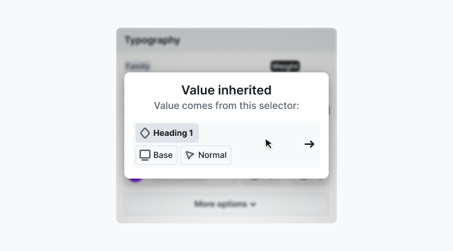
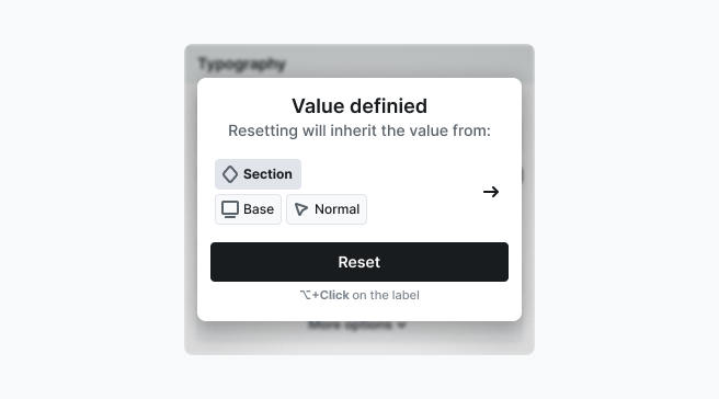
You have the flexibility to add new styles, override inherited ones, or even reset them entirely. In the Style tab, you might notice that some property names are highlighted in different colors. Clicking on these highlights will show you where the values come from, whether they’re set by the current class, inherited from another class, or even applied from a larger breakpoint.
Gray highlights
By clicking the gray indicator, you can easily see where the value was inherited from. If you want to make changes, you’ve got two options: you can override the style right on the spot by adding a new value, or go to the original source to edit the value directly.
Black highlights
If the name has a black highlight, it means the value is coming from the currently selected class. You can easily edit it right there or reset it by clicking on its name.
Linethroughs
If you see a line through the highlighted name, it means you’ve overridden an inherited style, either on a smaller breakpoint or in a specific class.