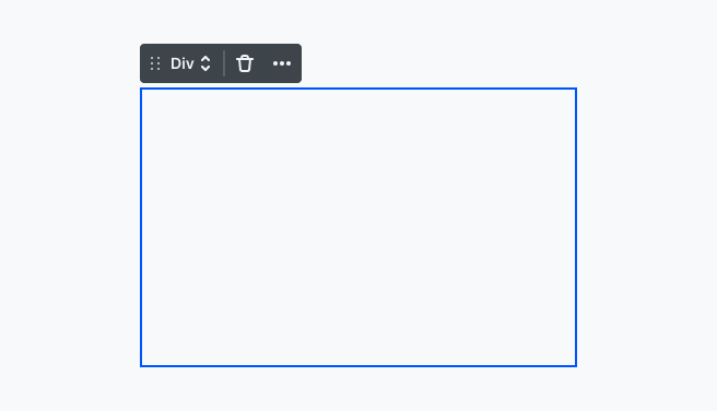
The Div element is the most generic element for structuring your website content. It’s a fundamental building block, serving as a versatile container that allows you to organize and structure your elements effectively.
A key feature of the div is its adaptability. It automatically grows or shrinks based on the content inside. By default, it’s displayed as a block-level element, meaning it takes up the full width available, stacking elements vertically. This behavior makes it an ideal building block for organizing content in a clear and structured way.
You also have the flexibility to turn divs into other layout elements if needed. Even though they serve slightly different purposes, each of them is a key tool for organizing your content.
Element classes
You can select the following element classes:
Grid
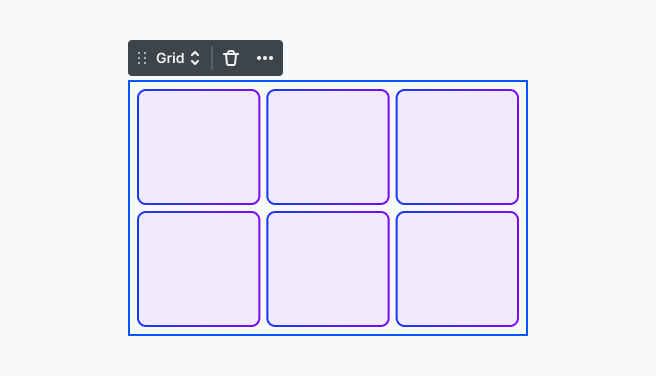
Grid elements provide consistent spacing, proportions, and ratios across different parts of your layout, making everything feel balanced. They are designed to handle two-dimensional layouts, managing both rows and columns with ease.
You can customize the layout settings of grids even further using the options available in the Style tab.
Additionally, to make your grids responsive, you can either manually adjust columns at specific breakpoints or enable Auto-fit for a more flexible solution.
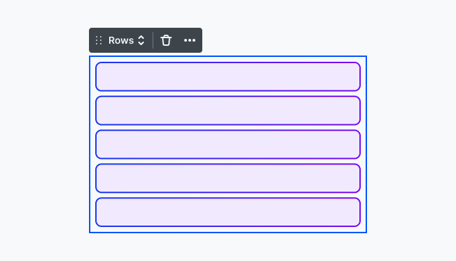
Rows & Columns
Rows and Columns both use flexbox for one-dimensional layouts. They allow you to arrange elements in a single direction, either horizontally or vertically, depending on which layout element you choose. Both Rows and Columns play a big role in helping you organize content within a grid layout. They provide structure and flexibility, making it easier to arrange your design.
- Rows: The Rows element arranges child elements vertically, from top to bottom. Flexbox is applied by default, so elements are laid out under each other in a natural flow.
- Columns: With the Columns element, child elements are arranged horizontally, stacking from left to right. Like Rows, flexbox handles the layout by default.
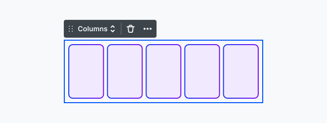
You can customize the layout settings of Rows and Columns even further using the options available in the Style tab.
Container
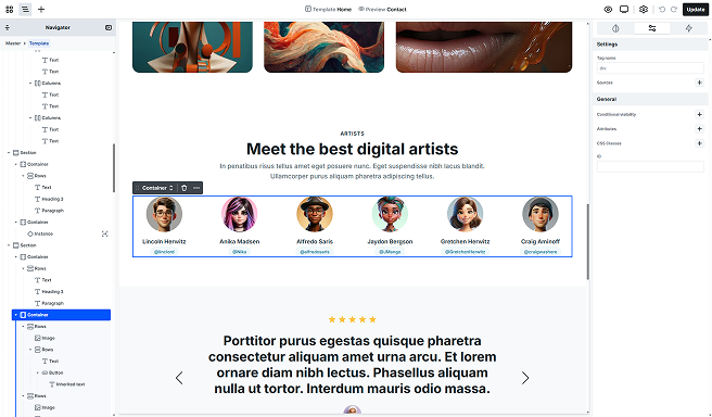
Container elements are typically nested within section elements and are essential for keeping your layout well-organized. While sections are primarily used to divide your content into different areas, containers focus on visual alignment and spacing.
Sizing
By default, containers stretch across the entire width of the page. However, to make the most of your container element, you can set a maximum width for it. This ensures that any content within the container won’t exceed that width. You can customize the look of your container in the Style tab.
Settings tab
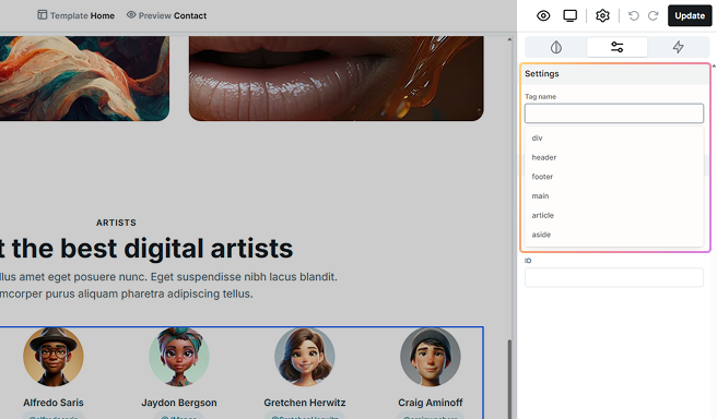
In the Tag name section, you can customize your div’s HTML tag. While the default div tag is enough for most cases, you have the flexibility to choose alternative tags, like header, to define the purpose of each element precisely. The dropdown list includes suggestions, but you can also manually enter any tag name you prefer.