The image element lets you display your chosen image on your website. To choose an image to display, either double-click on the image element or navigate to the Settings tab settings.
Clipboard actions
If you have an image URL on your clipboard and the active element is an image, simply insert it with the Ctrl (or Cmd) + V hotkey, and the given image will appear:
- If the image URL exists within your WordPress Media Library, we connect the image element to that image.
- If the image URL doesn’t exist within your WordPress Media Library, we will simply paste the given URL.
If you have an image on your clipboard (for example, from Snipping Tool or from a website), you can paste it as well, with the Ctrl (or Cmd) + V hotkey. The image will be uploaded to the WordPress Media Library and automatically placed into the image element.
Settings tab
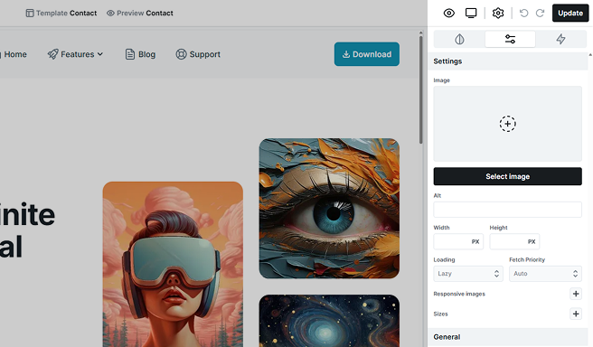
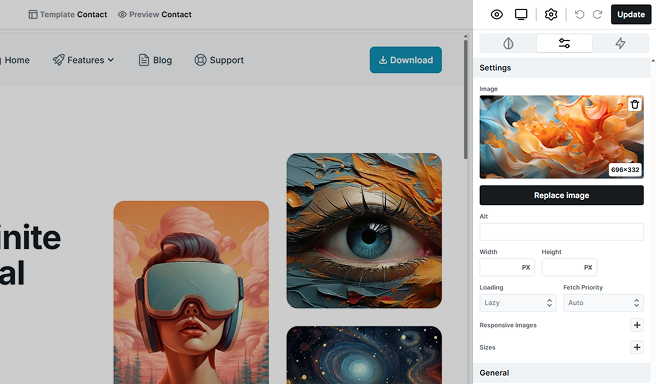
The Settings tab provides additional settings for your image. Let’s break them down.
Image
Your selected image will be displayed here. Once your chosen image is uploaded, you’ll have the option to delete or replace it if needed.
Alt
Alt tags are crucial for SEO. They provide a descriptive text for your images. Most of your images will benefit from alt text since they carry meaning for visitors, but purely decorative images don’t need it, as they don’t add relevant information.
Width & Height
These parameters determine the size of your image. By default, they use auto values:
- Width is set to 100% until the maximum width is reached.
- The maximum width is defined by the image’s width within the image file.
- The height automatically adjusts to the width.
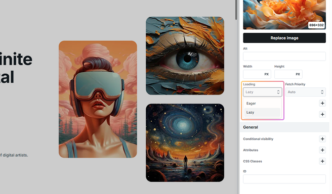
Loading
Controls when the image file is fetched. Eager loads the image immediately during page load, use it for critical, above-the-fold visuals (e.g.: hero, logo).
Lazy defers loading until the image nears the viewport, which improves performance for below-the-fold content.
Use Eager sparingly as unnecessary eager loads can slow the initial render.
Fetch Priority
Hints to the browser how important this image is. High asks the browser to fetch it earlier (good for hero/LCP images). Low suggests it’s non-critical (decorative or offscreen). Auto lets the browser decide (recommended by default).
Set High only for a few truly critical images to avoid competing with other important resources.
Responsive images
The Responsive images setting dives into the world of HTML code for responsive images, which might be a bit tricky. We won’t be giving a crash course in HTML here, so proceed with this feature only if you’re familiar with how HTML code works. If you’re just curious, it’s probably best to skip this, as the outcome can be a bit unpredictable. Here’s why:
- Browsers play the role of image selectors, deciding which image to load based on factors like browser screen size, website’s server speed, and visitor’s internet speed. This means even in the same browser and screen size, you might see different images loading at different times.
- Different browsers have different rules for selecting images, leading to a less consistent outcome.
- Browsers are caching your images, and they load the cached image rather than a not-yet-loaded image. This means if you check your website on a desktop and then resize the browser to check the mobile size, even if you refresh the page, the desktop image will load instead of the mobile image.
- Mosaic’s preview won’t reflect the set images on different devices. The final decision will still be made by the browser, regarding which image to load.
All in all, if your goal is to display different images for different device views and see the result as expected, we recommend following our alternative guide for a more reliable outcome.
Intrinsic width / device pixel ratio
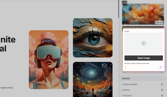
Controls how Mosaic calculates an image’s intrinsic CSS width. Use one of two modes:
- X (DPR scale): Enter the image’s scale factor (e.g., 1, 2, 3). Mosaic treats the CSS width as naturalWidth ÷ X.
- W (Width in px): Enter the intended CSS width (e.g., 800). Mosaic will reserve and render the image as 800 px wide regardless of the file’s pixel size.
Sizes
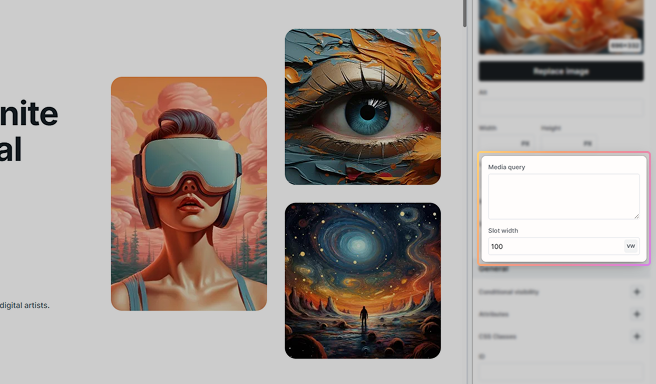
Within Sizes, you can set values for the sizes attribute.
Responsive images alternative
For a more predictable outcome for responsive images, consider the following alternative.
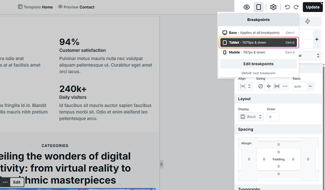
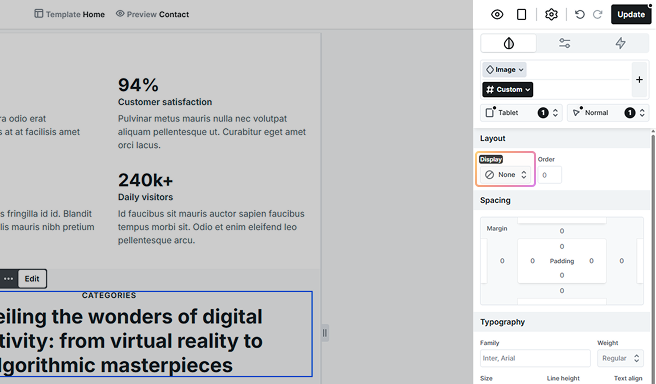
Instead of using only one image element, use multiple image elements. Then, on every view, set the display value of your images to choose where you want them to appear and where to be hidden.
With the Loading -> Lazy setting, an image won’t load while it is hidden, so you don’t have to worry about loading too many images into your website.
FAQ
You can use for example Squoosh (by Google) to optimize your images. WebP or AVIF image formats are recommended for optimal performance.
While WordPress already supports AVIF files, uploading them via the WordPress media library may encounter issues on many servers. This is because hosting providers have not yet standardized AVIF support in their configurations. If you experience problems uploading AVIF images, you should contact your hosting provider.
(WebP images are usually fine.)