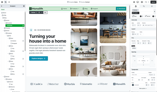
The Navbar element was made to help you create a top menu for your website. It’s a mix of elements. For example, it includes an Icon element for the logo and a Navigation element for the menu points.
Structure
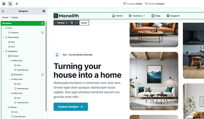
After entering the Navbar’s scope, you’ll find that by default, it’s made up of three main elements.
Link
You can typically find the Link element on the left side of the Navbar, where it usually holds the logo. To customize it, you can easily add your logo as an Icon within the Link element. For more info on how the Link works, check out the Button documentation.
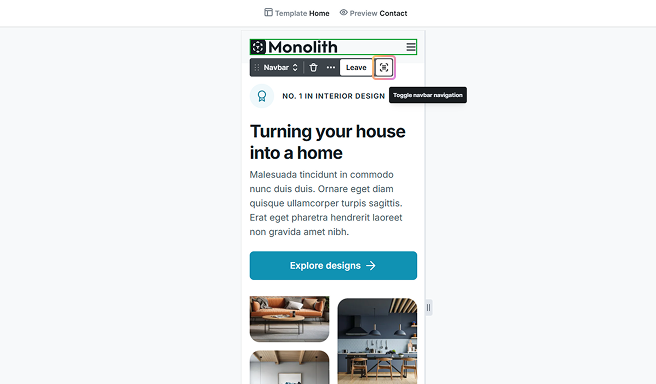
Menu button
In mobile view, the menu is replaced by a Menu button element. On desktop view, this button is hidden by default but becomes visible in mobile view to save horizontal space. By default, the element includes two icons to represent the open and closed states of the menu. You can add this element through the Add panel as well.
Toolbar actions
In mobile view, the element’s toolbar will also offer a new option to edit and preview the menu’s open and closed states directly on the Canvas.
Navigation
This holds all your navigation links. The Menu links inside this container are typically text-based and usually direct users to different pages or sections of your website. You can add both the Navigation and the Menu link elements through the Add panel.
Styling
The navbar is highly customizable, giving you plenty of flexibility when it comes to styling. You can easily adjust all of its settings through the Style tab.
By default, the navbar automatically adjusts its width to fit the element it’s placed in. However, you have full control over modifying this if needed. Additionally, its height is determined by the content inside, but this too can be adjusted through the Style tab to fit your design preferences.
Settings tab
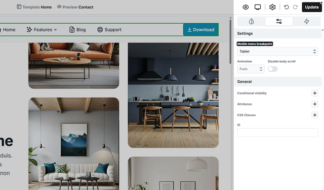
- Mobile menu breakpoint: Here you can set the activation of the Menu button by specifying the breakpoint at which it should appear. By default, it’s set to Mobile.
- Animation: You can customize the type of animation used for the opening and closing transitions.
- Disable body scroll: You can disable page scrolling when the Menu button is opened.
Additional elements
The Navbar includes additional elements that are accessible through the Add panel. For more information on how to use it, refer to the Add panel documentation.
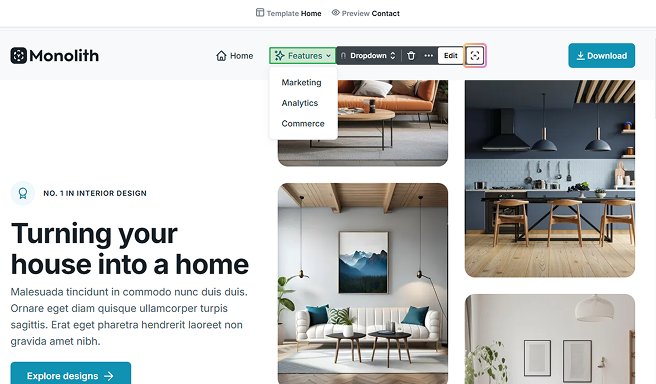
Dropdown & Dropdown wide
These are prebuilt elements designed for use within your Navbar. Their primary function is to present a list of options in a collapsible format, allowing users to access additional content or features with a single click. Initially equipped with pre-set links, these elements can be easily expanded upon to suit your specific needs.
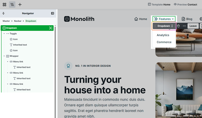
Dropdown
In this version of the dropdown, the wrapper has a base width. The dropdown itself has two main parts: the Toggle, which features the text and an arrow icon, and the Wrapper, which holds the menu links.
Dropdown wide
The wide version of the dropdown is designed a bit differently. Its wrapper width expands to fill the available space in the browser, and the link elements inside are arranged in columns. This layout helps maximize the space in the wrapper, allowing the links to sit side by side.
The dropdown will appear on the bottom of the first parent element, which has position: relative CSS setting on it. Use for example a Section element as parent, to control where it appears.
Toolbar actions
The wrapper is hidden by default, but it will appear when you enter the element’s scope. You can easily control its visibility using the Toolbar. Just toggle the dropdown button to show or hide the wrapper on the canvas as needed.
Settings tab options
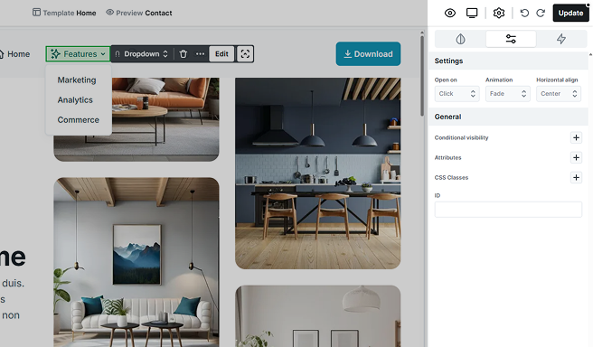
- Open on: You can choose whether to open the dropdown menu by clicking or hovering.
- Animation: You can customize the type of animation used for the opening and closing transitions.
- Horizontal align: You can adjust the horizontal alignment of the wrapper. This option is only available for the simple dropdown element, not the wide dropdown.
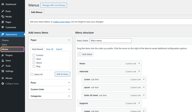
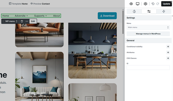
WP menu
The WP Menu lets you display the different menu points you’ve customized in the WordPress dashboard, ensuring they appear correctly on your website.
Mosaic does not support sub-submenus, so you can only use 1st level submenus.
Settings tab options
- Menu: Select the menu you would like to display.
- Manage menus in WordPress: This menu point leads you to the WordPress dashboard → Appearance → Menus, where your menus are.
Structure
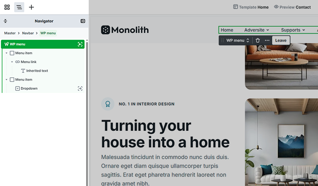
Menu item
In its Settings tab’s options, you can control how a menu item behaves in relation to other items in the menu structure.
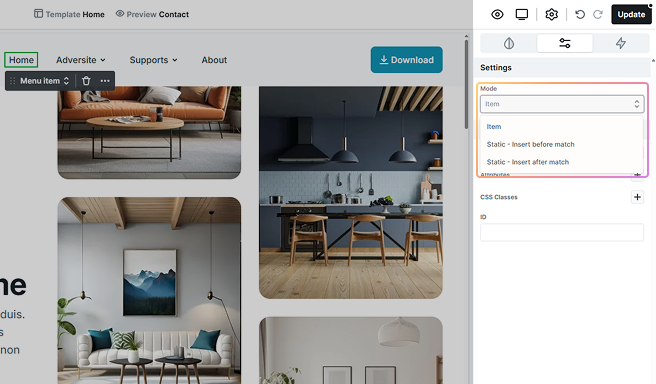
- Item: The new menu item is added without any automatic positioning based on matching rules.
- Static – Insert before match: The item will be inserted in a fixed position before a specific matching item in the menu based on a condition.
- Static – Insert after match: The item will be inserted in a fixed position after a specific matching item.
Additional states
The Navbar and its elements include additional states, accessible through the state selector. For more information on how states work, refer to the Class system documentation.
Navbar dropdown mode

This dropdown mode allows you to apply specific styles to the Navbar and all of its elements when in this state. Whether the elements are part of the original Navbar or were added later, they will automatically inherit this dropdown state.
Navbar opened
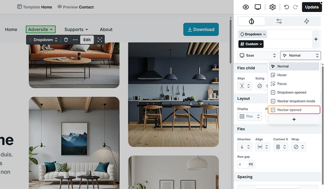
This state lets you enhance the styling of the Menu button and its Icons, along with the Navigation and its Menu links, specifically for smaller screens when the menu is open.
Navbar opening
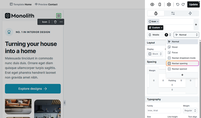
Style the Icon of the Menu button as it opens, focusing on how it looks during the opening transition.
Nested dropdown mode
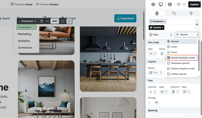
This state is for smaller screens. When the screen size decreases, the Navigation turns into a Menu button. This Nested dropdown mode enables you to customize styles for the dropdown and all its elements in this collapsed state.
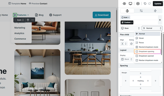
Dropdown opened

Style the Dropdown, including the Dropdown wide, Toggle and its child elements, and the Wrapper. Additionally, apply styles to the WP menu’s Dropdown when they are in the open state.
Dropdown opening
Style the Dropdown’s Toggle and its child elements in its opening state, specifically during the transition as it opens.
Current
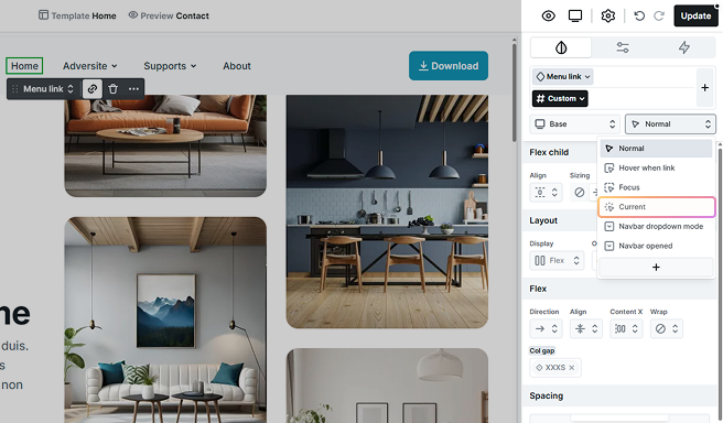
Style the WP menu’s Menu links, along with the Dropdown’s Menu links, to provide clear visual cues for the menu link that matches the page the visitor is currently viewing.
Current within
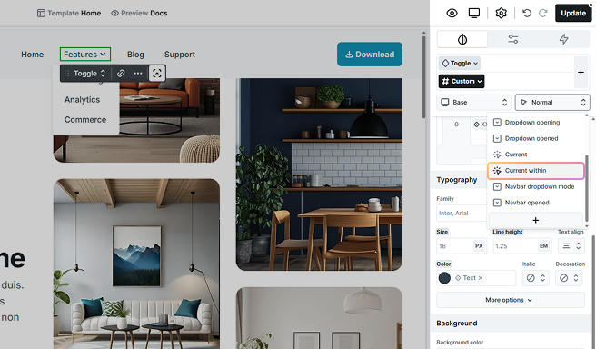
The Current within state is applied only to Dropdown Toggle elements. It becomes active when a visitor is viewing a page that belongs to one of the dropdown’s submenu items.