The Tabs element allows you to organize your content into different sections, known as tabs. Each tab displays its unique content, making it easy to include multiple pieces of information within a single area of your page.
Structure
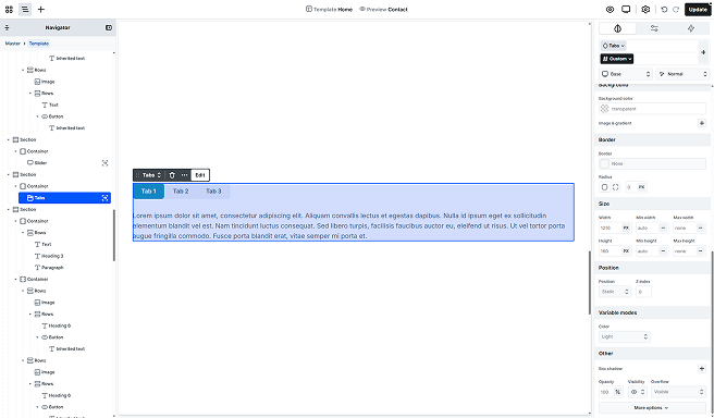
By default, the Tab is made up of two main elements.
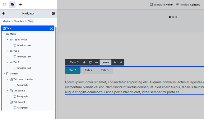
Menu
Holds the menu items that are responsible for showing/hiding the associated tab-pane. By default, you’ll see two Tabs, each representing a menu item. Each tab will come with an Inherited text, but you can easily customize it by adding your own content using elements from the Add panel.
Content
Holds the Tab panes associated with the given menu item. Its content cannot be built either. By default, there are two Tab panes, each holding content that you can fully customize to match your design. To build out the content, just use elements from the Add panel. Each pane comes with a Paragraph text element, which you can easily modify or replace as needed.
Toolbar actions
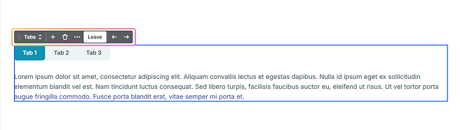
- Arrows: You can switch the active tab to see it on the canvas.
- Add icon: You can add a new Tab – Tab pane pair to your Tabs element.
- Leave: You can leave the scope of the Tabs element.
By default, the Active tab is marked with a black background and white text in the editor. Additionally, the term “Active” is added to the names of elements in the Navigator to indicate the currently selected tab. The active elements will be shown on the canvas as well.
Settings tab
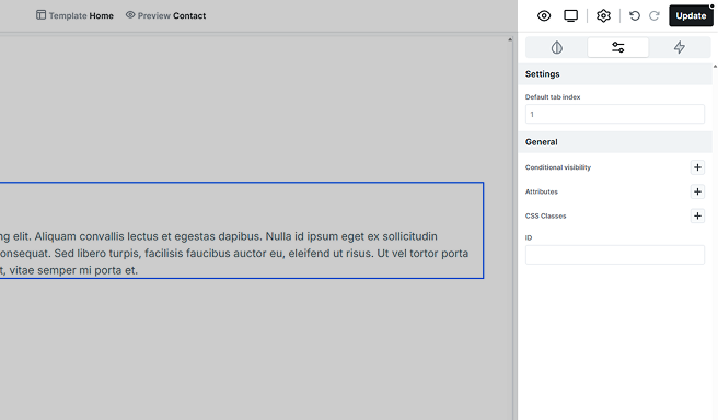
In the Settings tab, you’ll find the Default tab index setting, which allows you to define the order in which the tab elements are focused.
Additional elements
Loop tabs
It allows you to pull data dynamically, automatically updating your content. You’ll define a single Tab that acts as the template, and all subsequent tabs will be generated based on this template. For more details on its settings, check out the Loop documentation.
If you’re using a Loop tab element and plan to change its type, make sure to check this section first to avoid missing or mismatched content.
Additional states
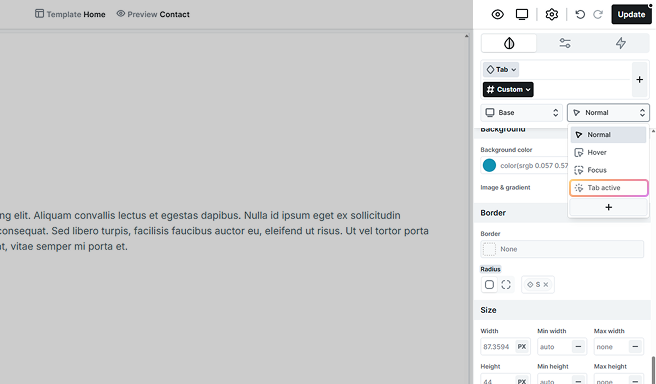
On the Style tab’s state selector, you can adjust the design of the Tabs depending on the given state. For example, you can customize the appearance of the active tab and its child elements here. For more information on how states work, refer to the Class system documentation.