
Components in Mosaic are reusable elements that hold a specific design. Think of them as containers or building blocks that you can add to a Template to show the same pre-made design you created. Components can be accessed from the Left menu and from the Canvas.
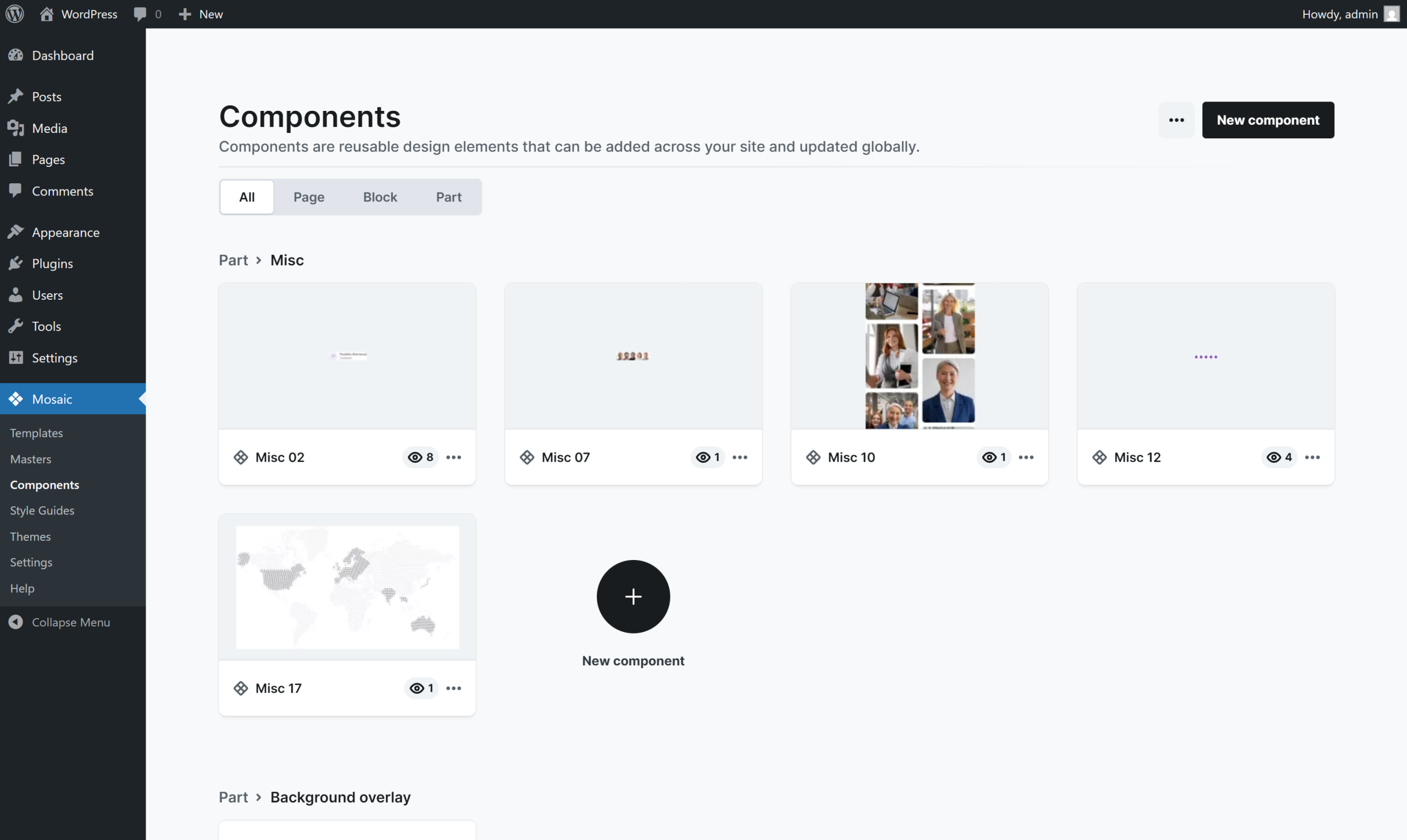
For example, you can create an icon with border, background, etc. and reuse that on a different page as many times as you want without needing to copy and paste your previous work.
Additionally, if you change the elements (design, layout, etc.) of the Component, it will automatically affect all its children instances throughout your website, making it incredibly easy and convenient to adjust content on your website.
Create components
You can create a component in Mosaic in four simple ways. You can do this directly from the Navigator, which provides easy access, or use the Toolbar for a more visual approach. Another option is to navigate to the Components menu, where you can find and manage all your components. If you prefer shortcuts, you can simply press Ctrl+K to create a component instantly. You can easily recognize when you are editing a Component by the purple highlight color used for its scope.
From the Navigator
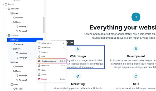
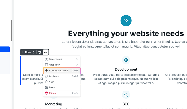
To create a component from the Navigator, you can right-click on your design to bring up a context menu and then select the Create component option.
From the Toolbar
You can also create a component using the Toolbar. Simply open the three-dot menu in the Toolbar, where you will find the same Create component option.
Once you select the Create component option in either of the ways mentioned above, you will see a popup window. For more information on the options of this popup window, refer to the Component settings section.
From the Components menu
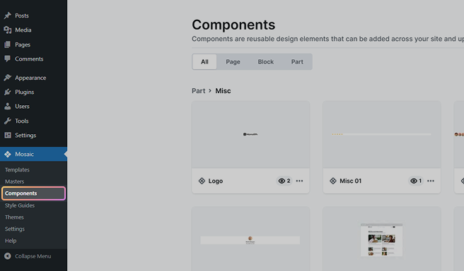
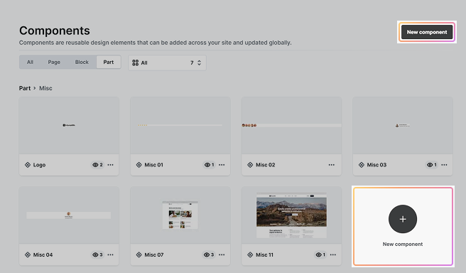
If you prefer a cleaner start, where you can build the component from scratch without having an already existing design to make it from, you can do it here by choosing either of the New Component buttons.
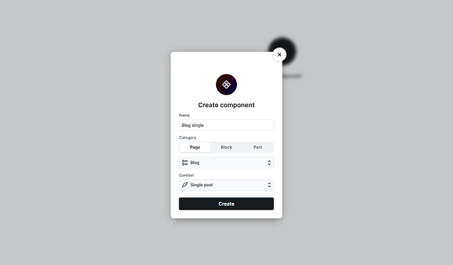
Once you click on the New component button, you will see almost the same popup window as for the component created from the Navigator.
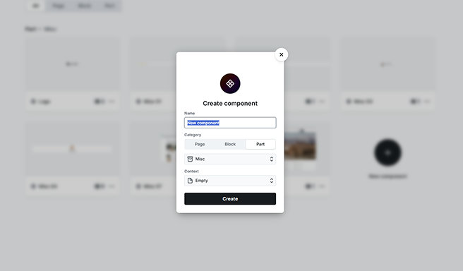
The only difference here is that you also get a new Context field. This determines what variables you get access to in the Component editor.
Reuse components
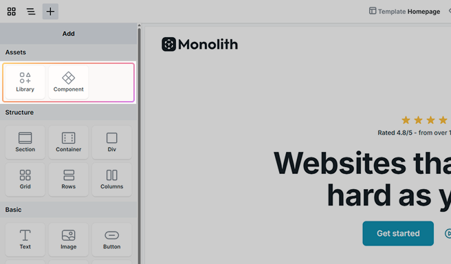
Once you’ve created a component, you can reuse it anywhere. To add a component, use the Add panel’s Assets section. In the Assets pop-up panel, you’ll have access to a variety of components. To learn more about this panel, check out the Library documentation.
Manage components
In the Components interface, you’ll see a list of your Components. By selecting a component, you’ll be directed to the Component editor.
For more options, use the Context menu accessible via the three dots on each Component.
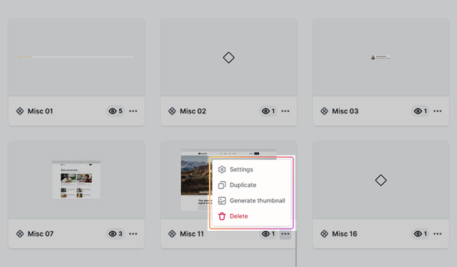
This menu allows for various actions:
- Settings: Allows you to customize the component name, category, and context (available variables).
- Duplicate: Creates a copy of the component.
- Generate thumbnail: Generate a small sneak peek of what is going on inside the component, allowing you to view its content without the need to open it. Helpful when managing many or similarly named ones.
- Delete: Permanently deletes the component.
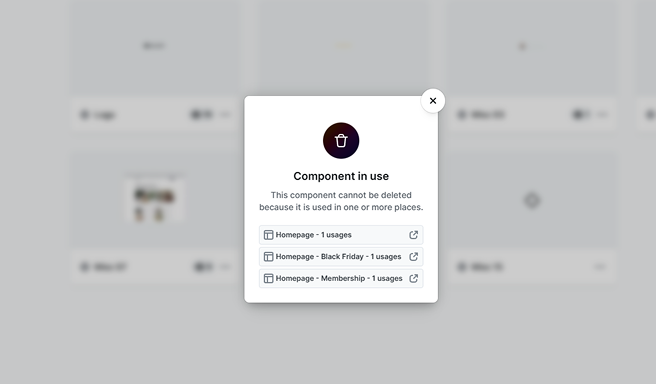
Use the Delete option with caution, as deletion is irreversible. If you want to delete a component but keep its instances, be sure to unlink all of them before proceeding. If the component is in use on your website, it won’t be deleted. Instead, a popup will notify you of its continued usage.
Component settings
In the settings, you can customize the component by renaming it, selecting a Category for better organization, and choosing a Context to define what kind of variables will be available based on where and how it will be used in your design.
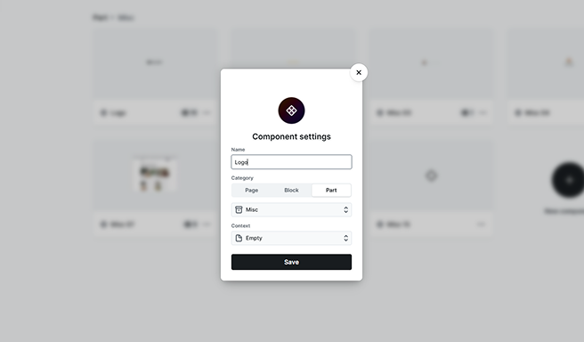
Category
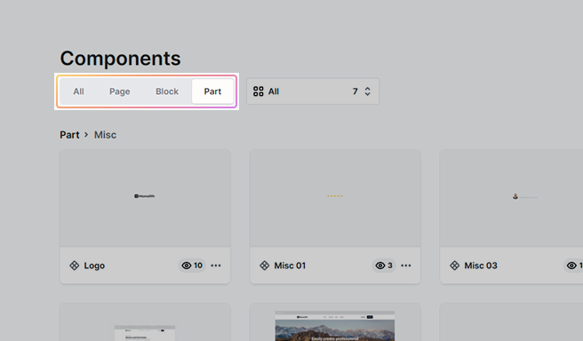
You can select its category to be either Page, Block, or Part. Depending on the one you’ve chosen, you’ll be able to select a subcategory.
- Page: The Page component holds an entire page as the stored design.
- Block: A Block holds a section as the stored design.
- Part: The Part holds a specific, smaller design as the stored design.
You can think of it like this: Pages are made of Blocks, and Blocks are made of Parts.
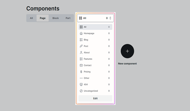
Additionally, using a subcategory helps you organize your components. So if you have lots of components, instead of all of them being in the main list of Categories (All), you can filter them for easier management.
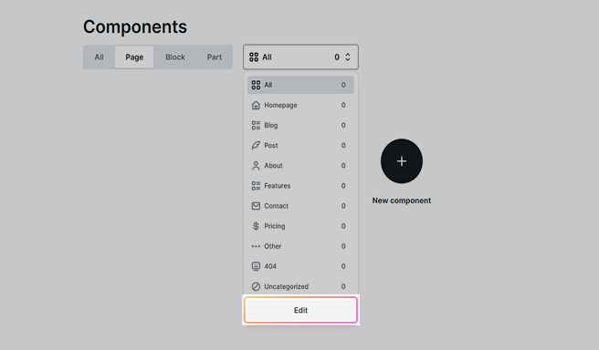
Add/remove a category
The Edit button allows for both adding and removing categories. To rename an existing category or update its icon, select the category you want to edit. You can make these adjustments in the category’s pop-up window.
Context
The Context determines what WordPress variables you get access to. For example, if you select Single post, you will get access to single post-related variables, like the post title or its content.
Component actions
Once you have added your component, you gain access to a range of extra features that provide you with greater flexibility and control over your design. They include the following options:
- Editing instance
- Editing component
- Detach instance
- Reset overrides
These options are also available on the Toolbar.
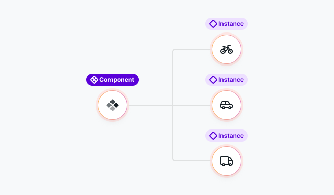
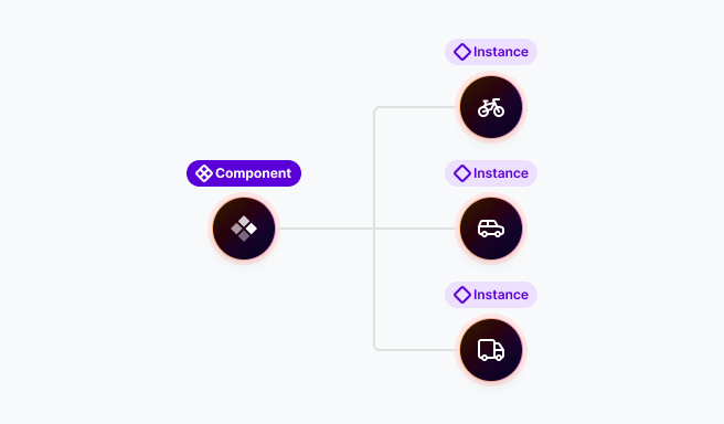
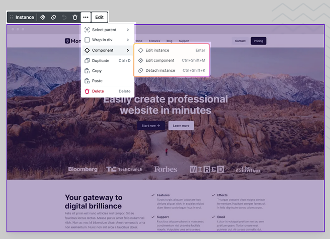
Edit instance
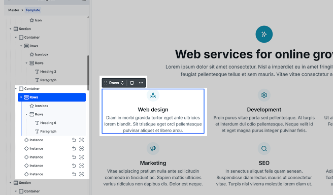
The big advantage of components is that instances inherit changes made to the component. This makes editing much simpler and faster. However, sometimes you want to change an instance of a component at one specific place.
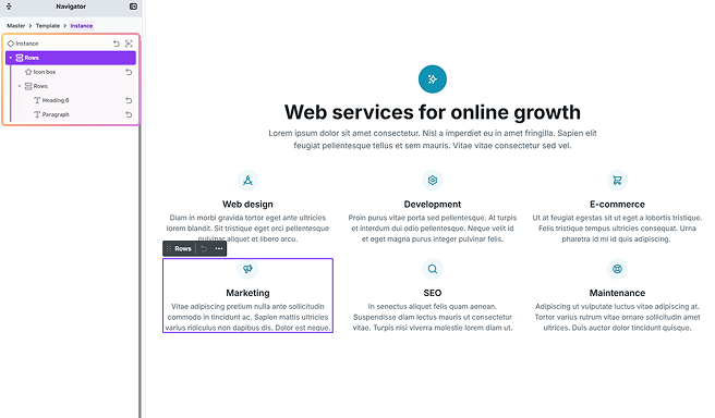
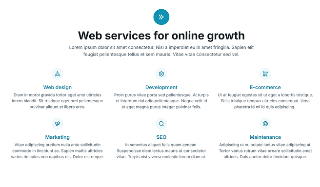
As an example, here is a container that contains six instances.
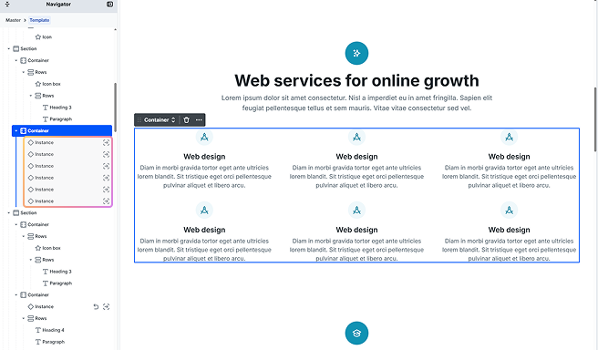
As you can see, they all look the same. However, we can change each instance to be unique and hold the texts they are supposed to. Here we just took advantage of the component’s design and changed the values of the texts, by entering the instances’ scopes in one of the following ways.
- Using the Navigator:
- Select the instance in the Navigator and double-click.
- Using the Canvas:
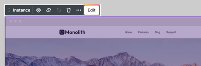
- Double-click the Instance.
- Click on the instance, then select Edit from its toolbar actions.
- Click on the instance, then select the Edit instance option in the right sidebar.
Edit component
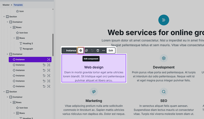
When you edit the component, any changes will automatically update across all instances. For example, changing the secondary text color will instantly apply it to every instance of the component.
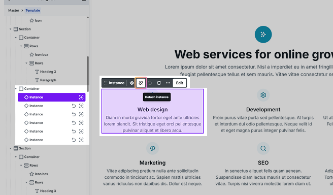
Detach instance
This option converts a component back into a static design, allowing you to modify it independently. Once unlinked, changes to other linked instances will no longer affect it.
Reset overrides
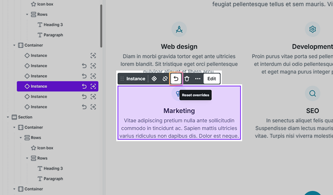
If you want the given component instance to lose all its custom changes and instead inherit the base design again from the component, you can use this option to do so.
Or, if you want to reset some specific change of it back to the component’s, you can do so by resetting the override on the given element.
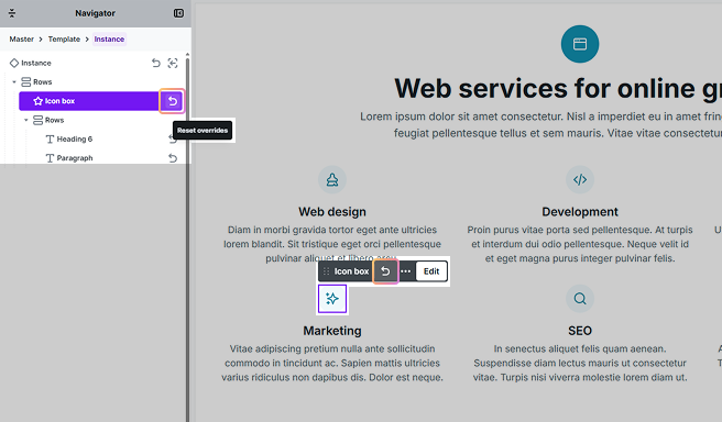
When you are resetting overrides on an element that contains other elements, like a Div, the Reset overrides option only resets the Div element, so it will not affect its children.