The Style guides are a central tool in Mosaic’s design workflow. It provides a structured environment for managing and previewing the visual styles used throughout your website. Starting your project here helps ensure consistency from the beginning, with a unified system that governs the overall look.
Managing Style guides
Mosaic supports any number of Style guides. Many sites are fine with a single guide, or none for very simple builds. When you need variations, you can add more to support different use cases, workflows, or experiments.
Each Style guide can include:
- Style variables: Color, font, spacing, and other variables.
- Default element styles: Base styles for elements like headings, paragraphs, and buttons.
- Utility classes: Reusable class definitions for styling.
- WordPress editor content styles: Styling rules applied to content created in the Post editor.
If you’re building your entire website within Mosaic and don’t plan to use Gutenberg, you can ignore the WordPress editor content styles part.
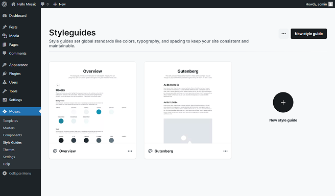
To create additional Style guides, use any of the New style guide buttons in the interface.
Each theme in Mosaic includes three predefined Style guides to help you get started:
- Overview: This is the main style guide for your theme. It defines the core visual rules and acts as the official source of truth for your design system.
- Gutenberg: If you’re using Gutenberg for post content, use this style guide to customize those areas.
Style guide elements
Within the Style guide, you’ll find a few elements that are not available on other editor pages. These elements exist specifically to support global styling and design consistency.
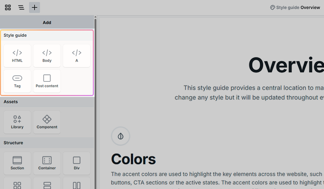
HTML and Body
The HTML and Body elements can be added to the Style guide to define and style their associated element classes. This allows you to apply design rules directly to the root structure of your website, such as background color, base font size, or global padding and margins.
A (Link)
The A element defines the base styling for all standard <a> tags on your website, unless overridden by dedicated Link or Button elements. It sets the default appearance for inline links. This element is especially important for links that appear inside content.
Tag
The Tag element is designed to help you label and visually identify elements and classes within the Style guide. It includes multiple predefined element classes, allowing you to experiment with and showcase different tag styles.
Post content
The Post content element is used to define the styles of the Post content element across your website. This is especially useful when working with content generated by the WordPress editor (Gutenberg). For detailed usage, refer to the Gutenberg section.
Adding and managing elements
You can add additional elements to the Style guide using the Add panel. We recommend including only elements that:
- Are used across multiple pages
- Share common styles that you want to manage centrally
Elements that are typically one-off (like structural divs) or don’t benefit from shared styles (like images used independently) can usually be excluded.
Also, if you edit a Custom class here, those changes appear only in the Style guide. To affect the whole site, select and modify the actual class used across your pages.
If you’re planning to use sub-classes, we recommend creating and managing them directly in the Style guide. This makes it easier to see how everything fits together.
Overview
The Overview typically includes your key style variables, default element styles, and any classes that apply across your entire website. It acts as the central source of truth for all visual decisions.
Within the Overview, you can configure:
- Global color and typography variables
- Default styles for elements like buttons and headings
- Utility classes
- Any additional styling used throughout the design system
Some values may be pre-filled by your selected theme. These serve as a starting point, and you can customize them as needed.
For detailed steps on customizing variables, check out the Style variables documentation.
Colors
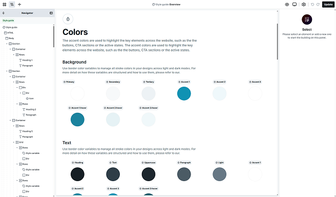
The Colors section of the Style guide is where you define your site-wide color palette. These variables ensure consistency across backgrounds, text, borders, and UI elements.
By default, your Style guide includes the following color variables:
- Background colors
- Primary: The base background color for most of your site. Typically white (#FFF), but may be darker in dark mode themes.
- Accent: Commonly used as the background for main buttons and key interactive elements.
- Text colors
- Headings: Used for all heading levels (<h1>-<h6>)
- Text: Applied to short supporting text elements, such as labels or captions.
- Paragraphs: The main color for body copy and longer-form content.
- Accent: Used for button text in its default (non-hover) state.
- Border colors
- Primary: A default border color is included to support layout framing.
To maintain a clean look, we recommend inserting all essential colors into the Style guide and limiting your palette to a well-defined set.
Managing colors
Always use defined color variables instead of setting the colors directly. This ensures consistency and makes it easy to update colors across your site. If you need a new color, duplicate the existing row and assign it a variable so all linked elements update automatically when changes are made.
Element styles
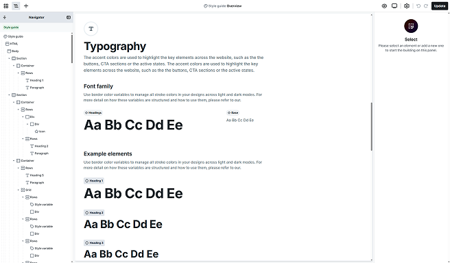
In this section of the Style guide, you can define the base styles for common elements used across your website. These include font sizes, line heights, padding, background colors, borders, and more. While CSS offers a wide range of properties, you have full control over which ones to use and how to apply them to each element class.
To learn more about working with classes, take a look at the Class system documentation.
Your style guides include a set of element classes to get you started:
- HTML: Sets the default typography for the entire website. It’s applied to all text unless specifically overridden.
- A: Applies to all <a> elements unless styled through specific Link or Button elements. This is especially relevant for links within content blocks like paragraphs, headings, or lists.
- Headings (H1–H6): Controls the visual hierarchy of heading levels throughout your site.
- Paragraphs: Sets the base style for body text across your website.
- Text: Used for smaller supporting text, such as labels, captions, or subheadings.
- Button: Defines the default appearance for buttons, including padding, background, borders, and typography.
- Link: Designed for clickable links outside standard content blocks, styled to stand out as interactive elements.
Use the same typography style for your HTML element as your paragraph. It’s the most frequently used font in most designs.
Utility classes
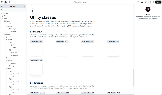
Utility classes offer a quick and reliable way to apply consistent styles across multiple elements on your website. While they’re completely optional, they can save time and help keep your design system organized and easy to maintain.
Depending on the theme you’re using, your Style guide may already include a set of predefined utility classes, such as border radius options or box shadows. These are ready to use and provide a solid starting point.
You can create additional utility classes to match your specific design needs. For detailed guidance on creating and managing utility classes, check out the Class system documentation.
Gutenberg
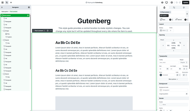
If you’re planning to use the Post content element to display post content created in Gutenberg (or the Classic WordPress editor), this is the style guide you’ll need to work with. It’s the only place where you can define and edit the styles applied to content rendered inside the Post content element.
To edit it, select the Gutenberg style guide from your list of style guides. By default, the Post content element is included on the canvas. If it wouldn’t be there, from the Add panel you can add this element. Simply double-click it to open its scope and begin editing or adding inner elements.
Inside the Post content, you’ll find the most common content elements, like paragraphs, headings, etc., already added. Make sure that the correct class is selected! You have to edit the Element class (like H1, Paragraph, Button), not the Custom class!
Edit Post content
To customize how your Post content appears:
- Enter the Post content element’s scope.
- Select the element you want to style within the Post content.
- Make sure its element class is selected, this typically corresponds to the element’s HTML tag.
- Apply the desired style changes using the Style tab.
Once saved, these styles will be automatically applied wherever the Post content element is used inside your editor pages.
Additional elements
The Post content element includes some additional prebuilt elements that are accessible through the Add panel.
Entry text
The Entry text element displays text pulled from your post’s Gutenberg content. Add it as a Heading (H1–H6) or a Paragraph and it will render the matching block from the post editor.
Entry quote
The Entry quote is a dedicated element designed to display quotes within your post content. It includes a Paragraph element for the quote text and a Cite element for the citation. This structure helps ensure that quotes are visually consistent and styled appropriately across your site.
Entry image
The Entry image is a prebuilt block used to showcase images within your content. It consists of an Image element followed by a Caption element for describing or crediting the image. This layout gives you better control over how images are presented in your posts.
Entry list
The Entry list element displays your post’s list block, that can be ordered, unordered, or footnotes. It holds the list items and includes three of them by default.
Entry code
The Entry code element shows a code snippets from your post. It keeps the original formatting for easy reading and copy/paste.
Entry preformatted
The Entry preformatted element displays the preformatted block exactly as typed, preserving spaces and line breaks. Use it for transcripts, ASCII layouts, or text where alignment matters.
Entry verse
The Entry verse element displays the verse block with its original line breaks and spacing. Use it for poetry, lyrics, or any text where layout matters.
Entry pullquote
The Entry pullquote is a dedicated element for highlighting standout lines within your post content. It uses the same structure as the Entry quote, a Paragraph for the quote text and a Cite for attribution, but is styled for greater visual emphasis.
Entry seperator
The Entry separator element renders the Separator block as a visual divider between sections of your post. Use it to break up long content or signal transitions.
Entry button
The Entry button element displays the Button/Buttons block from the post editor, preserving its label and link. Use Mosaic to style and to position it within your Post content.