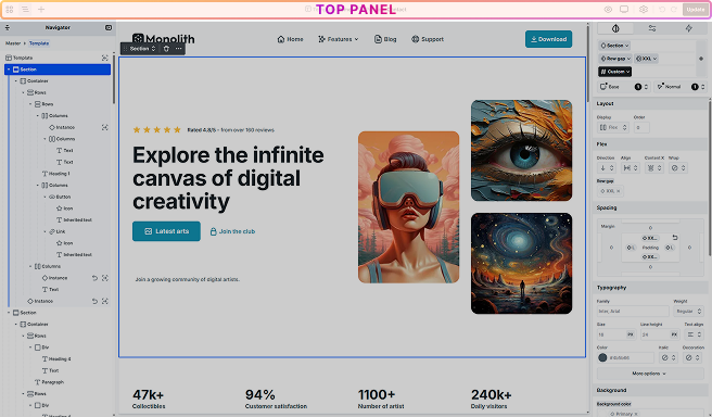
Top panel
The Top panel provides easy access to essential navigation options and key functionalities within the Editor. From here, you can easily perform various tasks such as adding elements, previewing your design, and saving your work, making it easier to control your editing process.
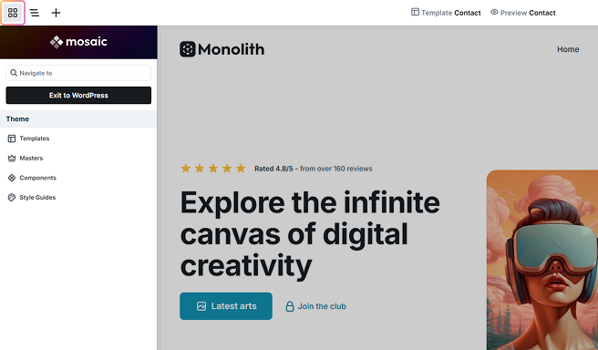
Menu
Pressing the Menu button brings up the same menu you have in the WordPress Admin area. You have the option to go to the following:
- Exit to WordPress
- Templates
- Masters
- Components
- Style guides
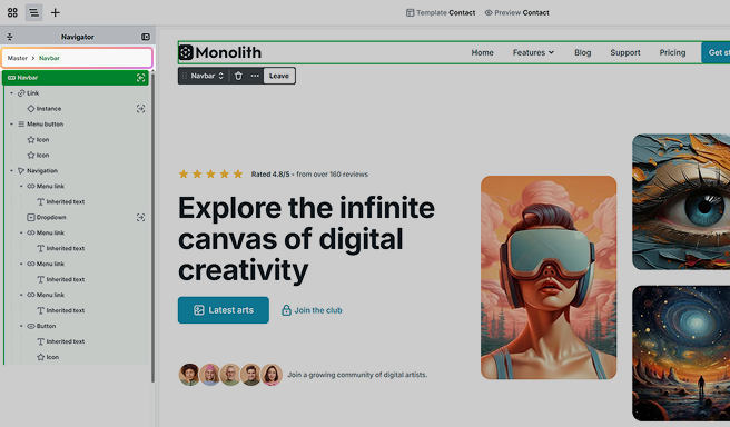
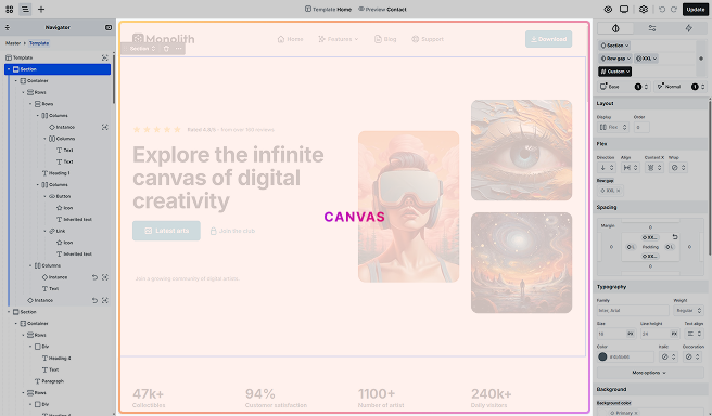
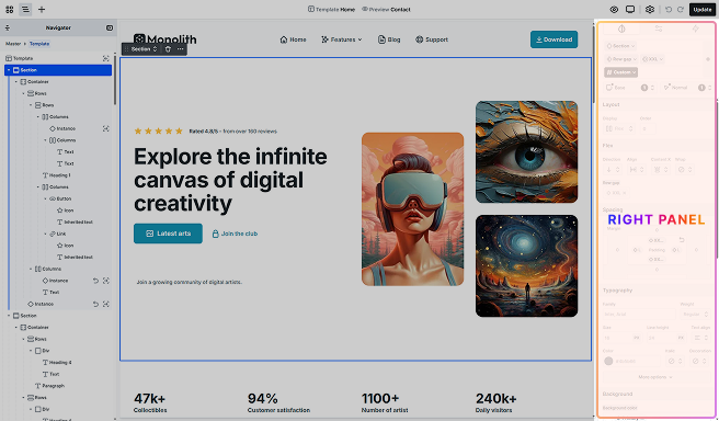
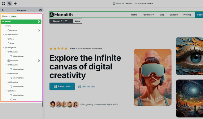
Navigator
The Navigator provides a hierarchically structured view of all of your elements, organized within Sections, Containers, and Divs for effortless management. Easily rearrange elements by dragging and dropping, ensuring your layout is precisely as you envision it.
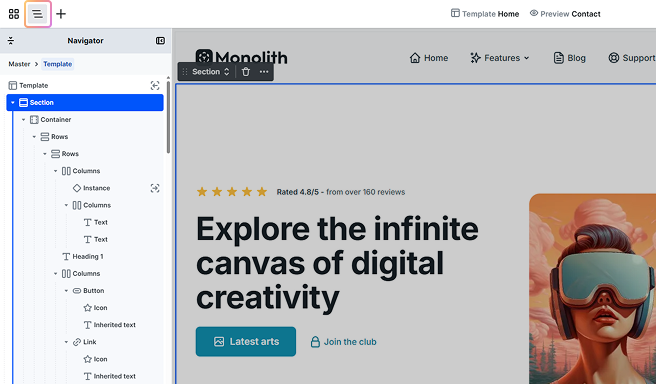
The popup menu, which is accessible by right-clicking on the element, offers editing options like delete, duplicate, copy/paste, or you can lock elements if you don’t want them to be edited.
At the top of the Navigator, you’ll find two useful controls:
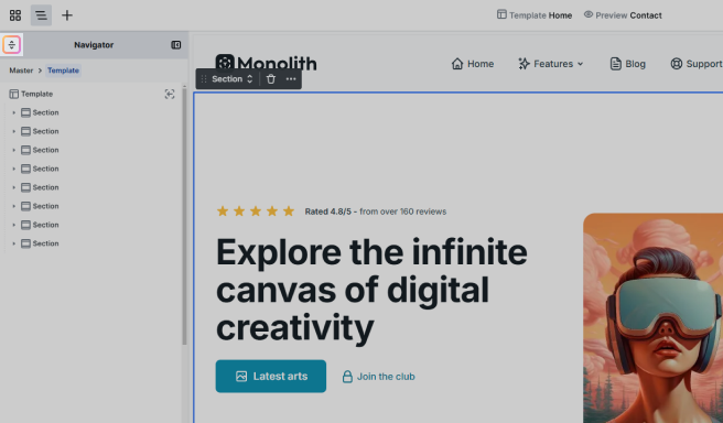
- Collapse/Expand: Located on the top left, this lets you quickly collapse or expand all sections in the Navigator, making it easier to manage large page structures.
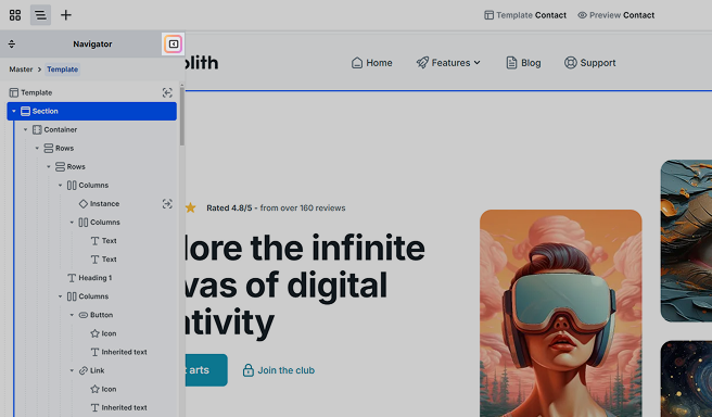
- Dock/Undock: On the top right, this option allows you to dock the Navigator to its default position or undock it into a floating panel for more flexible arrangements.
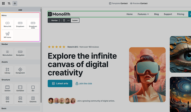
Add element
This panel makes it easy to add new elements to your page. Just drag and drop them wherever you want. This method is quick and lets you easily change your design. You can drop elements either on the Canvas or in the Navigator panel, which helps you position them more accurately.
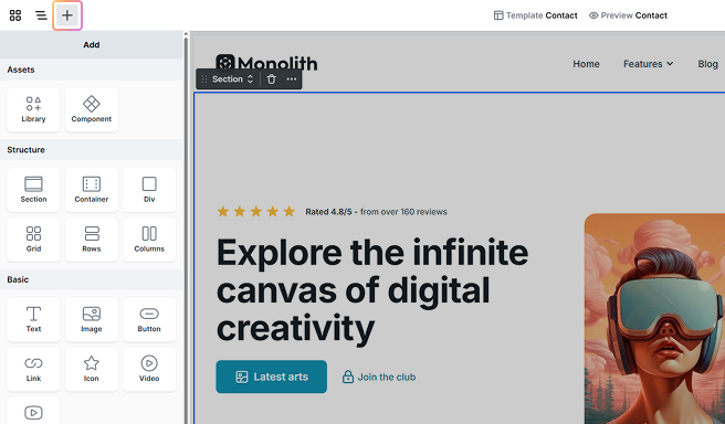
For further details, take a look at our Add panel documentation.
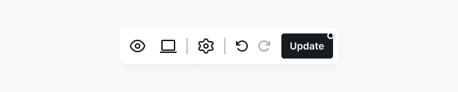
Editor options
On the Top panel’s right side, you can find essential settings and features that affect the entire Editor. These include the Preview, the Breakpoints, and the Update button, allowing for easy management and control of your work.
- Preview: Click here to get a preview of your page.
- Breakpoints: Edit breakpoints for responsive design.
- Settings: Manage key design and workflow options. Style variables let you store frequently used styles, while Classes provides access to the Class Manager for organizing and applying classes. Keyboard shortcuts offers a list of hotkeys to streamline your workflow, and Help & feedback provides resources for assistance and sharing feedback.
- Undo/Redo: Easily undo or redo your actions in the Editor. You can use the Ctrl+Z and Ctrl+Shift+Z hotkeys for the same purpose.
- Update: Save your changes. If there are unsaved changes, a small dot will appear as a reminder. Once you hit Update, your settings are published and go live.
Canvas
The Canvas is the building area of the Editor. This is where you can add texts, images, and other elements. Additionally, you can manage the content of these elements.
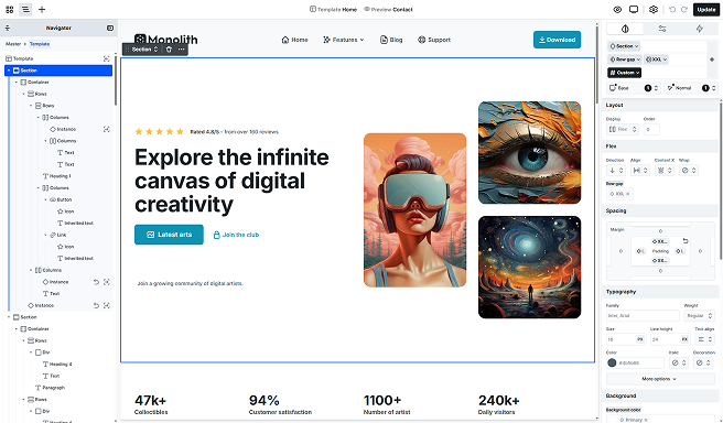
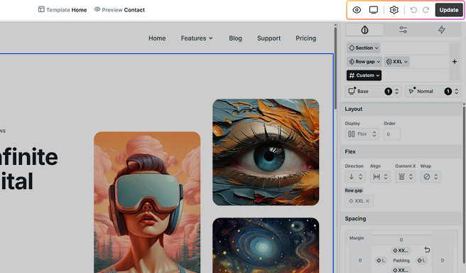
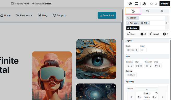
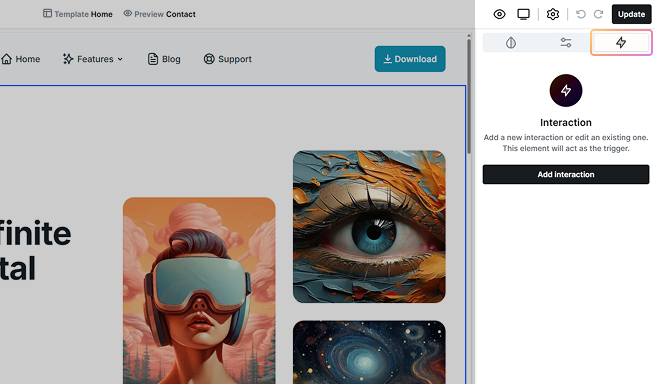
Right panel
On this panel, you can find the Style, Advanced, and Interaction settings related to the currently selected element. Here you can customize various aspects such as the text color, add alt tags to images, or animate elements when you scroll to them.
Style tab
In this tab, you can adjust the style settings of your elements. As an example, this is where you can modify the width of an image.
Additionally, you can access the Class manager from here, which allows you to efficiently organize and manage your classes. Through the Class manager, tasks such as renaming, deleting, and other related functions become seamless. Learn more about classes here.
Advanced tab
In the Advanced tab, you’ll find additional settings for your elements. For example, you can set the link for a button or configure various parameters.
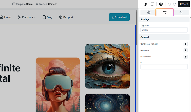
Moreover, if needed, you can set custom conditions to determine when the element should be visible. By clicking on the + icon next to Conditional visibility, you can easily access the Conditions interface, where you can define specific rules tailored to your needs.
Interaction tab
This tab lets you add special effects to your elements based on actions like hover, click, scroll, or page load. For example, you can animate a button when someone hovers over it. Learn more about interactions here.
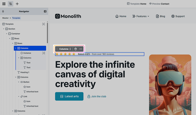
Active element
When you choose a specific element on the Canvas, it will become the active element, meaning it’s ready for you to edit or interact with. You’ll see a blue, purple, or green highlight around it, making it easy to spot. As you move the element around on the Canvas, a gray indicator will appear, showing the parent element you’re moving it into, along with its name.
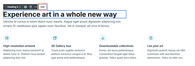
Toolbar
Over the active elements, you’ll see a Toolbar appearing.
This allows you to do the following:
- Select classes for them.
- Adjust the element-specific settings. Some elements come with custom tools for further customization.
- Delete the given element.
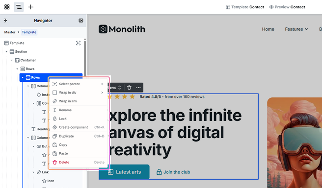
- Elements have various options in their 3-dot menus, including Select parent, Wrap in div, Wrap in link, Create component, Duplicate, Copy, Paste, and Delete.
- Edit the current element. / Enter its scope.
Connection with Navigator
The Navigator makes it easy to see which element you’re working on by always highlighting the active one. If you’re dragging elements around on the Canvas, you’ll see where you’re moving them within the Navigator as well.
It also gives you access to the same right-click menu options that appear in the active element’s toolbar under the three-dot menu.
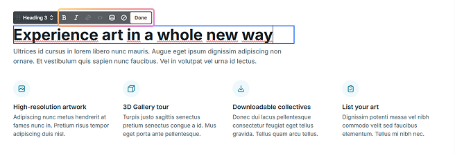
Scopes
Pressing the Edit button allows you to modify the content of your element. In addition, double-clicking on the element achieves the same thing.
At elements that contain multiple elements, such as menus, clicking the Edit button will bring you into the scope of the current element.
Once inside the scope of an element, you’ll notice some changes:
- Toolbar: New options might appear on the Toolbar.
- Navigator: The Navigator will now only show the contents of this element.
- Add panel: The Add panel will show only the elements that can be added to the current element. Simple elements like Texts may not have additional options, while more complex elements like Menus will display new elements once inside their scope.
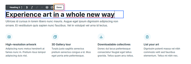
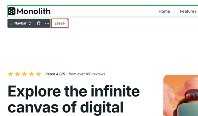
To exit the current element’s scope, you have several options:
- Press the Done button
- Click the Leave button
- Press Esc on your keyboard
- Click outside the current element
Additionally, you can always navigate to a parent scope using the breadcrumbs in the Navigator.