Mosaic is built to support accessibility standards, but you need to use the given features, to get the best result.
Images
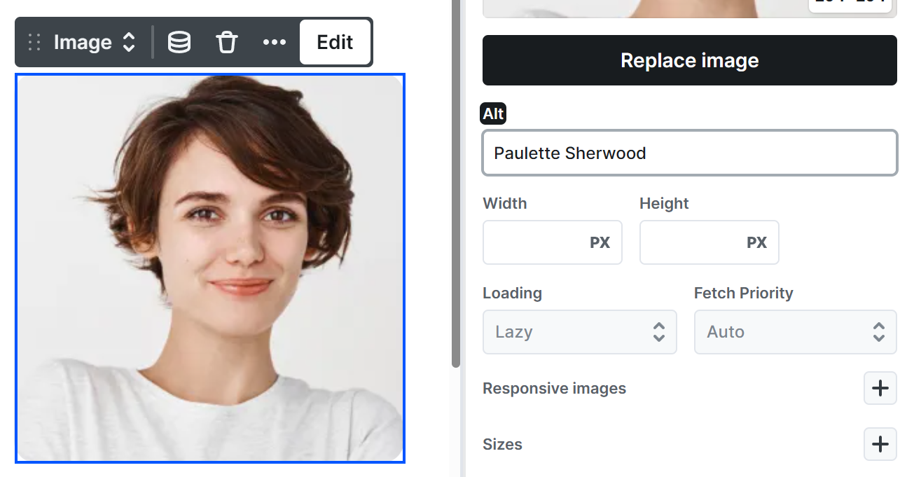
At Image elements always use their Alt field to describe the content of the image, so screen readers can interpret them.
Sliders
Slider elements follow the ARIA carousel pattern, so screen reader and keyboard users can recognize and control them.
What works automatically
- The slider container is announced as a carousel, and each slide as a slide, with its position (for example “2 of 5”) or its Slide title.
- While the slider auto-rotates, slide changes are not announced. When autoplay is paused or you change slides manually, the new slide is announced.
- Autoplay pauses while the slider has keyboard focus or the pointer is over it, and resumes when focus or the pointer leaves. It also stops once the autoplay limit is reached.
- The navigation bullets work as a button group: use Tab to move between them and Enter, Space, or click to jump to a slide. The current slide’s bullet is marked for screen readers.
- If a visitor’s system is set to reduce motion, autoplay is turned off and slides change instantly.
- When a navigation arrow hides on the first or last slide, keyboard focus moves to the still-visible arrow instead of being lost.
- The arrows are announced as buttons, labeled “Previous slide” and “Next slide”. To use your own wording, add an aria-label to the arrow in its Attributes.
What you should set up for the best result
- Screen reader label: In the Slider’s settings, set a Screen reader label so the carousel has a clear name (for example “Customer testimonials”).
- Slide titles: Give every slide a descriptive title, since screen readers read it when announcing the slide.
- Stop/Play control: Add a visible Stop/Play control with Interactions so visitors can stop auto-rotation at any time, not only by focusing the slider.
- Element order: Keep the suggested order (Button – Arrow left, Button – Arrow right, Navigation, Slides) so Tab moves through the controls in a logical sequence.
Accordions
Accordion elements have aria-expanded attributes on the accordions by default, which are changing between true and false state, based on whether or not the given accordion is opened.
The content of a closed accordion gets aria-hidden=”true”, so screen readers skip it until the accordion is opened.
Enter or Space opens/closes the accordions, when they get focused on using Tab button.
The Plus and Minus icons are SVG icons. Check the lower ARIA attributes for a suggestion regarding them.
Also with the lower ARIA attributes, you can specify role=”button” for the Accordion Title element.
Tabs
Tabs elements have the following attributes, to ensure accessibility:
- The tab menu has role=”tablist” and each tab button has role=”tab”, so screen readers announce them as a set of tabs.
- The active tab’s button gets aria-selected=”true” attribute, to mark when it is selected.
- The tab panels have role=”tabpanel” attribute, to let people know about their role.
- The inactive tabs are getting aria-hidden=”true” attribute, to hide them from accessibility tools, as they are invisible.
Navbar
Navbar elements use the following attributes to ensure accessibility:
- The entire navigation container has role=”navigation”, so assistive technologies can identify it as a site navigation region.
Dropdown menus
- Dropdown toggle buttons have aria-haspopup=”true” to indicate that they control a submenu.
- When a dropdown is closed, the toggle button has aria-expanded=”false”.
- When a dropdown is opened, the toggle button’s aria-expanded attribute is updated to “true” to reflect its current state.
Mobile navigation toggle
- The mobile menu toggle icon includes aria-label=”Open menu” to provide a clear, descriptive label for screen reader users.
- The mobile menu behaves like a dropdown menu, therefore the same ARIA attributes and state changes apply as described above.
Modals
Modal elements work as accessible dialogs, so keyboard and screen reader users can open them, use what’s inside, and close them again.
What works automatically
- The Modal is announced as a dialog. While it has its Overlay, it is also marked with aria-modal=”true”, and the page behind it can’t be focused, clicked, or scrolled.
- When the Modal opens, focus moves to its first field. While it’s open, Tab stays inside the window and loops around at the ends.
- When the Modal closes, focus returns to wherever it was before, usually the button that opened it.
- Esc closes the Modal, unless its Close on setting doesn’t allow it. If more than one Modal is open, Esc goes to the one that has focus.
- Elements that open or close a Modal with a Modal action get aria-haspopup and aria-controls, so screen readers know they control a dialog.
- As soon as the Modal starts closing, the page behind it becomes usable again, so a longer closing animation never locks visitors out.
What you should set up for the best result
- Accessible label: In the Modal’s Accessibility settings, give the Modal a clear name (for example “Newsletter signup”). Screen readers announce it when the Modal opens. If you leave it empty, the Modal has no name.
- Role: Leave it empty for most Modals, and they keep the built-in dialog role. Use alertdialog only for urgent messages the visitor has to respond to, like a confirmation.
- A visible way out: If you set Close on to Nothing, keyboard users can’t close the Modal with Esc. Always keep a button inside the window that closes it, like the Got it button or your own button with a Close action.
- Gentle animations: The default fade is gentle on motion-sensitive visitors. If you replace it with a larger movement, like sliding or zooming, keep it short and subtle, because Mosaic doesn’t tone down your own Modal animations for visitors who prefer reduced motion.
Popovers
Popover elements appear on top of the page without blocking it. Keyboard and screen reader users can move into a Popover, use what’s inside, and carry on with the rest of the page.
What works automatically
- A Popover never blocks the page and is never marked with aria-modal. The rest of the page stays focusable, clickable, and scrollable while it’s open.
- When the Popover opens, focus moves to its first field. If it has no field, focus stays where the visitor was, so a hover Popover never pulls focus away.
- Tab moves through the Popover’s content and then leaves it: after the last item, focus continues with whatever comes after the button that opened it. Shift + Tab from the first item goes back to that button. Unlike a Modal, a Popover never traps focus.
- When the Popover closes, focus returns to where it was before — but only if focus had moved into the Popover. If the visitor only looked at it, their focus isn’t moved.
- Esc closes the Popover only when its Close on setting allows it. If more than one Popover or Modal is open, Esc goes to the one that has focus.
- Elements that open or toggle a Popover with a Popover action get aria-controls. They also get aria-haspopup matching the Popover’s role (menu, listbox, tree, grid, or dialog). A Popover without a role doesn’t announce its button as a popup.
- A button with a Toggle action also gets aria-expanded, kept in sync as the Popover opens and closes.
What you should set up for the best result
- Accessible label: In the Popover’s Accessibility settings, give it a clear name (for example “Account menu”). If you leave it empty, the Popover has no name.
- Role: A Popover has no role until you set one. Pick the one that matches its content: menu for a list of commands, listbox for a list of options, dialog for a small panel with fields or buttons, and tooltip for a short hint.
- Toggle for open-and-close buttons: If one button both opens and closes the Popover, use the Toggle action, so screen readers hear whether it’s expanded or collapsed.
- A way out: A new Popover’s Close on is set to Nothing, so Esc doesn’t close it. Either choose a setting that includes Esc, or keep a close button inside the Popover, like the one it comes with.
- Live region: If the Popover shows a message the visitor should hear as soon as it appears, set Live region to polite (or assertive for urgent messages). Leave it off for menus and panels.
- Use a real button to open it: Open the Popover from a Button or a link, so keyboard users can reach and press it.
Forms
Mosaic forms are built from real form elements with the right semantics, so they work with keyboard navigation and screen readers out of the box. A few choices you make while building keep them that way.
What works automatically
- Every field’s label is tied to its control, and Mosaic keeps each control’s identifier unique on the page, even when a field is repeated, so a label always points to the right input.
- Radio and checkbox groups and field sets are grouped with a legend, so screen readers announce the question and know which options belong together.
- An Error message is linked to the field it describes and announced to screen readers, so people know which field needs attention.
- While the form is submitting, the submit button is marked as busy and the form announces its progress, so screen reader users know the submission is being processed.
- When a submission succeeds, focus moves to the Success screen and it is announced, so assistive technology users are told the submission worked.
What you should set up for the best result
- Hide a caption the accessible way: a Field’s Label and a group’s Legend can’t be deleted, so they always stay in place. If you don’t want a visible caption, add the screen-reader-only class to hide it on screen while keeping it for screen readers, rather than emptying its text. See the Class system.
- Add an error message element: without one, validation problems appear only in the browser’s default bubble. An Error message shows your own styled text and stays properly associated with the field or the whole form.
- Treat placeholders as hints, not labels: placeholder text disappears as the visitor types, so always give the field a real label as well.
Loop pagination
In a Loop’s pagination, when there’s no previous or next page to go to, the Previous or Next button gets aria-disabled=”true”, so screen readers announce it as unavailable.
ARIA attributes
At each element, in their Settings → Attributes, you can add any ARIA attributes needed for accessibility.
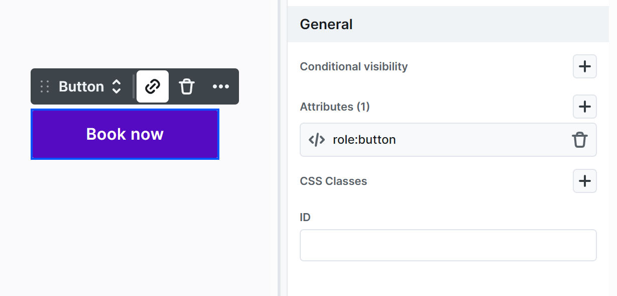
Examples:
- For a Button element, add role=”button” to specify its role.
- For a Section, add role=”section” for clearer structure.
- For an SVG icon, add aria-hidden=”true” if you don’t want screen readers to interpret it.