The Add panel opens when you press the top left + button, allowing you to effortlessly add new elements to your Canvas. You’re not just limited to a single item, you can also include groups of elements that complement each other perfectly. This functionality boosts the flexibility and creativity of your design process, giving you the freedom to explore different combinations and layouts.
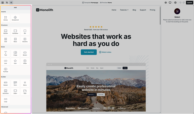
Structure
The Add panel is organized into six main sections, each containing different elements you can add to your Canvas. As you use the panel, you may encounter additional sections based on the elements you’re working with.
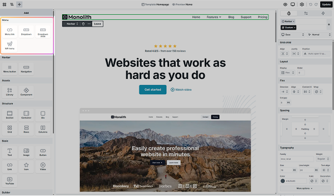
For example, when you add a complex element to your Canvas, such as a Menu, and enter its scope, it may include its own set of related elements, resulting in the creation of a new section at the top of the Add panel. This section is dedicated to the specific elements associated with that element.
Assets
These elements provide ready-made elements that save time and effort when building a website. They are pre-configured with essential features and layouts, offering a fast and flexible way to get started.
- Library: A collection of ready-to-use Pages, Blocks, and Parts you can browse, preview, and insert with one click.
- Component: Reusable elements that hold a specific design. Think of them as containers or building blocks that you can add to a Template to show the same pre-made design you created.
Structure
In the Structure section, you’ll find fundamental building blocks that provide the framework and organization for your web pages. These elements give you control over the layout.
- Section: Section elements are core building blocks that group related content, create clear flow, and span the full width of the page. Each section includes a Container by default.
- Container: It’s typically nested inside a Section and helps organize and align your content. Use Containers to control alignment, spacing, and structure within your sections.
- Div: The Div element is a versatile container for organizing elements. It’s especially useful inside containers to break layouts into smaller sections.
- Grid: It provides a flexible way to organize content in both rows and columns.
- Rows: It arranges child elements vertically from top to bottom using flexbox by default. It’s ideal for stacking content in a clear, structured flow.
- Columns: It arranges child elements horizontally from left to right using flexbox by default. It’s perfect for creating side-by-side layouts.
Basics
The Basics section contains essential elements for adding content to your website. They allow you to display written content and visuals.
- Text: The Text element is a versatile tool used for displaying titles, descriptions, or any other text on your website.
- Image: The Image element, a fundamental part of web design, gives you the opportunity to display a chosen image on your website.
- Button: Buttons are essential for adding interactive elements to your website, such as call-to-action (CTA) buttons that link to pages, forms, or other content.
- Link: It lets you turn text, images, or other elements into clickable links. You can customize the URL and choose where it opens.
- Icon: The Icon element is a powerful tool that allows you to incorporate SVG images into your design. Whether you’re uploading simple icons or complex SVGs, this element provides an intuitive way of adding visual elements to your canvas.
- Video: The Video element allows you to upload a video file directly from your computer. It comes with a variety of built-in features that you can customize to suit your preferences.
- YouTube: The YouTube element embeds a video from a YouTube URL. It includes built-in options you can adjust to match your design and playback preferences.
Builder
The Builder section includes elements that enhance the functionality of your website. With them, you can create interactive features that engage visitors.
- Navbar: The Navbar element was made to help you create a top menu for your website. It is a combination of elements within its scope, so by default, it contains an Image element for the logo and a WP Menu element for the menu points.
- Form: The Form element makes it easy to collect information from your visitors efficiently. They come with a few built-in child elements, and you can add more within its scope to customize the Form to meet your specific needs.
- Menu: The Menu element helps you organize menu links, which makes it easier for you to guide visitors from one area of your website to another. They come with additional child elements in their scope that you can easily build upon.
- Accordion: The Accordion element is typically used in FAQs or any section with lots of text. It groups content into collapsible headings so visitors can open only what they need.
- Slider: The Slider element allows you to highlight key content in a visually engaging and space-efficient manner. Within its scope, you can easily customize them to fit your design preferences.
- Tabs: The Tabs element allows you to organize content into clear sections, resulting in a more straightforward navigation for your users. After entering its scope, you can further customize the layout and content, making this element particularly useful for breaking down complex information and maximizing screen space.
- Loop: The Loop element enables the dynamic generation of content on your pages. They automatically display information that changes frequently, like blog posts, so your page updates on its own without any manual effort. They can be fully customized once you enter their scope.
Advanced
For those who need to add custom functionality, the Advanced section offers elements that let you inject custom code into your pages.
- Code: The code element is a handy tool that lets you add custom code, such as HTML, CSS, and JavaScript, to your pages. It’s perfect for when you need to go beyond the usual features, like putting in unique forms or embedding videos from external sources.
WordPress
The WordPress section provides elements that allow you to pull in content from WordPress.
- Post content: Easily add your blog post content to your pages by including text, images, and any other content included in it. Once added, your posts will be neatly displayed.
- Shortcode: The shortcode element allows you to insert any WordPress shortcode directly into your page. It’s ideal for embedding plugin features or custom functionality without writing code.
Add elements
You can add elements to your canvas in two ways:
- Clicking: Simply click on an element in the Add panel, and it will be added to your canvas.
- Dragging: Drag an element from the Add panel and drop it directly onto the Canvas or into the Navigator.
Hierarchical placement
When you add an element by clicking or dragging, its placement depends on the current selection in the Navigator.
- If the last selected element supports nesting, the new element will be placed inside it.
- If the selected element cannot contain other elements, the new element will automatically move up the hierarchy to find a suitable parent.
- If no element is selected, the new element will be added to the bottom of the page, inside the Body element.