Style variables in Mosaic serve as a centralized style management toolkit. They store frequently used styles such as colors, fonts, spacing, radius, and sizes. By using style variables, you can achieve consistent design across your entire website and easily update multiple elements simultaneously. This is especially useful when working on large sites where design consistency is essential.
Manage style variables
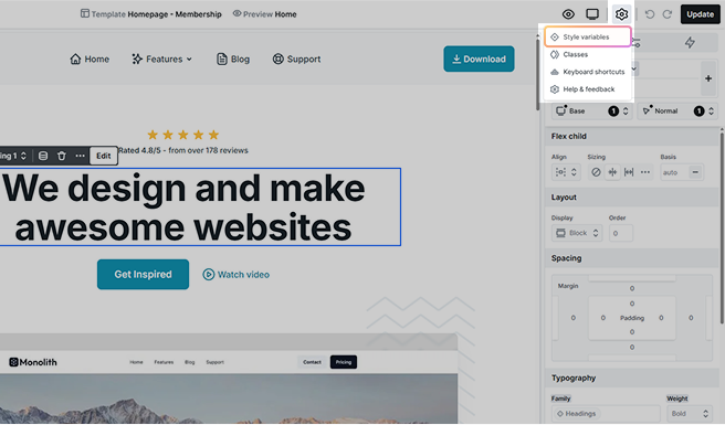
These variables are accessible from the Top panel’s settings in any Editor, where you can manage them via the Style variables right-side panel.
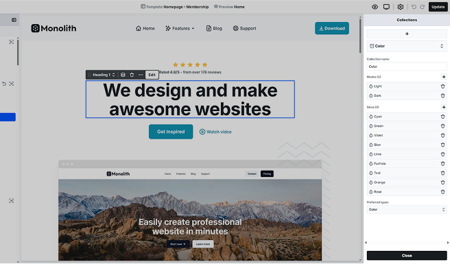
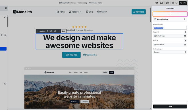
Collections
Collections are used to organize style variables into related groups. Collections can hold all style variables of the type or types you choose, ensuring better customization and accessibility.
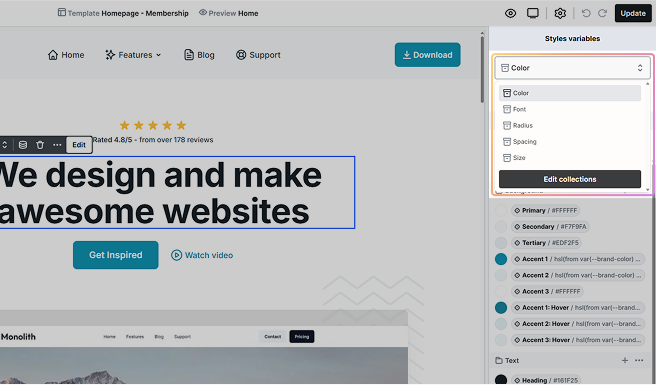
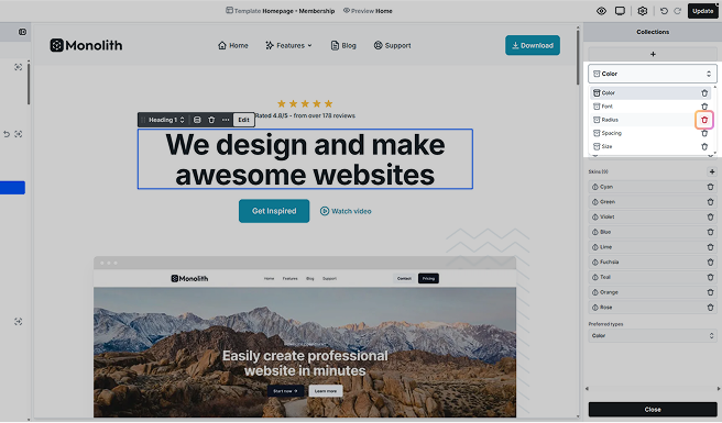
By default, the following collections are available:
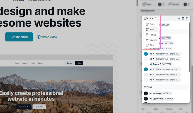
- Color: Color variables store hex or RGB-based colors and support Light and Dark modes by default. These variables are ideal for managing themes and palettes.
- Font: You can easily shape the typography of your web pages by creating a list of Font variables. Read more about them lower.
- Radius: Control corner rounding with Radius variables. Accepts whole numbers or decimals.
- Spacing: Use Spacing variables for margins, paddings, and gaps. Accepts whole numbers or decimals.
- Size: Define width, height, or other dimension-related properties with Size variables. Accepts whole numbers or decimals.
Font
By setting up a list of fonts, you can effortlessly control your web page’s typographic style. Making changes to these fonts later will dynamically update them wherever they are selected. Fonts can be sourced from Google fonts and Custom fonts.
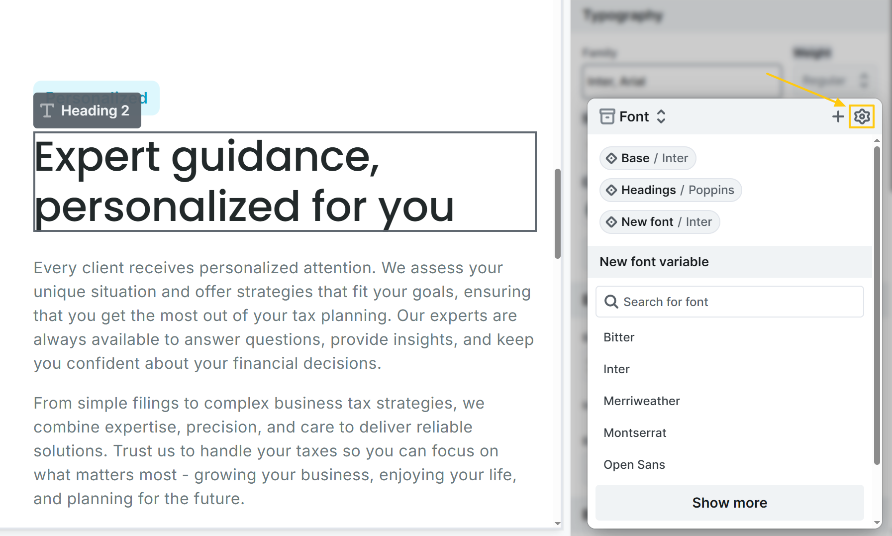
Accessing Font collections
Reaching the Font collections is possible from the top Style variables menupoint, or from the Style tab’s Family field, by pressing the cog icon. There you can manage the collection.
Adding fonts
You can add fonts to the Font collection with either of the following options:
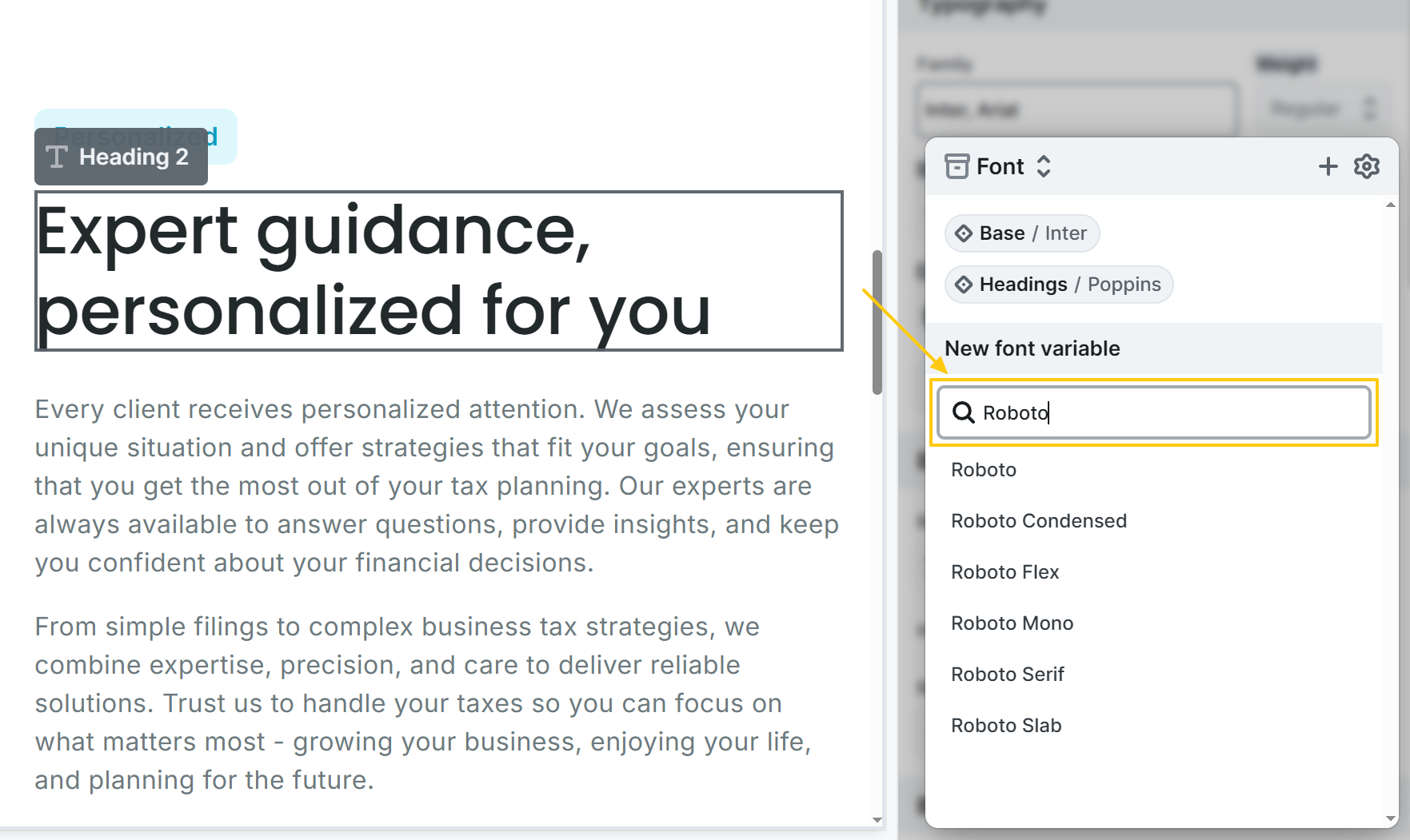
New font variable
At the Style tab’s Family field, Google fonts can be entered as New font variable.
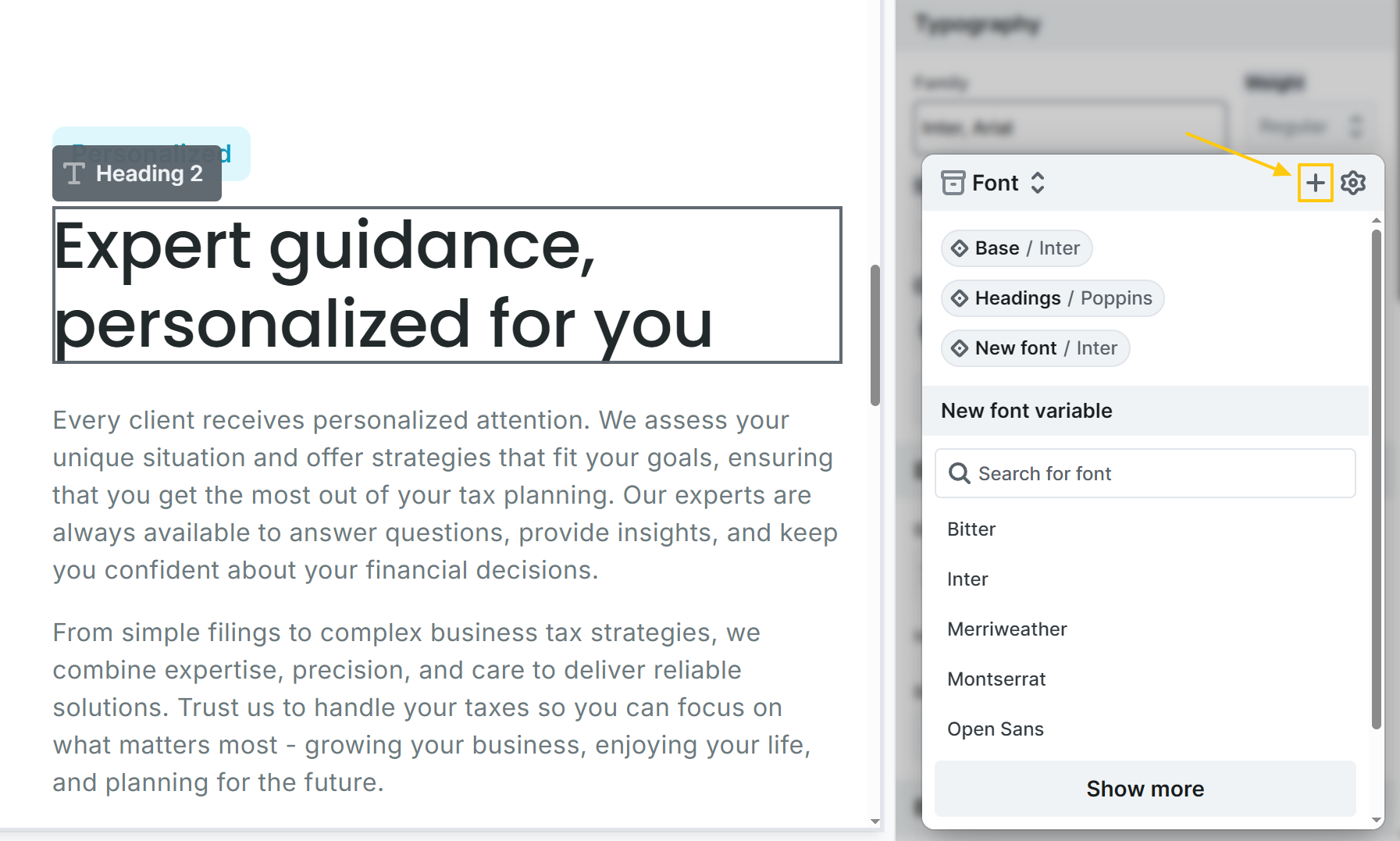
Family field
In the Family field, press the + icon to add Google or Custom fonts.
Font collection manager
Add Google or Custom fonts at the Font collection manager.
Editing fonts
Existing fonts can be edited either at the Style tab’s Family field by clicking the pen icon, or via the Font collection manager.

Google fonts
Mosaic automatically loads the chosen font from Google Fonts, so you can use it right away. The available settings include:
- Name: Give your font a clear and memorable name for easy identification.
- Provider: Choose Google if you’re selecting from the Google Fonts library.
- Font family: Browse and pick from the extensive list of Google Fonts.
- Font variants: Select the desired font weights.
- Fallback fonts: Specify alternative font families in case your chosen Google font encounters loading issues.
- Usage (Optional): Decide where the font will be applied, such as headings, body text, or specific UI elements.
- CSS custom property (Optional): Define a custom property if you want to easily reuse the font.
Load Google fonts from local storage
In Mosaic’s Global settings you can enable Save fonts locally to prevent fonts from being loaded from Google. When this option is enabled, Mosaic stores and serves the Google Fonts used on your website directly from your own server, making your site GDPR-compliant in this regard.
Ensuring GDPR compliance is the responsibility of the website creator. While Mosaic provides tools to support GDPR-related requirements, you must verify that all relevant settings are correctly configured and working as expected.
Custom fonts
Upload and apply custom fonts using the @font-face code. Make sure the font-family name matches across the Font family field and the @font-face code.
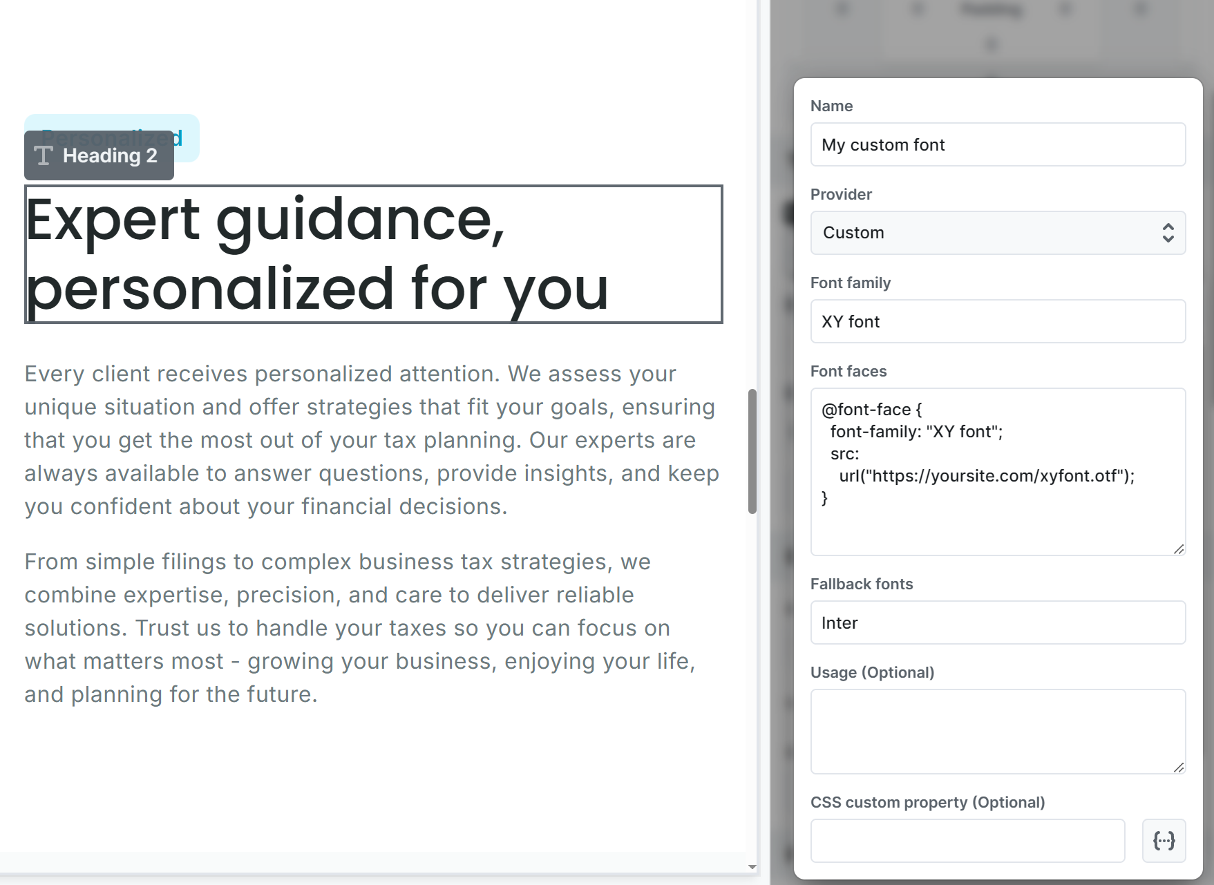
It has the following settings:
- Name: Give a name that helps identify your font.
- Provider: Select Custom here to load your own font.
- Font family: The font family name of your font.
- Font faces: It requires a small piece of code, commonly known as the font-face code, to load your chosen font.
- Fallback fonts: Specify an alternative font family in case your chosen font faces loading issues.
- Usage (Optional): Decide where the font will be applied, such as headings, body text, or specific UI elements.
- CSS custom property (Optional): Define a custom property if you want to easily reuse the font.
Manage collections
Within the Style variables interface, Collections can be edited or created by clicking the Edit collections button in the dropdown.
The options available include:
- Add collection: Click the + button to create a new collection. This will open a panel where you can define settings for the new collection.
- Delete collection: Use the trash icon in the collection dropdown to remove any of them.
- Collection name: Modify the name of an existing collection.
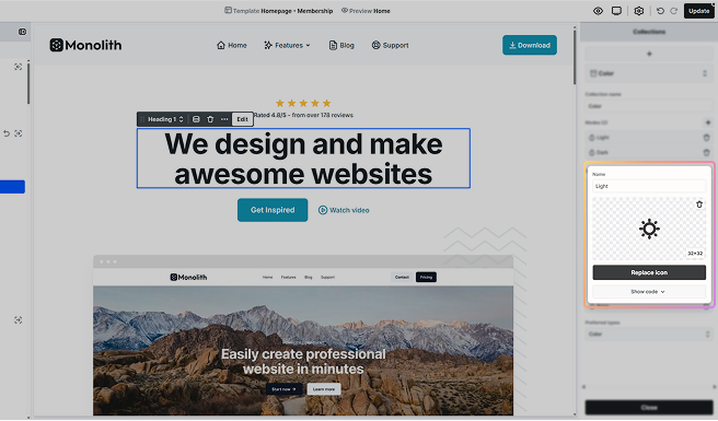
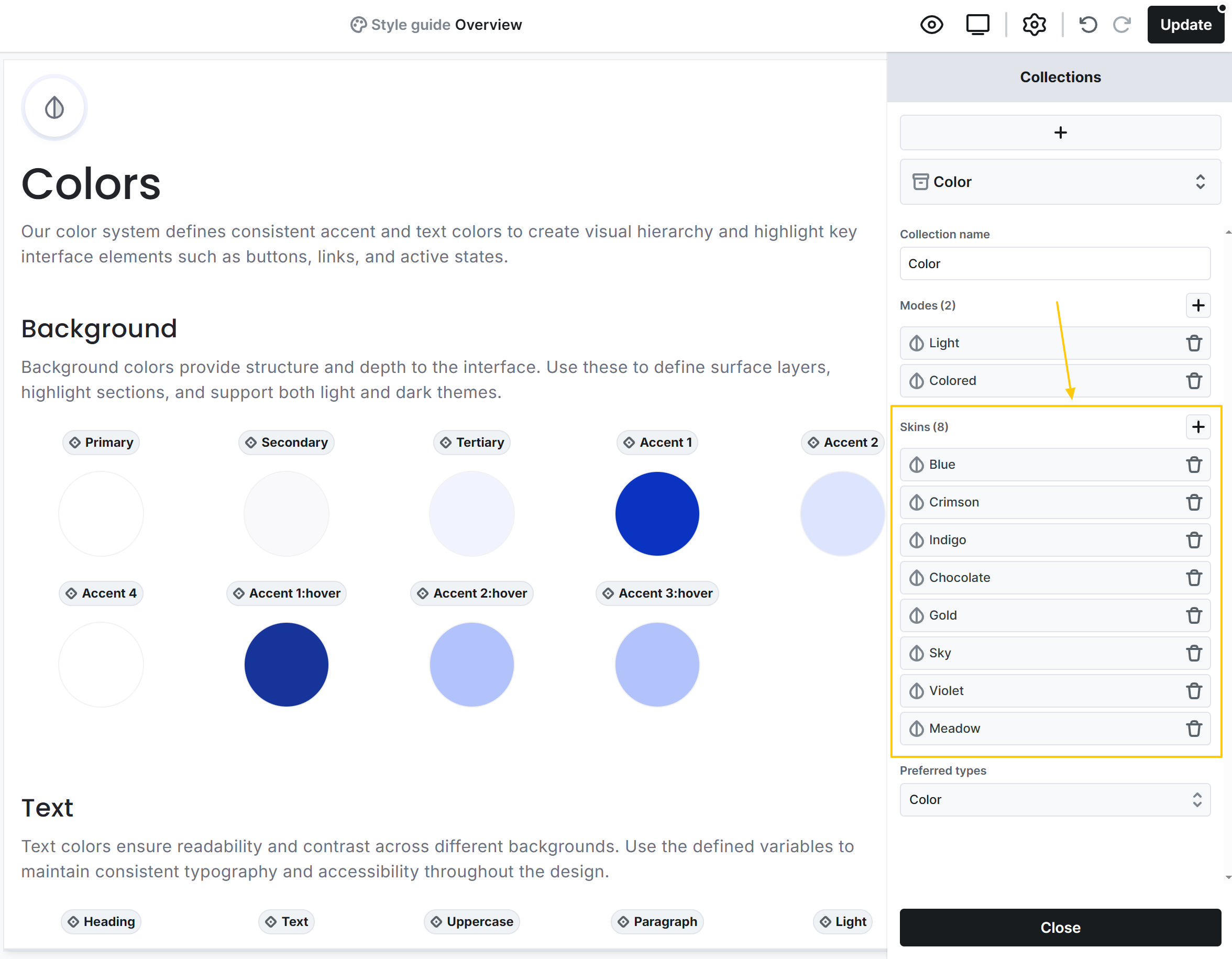
- Manage modes: Add, edit, or remove modes associated with collections. Most collections have a default mode. Later on, you will be able to select these modes at elements.
- Manage skins: Add, edit, or remove skins linked to your theme. The order defines the currently used/edited skin.
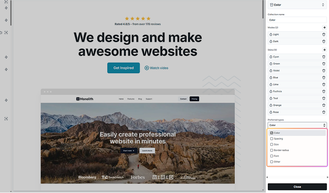
- Preferred types: Specify which variable types are prioritized when choosing style variables for properties in the Style tab.
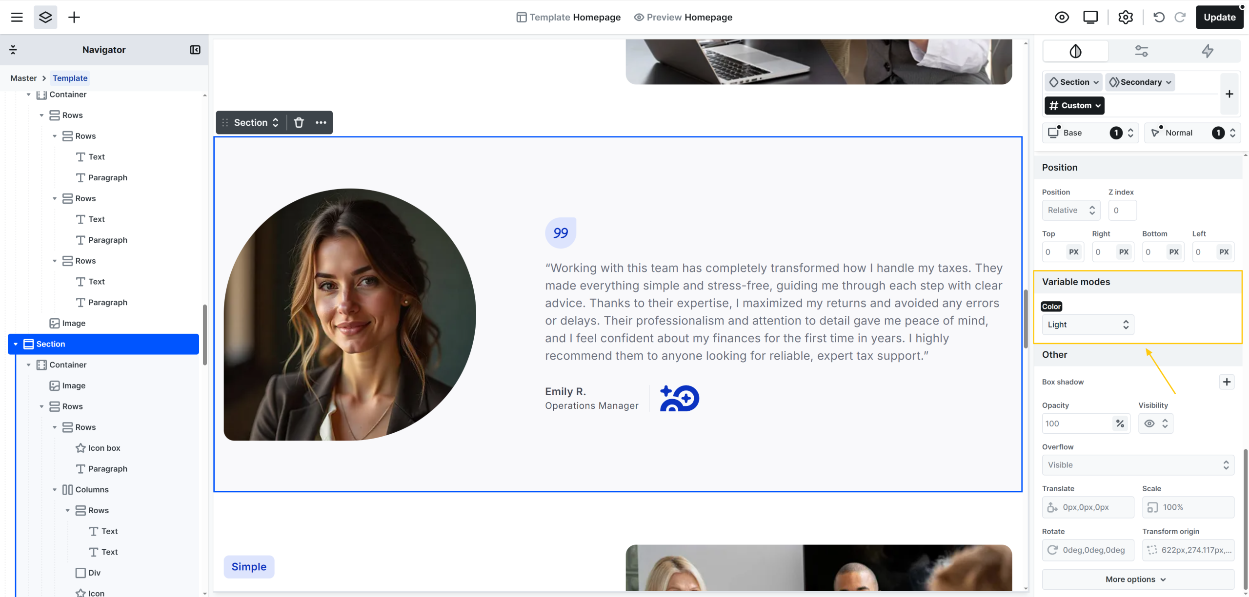
Select modes
You will be able to select modes at any element’s Variable modes setting. Child elements are inheriting this value from their parent elements.
Manage skins
At the collection manager you can drag ‘n drop skins higher or lower on the list. The highest one defines your current skin. The edited variables are linked to that skin, and your theme uses those variables as well.
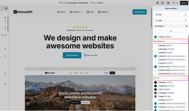
Groups
Groups provide further organization within collections, allowing you to categorize style variables (e.g.: background, text, and border colors). This structure helps keep your design decisions clear and manageable.
Manage groups
- Creating groups: Click the folder icon to create groups. The new group will appear at the bottom of your style variables list. Drag and drop to rearrange it.
- Editing/deleting groups: Use the three-dot menu next to a group name to rename or delete it.
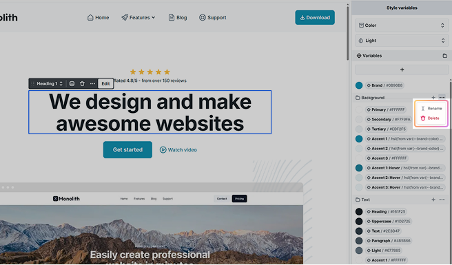
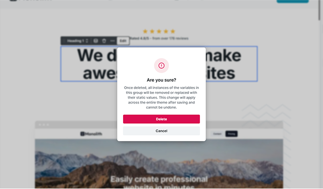
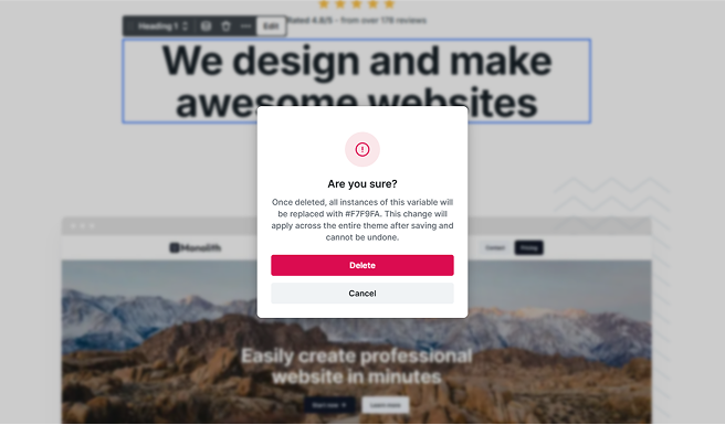
Deleting a group will replace all instances of its style variables with static values throughout your theme. A confirmation popup will remind you of this consequence.
Manage variable list
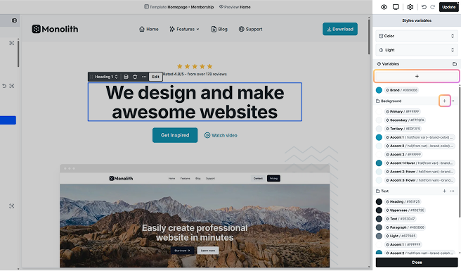
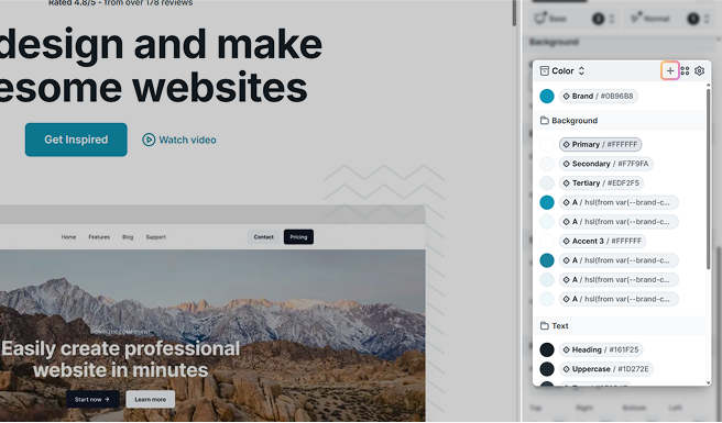
Style variables can be added, edited, or removed via the Style variables panel.
- Adding style variables: Use the appropriate collection or group to create new style variables using the + button for each.
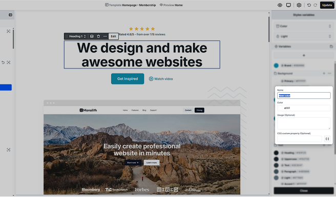
- Editing style variables: Click on a style variable to modify it in their popup window. Any changes will update globally wherever the style variable is used.
- Removing style variables: Hover over a style variable to reveal the trash icon, then click to delete.
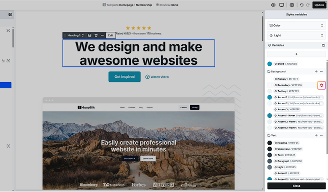
Just like with a group, deleting a style variable will replace all instances of its variables with static values throughout your theme. A confirmation popup will remind you of this consequence.
- Reordering style variables: Drag and drop style variables to change their order.
Update in the Style tab
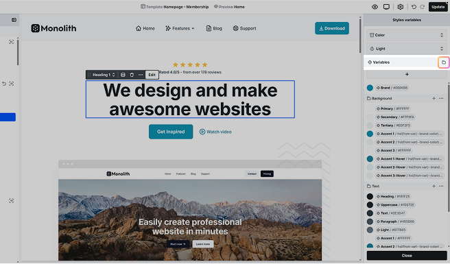
Updating style variables directly from the Style tab is quick and straightforward. When you hover over a property that supports style variables, a style variable icon will appear next to the property name.
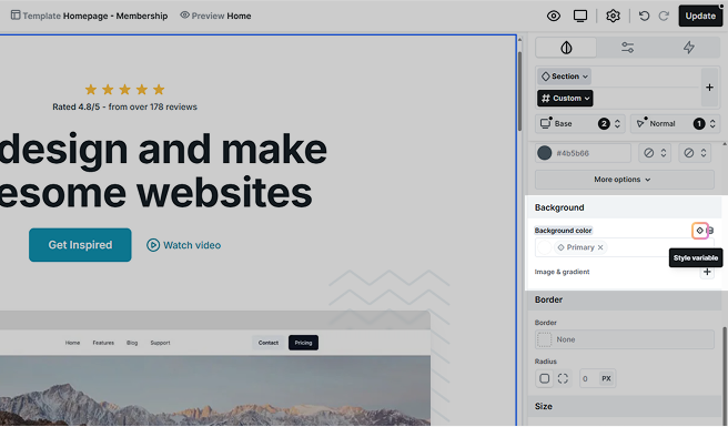
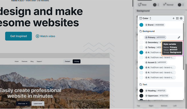
Clicking on this icon opens a popup window where you can see and choose from available style variables.

Additionally, hovering over a style variable in this popup window will display the specific settings applied to that variable.
Select/create variables
When the popup window opens, you’ll first see style variables from your preferred collection type. You can switch between collections by clicking on the type name.
To add a new style variable, simply click the + button.
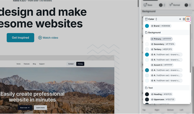
If you want to organize style variables into groups or reorder them by dragging and dropping them, you’ll need to open the Style variables panel by clicking the cog icon.
For Color variables, you can switch between two viewing modes by clicking the middle icon in the top right corner:

- A simple view displaying only the colors.
- A detailed view that shows both colors and their names, making it easier to identify the right one.
Edit variables
To edit a style variable’s name or value, hover over the variable and click the pencil icon.
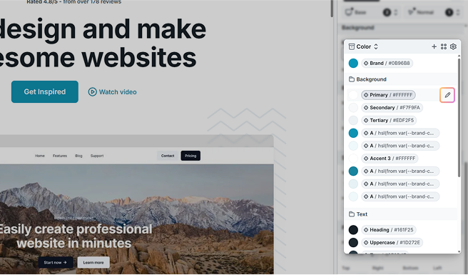
This opens the same popup you see in the Style variables panel when selecting a style variable, allowing you to easily adjust its details. Any changes made here are applied globally, so every element linked to that variable will update instantly across your entire site.
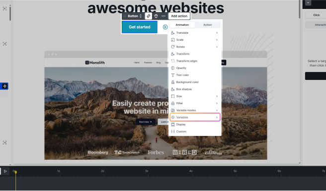
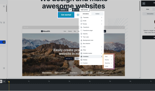
Variables in interactions
Interactions can use style variables for properties like:
- Size
- Radius
- Spacing
- Color
Interactions also support Variable modes, which allow elements to change their appearance based on the active mode.