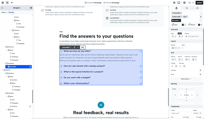
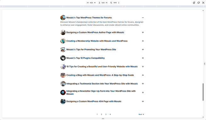
The Accordion element is typically used in FAQs or any section with lots of text. It groups content into collapsible headings so visitors can open only what they need, keeping pages tidy and easy to scan, especially on mobile. They’re great for housing secondary details.
Structure
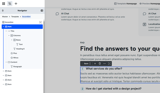
After entering the Accordion’s scope, you’ll find that by default, it’s made up of the following elements.
Item
The Accordion holds the Items that show/hide their associated content. By default, you get two Items, each with a Title and Content. The Title includes a Heading 6 and plus/minus Icons, the Content contains a Paragraph. You can customize both anytime and add, remove, or rearrange elements from the Add panel.
Toolbar actions
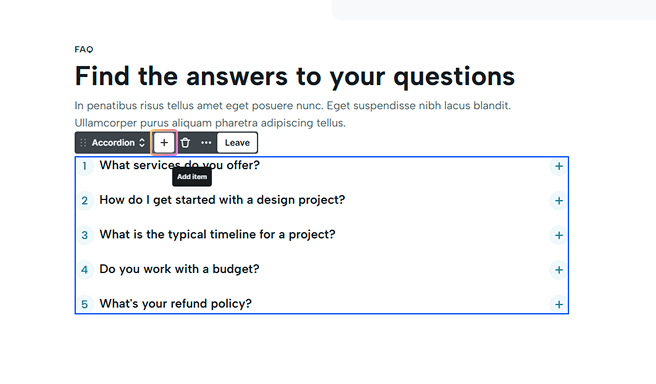
- Add icon: Select the Accordion or any Item, then click the Add icon to insert a new Item.
Settings tab
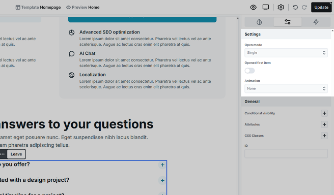
- Open mode: Choose Multiple to allow several items open at once, or Single to keep only one open.
- Opened first item: Turn this on to have the first item open by default. When enabled, you can choose whether it’s always open or only open on initial load.
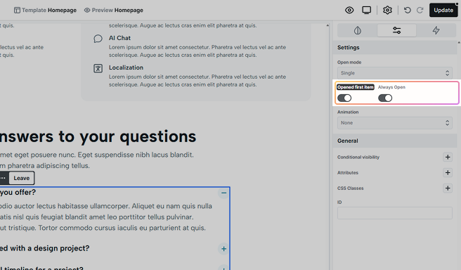
- Animation: Choose Slide to animate item open/close, or None for no animation.
Additional elements
Loop items
It allows you to pull data dynamically, automatically updating your content. You’ll define a single Item that acts as the template, and all subsequent items will be generated based on this template. For more details on its settings, check out the Loop documentation.
Additional states
Use the state selector to style Items and their child elements by state. For example, customize the look of an opening or opened Item and its child elements. For details on how states work, see the Class system documentation.