Buttons are essential elements of web design, enabling interactivity and navigation throughout your website. Every button element includes an Inherited text that automatically inherits the typography styles you’ve set for the element. This means you don’t need to adjust the text separately, it’s already styled based on your button’s settings.
You can also easily convert buttons into links and vice versa, offering greater flexibility. Although buttons and links can have different functions, they both ultimately guide users to take specific actions or reach particular destinations.
Element classes
You can select the following element classes:
Button
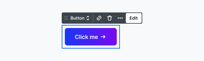
You’re not limited to just text, you can easily add other elements, like an icon alongside the text. And, if you want to customize the button further, the Style tab gives you complete control to personalize it exactly how you like.
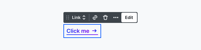
Link
The Link element lets you make almost any element clickable by wrapping it inside a link. Right-click on an element in the Navigator or on the Canvas, then choose Wrap in link.
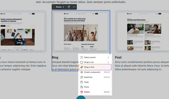
You can nest images, text, or even entire blocks inside, turning them into links that direct users to another page, section, or external URL. This makes it easy to create anything from simple text links to fully clickable content blocks.
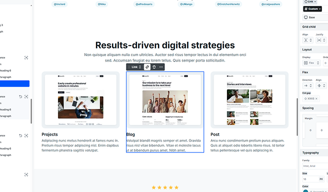
Additionally, you can fully customize how it looks by adjusting its settings in the Style tab.
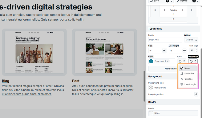
Any text inside a link will, by default, have an underline. If you’d prefer not to have it, you can easily remove it by adjusting the decoration setting in the Style tab of the link.
Settings tab
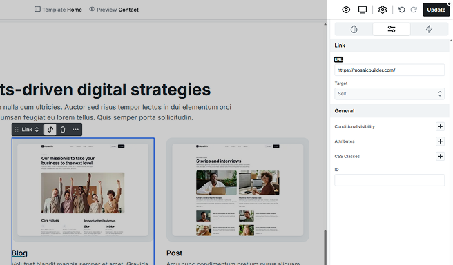
In the Right sidebar’s Settings tab settings, you’ll find options, like URL and Target, which allow you to manage and customize the behavior of your links. These settings are particularly useful for defining where the link directs users and where it opens.
Trigger JavaScript
If you want a button to run custom JavaScript, you can do this through the Settings tab under Attributes.
- Name: onclick
- Value: alert(‘test’);
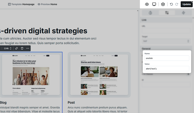
This creates an onclick event, so when the button is clicked, the specified JavaScript code will run.
Additional states
The Button includes additional states, accessible through the state selector. For more information on how states work, refer to the Class system documentation.
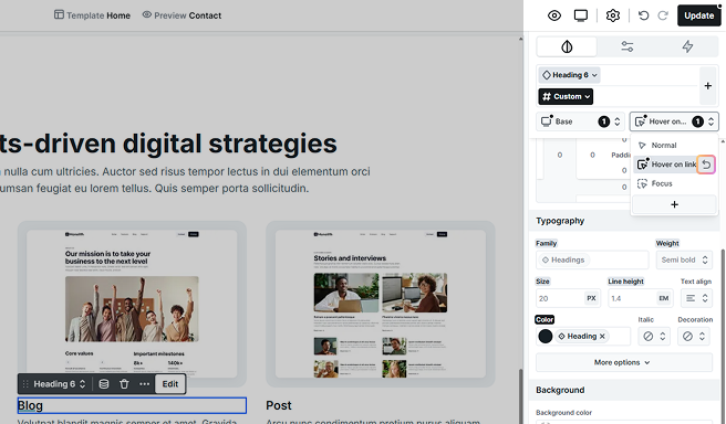
Hover when link
The Hover when link additional state, specific to button and link element classes, is available in the Style tab’s state selector.
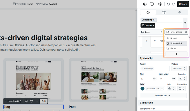
When you add a link to your button or link, you’ll be able to set a hover color for both links and buttons. By default, there’s no hover styling applied.
To customize it, simply choose the Hover when link state from the dropdown menu and then adjust the styles through the Style tab. These changes will be saved specifically for the chosen state. If you want to remove the hover styling altogether, just click the back arrow next to the state name in the dropdown.
Hover effects may not work well on smaller screens (like mobile devices), so it’s important to consider that while designing for different breakpoints.
FAQ
When you create links pointing to your own website, we suggest selecting the page/post from the search results. These would be relative to your domain, so if you decide to move your website to a different domain later on, your links would still stay fine.
If you want to add a link to only a part of your text, here’s how:
Step 1: Write your content using the text element.
Step 2: Highlight the specific part of the text that you want to turn into a link.
Step 3: Once highlighted, the link option will appear in the toolbar.
Step 4: Click on the link option and add the link to the selected text.
Step 1: Select the element where you want to scroll to. On its Settings tab settings, add an id attribute to it with a unique name. (The name shouldn’t contain spaces or special characters.)
Step 2: Go to your Button/Link, and write #name in its URL field, with the name you used in Step 1.
Step 1: Select the Button (or Link) element you would like to use.
Step 2: Go to its Settings tab settings.
Step 3: Write the file’s link into the URL field.
Step 4: Add a download attribute with the file’s name as the value.
If you would like a Button/Link with a phone number in it, just simply write “tel:” and the phone number into the URL field.
If you would like to have an email address within a Button/Link, you should just write “mailto:” and the email address into the URL field.