The icon element is a powerful tool that allows you to incorporate SVG images seamlessly into your design. Whether you’re uploading simple icons or complex SVGs, this element provides an intuitive way of adding visual elements to your canvas.
Element classes
You can select the following element classes:
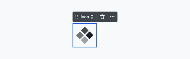
Icon
The Icon is the graphical symbol itself. It refers to a small graphical element or symbol. They provide an easily recognizable way to convey meaning.
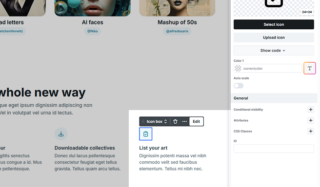
Icon box
An Icon box refers to a container or a box that holds the icon, used to structure an icon within a specific space. The box often has padding, background colors, borders, or hover effects that create a distinct visual effect around the icon.
Clipboard actions
If you have an SVG image’s HTML code on your clipboard and the active element is an icon, simply insert it with the Ctrl (or Cmd) + V hotkey, and the given SVG image will appear.
Settings tab
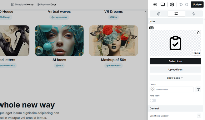
Icon
Displays the selected SVG image along with its size. Once the icon is added, you also have the option to delete it from here.
Select icon
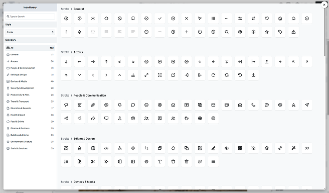
This will open up the Icon library. You can search by keywords, choose a style (Stroke or Solid), and filter by categories to narrow results.
Replace icon
Once you’ve selected an icon, you have the option to easily replace it here.
Show/Hide code
Allows you to show/hide the SVG code field if you don’t need to view it.
Color
You can modify the fill and stroke colors of the SVG code. Additionally, if your SVG contains multiple colors, they will be listed here for you to modify individually.
Inherit current color
The T buttons were made to let your icon inherit the color from its parent element’s text color. For example, it is common usage to have an icon within the Button element, and this is a handy feature there as it ensures consistency in color usage.
Auto scale
This setting controls the size of your icon.
- On: The SVG image fills its container element at 100% width.
- Off: the image keeps its defined width in the code, scaling down as needed when the container size decreases.
FAQ
In the Settings tab settings, you have three options to display your SVG image:
Step 1: First, you delete the existing icon element.
Step 2: Then, you can select your SVG image from your computer’s files to upload and display as the new icon.
Step 3: With this option, you can directly drag an SVG file from your computer and drop it into the icon area.
Step 4: This option involves manually copying the SVG code from your SVG image file. Start by opening the SVG image file in a text editor, such as Notepad on Windows or TextEdit on Mac. → Once the file is open, copy the SVG code. → Next, select the icon element and paste the code into the icon element’s SVG field by pressing Ctrl + V (Windows) or Cmd + V (Mac). The SVG image will then be interpreted and displayed as the new icon.