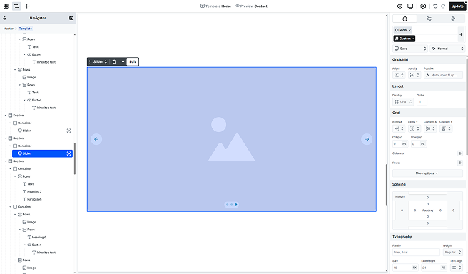
With the Slider element, you can create your own slider easily. In Mosaic, you get a base skeleton design for your slider, so all you need to do is just replace the needed parts or adjust the styling to suit your preferences.
Structure
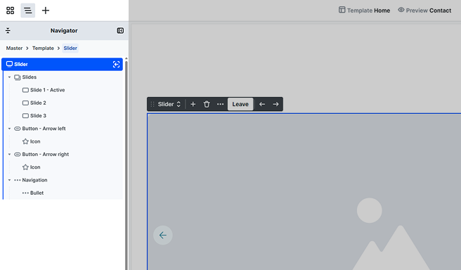
After entering the Slider’s scope, you’ll find that by default, it’s made up of the following elements.
Slides
Holds the slide items, where each represents a single slide in the slider. You can’t build any content here, you can do that in the Slide. By default, there’s a single slide in the slider, which you can modify according to your design. Its content can be built with elements from the Add panel. It also shows which slide is currently Active, the one you’re working on.
Button – Arrow left/right
Represents the slide-switching arrow in the slider. By default, it holds an Icon element featuring an Arrow SVG. Its content can be extended with elements from the Add panel.
Navigation
Holds the navigation section of the slider. Its content cannot be extended, however, you may adjust its styles on the Style tab. The Bullet element inside it represents a single bullet control element.
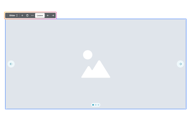
Toolbar actions
Inside the toolbar scope, you’ll get the following additional options:
- Arrows: You can switch the active Slide to see it on the canvas.
- Add icon: You can add a new Slide to your Slider element.
- Leave: You can leave the scope of the Slider element.
Settings tab
You can customize the behavior of your Slider to suit your needs using the following settings in the Settings tab.
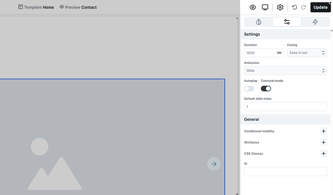
- Duration: Set the time (in milliseconds) for how long each slide remains visible before transitioning to the next.
- Easing: Choose an easing option to determine how your slides transition.
- Animation: Select the type of animation effect you want for your slides.
- Autoplay: Enable autoplay to let your slider run on its own.
- Carousel mode: Turn on carousel mode for a continuous looping experience.
- Default slide index: Sets the initial slide that appears when the slider is first loaded.
Slide background image
To add a background image to a slide, go to the Advanced tab in the Style panel. Here you’ll find additional customization options for your slide.
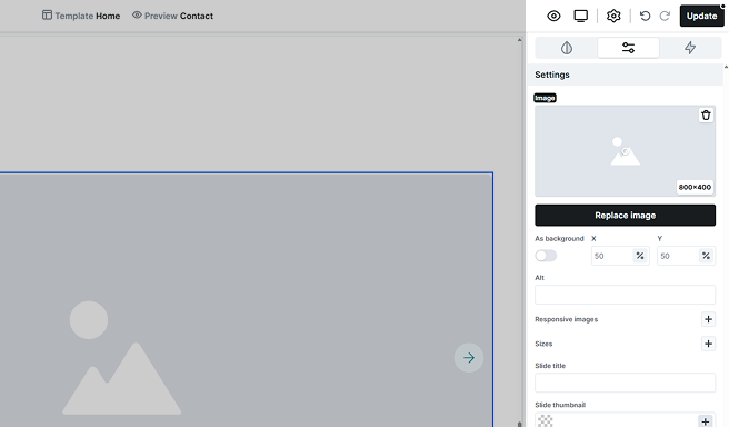
While many of these settings are similar to those for Image element customization, there are some specific options for slides.
- As background: When enabled, the image won’t affect the slide’s size, acting like a CSS background image with absolute positioning. When disabled, the image can increase the slide’s dimensions.
- X/Y: Adjust how the image along the horizontal (X) and vertical (Y) axes so that the focus remains on the key part of the image.
- Slide title: After switching slides, screen readers announce the current slide by reading its title. Ensure that each slide has a descriptive title for better accessibility.
- Slide thumbnail: Provide visual cues for managing and navigating the slides.
You can later position any content on top of this background if needed, and the size of the slide will automatically adjust to the size of the content that is placed on it.
Additional elements
The Slider includes additional elements that are accessible through the Add panel. For more information on how it works, refer to the Add panel documentation.
Loop slides
It allows you to pull data dynamically, automatically updating your content. You’ll define a single Slide that acts as the template, and all subsequent slides will be generated based on this template. For more details on its settings, check out the Loop documentation.
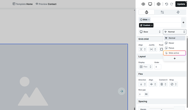
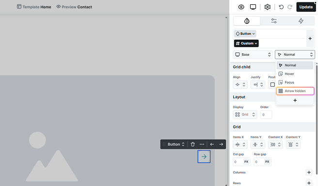
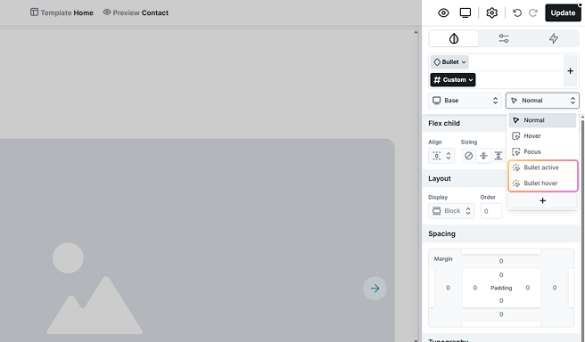
Additional states
Adjust the design of the Slider depending on the state selector’s additional states. For more information on how states work, refer to the Class system documentation.
Slide active
Customize the appearance of the active slide and its child elements to provide clear visual cues for your users.
Arrow hidden
This lets you style the arrows even when they’re hidden (e.g., for spacing or layout adjustments), rather than removing them entirely or leaving them unstyled.
Bullet active/hover
Adjust the navigation’s bullets to clearly distinguish between active and hover states.
FAQ
The slider element in Mosaic offers basic customization options. For more advanced designs, custom coding may be necessary, as such features are not available.
You should note that we do not provide support for such customization, so in cases where a more advanced slider is needed, you can add a Smart Slider 3 slider using its Shortcode, which can easily be added with a Code block in Mosaic.
Each slide will serve as a slide pane that holds multiple images. To make a carousel slider, follow these steps:
Step 1: Enter each slide and delete the background image.
Step 2: Add the image elements in a flex or grid layout.
Step 3: Then, adjust the responsive settings on different views.
To set up thumbnails for your slider:
Step 1: Select a slide element and open its Advanced tab.
Step 2: In the Slide thumbnail setting, set it to use the same image as your slide (or choose another).
Step 3: Repeat this process for each slide so all thumbnails are defined.
Step 4: Go to the bullet element’s Style tab and adjust the bullet styles (size, border, etc.) as needed.
Step 6: In the Image & gradient setting, click the Dynamic data icon of the image.
Step 7: Then from the list, select Thumbnail so the navigation shows the images you assigned.