What you can use it for
A Select is the tidiest way to offer a set of choices when there are more than a handful and you want people choosing only from options you control. Because the visitor picks from your list instead of typing, you get clean, consistent values every time. Common uses include:
- A long, fixed list: a country, state, or currency picker, where free typing would be messy and error-prone.
- Routing a submission: a support category or department, so each request reaches the right team.
- Simple survey answers: a “How did you hear about us?” list or a rating you can compare across submissions.
Adding a Select field
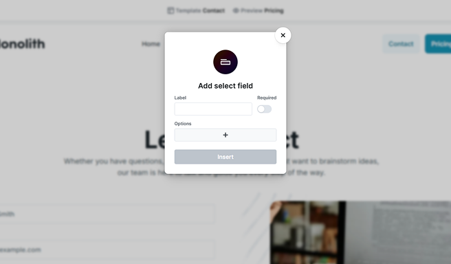
Add a Select the same way you add any other field. When you insert it, Mosaic opens a small popover so you can get the field started right away. It asks for three things:
- Label: the text shown next to the field so your visitor knows what they’re choosing.
- Required: whether a choice is mandatory before the form can be submitted.
- Options: the choices themselves. Use the + to add each one. Every option has a text the visitor sees and a value that’s submitted, and you can add as many as you need here in one go.
Select Insert and Mosaic drops the field into your form with the options you listed, ready to fine-tune. You don’t have to add every option now: you can build the list here or add and edit options later, as described below. For how labels, names, and required fields work across all fields, see Fields & field groups.
The Select and its options in the Navigator
Each choice in a Select is its own Option element, nested under the Select in the Navigator. This is where you manage the list: you can reorder options, remove ones you don’t need, and open any option to change its text and value.
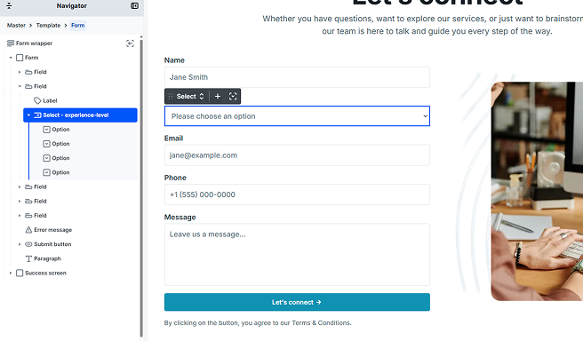
To edit an option, select it in the Navigator to open its settings, or double-click it to open the quick editor for its value and text. To add another option, use the + on the Select’s toolbar, or on any option’s toolbar to add a sibling next to it. A small dialog asks for the new option’s value and text, then inserts it into the list.
Select settings
Select the field in the Navigator or on the canvas to open its settings.
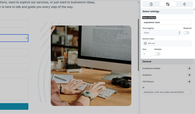
- Name attribute: the key the chosen value is submitted under. It identifies the field in your form submissions and in actions like email, so give it a clear, meaningful name.
- Required: makes the field mandatory. See Making a choice mandatory below.
- Default value: sets which option is chosen when the form loads. See Choosing what starts selected below.
- Size: how many options are visible at once. See Size below.
- Multiple: lets a visitor pick more than one option. See Allowing more than one choice below.
- Data logging: controls how the chosen value is saved with your submissions.
Choosing what starts selected
There are two ways to decide which option is chosen when the form first loads. On each option, the Selected toggle marks it as the starting choice. On the Select itself, the Default value setting does the same thing at the field level and can also pull a value in from elsewhere, such as a parameter in the page’s web address.
When the Select’s Default value is set, it takes over: it overrides the Selected toggle on the individual options. Use the option’s Selected toggle for a simple fixed starting choice, and the field’s Default value when you want to prefill the Select from a source such as the URL. To learn about every value source, see Default values.
Making a choice mandatory
A drop-down normally shows its first option straight away, so it always has something selected. If you want to force a real, deliberate choice, add a first option that acts as a prompt, such as “Please choose” with an empty value, and turn on Required. The visitor then has to pick a genuine option before the form will submit. A prompt option like this appears in a lighter, placeholder-style color until a real choice is made.
Size
Size sets how many options are shown at once. Leave it at 1 (the default) for a normal drop-down that opens when clicked. Set it higher and the field becomes a scrolling list box that shows that many options at a time, with the rest reachable by scrolling. Size accepts whole numbers only and can’t go below 1.
Allowing more than one choice
Turn on Multiple to let a visitor pick several options from the same field rather than just one. By default a multiple-choice Select looks and behaves just like a single-choice one, so it stays neat on your form; pair it with a higher Size if you’d rather show several options at once as a list box. All of the chosen values are submitted together under the field’s name.
Option settings
Select an option in the Navigator to open its settings. Each option carries its own value, text, and state.
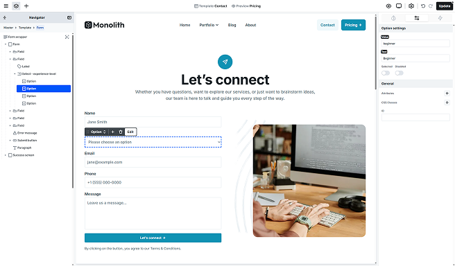
- Value: what gets submitted when this option is chosen. Keep it short and stable (for example, a code or key), since this is the data you’ll see in submissions and use in actions.
- Text: the label the visitor reads in the list. It can be friendlier and more descriptive than the value. Option text is plain text.
- Selected: marks this option as the starting choice when the form loads. Remember that the Select’s Default value, if set, overrides this.
- Disabled: shows the option in the list but stops it being chosen. It’s handy for a “Please choose” prompt or an option that’s temporarily unavailable.
Styling the options
Beyond the field itself, a Select gives you separate style states for its options, so you can control how the list looks:
- Option: the normal look of an option in the list.
- Option disabled: the look of an option that has its Disabled toggle turned on.
You’ll find these states in the Style tab when the Select is selected. For how style states work in general, see Style tab.
How much of an option’s appearance you can restyle depends on the browser, since browsers draw the drop-down list themselves. Colors and text generally follow your styling; finer details may vary from one browser to another.