What you can use them for
A Mosaic form is built from small structural pieces that keep your inputs organized and accessible. Three of them group your controls, each for a different job:
- Field: wraps a single input, such as a text box, email, number, date, text area, select, or file upload, together with its label.
- Choice field: groups a set of radio buttons or checkboxes that make up one question.
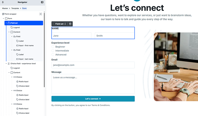
- Field set: groups several Field or Choice field elements under one caption, for example a billing address block or a “Contact details” section.
The one input that isn’t wrapped in a Field is the hidden input, since the visitor never sees or interacts with it. You can read about it on the Hidden input page.
Field
A Field is the wrapper for a single input. It always holds two things: a Label and the input itself, whether that’s a text box, a select, a file upload, or any other control except the hidden input. Pairing the label with its input is what lets the caption and the control work as one, so the field reads correctly for everyone, including people who use screen readers. For the individual input types and their settings, see Text inputs.
You can’t delete the Label or the input from a Field, but you’re free to wrap them in other elements (such as a Div) to build your own structure. This lets you place an icon beside the input, split the field across columns, or add helper text, while keeping the parts the field needs to work.
Whatever input a Field wraps, it is the input, not the Field, that holds the value and its settings. Two of these are shared by every input type: a name that identifies the value in your submissions and in actions such as email, and a default value that can prefill it. You set both on the input itself, alongside its other settings. For the ways a value can be prefilled, see Default values.
Choice field
A Choice field is the grouping element for options that answer one question, using radio buttons (pick one) or checkboxes (pick any number). It’s a single element that covers both kinds; which one it is depends on the choices inside it, not on a separate setting.
Rather than one label, a Choice field has a Legend (the caption for the whole question) and a Content holder for the options. Each option is a Choice, pairing the radio or checkbox input with its Choice label. You can add and remove Choice elements to change the options, and just like a Field, you can’t delete the input or label inside a single Choice, but you can wrap them to build a custom option layout.
Building the option list, the required rule, the default selection, and styling each part are all covered on the Radio & checkbox page.
Field set
A Field set groups several Field or Choice field elements together under one shared caption. Reach for it when a handful of controls belong to the same topic and you want them to read as a single block, such as a shipping address (street, city, and postal code) or a set of related preferences.
Like a Choice field, a Field set has a Legend and a Content holder. The Legend names the group and sits above it as a heading, while the Content holds the fields you place inside. Grouping fields this way also tells screen reader users that they belong together.
Labels, legends, and accessibility
Every Field has a Label, and every Choice field and Field set has a Legend. These captions are what let assistive technology announce each control correctly, so Mosaic doesn’t let you delete them.
If your design doesn’t call for a visible caption, you can still hide it the accessible way. Every theme that ships with Mosaic includes a screen-reader-only utility class: add it to a Label or Legend to take it off the screen while keeping it available to screen readers. See the Class system page for how to apply classes.
You don’t need to manage the technical link between a label and its input. Mosaic connects each Label to its control automatically and keeps every control’s identifier unique on the page, even when a field is repeated, so labels always point to the right input.
Hiding a caption with the screen-reader-only class keeps it available to screen readers while taking it off the screen. Don’t empty a Label or Legend to get rid of a caption, since that would leave people who rely on screen readers unable to tell what a field is for. For more on building accessible forms, see Accessibility support.
Styling each level
Field, Choice field, Field set, and their labels and legends are each a separate element class, so you can style every level of the structure on its own and keep a clear hierarchy, for example a group’s Legend reading stronger than the field labels beneath it. You’ll find these in the Style tab when the element or one of its parts is selected. For how styling works in general, see Style tab.
On top of styling each part, the grouping elements expose states so they can react while a visitor fills in the form, mainly around keyboard focus and validation.
A Field has three states of its own:
- Focus visible: applies while the visitor has moved keyboard focus into the field, so you can show a clear focus ring for people navigating without a mouse.
- Invalid: applies when the input’s value fails validation, so you can flag the field as needing attention.
- Invalid + focus visible: applies when the field is both invalid and focused this way, so you can fine-tune how an error looks at the moment the visitor is in the field.
A Field also passes its error down its whole branch as a Within invalid field state. This lets any element you’ve placed inside the field, such as its Label, an icon, helper text, or a wrapper, respond to the error too, not just the field’s outer container.
A Choice field handles validation the same way: it has an Invalid state for the group itself and passes a Within invalid choice field state down its branch so the parts inside can react. The full set of choice field parts and states is covered on the Radio & checkbox page.
A Field set has an Invalid state that applies when any Field or Choice field inside it is currently invalid, so you can flag the whole group when one of its controls has a problem.