In this tutorial, we’ll create a dark/light mode switcher in Mosaic that your visitors can use on the live website. It’s built entirely with Interactions, Style variables, and collection modes, so no custom code is needed.
The switcher remembers the visitor’s choice with a cookie, so the selected mode stays active when they navigate to another page or refresh the current one.
Here’s how the setup works:
- Click interactions on the Light and Dark mode buttons switch the mode right away and save the visitor’s choice in a cookie.
- A Page load interaction on the HTML element reads the cookie and applies the saved mode every time a page loads.
Before you start – Set up the color modes
The switcher changes the active mode of your Color style variables, so your theme needs two things:
- Two modes in your Color collection: one for Light and one for Dark, with a value set for every color variable in both modes.
- Color variables used everywhere: your elements should use Color style variables instead of static colors. A static color, for example a plain white background, stays the same in both modes.
Some of the included themes, like Gibraltar and Monolith, usually come with Light and Dark modes already set up. In that case, you can skip to Step 1, or adjust the colors of each mode if you’d like to match your branding.
If you started with the Blank or Empty theme, or removed the modes earlier, you already have one mode: your current default mode. You only need to add one more:
- Open the Style variables, click Edit collections, and select the collection that holds your color variables.
- Add a new mode under Manage modes. For example, if your current mode is your light design, name the new mode “Dark”.
- Switch to the new mode and adjust the values of your color variables. All of your existing variables are listed in the new mode too, so you don’t need to create new ones.
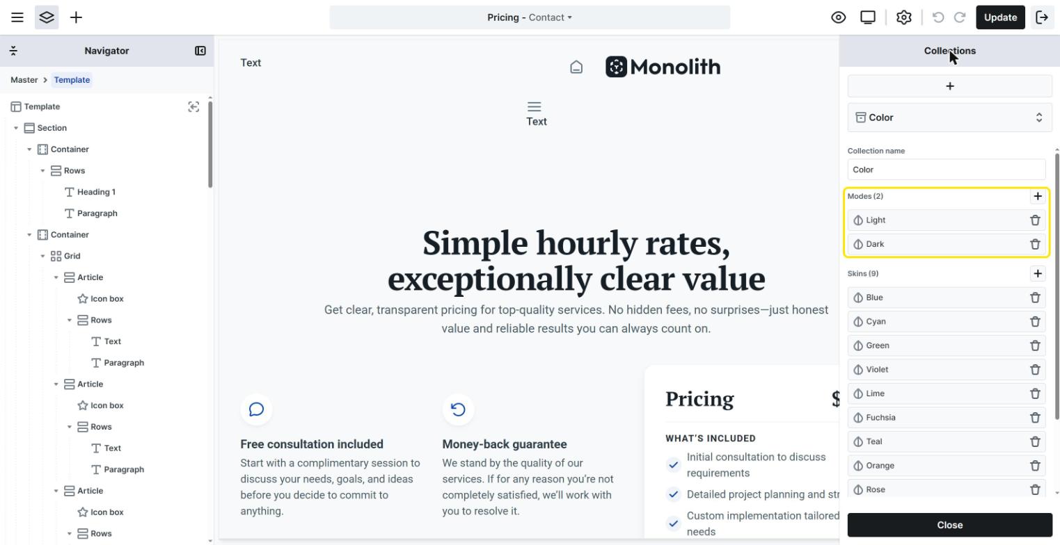
If your elements already use the color variables, that’s all you need to do. You don’t have to update your elements one by one, because they keep using the same variables, which simply have different values in each mode.
Tip: the first mode in the collection is the one your theme uses by default. While you’re adjusting the Dark colors, you can temporarily move the Dark mode to the first position, so you immediately see the results on the canvas. Move it back afterward to keep Light as the default.
Step 1 – Add the Light and Dark mode buttons
Open your theme’s Master and add two elements that visitors can click, for example two Button elements or two Icon elements (like a sun and a moon icon):
- one for Light mode,
- one for Dark mode.
Because the whole setup lives in the Master, you only need to build it once. Every template that uses this Master gets the dark/light mode switcher automatically.
Step 2 – Set up the Dark mode button
Select the Dark mode button, open the Interactions tab, and create a new interaction:Add interaction → Click
Inside the Click interaction, add two actions:
- Switch to Dark mode: while the interaction is open, select the HTML element in the Navigator, so it becomes the target of the action. Then click Add action, select
Variables → Variable modes → Color, and set the To field to your Dark mode.
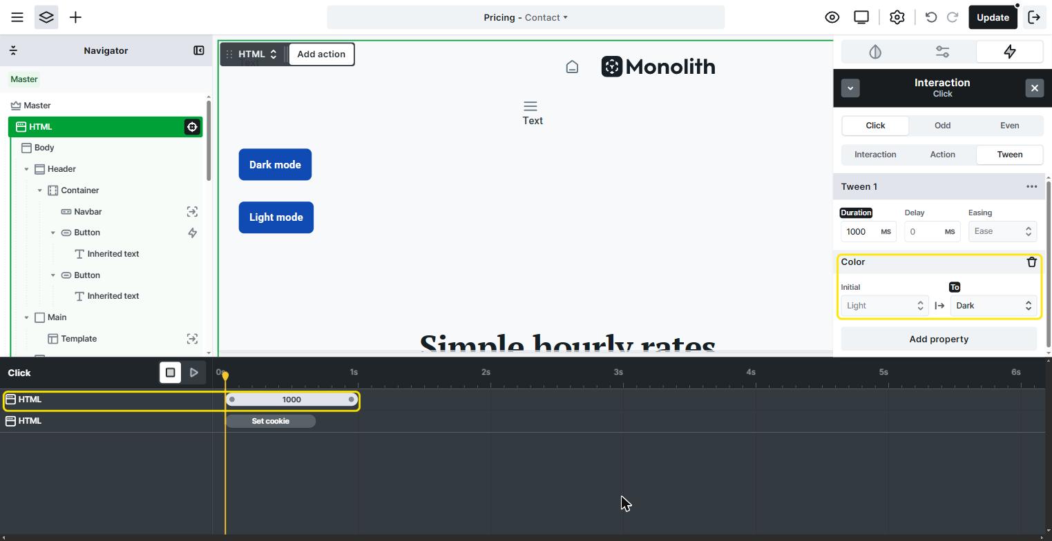
- Save the choice: add a Set cookie action, and enter:
- Name:
color-mode - Value:
dark
- Name:
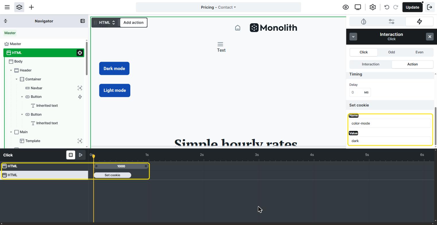
The Variable modes action changes the mode immediately on the current page, while the cookie makes sure the browser remembers the choice for the next pages.
Setting the mode on the HTML element is what makes the change affect the whole page: child elements inherit the selected mode from their parents, and the HTML element is the parent of everything.
Step 3 – Set up the Light mode button
Select the Light mode button and repeat Step 2 with two differences:
- In the
Variables → Variable modes → Coloraction, set the To field to your Light mode. - In the Set cookie action, use the same name (
color-mode), but a different value:light.
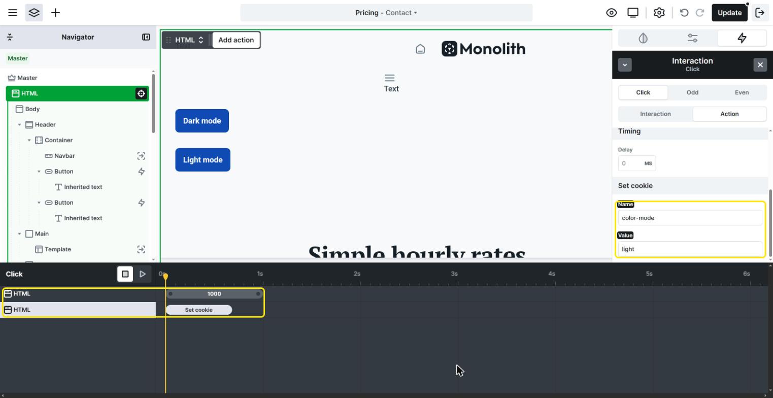
The exact value of the Light mode cookie doesn’t really matter, it can even be left empty. Later, we only check whether the cookie value is dark, and in every other case the default Light mode stays active.
Step 4 – Apply the saved mode on page load
Now, the saved choice needs to be applied whenever a page loads. Select the HTML element in the Navigator and create a new interaction:Add interaction → Page load
Inside the Page load interaction, add the same action as on the Dark mode button: Variables → Variable modes → Color, with the To field set to your Dark mode.
Then add a condition to the interaction, so it only runs when the visitor has chosen Dark mode. On the Interaction tab, click the + next to Conditions, select Browser storage → Cookie, and fill in the Trigger conditions window:
- Cookie Name:
color-mode - Operator: equals
- Value:
dark
Then click Apply condition.
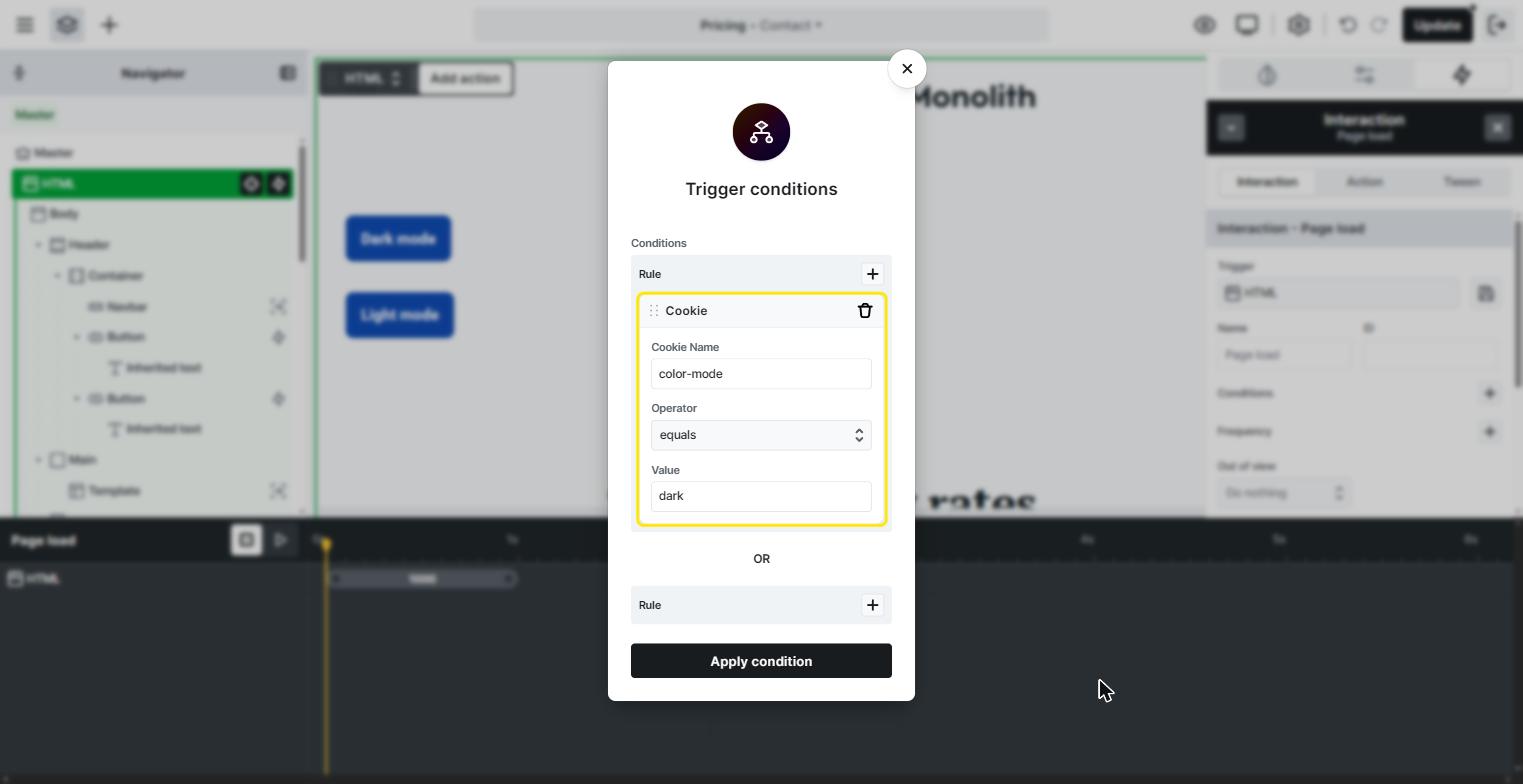
After you apply it, the condition is listed on the Interaction tab, and the Page load interaction is ready: it switches the HTML element to Dark mode, but only when the saved cookie value is dark.
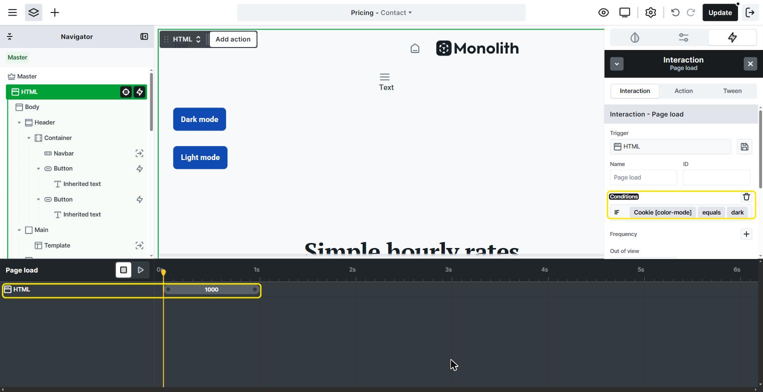
If the cookie isn’t set to dark, for example because the visitor chose Light mode or hasn’t clicked either button yet, the interaction doesn’t run, and the page stays in the default Light mode.
That’s it! Save the Master, open your website, and try the buttons. The selected mode now stays active when you navigate to another page or refresh the current one.
The Set cookie action saves the choice for the current browser session. This means the selected mode is remembered while the visitor’s browser stays open, and the default mode is used again after they close and reopen it.
Optional: Show only the relevant button
If you’d like to display only one button at a time, for example only the Dark mode button while the page is light, you can hide and show the buttons with the same interactions:
- Default state: hide the Light mode button with the Style tab, so only the Dark mode button is visible when the page loads in Light mode.
- Dark mode button Click interaction: add a Display action that hides the Dark mode button, and another one that shows the Light mode button.
- Light mode button Click interaction: do the opposite: hide the Light mode button, and show the Dark mode button.
- HTML element Page load interaction: add the same two Display actions as on the Dark mode button, so the Light mode button appears when a page loads in Dark mode.
For these actions, select the button you want to hide or show in the Navigator, so it becomes the target of the action.