How errors are shown by default
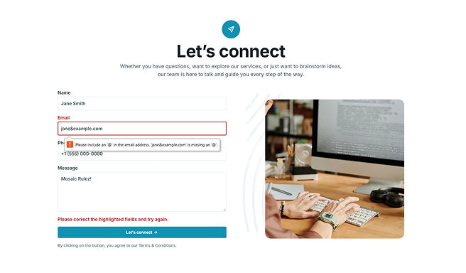
Every field can be checked when the form is submitted: a required field left empty, an email address in the wrong format, and so on. Without an Error message element, browsers show these validation errors in their own built-in bubble. That bubble works, but you cannot style it, and it looks different in every browser.
Adding an Error message element
You add an Error message element to your form like any other element. Where you place it decides what it shows: an error for one specific field, or an error for the whole form.
Field errors and form errors
Where you place an Error message element decides its scope: whether it handles the errors of one field or of the whole form.
Inside a field
Place an Error message element inside a Field or Choice field, and it takes over that field’s validation messages. Instead of the browser bubble, the visitor sees your styled message right next to the field it belongs to.
At form level
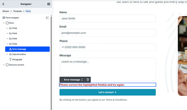
Sometimes an error applies to the whole form rather than a single field, for example when something goes wrong while the form is being submitted. Place an Error message element inside the Form but outside any Field or Choice field, and it shows these form-level messages.
Using more than one
You can add as many Error message elements as you like. Every Error message in the same scope shows the same text: two Error messages inside the same field both display that field’s error, and two at form level both display the form-level message. This is useful when you want the same message to appear in more than one place in your layout.
Designing the Error message
You control how the Error message looks and where it sits, but not what it says. Mosaic writes the message text at the moment the error happens, and the wording changes depending on the error, so there is no text for you to edit.
The element behaves differently in the editor and on the live site. On the front end, an Error message stays hidden until there is an error to show. In the editor, it stays hidden until you select it in the Navigator, which reveals it so you can design it.
The text of an Error message is defined by Mosaic and translated with your site’s language. It is set automatically for each error, so you can style and position the element, but you cannot type your own message.
Accessibility
When an Error message appears, it is linked to the field it describes and announced to screen readers, so people using assistive technology know which field needs attention. No extra setup is required. You can read more in Accessibility support.