What you can use them for
Radio and checkbox fields both offer a set of choices laid out in full, so your visitor sees every option at once. They differ in how many can be picked:
- Radio: the visitor picks exactly one option from the group. Use it for choices that are mutually exclusive, such as a plan tier, a preferred contact method, a yes/no answer, or a satisfaction rating.
- Checkbox: the visitor can pick any number of options, including none. Use it for “select all that apply” questions, such as interests, topics, or add-ons. A checkbox field with a single option is also the right choice for a consent box, like an “I agree to the terms” tick.
Both work best for a short, fixed list where showing every option helps the visitor decide. When the list is long, a drop-down keeps the form tidier: see Select.
Adding a radio or checkbox field
The add panel offers Radio and Checkbox as two separate entry points. Both create the same kind of element, a choice field; the only difference is the kind of choice it starts with. Pick the one that matches how many answers you want to allow.
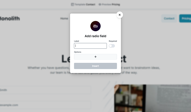
When you insert one, Mosaic opens a small popover so you can get the field started right away. It asks for three things:
- Label: the caption shown above the group, so your visitor knows what they’re choosing. Mosaic also uses it to generate the field’s name automatically.
- Required: whether a choice is mandatory before the form can be submitted.
- Options: the choices themselves. Each row is one option; use the + to add another and the trash icon to remove one. Every option has the text the visitor sees, and Mosaic derives the submitted value from that text (you can change the value later on the choice’s input).
Select Insert and Mosaic drops the field into your form with the options you listed, ready to fine-tune. You don’t have to add every option now: you can build the list here or add and edit choices later, as described below. The name, and the rest of the settings, can all be changed afterward. For how labels, names, and required fields work across all fields, see Fields & field groups.
The field and its choices in the Navigator
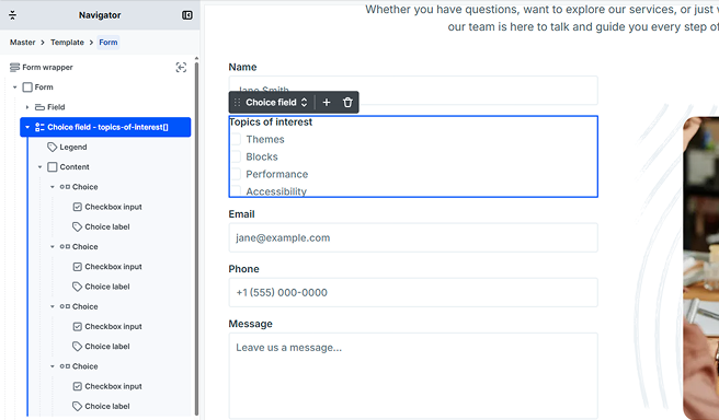
A radio or checkbox field is a single element, shown in the Navigator as a Choice field. Nested inside it are three kinds of part:
- Legend: the caption above the group, describing what the choices are for.
- Content: the area that holds the list of choices.
- Choice: one option in the group. Each choice pairs an input (the radio or checkbox control itself) with a Choice label (the text the visitor reads). The label and its control belong together, so clicking the text selects the option too.
Whether a field is radio or checkbox is decided by the choices inside it, not by a setting on the field. A group is always all radio or all checkbox: they don’t mix. For a radio group, the field’s shared name is what ties the options together so only one can be chosen at a time.
Adding and editing choices
You can build most of your list right in the popover when you add the field. Afterward, to add another option, use the + on the choice field’s toolbar, or on any choice’s toolbar to add one next to it. A small dialog asks for the new choice’s value and label, then inserts a choice of the same kind as the ones already there.
New choices always match the kind already in the field, so a radio group stays radio and a checkbox group stays checkbox. If you remove every choice from a field, the next one you add asks whether it should be a radio or a checkbox, since there’s nothing left to match.
To edit a choice, select its input in the Navigator to change the submitted value and whether it starts selected, or select its Choice label to edit the text the visitor reads. Choice label text is plain text.
Choice field settings
Select the field in the Navigator or on the canvas to open its settings. These apply to the group as a whole.
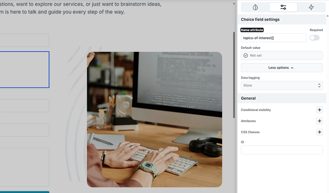
- Name attribute: the key the chosen value is submitted under. It identifies the field in your submissions and in actions like email, so give it a clear, meaningful name. For a radio group, this shared name is also what makes the options mutually exclusive. A checkbox group can submit several values at once, so its name carries a trailing [] to keep them together.
- Required: whether the visitor must make a choice. What “required” means differs between radio and checkbox: see Making a choice required below.
- Default value: which choice is selected when the form loads. See Choosing what starts selected below.
- Data logging: controls how the chosen value or values are saved with your submissions.
Making a choice required
Because radio and checkbox groups collect answers differently, the Required setting adapts to the kind of field:
- Radio: a single on/off toggle. When it’s on, the visitor has to pick one option before the form can be submitted.
- Checkbox: the same on/off toggle, plus a Minimum selections number that appears once Required is on. It sets how many boxes must be checked, so you can ask for “at least one” or “at least three.” It starts at 1 and can’t go lower.
The requirement is checked in the visitor’s browser and again on your server when the form is submitted. If it isn’t met, the message appears on the group as a whole rather than on a single option. To learn how those messages work, see Error message.
Choosing what starts selected
There are two ways to decide what’s selected when the form first loads. On each choice’s input, a Selected toggle (for radio) or Checked toggle (for checkbox) marks that option as a starting choice. On the field itself, the Default value setting does the same thing at the group level and can also pull a value in from elsewhere, such as a parameter in the page’s web address.
When the field’s Default value is set, it takes over: it overrides the Selected and Checked toggles on the individual choices. Use a choice’s own toggle for a simple, fixed starting selection, and the field’s Default value when you want to prefill the group from a source such as the URL. To learn about every value source, see Default values.
Choice input settings
Select a choice’s input in the Navigator to open its own settings. This is where each option carries its value and its starting state.
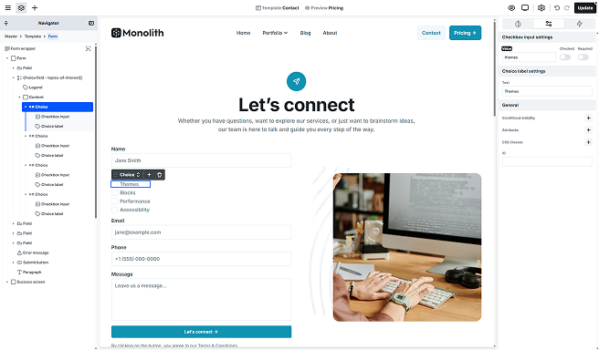
- Value: what gets submitted when this option is chosen. Keep it short and stable (for example, a code or key), since this is the data you’ll see in submissions and use in actions.
- Selected (radio) or Checked (checkbox): marks this option as chosen when the form loads. Remember that the field’s Default value, if set, overrides this.
- Required (checkbox only): makes this one box mandatory on its own, so the form can’t be submitted unless it’s ticked. It’s what you want for a single consent box, like agreeing to your terms. Radio inputs have no per-option required setting: use the field’s Required instead, since a radio group is required as a whole.
Styling radio and checkbox fields
A choice field is made of several parts, and each one styles separately, so you can shape the whole group and the individual options:
- Choice field: the group as a whole, the outer container around the caption and the options.
- Legend: the caption above the options.
- Content: the area that holds the list of choices, handy for spacing the options as a set.
- Choice: one option’s row, wrapping its control and label together.
- Choice label: the text of a single option.
On top of those parts, a choice field gives you two states so the group can react to what the visitor does:
- Within checked choice: applies while a choice is selected, to the parts inside that choice. Use it to make the chosen option stand out, for example by tinting its row or emphasizing its label once it’s ticked.
- Within invalid choice field: applies to everything in the field when its required rule isn’t met. Use it to flag the whole group as needing attention, for example with a colored outline, until the visitor makes a valid choice.
You’ll find these parts and states in the Style tab when the choice field or one of its parts is selected. For how style states work in general, see Style tab.