The label and loading slots
A Submit button is built from two slots you fill with your own content: Submit label and Submit loading. Both are content-only slots. You cannot style the slots themselves; you build content inside them and style that content like anything else in Mosaic.
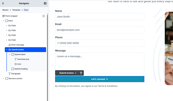
Submit label
This is the button’s default content, shown while the form is waiting to be submitted. Build your button text here, and add anything else you want, such as an icon.
Submit loading
This is the content shown while the form is being submitted, in place of the Submit label. Build whatever suits your design here: a spinner, a different label such as “Sending…”, or both.
If you leave the Submit loading slot empty, the button keeps showing the Submit label while the form is submitted, with no change to its content.
What happens while submitting
When a visitor submits the form, the Submit button reacts in two ways:
- The button is temporarily disabled, so a visitor cannot submit the form twice by accident.
- If the Submit loading slot has content, that content replaces the Submit label until the submission finishes.
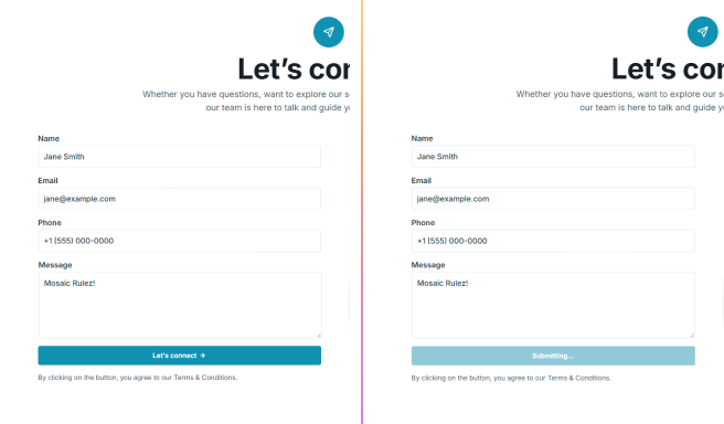
Styling the Submitting state
The Submit button also has a Submitting state you can style, just like its other states. This lets you change the button’s appearance while the form is being sent, even if you have not built a Submit loading slot. A common use is to fade the button out slightly so it clearly looks busy.
You style the Submitting state the same way you style any other state, from the Style tab.
Accessibility
While the form is submitting, the button is marked as busy for assistive technologies, and the form announces its progress, so people using screen readers know the submission is being processed. No extra setup is required. You can read more in Accessibility support.