With Classes, you can set up an animation once and reuse it on as many elements as you like. Instead of adding the same interaction to each element one by one, you add a Class to them, and they get the animation automatically.
In this tutorial, we’ll build a scroll reveal: when a Section scrolls into view, its child elements fade in and slide up one after another. The same steps work with other interactions too, like Hover. You’ll find notes on what’s different along the way.
This tutorial uses Classes and interactions. If you’re new to them, take a look at the Class system and Interactions pages first.
How it works
Two settings make an animation reusable:
- The Trigger is a Class. Every element with this Class starts the interaction on its own. For example, every Section with the
animated-sectionClass when it scrolls into view, or every card with thehover-cardClass when you hover over it. - The Target is empty. An empty Target means the element that started the interaction. To animate elements inside it instead, narrow it down with Target modifiers, for example, to the children with the
animated-child1Class.
This way, only the element that started the interaction (or its children) is animated, and every element with the Class gets the same animation.
Step 1 – Add a Class to the trigger elements
First, add a Class to the elements that should start the interaction. For the scroll reveal, this is the Section that contains the animated elements. Select it, and on the Style tab, add a new Class to it, for example animated-section.
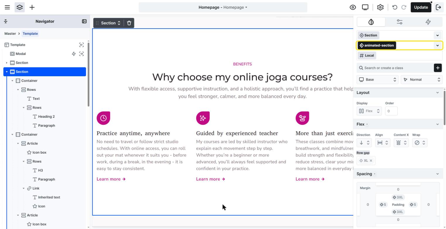
For a hover effect on cards, you’d add a Class like hover-card to each card instead.
Step 2 – Add Classes to the animated children
If you’d like to animate the trigger element itself (for example, lift the card you’re hovering over), skip this step. Otherwise, add Classes to the child elements you’d like to animate. You have two options:
- The same animation for every child: give all of them the same Class, for example
animated-child. - A different animation for each child (for example, with an extra delay, so they appear one after another): create a separate Class for each child, like
animated-child1,animated-child2, andanimated-child3. This tutorial uses this approach.
In this example, the Section has three cards (Article elements). They got the animated-child1, animated-child2, and animated-child3 Classes, in this order:
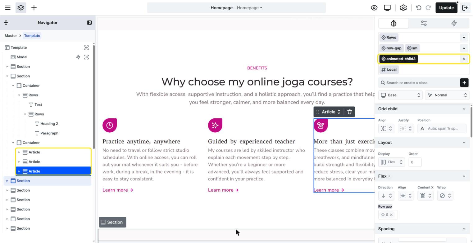
The element type doesn’t matter: an animated child can be a Div, an Article, a Link, or any other element.
Step 3 – Add the interaction
Select an element with the trigger Class, open the Interactions tab, click Add interaction, and choose the interaction type. For the scroll reveal, choose Scroll into view. For a hover effect, you’d choose Hover.
On the Interaction tab, click the Trigger field, choose your trigger Class (here, animated-section) from the list, and click Apply.
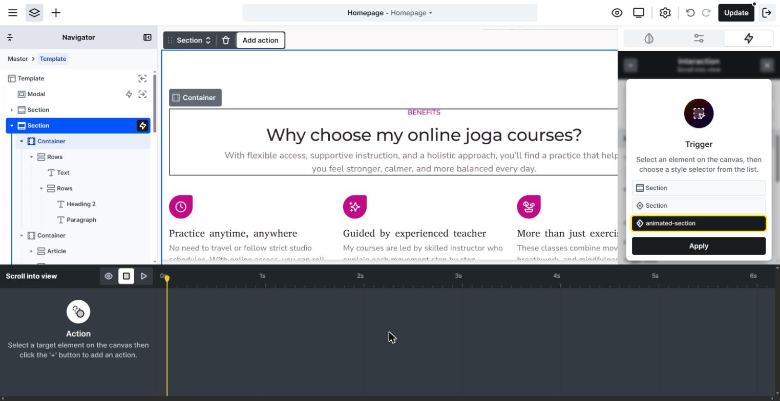
With a Class as the Trigger, the interaction runs separately on every element that has that Class.
Step 4 – Add an action and reset its Target
Here’s the small trick that makes the animation reusable: the action doesn’t target one fixed element. Instead, it targets the element that started the interaction, or the matching children inside it.
- While the interaction is open, select the element you’d like to animate (here, the first child) on the canvas or in the Navigator.
- Click Add action and choose an animation, for example Transform > Translate > Translate Y.
- On the Action tab, click + next to Target modifiers. If you’re animating the trigger element itself, skip this and the next step.
- Leave the Match type on Matching children, choose the child’s Class (here,
animated-child1) from the list, and click Apply.
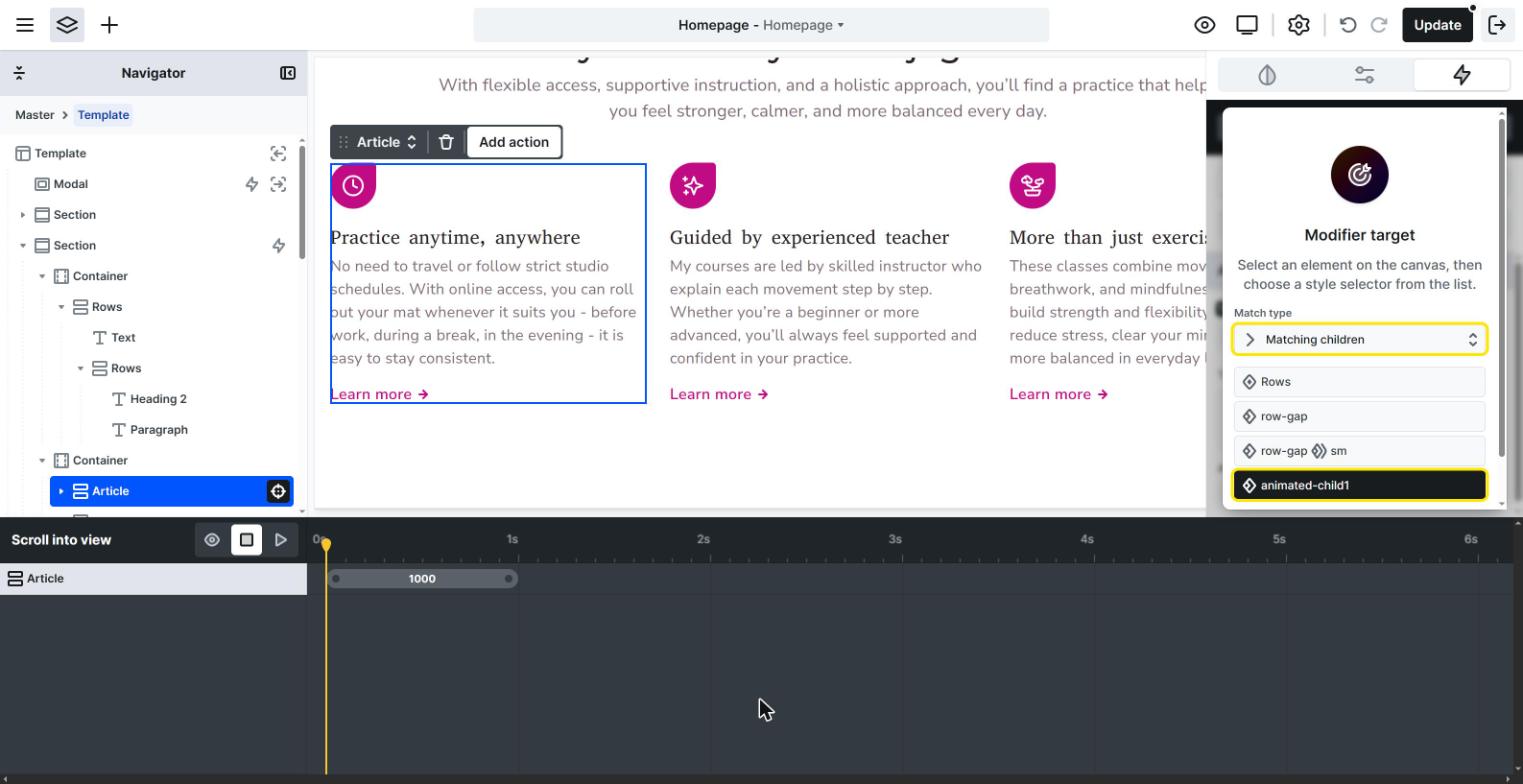
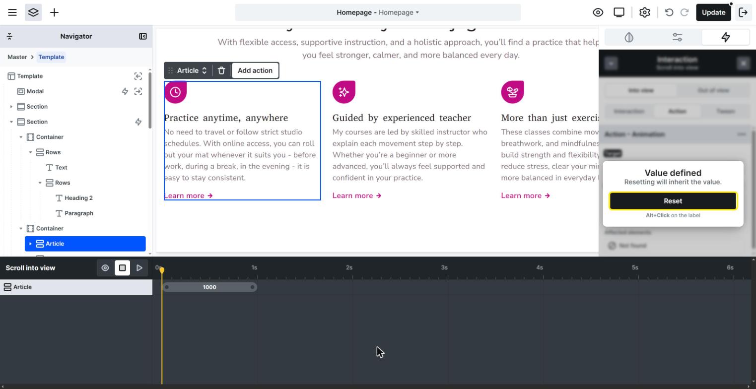
At this point, the Target is still the element you selected, so Affected elements shows Not found. To fix it, reset the Target value:
- Click the Target label and click Reset. (You can also Alt+Click the label.)
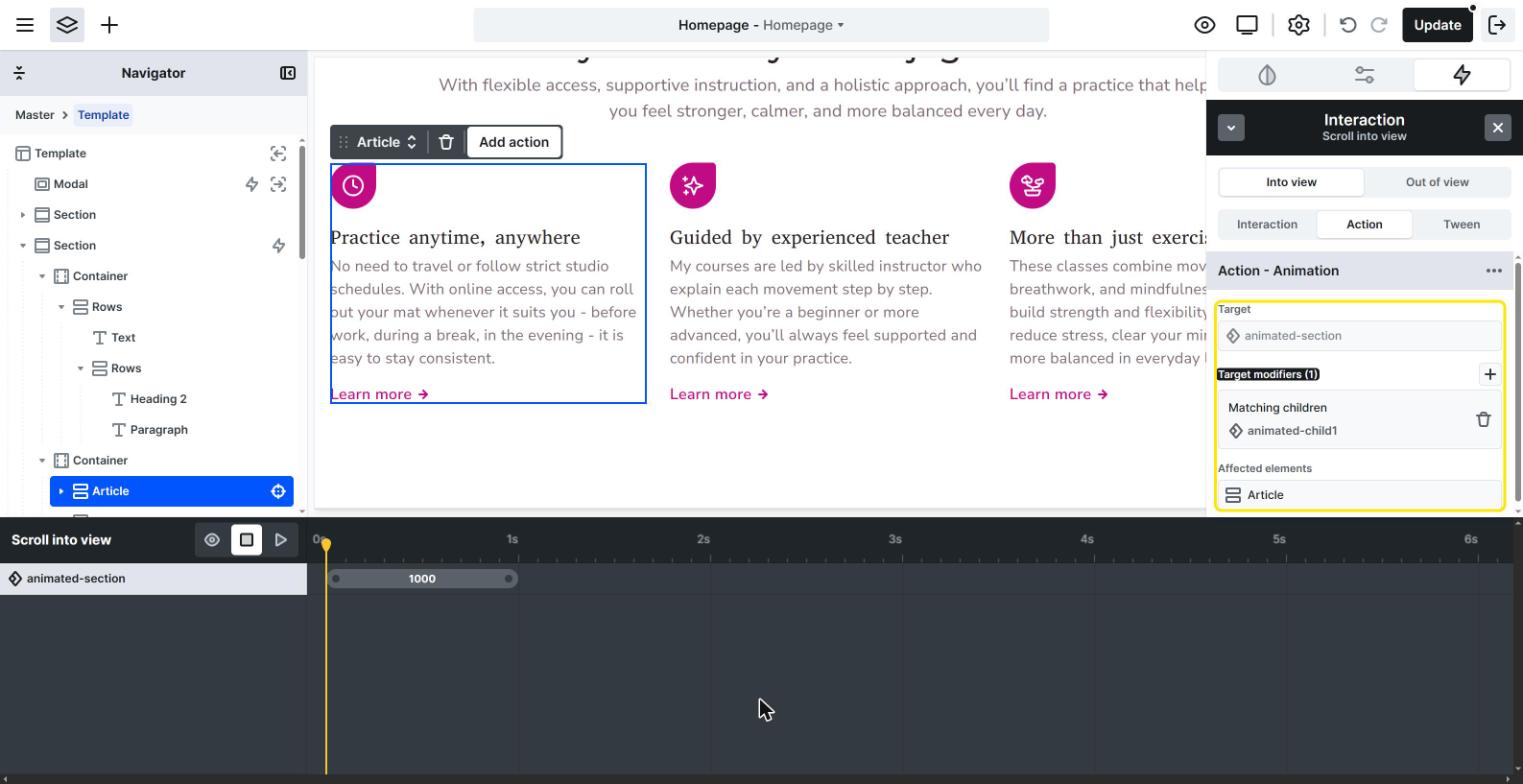
After the reset, the Target inherits the Trigger (animated-section), which means the Section that’s scrolling into view. The Target modifier narrows it down to the matching children inside it, so Affected elements now shows the first card:
If you skipped the Target modifiers, the empty Target animates the trigger element itself: the Section that’s scrolling into view, or the card you’re hovering over.
Don’t choose the trigger Class as the Target. A Class as the Target selects every element with that Class on the page, and you’ll see all of them listed under Affected elements. As a result, they’re all animated at the same time. For example, when the first Section scrolls into view, all Sections with the animated-section Class are animated. Since usually only the first one is visible at that moment, it looks like only the first Section is animated.
Step 5 – Set up the animation
On the Tween tab, set up the properties you’d like to animate. Use Add property to add more. In this example:
- Translate Y: Initial 40 px, To 0 px
- Opacity: Initial 0%, To 100%
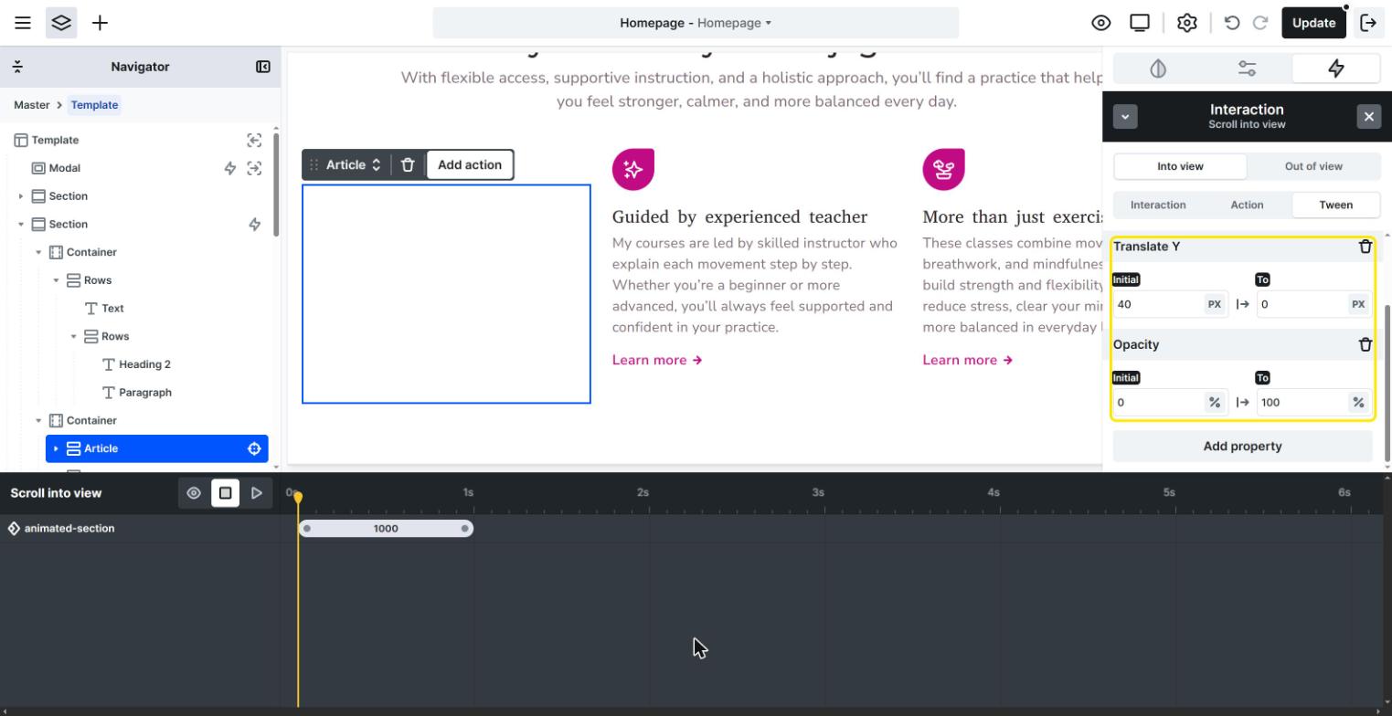
The duration, easing, and values are up to you. For a hover lift, for example, a Translate Y action from 0 px to -10 px is enough.
Step 6 – Repeat for the other children
If you have more animated children, repeat Steps 4 and 5 for animated-child2, animated-child3, and any other Classes you created (for example, animated-child4, animated-child5). The quickest way is to copy the first action:
- In the Timeline, right-click the first action and choose Duplicate (Ctrl+D). You can also use Copy and Paste.
- With the new action selected, open the Action tab and click the Target modifier to edit it.
- Select the next child element on the canvas or in the Navigator, choose its Class (for example,
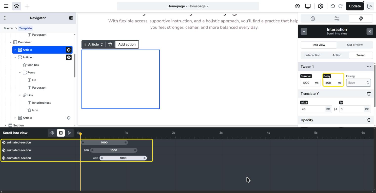
animated-child2), and click Apply. The reset Target is kept, so you don’t need to reset it again. - On the Tween tab, set a Delay, so the children appear one after another.
In this example, the three actions start at 0, 200, and 400 ms:
Step 7 – Reuse the animation
That’s it. To use the same animation on other elements:
- add the trigger Class (here,
animated-section) to the element, - and if you animate children, add the
animated-child1,animated-child2, … Classes to them, in the order you’d like them to appear.
You don’t need to create a new interaction. The element gets the interaction through its Class, and you’ll see it listed on its Interactions tab:
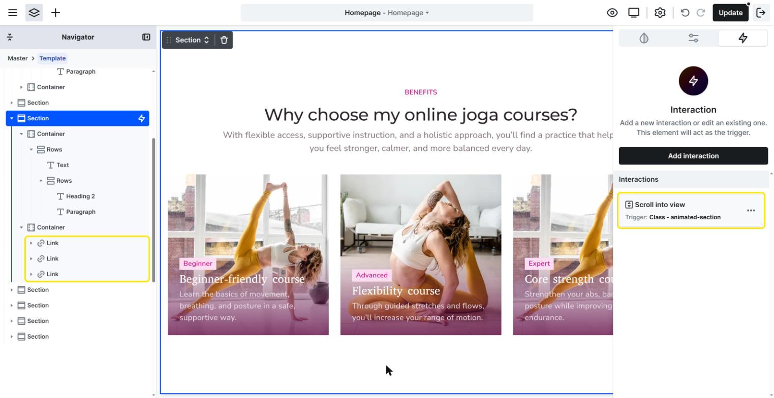
Since the animation belongs to the Classes, any change you make to it (for example, to the duration, the delays, or the Tween values) applies to every element that uses these Classes.