What you can use them for
Text inputs are the fields your visitors type into, and they cover most of what a form needs to collect. Mosaic gives you two elements for the job:
- Input: a single-line box for short answers, such as a name, an email address, a phone number, a price, or a date. A single Input can collect any of these, depending on the type you give it.
- Text area: a larger, multi-line box for longer, free-form answers, such as a message, a description, or feedback.
The two share almost all of the same settings. The main difference is that an Input has a Type that shapes what it collects and how the visitor enters it, while a Text area is always for plain, multi-line text.
Adding an input field
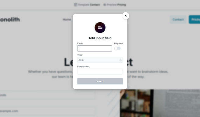
Add an input the same way you add any other field. When you insert it, Mosaic opens a small popover so you can set it up right away. It asks for four things:
- Label: the text shown next to the field so your visitor knows what to enter. Mosaic also uses the label to generate the field’s name automatically, so you don’t have to. The Insert button stays disabled until you type a label.
- Required: whether an answer is mandatory before the form can be submitted.
- Type: the kind of value the field collects, such as plain text, an email address, or a number. See Choosing the input type below.
- Placeholder: faint hint text shown inside the empty field, such as “you@example.com”. It disappears as soon as the visitor starts typing and is not a substitute for the label.
Select Insert and Mosaic drops the field into your form, wrapped in a Field together with its Label, ready to fine-tune. You can change any of these choices later in the field’s settings. For how labels, names, and required fields work across all fields, see Fields & field groups.
Choosing the input type
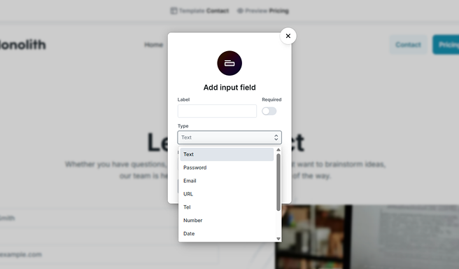
The Type setting decides what kind of value the field collects. It changes how the field behaves for your visitor, the on-screen keyboard shown on phones and tablets, and the built-in checks the browser runs before the form is submitted. You can set the type when you add the field and change it any time in the settings. The available types are:
- Text: a single line of plain text. The default, and the right choice for names, subjects, and anything that doesn’t fit a more specific type.
- Password: hides the characters as they’re typed, showing dots instead.
- Email: an email address. The browser checks the value looks like an email before submitting, and mobile devices show a keyboard with the @ symbol handy.
- URL: a web address. The browser checks the value looks like a URL before submitting.
- Tel: a telephone number. Mobile devices show a phone keypad. Phone numbers vary too much worldwide for the browser to check the format, so use Pattern if you need to enforce one.
- Number: a numeric value, with small up and down steppers for nudging it.
- Date: a calendar date, with a date picker in most browsers.
- Time: a time of day, with a time picker in most browsers.
- Date & Time: a date and a time together, picked in one field.
- Search: works like Text but is styled as a search box, and some browsers add a clear (“x”) button inside it.
Picking the right type does more than validate the value. It brings up the matching keyboard on touch devices (an email keyboard, a number pad, a date picker), which makes your form quicker and less error-prone to fill in. The type you choose also decides which type-specific settings appear lower down, covered under More options below.
The type also affects how the field’s value is handled when you reuse it as a data variable in your actions: a Number field’s value is treated as a number and a URL field’s as a web address, rather than as plain text. See Data variables.
Input settings
Select the input in the Navigator or on the canvas to open its settings, listed under Input settings. The options you’ll reach for most sit at the top; select More options to reveal the rest.
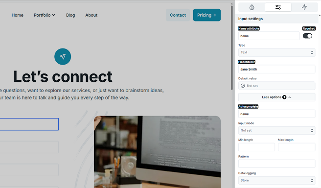
- Name attribute: the key the value is submitted under. It identifies the field in your form submissions and in actions like email, so give it a clear, meaningful name. Mosaic fills this in from the label when you add the field, and you can change it here.
- Required: makes the field mandatory, so the form can’t be submitted until the visitor fills it in.
- Type: the kind of value the field collects. See Choosing the input type above.
- Placeholder: faint hint text shown inside the empty field.
- Default value: what the field contains when the form first loads. See Default value below.
The remaining settings live under More options: Autocomplete, the type-specific settings for the current type, and Data logging. Select it again (it now reads Less options) to collapse them.
Default value
The Default value sets what the field starts with when the form loads. A new field is Not set, so it starts empty. You can type a fixed value or pull one in automatically, for example from a parameter in the page’s web address, so the field arrives prefilled. The visitor can still change whatever you prefill. For every value source and how each one works, see Default values.
Autocomplete
The Autocomplete setting tells the browser what a field is for, so it can offer to fill it in from the details your visitor has saved, like their name, email, or address. Choose a value from the list (for example email, tel, name, or street-address), or leave it empty. To turn the browser’s suggestions off for a field, set it to off. When you set the type to Email or Tel, Mosaic suggests the matching autocomplete value for you.
Autocomplete only helps the browser reuse data the visitor already saved in it. Mosaic doesn’t store or read those details, and the visitor stays in control of what their browser fills in.
Validation and type-specific settings
Beyond Required, each input can carry extra rules the browser checks before the form is submitted. Which of these appear under More options depends on the type you chose, since a rule that makes sense for text doesn’t fit a date, and the other way around.
For the text-style types (Text, Password, Email, URL, Tel, and Search):
- Min length and Max length: the fewest and most characters the value may have. Leave either empty for no limit.
- Pattern: an advanced rule the value must match, written as a regular expression. For example, [0-9]{5} requires exactly five digits, handy for a postal code. Leave it empty unless you need this level of control.
For the numeric and date types (Number, Date, Time, and Date & Time):
- Min and Max: the lowest and highest value allowed. For Number these are numbers; for the date and time types they are the earliest and latest date or time.
- Step: the size of each allowed increment. A number step of 5 only allows 0, 5, 10, and so on; for a time field it sets how finely the time can be picked.
A couple of settings appear only for specific types:
- Input mode (Text and Number types): sets which on-screen keyboard phones and tablets show, without changing what the field accepts. Text offers Text and Search; Number offers Numeric (a plain number pad) and Decimal (a number pad with a decimal point).
- Multiple (Email type): lets the visitor enter several email addresses in the one field, separated by commas.
When a value breaks one of these rules, the browser stops the submission and shows a short message on the field, so the visitor can fix it before trying again. To learn how those messages work, see Error message.
Data logging
The Data logging option, under More options, controls how the field’s value is saved with your form submissions. Use it when a value may be sensitive and you want to hide it in your submissions view or leave it out of the stored data entirely. To learn how data logging works across the whole form, see Form submissions.
Text area
The Text area is the multi-line counterpart to the Input. Use it for longer, free-form answers where a single line isn’t enough, such as a message, a description, or feedback. You add it the same way as an input, and it opens the same setup popover for a label, required, and placeholder. It has no Type setting, because a text area is always for plain multi-line text.
Its settings mirror the text-style input, with two differences: there’s no Type, and there’s no Pattern (that rule doesn’t apply to a multi-line box). So you get Name attribute, Required, Placeholder, and Default value, plus Autocomplete, Min length, Max length, and Data logging under More options. Unlike the single-line input, the text area’s Default value can span several lines, so you can prefill it with line breaks.
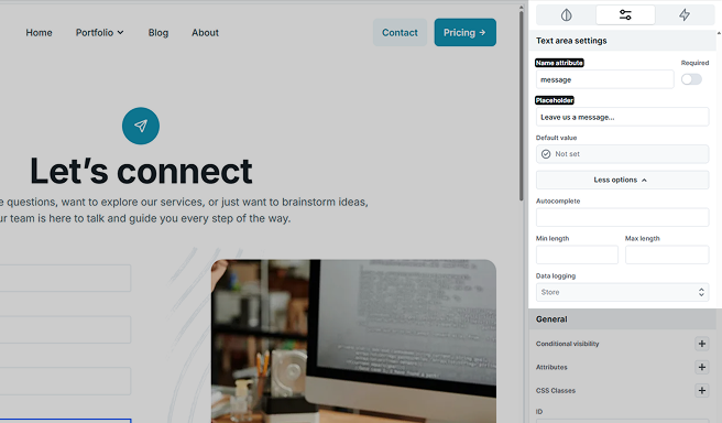
You set a text area’s size, its width and height, in the Style tab rather than with row and column settings. Give it a comfortable starting height so visitors can see there’s room to write.