What you can use it for
A List box shows a scrolling list of options right on the form, with several options visible at once. It’s the browser’s own list control, and it’s the field to use when visitors should be able to pick more than one option from the same list. Common uses include:
- Several answers to one question: the topics a visitor is interested in, or the services they’d like a quote for.
- A short list that’s always visible: a handful of choices you’d like visitors to see without opening a drop-down.
If you need a drop-down with a single choice, or options with icons and descriptions, use a Select instead.
Adding a List box
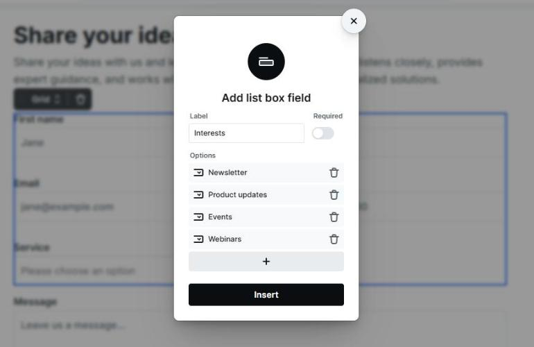
Add a List box the same way you add any other field. When you insert it, Mosaic opens a small popover that asks for a Label, whether the field is Required, and its Options. Use the + to add each option with the text the visitor sees and the value that’s submitted, then select Insert.
For how labels, names, and required fields work across all fields, see Fields & field groups.
The List box and its options in the Navigator
Each choice in a List box is its own Option element, nested under the List box in the Navigator. This is where you manage the list: you can reorder options, remove ones you don’t need, and select any option to change its text and value.
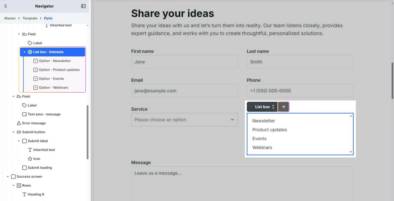
To add another option, use the + on the List box’s toolbar, or on any option’s toolbar to add one next to it. A small popover asks for the new option’s text and value, then inserts it into the list.
List box settings
Select the field in the Navigator or on the canvas to open its settings. The same settings also appear on the Field that holds the List box.
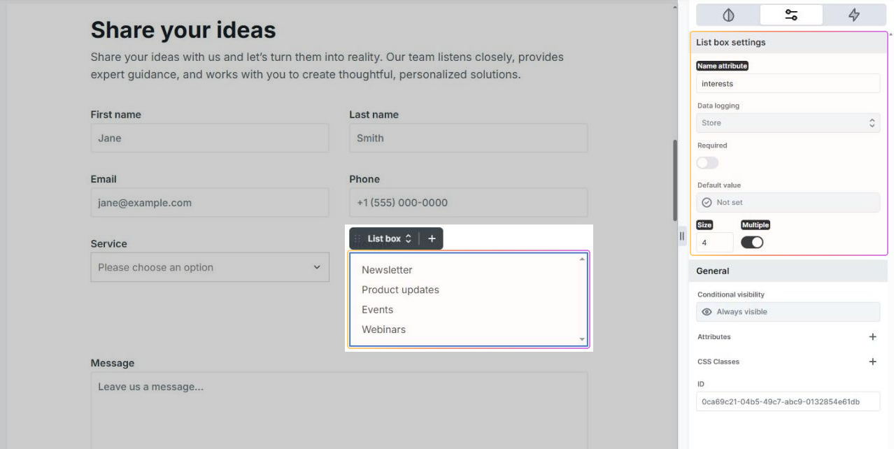
- Name attribute: the key the chosen values are submitted under. It identifies the field in your form submissions and in actions like email, so give it a clear, meaningful name.
- Data logging: controls how the chosen values are saved with your submissions: Store, Mask, or Exclude.
- Required: makes the field mandatory. See Making a choice mandatory below.
- Default value: sets which options are chosen when the form loads. See Choosing what starts selected below.
- Size: how many options are visible at once. See Size below.
- Multiple: lets a visitor pick more than one option. See Allowing more than one choice below.
Size
Size sets how many options are shown at once. The rest are reachable by scrolling inside the list. Size accepts whole numbers only, and it starts at 2: a List box always shows at least two rows. For a one-line drop-down, use a Select.
Allowing more than one choice
Turn on Multiple to let a visitor pick several options from the same list. All of the chosen values are submitted together under the field’s name.
Choosing what starts selected
There are two ways to decide which options are chosen when the form first loads:
- On each option, the Selected toggle marks it as a starting choice. With Multiple turned off, only the last selected option counts; with Multiple on, every selected option starts chosen.
- On the List box itself, the Default value setting does the same at the field level and can also pull values in from elsewhere, such as a parameter in the page’s web address. To start with several values, see Selecting more than one value.
When the List box’s Default value is set, it takes over: it overrides the Selected toggle on the individual options. To learn about every value source, see Default values.
Making a choice mandatory
A List box starts with nothing selected unless you set a starting choice. Turn on Required and the visitor has to select at least one option before the form will submit.
Option settings
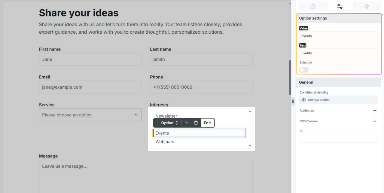
Select an option in the Navigator to open its settings:
- Value: what gets submitted when this option is chosen. Keep it short and stable (for example, a code or key), since this is the data you’ll see in submissions and use in actions.
- Text: the label the visitor reads in the list. It can be friendlier than the value. Option text is plain text.
- Selected: marks this option as a starting choice when the form loads. The List box’s Default value, if set, overrides this.
Styling the List box
Select the List box to style the box itself on the Style tab. To style the rows, use its Option state, which applies to every option in the list. Options can’t be styled one by one. A List box fills the width of its container; set a max width if you’d like it narrower.
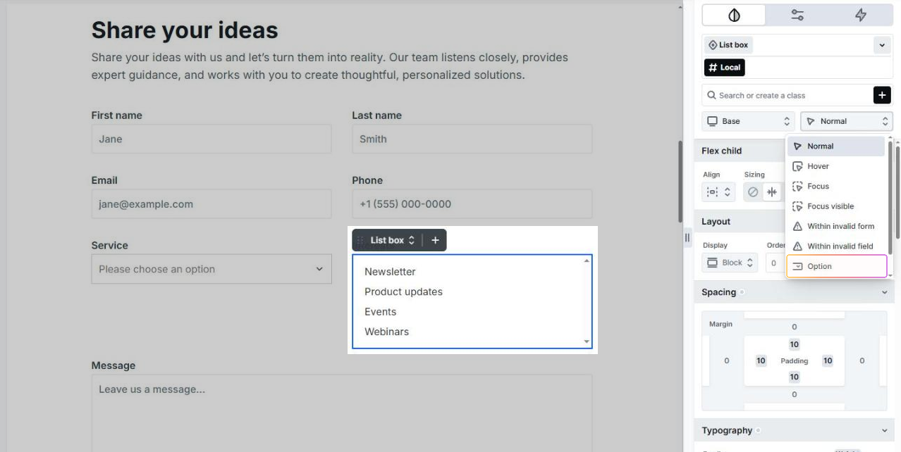
Browsers draw a List box’s rows themselves, so how much of your option styling shows depends on the browser. Colors and text generally follow your styling, but the highlight of a selected row is always the browser’s own, and phones and tablets may show their own picker. If you need full control over how the options look, use a Select.